Commons:Quality images candidates/Archives September 2008
-

- Nomination Cannabis coffee shop in Amsterdam --Massimo Catarinella 22:44, 27 September 2008 (UTC)
- Promotion Nice colours, night shot well handled, like the composition very much.
-
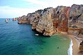
- Nomination Praia da Dona Ana, Portugal. --Stevenfruitsmaak 19:32, 27 September 2008 (UTC)
- Decline Nice plunging view but sky is blown white and purple fringing is too obvious -- Alvesgaspar 23:43, 27 September 2008 (UTC)
-
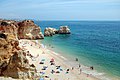
- Nomination Praia da Rocha, Portugal. --Stevenfruitsmaak 19:32, 27 September 2008 (UTC)
- Promotion Correct picture, no ovious flaws -- Alvesgaspar 22:00, 27 September 2008 (UTC)
-

-

- Nomination A Rose (Rosa Chinesis?) Mrmariokartguy 14:23, 27 September 2008 (UTC)
- Decline Out of focus, too much compression and CA --Massimo Catarinella 15:16, 27 September 2008 (UTC)
-

-

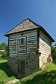
- Nomination Tentement house, Vilnius, Lithuania. --Sfu 14:06, 27 September 2008 (UTC)
- Promotion good --Mbdortmund 19:32, 27 September 2008 (UTC)
-

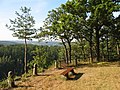
- Nomination Forggensee. --Simonizer 12:22, 27 September 2008 (UTC)
- Promotion Of course, but this is only the first step, right?... -- Alvesgaspar 14:59, 27 September 2008 (UTC)
What do you mean? --Simonizer 21:17, 27 September 2008 (UTC)
-

-
-

-

- Nomination An exercise in contre-jour. Not as good as this other one, of course, but I believe it still deserves the seal -- Alvesgaspar 23:04, 24 September 2008 (UTC)
- Promotion Per your own explanation --Massimo Catarinella 15:22, 27 September 2008 (UTC)
-

- Nomination High res exposure blended dramatic perspective shot of the Indiana World War Memorial. --Dschwen 23:19, 23 September 2008 (UTC)
- Promotion No concerns, high resolution and dramatic indeed. --Stevenfruitsmaak 19:28, 27 September 2008 (UTC)
-

- Nomination Bail bonds agency. --Dschwen 20:36, 23 September 2008 (UTC)
- Promotion good --Mbdortmund 18:53, 26 September 2008 (UTC)
 Comment This is FP-material. I would just correct the small tilt (0,4 degrees) and do some additional cropping on the left. --Massimo Catarinella 11:54, 28 September 2008 (UTC)
-
- Nomination Interior of the Pouhon (spring) Pierre-le-Grand at Spa, Belgium. -- MJJR 20:11, 23 September 2008 (UTC)
- Promotion Very well done. --Stevenfruitsmaak 19:24, 27 September 2008 (UTC)
-
-

- Nomination Boer billy goat --Böhringer 06:28, 23 September 2008 (UTC)
- Decline Overexposed noses. --B.navez 00:56, 28 September 2008 (UTC)
-

- Nomination The Cabot Circus development in Bristol. Mattbuck 22:52, 22 September 2008 (UTC)
- Promotion Interesting angle of view on architecture and a worker. --B.navez 00:53, 28 September 2008 (UTC)
-

- Nomination Portal "Maria im Sand" in Dettelbach, Germany --Berthold Werner 08:57, 22 September 2008 (UTC)
- Promotion No concerns, looks great. --Stevenfruitsmaak 19:40, 27 September 2008 (UTC)
-

- Nomination Aberto Contador, winner of Tour de France, Giro de Italia and Vuelta de España. I think it has good DoF and it is sharp enough for a fast moving target. Barcex 09:49, 22 September 2008 (UTC)
- Decline Even the parts of him which shouldn't be moving too fast (e.g. the helmet) are blurry. --Stevenfruitsmaak 19:16, 27 September 2008 (UTC)
-

-

- Nomination Brothels in Red-light district Amsterdam, The Netherlands. --Massimo Catarinella 22:36, 26 September 2008 (UTC)
- Promotion Very good composition and mood (but where is the lady?...). I would care to correct the slight tilt at left though -- Alvesgaspar 23:48, 26 September 2008 (UTC)Thank you for your comments. I tried to correct the tilt this morning, but I couldn't find one. I also made this picture with a Manfrotto tripod with a build in waterbubble to prevent tilts. As for the prostitute, making pictures of them is prohibited. You normally even get in an argumented if you make a picture of the brothels themselves. --Massimo Catarinella 11:43, 27 September 2008 (UTC)
-

- Nomination Moth Selenia lunaria taken in Vendée, French by Hamon jp --Mbdortmund 20:37, 26 September 2008 (UTC)
- Promotion Good focus, good composition. Vassil 21:10, 26 September 2008 (UTC)
-

-

- Nomination Sympetrum danae--Loz 14:45, 26 September 2008 (UTC)
- Promotion good --Mbdortmund 18:51, 26 September 2008 (UTC)
-

- Nomination Agrius convolvuli --Daniel Baránek 12:25, 26 September 2008 (UTC)
- Decline A nice close-up of a moth but the image is too noisy. Try again with the camera set for the best available quality. Quality macroshots normally require better cameras with larger sensors, to minimize noise and artifacts -- Alvesgaspar 13:48, 26 September 2008 (UTC)
-
- Nomination Dinkelsbühl by User:Doenertier82
--Berthold Werner 07:57, 26 September 2008 (UTC) - Promotion good atmosphere, good edit --Mbdortmund 20:23, 26 September 2008 (UTC)
- Nomination Dinkelsbühl by User:Doenertier82
-

- Nomination Queen paper wasp chewing a caterpillar to feed the larvae. Adult paper wasps are vegetarian! -- Alvesgaspar 08:39, 25 September 2008 (UTC)
- Promotion Good recognizable subject, vivid colors and classy macro view --Twdragon 18:44, 26 September 2008 (UTC)
-

- Nomination A male Pine Processionary Moth (Thaumetopoea pityocampa) with the wings stretched upright to get them dry. -- Alvesgaspar 23:10, 24 September 2008 (UTC)
- Promotion --Twdragon 18:47, 26 September 2008 (UTC)
-
- Nomination blue mailbox in Warburg, germany --Mbdortmund 21:07, 24 September 2008 (UTC)
- Promotion Good photo, very interesting ornate subject and bright colors --Twdragon 18:47, 26 September 2008 (UTC)
-

- Nomination Flexfuel Chevy Tahoe. --Dschwen 20:30, 23 September 2008 (UTC)
- Promotion good --Massimo Catarinella 22:55, 26 September 2008 (UTC)
-

- Nomination Sausages --Che 20:18, 23 September 2008 (UTC)
- Decline Very noisy. --Kosiarz-PL 18:01, 24 September 2008 (UTC)
Looks tasty, and yes, it has some chromatic noise in the shadows, but the more important problem is the lack of sharpness, even when viewed at reduced size. --Dschwen 20:40, 26 September 2008 (UTC)
-

- Nomination State Capitol Police car in Indianapolis. --Dschwen 16:51, 23 September 2008 (UTC)
- Promotion Es ist gut --Massimo Catarinella 22:55, 26 September 2008 (UTC)
-

- Nomination Jeep in a nice setting --Ikiwaner 16:23, 23 September 2008 (UTC)
- Promotion Nice one --Massimo Catarinella 22:55, 26 September 2008 (UTC)
-

- Nomination The Cabot Circus development in Bristol. Mattbuck 22:52, 22 September 2008 (UTC)
- Decline Crop is too much, the bridge is not really visible.
 Info Please don't submit so many pictures as explained above (it takes time to review). Guérin Nicolas 14:57, 26 September 2008 (UTC)
-

- Nomination The Cabot Circus development in Bristol. Mattbuck 22:52, 22 September 2008 (UTC)
- Decline Unbalanced exposure (foreground too dark). --Dschwen 20:43, 26 September 2008 (UTC)
-
- Nomination The Cabot Circus development in Bristol. Mattbuck 22:52, 22 September 2008 (UTC)
- Decline Cut-off base, unattractive overexposure on the building and the sky (I wouldnt mind if an overcast sky was overexposed close to the sun, but for a blue sky I do). --Dschwen 20:43, 26 September 2008 (UTC)
-
-

-

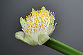
- Nomination Cucurbita pepo (Vilarromarís, Oroso, Galicia (Spain))--Lmbuga 22:04, 17 September 2008 (UTC)
- Promotion
Snapshot picture, low interesting subject --Twdragon 10:01, 24 September 2008 (UTC)Not QI arguments --B.navez 17:29, 24 September 2008 (UTC) Very good. Mrmariokartguy 02:45, 27 September 2008 (UTC)
-

- Nomination Avocado new leaves --B.navez 10:45, 24 September 2008 (UTC)
- Withdrawn
 I withdraw my nomination --B.navez 08:52, 26 September 2008 (UTC)
-

- Nomination a pink rose(Rosa chinensis) --Mrmariokartguy 14:02, 23 September 2008 (UTC)
- Decline Fails as no taxo information & very generic name. Shame, it's rather a nice rose. Mattbuck 14:13, 23 September 2008 (UTC) You want the species name? Mrmariokartguy 14:25, 23 September 2008 (UTC)
Quality images must be categorized, have a meaningful title and description. This should include the Taxa naming for organisms. Mattbuck 14:26, 23 September 2008 (UTC) Look up^ mrmariokartguy 23:18, 25 September 2008 (UTC)
-

- Nomination The Cabot Circus development in Bristol. Mattbuck 22:52, 22 September 2008 (UTC)
- Decline Poor focus, poor composition, overexposed at right top.
-

-

-

-

- Nomination The sheerlegs Norma in the port of Bruges, Belgium -- MJJR 21:06, 17 September 2008 (UTC)
- Decline Sky looks too noisy to me (I couldn't find the ISO setting in the EXIF info??) --Eusebius 10:59, 25 September 2008 (UTC) -- Info ISO setting was switched to 'automatic'. The noise in the sky seems minimal to me, and is not disturbing IMO, even at 100% size. -- MJJR 19:14, 25 September 2008 (UTC)
-

- Nomination church in Nová Kelča, Slovakia --Przykuta 05:46, 25 September 2008 (UTC)
- Promotion Very good composition Albertus teolog 12:05, 25 September 2008 (UTC)
-

- Nomination statue of Andy Warhol in Medzialborce, Slovakia --Przykuta 05:46, 25 September 2008 (UTC)
- Promotion High quality Albertus teolog 12:08, 25 September 2008 (UTC)
-
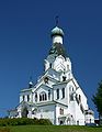
- Nomination orthodox church in Medzilaborce, Slovakia --Przykuta 05:46, 25 September 2008 (UTC)
- Promotion Good perspective and colors Albertus teolog 11:56, 25 September 2008 (UTC)
-

- Nomination new church in Krásny Brod, Slovakia --Przykuta 05:46, 25 September 2008 (UTC)
- Promotion good colours, sharp --Mbdortmund 07:20, 25 September 2008 (UTC)
-

-
-

-

- Nomination Gladiolus --Twdragon 17:14, 23 September 2008 (UTC)
- Decline Nice composition and colours, but ruined by noise and compression artifacts -- Alvesgaspar 08:55, 25 September 2008 (UTC)
-

- Nomination Gladiolus --Twdragon 17:14, 23 September 2008 (UTC)
- Decline Nice composition and colours, but poor detail and compression artifacts -- Alvesgaspar 08:55, 25 September 2008 (UTC)
-

- Nomination Cathedral of Christ the Saviour (Moscow) Twdragon 17:24, 23 September 2008 (UTC)
- Promotion Quite good given the difficult conditions -- Alvesgaspar 08:57, 25 September 2008 (UTC)
-

- Nomination The Cabot Circus development in Bristol. Mattbuck 22:52, 22 September 2008 (UTC)
- Promotion It's good for QI --Pudelek 15:29, 24 September 2008 (UTC)
-

-

-

-
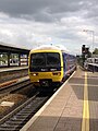
- Nomination British Rail Class 166 at Reading railway station. Mattbuck 19:22, 16 September 2008 (UTC)
- Decline Unsharp. --Eusebius 10:54, 25 September 2008 (UTC)
-

-

- Nomination Looking up at the glass dome of the Indiana State Capitol. --Dschwen 20:46, 23 September 2008 (UTC)
- Promotion nice view --Mbdortmund 21:19, 23 September 2008 (UTC) -- Really good. It may have a chance at FPC but I would recommend a square crop to reduce the dark area around the glass -- Alvesgaspar 07:49, 24 September 2008 (UTC)
-

-

- Nomination Church interior, St. Martin's Church, Eindhoven, The Netherlands. --Wammes Waggel 19:33, 23 September 2008 (UTC)
- Decline Nice composition but poor image quality, with the noise seriously affecting the detail and sharpness. The Exif doesn't show it but I suppose a high ISO setting was used -- Alvesgaspar 08:55, 24 September 2008 (UTC)
-

-

-

- Nomination fountain "Gauklerbrunnen" in Dortmund --Mbdortmund 11:43, 23 September 2008 (UTC)
- Promotion Nice color composition. --Guérin Nicolas 16:04, 23 September 2008 (UTC)
-

-
- Nomination The Galleries shopping centre in Bristol. Mattbuck 00:24, 23 September 2008 (UTC)
- Decline Overshadowed, noisy, snapshot-like picture --Twdragon 09:44, 24 September 2008 (UTC)
-

- Nomination The Galleries shopping centre in Bristol. Mattbuck 00:24, 23 September 2008 (UTC)
- Decline Overshadowed, noisy, snapshot-like picture --Twdragon 09:44, 24 September 2008 (UTC)
-

- Nomination Topographic map in French of the department of the Pyrénées-Atlantiques by Sting -STyx 22:49, 22 September 2008 (UTC)
- Promotion Very good map --Aotearoa 05:51, 23 September 2008 (UTC)
Promotion: very precise map. --Guérin Nicolas 16:04, 23 September 2008 (UTC)
-
- Nomination The Cabot Circus development in Bristol. Mattbuck 22:52, 22 September 2008 (UTC)
- Decline Bad cutoff of the picture. Guérin Nicolas 16:07, 23 September 2008 (UTC)
-

- Nomination Church in Sosnowiec. --Lestath 22:23, 22 September 2008 (UTC)
- Decline Too unsharp and the shadow ruins the composition -- Alvesgaspar 08:59, 24 September 2008 (UTC)
-

-

-

-

-
-

- Nomination Ian Horrocks -- Rama 23:28, 16 September 2008 (UTC)
- Decline Certainly another valuable image. But I think it has a purple colour cast and the flash shadow is too obvious. --Ikiwaner 16:19, 23 September 2008 (UTC)
-

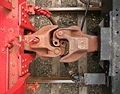
- Nomination coal mine in Dortmund, wheel of a railway waggon --Mbdortmund 16:54, 14 September 2008 (UTC)
- Decline unsharp --Pudelek 08:59, 22 September 2008 (UTC) I think the sharpness is sufficient given the high res. And the composition is stron. However the colours seem too weird that I would promote it. --Ikiwaner 16:21, 23 September 2008 (UTC)
-

- Nomination Exposition in Schöen Palace in Sosnowiec. --Lestath 16:35, 13 September 2008 (UTC) Comment I think this one is good, but could you please geocode? Dori 22:49, 16 September 2008 (UTC) -
- Promotion Not the most exciting subject, especially for those not reading Polish, but the quality is quite good. Geocoding is not formally required -- Alvesgaspar 11:11, 24 September 2008 (UTC)
- Nomination Exposition in Schöen Palace in Sosnowiec. --Lestath 16:35, 13 September 2008 (UTC)
-

-
-
-
-

-

-

-

-

-

-
- Nomination Pair of Tipulidae mating in North Texas--Lmbuga 20:46, 21 September 2008 (UTC)
- Promotion --Mbdortmund 11:21, 22 September 2008 (UTC)
-

- Nomination Post in Gliwice. --Lestath 17:25, 21 September 2008 (UTC)
- Promotion OK --Mbdortmund 20:32, 21 September 2008 (UTC)
-

- Nomination One of my favourite benches in Porto Covo, west coast of Portugal. Compare with this other sunset, taken at the same spot but in October -- Alvesgaspar 15:33, 21 September 2008 (UTC)
- Promotion good atmosphere --Mbdortmund 20:33, 21 September 2008 (UTC)
-

- Nomination A "true weevil" or "stout beetle" (Lixus angustatus) -- Alvesgaspar 14:47, 21 September 2008 (UTC)
- Promotion Very nice image, might be a future FP (I would nominate it.). The only slight fault is the unsharp back of the beetle, which is a shame. The background is really nice though. --Massimo Catarinella 15:17, 21 September 2008 (UTC)
-
- Nomination Watermill at Opwetten, Nuenen, The Netherlands --Wammes Waggel 12:59, 21 September 2008 (UTC)
- Promotion nice picture, but geocoding please--Pudelek 08:44, 22 September 2008 (UTC)
-
- Nomination Rothenburg ob der Tauber, Spitalbastei --Berthold Werner 12:04, 21 September 2008 (UTC)
- Decline Shadows, blurred tower and not such a good composition. --Massimo Catarinella 15:15, 21 September 2008 (UTC)
-
- Nomination little fishing village Yport --Tobi 87 08:50, 21 September 2008 (UTC)
- Decline Dull colors, harsh light and too much compression --Massimo Catarinella 15:21, 21 September 2008 (UTC)
-

- Nomination Rothenburg ob der Tauber, Siebersturm --Berthold Werner 15:30, 20 September 2008 (UTC)
- Decline The shadows ruin the picture. --Massimo Catarinella 15:19, 21 September 2008 (UTC)
-

- Nomination Charles Bridge, new crop --Massimo Catarinella 00:17, 20 September 2008 (UTC)
- Promotion Better crop than the last version, ok for me now. --Eusebius 09:08, 22 September 2008 (UTC)
-
-

-

- Nomination Equipments of fishing, Ribeira, Category:Galicia (Spain) --Lmbuga 00:33, 19 September 2008 (UTC)
- Decline Tilted --Sfu 11:42, 22 September 2008 (UTC)
-
- Nomination Sunk boat (Pontedeume, Galiza, Spain. /--Lmbuga 23:49, 18 September 2008 (UTC)
- Promotion interesting --Mbdortmund 11:25, 22 September 2008 (UTC)
-

-
-
- Nomination Oude Kerk (the Old Church), Amsterdam -- Fabienkhan 11:25, 16 September 2008 (UTC)
- Decline poor lighting and vignetting--Pudelek 08:56, 22 September 2008 (UTC)
-

- Nomination Lycoris radiata--池田正樹 17:53, 20 September 2008 (UTC)
- Decline Stamens fade in the dark, oversharpening makes noisy pink --B.navez 05:26, 21 September 2008 (UTC)
-

- Nomination Reconstructed manor palace in Krikštėnai --Juliux 07:50, 19 September 2008 (UTC)
- Promotion An well lit scene and good perspective. Image could be sharper on the right hand side. --Ikiwaner 19:47, 20 September 2008 (UTC)
-

- Nomination: coal mine in Dortmund, manual point --Mbdortmund 16:54, 14 September 2008 (UTC)
- Review needed
-

- Nomination: coal mine in Dortmund, winding tower --Mbdortmund 16:54, 14 September 2008 (UTC)
- Review needed
-

- Nomination: Crypt in cathedral in Katowice. --Lestath 13:39, 14 September 2008 (UTC)
- Review needed
-

- Nomination Ignacio Vilar, Rubén Riós e Roberto Porto, actors of the film Pradolongo--Lmbuga 01:12, 13 September 2008 (UTC)
- Promotion pleasant portrait --B.navez 05:46, 21 September 2008 (UTC)
-

- Nomination Peace Memorial (Mohyla míru) on Prace hill, Moravia --Pudelek 20:16, 10 September 2008 (UTC) Comment It seems to be leaning clockwise, but maybe it just looks that way. Dori 22:44, 16 September 2008 (UTC)
- Decline Sharpness, color and light balance a bit under the QI criteria --B.navez 05:56, 21 September 2008 (UTC)
- Nomination Peace Memorial (Mohyla míru) on Prace hill, Moravia --Pudelek 20:16, 10 September 2008 (UTC)
-

- Nomination Rothenburg ob der Tauber, Rödertor, --Berthold Werner 17:32, 19 September 2008 (UTC)
- Promotion Nice picture --Massimo Catarinella 23:02, 19 September 2008 (UTC)
-

- Nomination Lycaena tityrus mating --Loz 14:51, 19 September 2008 (UTC)
- Promotion Good -- Alvesgaspar 22:12, 19 September 2008 (UTC)
-
- Nomination Lycaena phlaeas --Loz 14:51, 19 September 2008 (UTC)
- Decline Angle is not the best, wings are out of focus -- Alvesgaspar 22:14, 19 September 2008 (UTC)
-

- Nomination Fishing boat (A Illa de Arousa, Galiza, Spain. --Lmbuga 00:07, 19 September 2008 (UTC)
- Decline Overall unsharpness (blame the camera?), unbalanced composition with too large uninterenting area of water in the foreground -- Alvesgaspar 22:18, 19 September 2008 (UTC)
-

- Nomination Stunt action at Eurodisney, Paris - Alvesgaspar 20:45, 18 September 2008 (UTC)
- Decline This would IMO benefit from a crop removing the bright stuff in the top right corner. Quality (sharpness) is not good enough for the small size of the subject though. --Dschwen 18:29, 19 September 2008 (UTC)
-

- Nomination Landscape near Colmberg --Simonizer 19:38, 18 September 2008 (UTC)
- Promotion Good enough, good composition --Massimo Catarinella 23:10, 19 September 2008 (UTC)
-

- Nomination Close-up of the head of a male ctenosaura similis. --Chmehl 20:12, 15 September 2008 (UTC)
- Decline Focus is a little too far back. Unsure. --Dschwen 18:31, 19 September 2008 (UTC)-- Agree. And there is little excuse, a much smaller aperture could have been used -- Alvesgaspar 22:22, 19 September 2008 (UTC)
-
-
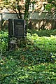
- Nomination A couple of gravestones in old Jewish cemetery in Otwock, Poland Aotearoa 08:38, 14 September 2008 (UTC)
- Decline Dull light and blurry --Massimo Catarinella 23:03, 19 September 2008 (UTC)
-

- Nomination: Exposition in Schöen Palace in Sosnowiec. --Lestath 16:35, 13 September 2008 (UTC)
- Review needed
-

- Nomination Relief of Austrian Empire coat of arms. Špilberk Castle, Brno (Brünn), Moravia --Pudelek 17:18, 9 September 2008 (UTC)
- Decline * Comment, should be cropped to half the current size, most of the image is blank. TimVickers 21:19, 11 September 2008 (UTC) Markings on rock is not clear.Mrmariokartguy 13:34, 19 September 2008 (UTC)
-

-

- Nomination Cathedral of Santiago de Compostela, Category:Galicia (Spain) --Lmbuga 01:46, 19 September 2008 (UTC)
- Decline I like the composition, but I think it's oversharpened and compression artifacts are visible. Otherwise nice. --Sfu 06:40, 19 September 2008 (UTC)
-

-

- Nomination Boletus edulis --Kosiarz-PL 13:26, 18 September 2008 (UTC)
- Decline Details are smoothed, focusing is weak, mosses are unidentified and why is the picture so tilted ? --B.navez 14:22, 18 September 2008 (UTC)
-

- Nomination Flats in Opole (Oppeln) on the Młynówka (Mühlgraben; old channel of Odra river) --Pudelek 11:24, 18 September 2008 (UTC)
- Promotion Should be a bit sharper but quite good picture and very interesting perspective and reflection. Though I wonder what does Richard Gere do on the balcony ? --B.navez 14:18, 18 September 2008 (UTC)
-
- Nomination Detail of the bridge of Alexandre III, Paris -- Alvesgaspar 22:48, 17 September 2008 (UTC)
- Promotion Good composition and details, completed contrast balance (very hard to manage with a black sculpture).--B.navez 02:56, 19 September 2008 (UTC)
-

- Nomination Cucurbita pepo (Vilarromarís, Oroso, Galicia (Spain))--Lmbuga 22:04, 17 September 2008 (UTC)
- Promotion A good illustration of a big specimen. --B.navez 03:06, 19 September 2008 (UTC)
-
-

- Nomination coal mine "Zeche Zollern", railway crossing --Mbdortmund 19:11, 16 September 2008 (UTC)
- Decline detailed texture of rust and steel is dramatically missing. --B.navez 14:07, 18 September 2008 (UTC)
-
- Nomination coal mine "Zeche Zollern", historical waggon --Mbdortmund 19:11, 16 September 2008 (UTC)
- Decline I think picture should be taken from the other side of the track in order to get better light and avoid overxposed sky, and other problems. --Sfu 06:35, 19 September 2008 (UTC)
-

-
-
- Nomination Düsseldorf, Rheinkniebrücke at the parliament of NRW --Mbdortmund 00:34, 11 September 2008 (UTC)
- Decline Not sharp which is quite visible on the boat. /Daniel78 21:09, 18 September 2008 (UTC)
-
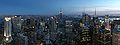
- Nomination View from the Rockefeller Center in Manhattan at dusk. --Dschwen 21:44, 16 September 2008 (UTC)
- Promotion nice --Mbdortmund 22:30, 16 September 2008 (UTC)
-

- Nomination Aiguille du Midi--Shizhao 01:24, 17 September 2008 (UTC)
- Promotion Pretty good. --B.navez 03:15, 17 September 2008 (UTC)
-

- Nomination coal mine "Zeche Zollern", window --Mbdortmund 19:11, 16 September 2008 (UTC)
- Promotion Nice picture of an interesting place (which I know rather well, as I visited it a couple of times some years ago) -- MJJR 20:59, 16 September 2008 (UTC)
-

-

-

- Nomination Montelbaan Tower in Amsterdam -- Fabienkhan 10:12, 16 September 2008 (UTC)
- Decline Bad color balance. --Lestath 17:44, 16 September 2008 (UTC)
-

- Nomination Monticello Railway Museum. --Dschwen 03:24, 16 September 2008 (UTC)
- Promotion Nice engine!!! A square picture, with the small building at the left cropped out, would perhaps be even better. But this version is also QI, although a little bit gray due to the weather conditions. -- MJJR 21:17, 16 September 2008 (UTC)
-

- Nomination Albuquerque and Sandia Mountains at sunset. --Dschwen 23:02, 15 September 2008 (UTC)
- Promotion Comment QI guidelines specify candidates must be >2MP. Do you have a larger version? Thegreenj 01:17, 16 September 2008 (UTC) :) OMG - what's a quality... impressive. --Lestath 17:48, 16 September 2008 (UTC)
-

- Nomination Atlante of the baroque organ in Laon Cathedral. Vassil 21:33, 15 September 2008 (UTC)
- Promotion good --Mbdortmund 11:43, 16 September 2008 (UTC) "Good" is not a proper review. Mrmariokartguy 14:15, 16 September 2008 (UTC)
Still better than your discuss reason. Changed back to Promotion. --Dschwen 17:31, 16 September 2008 (UTC)
-

- Nomination coal-mine "Zollern II/IV" in Dortmund --Mbdortmund 19:03, 15 September 2008 (UTC)
- Decline
 Oppose Sorry but a good portion of the image is overexposed. Dori 22:56, 16 September 2008 (UTC)
-

-

- Nomination Water tower in Burlington, NC --Specious 02:28, 14 September 2008 (UTC)
- Decline This is underexposed (probably trying to keep the highlights from blowing out you took the worse of two evils). --Dschwen 21:58, 16 September 2008 (UTC)
-

- Nomination: Peace Monument in Prace. Sculpture "Russia" --Pudelek 20:16, 10 September 2008 (UTC)
- Review needed
-

- Nomination: Church of the Resurrection of the Lord, Slavkov u Brna (Austerlitz), Moravia --Pudelek 20:16, 10 September 2008 (UTC)
- Review needed
-
- Nomination Petroglyph National Monument near Albuquerque. --Dschwen 19:27, 9 September 2008 (UTC)
- Promotion Comment Compared with whole of image, Petroglyph is too small. _Fukutaro 11:29, 13 September 2008 (UTC)
 Support I think it helps the composition as it puts it in context. Dori 22:42, 16 September 2008 (UTC)
-
- Nomination Train coupling. --Dschwen 03:15, 16 September 2008 (UTC)
- Promotion interesting view --Mbdortmund 11:39, 16 September 2008 (UTC)
-

- Nomination 19th century gargoyle of Laon Cathedral. Vassil 21:42, 15 September 2008 (UTC)
- Promotion good picture . interesting motive --Mbdortmund 11:43, 16 September 2008 (UTC)
-

- Nomination POL, Świdnica, Cathedral --Daniel Baránek 19:26, 14 September 2008 (UTC)
- Decline Bad crop and perspective. --Lestath 13:26, 15 September 2008 (UTC)
-

- Nomination CZE, Božanov, Church --Daniel Baránek 19:26, 14 September 2008 (UTC)
- Decline Unsharp, CA and bad lighting --Massimo Catarinella 15:48, 15 September 2008 (UTC)
-

-

- Nomination Mt. Showa-shinzan in Japan --Mugu-shisai 18:35, 14 September 2008 (UTC)
- Promotion Beautiful photo, good details. --Lestath 13:27, 15 September 2008 (UTC)
-

- Nomination Central Valley of California (haze is from smog) --Intothewoods29 06:33, 14 September 2008 (UTC)
- Decline Although there is some smog, I think this is too unsharp --Lucarelli 22:45, 15 September 2008 (UTC)
-

-

- Nomination Detail of Pulpit in St. Stephen's Cathedral, Vienna Aotearoa 10:51, 15 September 2008 (UTC)
- Promotion good composition --Mbdortmund 11:28, 15 September 2008 (UTC)
-
- Nomination Swiss-Italian Border in the Engadin. --Dschwen 02:12, 15 September 2008 (UTC)
- Promotion Very good, no stitching errors as far I can see. --Massimo Catarinella 09:59, 15 September 2008 (UTC)
-

- Nomination Crater Lake National Park in Oregon --VVHeavyVv 04:17, 15 September 2008 (UTC)
- Decline Underexposed --Massimo Catarinella 09:59, 15 September 2008 (UTC)
-

- Nomination POL, Świdnica, Cathedral --Daniel Baránek 19:26, 14 September 2008 (UTC)
- Decline Bad lighting and chromatic aberration --Massimo Catarinella 10:52, 15 September 2008 (UTC)
-

- Nomination Crayons --Jwitos 18:52, 14 September 2008 (UTC)
- Decline Front Color pencil blurred, out of focus highlights on back Mrmariokartguy 22:45, 14 September 2008 (UTC)
-

-
-

- Nomination Anthericum liliago --Böhringer 19:07, 7 September 2008 (UTC)
- Decline Comment The insect should be identified. --Eusebius 08:58, 9 September 2008 (UTC) Sorry, I do not know the fly --Böhringer 06:12, 12 September 2008 (UTC) What is that green halo on the flower's edge? CA? _Fukutaro 11:29, 13 September 2008 (UTC), a part of the plant --Böhringer 22:19, 13 September 2008 (UTC) Oppose Top of the inflorescence cropped. --B.navez 11:36, 14 September 2008 (UTC)
-

- Nomination Wooden statue in Laon Cathedral.Vassil 21:19, 13 September 2008 (UTC)
- Promotion Very nice looking with no flaws! Mrmariokartguy 23:31, 13 September 2008 (UTC)
-

-
- Nomination Bishop court in Sosnowiec. --Lestath 16:35, 13 September 2008 (UTC)
- Decline Too much shadow all around Mrmariokartguy 23:34, 13 September 2008 (UTC)
-

- Nomination Carrouges Castle, Normandy, France. -- Fabienkhan 12:09, 13 September 2008 (UTC)
- Promotion The sky is a bit noisy, but I like the perspective and the colours. --Eusebius 12:30, 13 September 2008 (UTC)
-
- Nomination Oleander aphids (Aphis nerii) -- Alvesgaspar 11:58, 13 September 2008 (UTC)
- Promotion Very nice suckers. --B.navez 13:10, 13 September 2008 (UTC)
-
- Nomination Indian Fritillary -- masaki ikeda 17:36, 12 September 2008 (UTC)
- Promotion Good sharpness and details. Nice colorus. Overall it's very good shot. --Lestath 19:18, 12 September 2008 (UTC)
-

- Nomination The Japanese Tree frog-- masaki ikeda 17:08, 12 September 2008 (UTC)
- Promotion good composittion, good details --Mbdortmund 10:00, 13 September 2008 (UTC)
-

- Nomination A satyr sculpted on a building in Paris -- Stephanemartin 15:20, 12 September 2008 (UTC)
- Promotion More DOF would be better, but otherwise good. --Massimo Catarinella 16:26, 13 September 2008 (UTC)
-

- Nomination Chicago river, showing buildings on West Wacker Drive -- Alvesgaspar 09:04, 12 September 2008 (UTC)
- Decline Chromatic Abberation (see green lining rooftops) --Massimo Catarinella 16:25, 13 September 2008 (UTC)
-

- Nomination Klesenza Valley in Vorarlberg --Böhringer 06:24, 12 September 2008 (UTC)
- Promotion Very good with no flaws!!! Mrmariokartguy 23:36, 13 September 2008 (UTC)
-

- Nomination "Aiguille" and "Porte d'Aval" in Étretat, Normandy --Tobi 87 09:35, 11 September 2008 (UTC)
- Decline
 NeutralThe classical sight :-) I think there is too much noise in the sky, but I'm not sure about it. --Eusebius 20:35, 11 September 2008 (UTC) Oppose Yes, there is too much noise present in the picture and it isn't very sharp either. --Massimo Catarinella 16:33, 13 September 2008 (UTC)
-
- Nomination Germany, Bernkastel-Kues, Church --Berthold Werner 11:40, 10 September 2008 (UTC)
- Decline Harsh light and noise --Massimo Catarinella 16:24, 13 September 2008 (UTC)
-

-

- Nomination Suicide hotline sign on suicide bridge. --Cumulus Clouds 16:40, 8 September 2008 (UTC)
- Decline hand blurred and slightly noisy. _Fukutaro 11:29, 13 September 2008 (UTC)
-
- Nomination Notre-Dame de Chartres Gothic cathedral, taken by Honge from German wikipedia. --MathKnight 16:48, 8 September 2008 (UTC)
- Decline Tilted, unsharp, noisy. _Fukutaro 11:29, 13 September 2008 (UTC)
-

-

- Nomination Anemone coronaria, Israel. MathKnight 20:33, 11 September 2008 (UTC)
- Decline Rough processing --B.navez 08:58, 12 September 2008 (UTC)
-

- Nomination Typical Moroccian Tea kit. --Pedroserafin 18:44, 11 September 2008 (UTC)
- Decline Very noisy, bad crop. --Eusebius 20:14, 11 September 2008 (UTC)
-

-
- Nomination A Goldenrod Crab Spider (Misumena vatia) capturing a bee (Andrena sp.) -- Alvesgaspar 10:48, 11 September 2008 (UTC)
- Promotion Looks fine to me, interesting picture. --Eusebius 20:19, 11 September 2008 (UTC)
-

- Nomination Marble Sarcophagus, typical of Pamphylia. Roman period III century AD. Artefact located in Konya archeological museum. -- Fabienkhan 14:21, 10 September 2008 (UTC)
- Promotion CommentThe cut-out is fairly well done, but the shadow looks very fake. Could you make a version without it? Thegreenj 21:48, 10 September 2008 (UTC)
Looks good now. Thegreenj 20:45, 11 September 2008 (UTC)
-
- Nomination Altar in the church in Wola Gułowska, Poland. --Sfu 07:11, 10 September 2008 (UTC)
- Decline Lens flare from reflection. TimVickers 22:54, 11 September 2008 (UTC)
-

- Nomination Reenactors of the Austrian army in Austerlitz (Slavkov u Brna), Moravia --Pudelek 17:18, 9 September 2008 (UTC)
- Promotion please add a personal rights warning --Mbdortmund 16:54, 11 September 2008 (UTC)
Info Done -Pudelek 17:24, 11 September 2008 (UTC)
-

- Nomination Agfa Box --Berthold Werner 09:23, 9 September 2008 (UTC)
- Promotion Sehr gut! I would only like it to be a bit more contrasty, but this is minor. Adamantios 20:47, 11 September 2008 (UTC)
-

- Nomination Adobe pueblo revival architecture. --Dschwen 01:57, 10 September 2008 (UTC)
- Promotion The quality is good, though the composition would be better without the green. --Massimo Catarinella 17:11, 10 September 2008 (UTC)
-

- Nomination A white cultivar of a Osteospermum sp. flower (Cape Daisy) -- Alvesgaspar 23:10, 9 September 2008 (UTC)
- Promotion Good DOF, nice colours -- Stephanemartin 22:45, 10 September 2008 (UTC)
-

- Nomination The train station of Marche-les-Dames, Belgium -- MJJR 21:07, 9 September 2008 (UTC)
- Decline Nice composition, but the sky is overexposed. --Kosiarz-PL 19:41, 10 September 2008 (UTC)
-

-
- Nomination Germany, Rothenburg ob der Tauber, Klostergasse --Berthold Werner 12:24, 6 September 2008 (UTC)
- Decline Exposition issues : left side of the street black, building at the end of the street overexposed. --B.navez 17:47, 10 September 2008 (UTC)
Yes, but I like the colours --Berthold Werner 19:47, 10 September 2008 (UTC)
-
- Nomination: Exposition in Schöen Palace in Sosnowiec. --Lestath 21:31, 4 September 2008 (UTC)
- Review needed
-
- Nomination: Exposition in Schöen Palace in Sosnowiec. --Lestath 21:31, 4 September 2008 (UTC)
- Review needed
-
- Nomination: Bishop court in Sosnowiec. --Lestath 21:31, 4 September 2008 (UTC)
- Review needed
-

- Nomination A view of the Mostecká viewed towards Malostranské Náměstí with the Church of Saint Nicolas in the background in Malá Strana, Prague just after sunrise. --Massimo Catarinella 22:33, 3 September 2008 (UTC)
- Promotion Sharpness is good. Composition is not bad. enough to QI. _Fukutaro 14:33, 10 September 2008 (UTC)
-
- Nomination The Saint-Loup church in Namur, Belgium (Notice: this church stands in a narrow street, without possibility of a more distant point of view) -- MJJR 21:07, 9 September 2008 (UTC)
- Decline Not the best angle of view. --Lestath 22:38, 9 September 2008 (UTC) Comment I know, but there is not really a better angle of view possible, due to the narrowness of the street -- MJJR 08:00, 10 September 2008 (UTC)
-

-
- Nomination Petroglyph near Albuquerque. --Dschwen 19:27, 9 September 2008 (UTC)
- Promotion Nice --Massimo Catarinella 21:13, 9 September 2008 (UTC)
-

-
- Nomination The fruit of a Smooth Sow-Thistle (Sonchus oleraceus). Notice the delicate structure of the filaments -- Alvesgaspar 20:44, 8 September 2008 (UTC)
- Promotion nice --Mbdortmund 15:59, 9 September 2008 (UTC)
-

-

- Nomination Düsseldorf, Rheinturm --Mbdortmund 21:25, 6 September 2008 (UTC)
- Promotion I like it, nice asymmetric composition --Lucarelli 21:17, 9 September 2008 (UTC)
-
- Nomination: Germany, Bernkastel-Kues, Am Kirchhof --Berthold Werner 12:01, 4 September 2008 (UTC)
- Review needed
-
- Nomination: Castle in Olsztyn, Poland --Pudelek 07:53, 4 September 2008 (UTC)
- Review needed
-

- Nomination Lone tree on a summer hillside --ShakataGaNai 01:48, 2 September 2008 (UTC)
- Decline Comment A precise identification of the tree is needed. --Eusebius 06:56, 2 September 2008 (UTC)
Clearly an oak,maybeQuercus agrifolia,but needs to be checked and fixed by a neighbour !--B.navez 10:47, 6 September 2008 (UTC) fixed by web sources! --B.navez 11:16, 6 September 2008 (UTC) Artifacts, too low contrasts. --Lestath 22:28, 9 September 2008 (UTC)
-
-
-
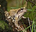
- Nomination Female Common Frog (Rana temporaria) --LC-de 18:26, 8 September 2008 (UTC)
- Promotion Very good, passes QI requirements. TimVickers 18:55, 8 September 2008 (UTC)
-

-

- Nomination Sailing fishing boat, south coast of Portugal -- Alvesgaspar 23:39, 7 September 2008 (UTC)
- Promotion Nive pic, very sharp. You could add a geocoding tag, but this passes the QI requirements. TimVickers 19:00, 8 September 2008 (UTC) --
 Done Alvesgaspar 19:27, 8 September 2008 (UTC)
-

- Nomination Kyrgyz yurt near the lake Song-Köl (Naryn Province, Kyrgyzstan).--Ondřej Žváček 20:19, 7 September 2008 (UTC)
- Decline Chromatic Aberration --Massimo Catarinella 16:35, 8 September 2008 (UTC)
-

- Nomination Slide projector Agfa Opticus 100 --Berthold Werner 18:01, 7 September 2008 (UTC)
- Promotion good details --Mbdortmund 19:08, 8 September 2008 (UTC)
-

- Nomination Mooring bollards --Lucarelli 23:03, 6 September 2008 (UTC)
- Promotion Illustrates subject well, good resolution. TimVickers 21:18, 8 September 2008 (UTC)
-

-

- Nomination Helix pomatia --Kosiarz-PL 17:16, 4 September 2008 (UTC)
- Decline DOF is too small, eye stalks are not in focus. Lycaon 11:56, 9 September 2008 (UTC)
-

- Nomination Heavy metal band Masterstroke live at Jalometalli 2008 in Oulu. by Cecil Mbdortmund
- Decline White parts overexposed, lights behind disconnected with the subject --B.navez 11:38, 7 September 2008 (UTC)
-

- Nomination Six-spot Burnet and Scabiosa columbaria --Böhringer 18:51, 7 September 2008 (UTC)
- Promotion nice --Mbdortmund 21:11, 7 September 2008 (UTC)
-
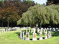
- Nomination Belgian World War I cemetery at Houthulst, West Flanders, Belgium -- MJJR 18:44, 7 September 2008 (UTC)
- Decline sorry, but partially overexposured --Mbdortmund 21:17, 7 September 2008 (UTC)
-

- Nomination Agfa Optima II --Berthold Werner 07:56, 7 September 2008 (UTC)
- Promotion Good Quality. Mrmariokartguy 14:32, 7 September 2008 (UTC)
-

- Nomination Mexican poppy --B.navez 18:44, 6 September 2008 (UTC)
- Promotion I don't see a problem here --Massimo Catarinella 15:09, 7 September 2008 (UTC)
-
-

- Nomination Belgian World War I cemetery at Houthulst, West Flanders (Belgium) -- MJJR 20:42, 4 September 2008 (UTC)
- Promotion There's nothing wrong with it. --Massimo Catarinella 15:08, 7 September 2008 (UTC)
-

- Nomination Remaining columns on the Roman forum of Athens, Greece. --Eusebius 19:55, 3 September 2008 (UTC)
- Withdrawn Excessive chromatic abberation --Massimo Catarinella 14:56, 7 September 2008 (UTC)
 QuestionThanks for the review, can you tell me where to look please? --Eusebius 17:32, 7 September 2008 (UTC) Comment The top and upper right corner of the structure mostly. If you zoom in at 200-300% you can clearly see purple lines along the edges. This is due to a wide open diaphragm on a sunny day. You can avoid this by photograph with F>5.0. --Massimo Catarinella 18:50, 7 September 2008 (UTC) OK, thanks! --Eusebius 18:57, 7 September 2008 (UTC)
-

- Nomination Nose art on a B-17G --Mr.Z-man 02:49, 2 September 2008 (UTC)
- Decline Harsh light, chromatic aberration and flares --Massimo Catarinella 14:57, 7 September 2008 (UTC)
-

- Nomination: Sedum Spectabile -- MJJR 21:05, 1 September 2008 (UTC)
- Review needed
-

-

- Nomination Verbascum blattaria, the moth mullein. Arria Belli 18:55, 1 September 2008 (UTC)
- Decline Too much noise --Massimo Catarinella 15:05, 7 September 2008 (UTC)
-
- Nomination Bronze sculpture "Uhlan and girl" in Grudziądz --Kosiarz-PL 18:20, 1 September 2008 (UTC)
- Decline There is overexposure in between the two faces making it distracting. you should have waited a bit for the clouds to move away and/or underexposed a little. Dori 17:21, 7 September 2008 (UTC)
-

- Nomination Germany, Bernkastel-Kues, Rathaus (Town hall) --Berthold Werner 17:24, 1 September 2008 (UTC)
- Decline Chromatic aberration and unsharp parts. --Massimo Catarinella 15:04, 7 September 2008 (UTC)
-

- Nomination Tithonia rotundifolia flower. Ram-Man 02:44, 1 September 2008 (UTC)
- Promotion Yep, I know how difficult it is to photograph this flower. Dori 17:19, 7 September 2008 (UTC)
-

- Nomination Tithonia rotundifolia flower. Ram-Man 02:44, 1 September 2008 (UTC)
- Promotion This one is good as well. Dori 17:19, 7 September 2008 (UTC)
-

- Nomination Fyllingsdalen in Bergen, Norway. --Aqwis 22:32, 31 August 2008 (UTC)
- Promotion Nothing wrong with it's quality. --Massimo Catarinella 15:03, 7 September 2008 (UTC)
-

-
- Nomination A male solitary bee (Eucera cf. longicornis) -- Alvesgaspar 13:19, 31 August 2008 (UTC)
- Promotion Dof and sharpness could be better, but good enough. Nice background. --Massimo Catarinella 15:00, 7 September 2008 (UTC)
-
- Nomination Cadillac by CZmarlin --Mbdortmund 21:25, 6 September 2008 (UTC)
- Decline Disturbing chroma noise on the shadow side. Lycaon 21:35, 6 September 2008 (UTC)
-
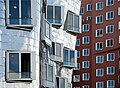
- Nomination Düsseldorf, Neuer Zollhof, „Gehry-Bauten“ --Mbdortmund 21:25, 6 September 2008 (UTC)
- Decline Too soft in parts. Probably DOF issue. Did you use a tripod? A static subject should be very crisp. Very interesting image otherwise with good composition and colours. Lycaon 21:33, 6 September 2008 (UTC)
-

- Nomination Giant Squid (Architeuthis sanctipauli). Natural History Museum, Paris -- Stephanemartin 19:29, 6 September 2008 (UTC)
- Decline Unfortunate crop, DOF and BG. Lycaon 21:20, 6 September 2008 (UTC) Comment This not an "unfortunate crop". The squid is 9 meters long, with 6 meters for the front tentacles. There is just no way to have them entirely. For the background, unfortunate choice by the museum, no choice either. I'll go for a reshot with a more appropriate DOF. -- Stephanemartin 22:09, 6 September 2008 (UTC)
-

-

-

-

- Nomination Peppery Bolete (Chalciporus piperatus) --LC-de 21:53, 5 September 2008 (UTC)
- Promotion Very good indeed. TimVickers 18:22, 6 September 2008 (UTC)
-

- Nomination Coffin --Sfu 14:28, 4 September 2008 (UTC)
- Promotion Wow, what a great image. TimVickers 19:49, 4 September 2008 (UTC)
Interesting image indeed, but could you straighten it a little? Not a the plank level, that one is tilted because of the skulls, but at the ground level. Lycaon 06:18, 6 September 2008 (UTC) Done --Sfu 14:59, 6 September 2008 (UTC)
-

-

- Nomination: Butterfly feeding on a flower. Ram-Man 02:44, 1 September 2008 (UTC)
- Review needed
-

-

- Nomination: Galdhøpiggen - view to west --Pudelek 21:35, 31 August 2008 (UTC)
- Review needed
-
-

- Nomination Bikes during Harley-Davidson's 105th anniversary in Milwaukee. Dori 05:08, 31 August 2008 (UTC)
- Promotion Nice DOF, but a really noisy background. --Massimo Catarinella 23:29, 1 September 2008 (UTC) Great composition (as for the noise issue mentioned by M.C., I really don't think it's a problem). --Aqwis 18:54, 6 September 2008 (UTC)
-

- Nomination Church of Transfiguration in Lviv. --Lestath 23:22, 4 September 2008 (UTC)
- Decline Sadly the man on the front spoils it all --Stephanemartin 17:10, 5 September 2008 (UTC)
-

- Nomination Oedemera nobilis on a Silene latifolia flower. Crop of this photo. Arria Belli 18:55, 1 September 2008 (UTC)
- Decline Nice composition, but it's overexposed. --Kosiarz-PL 17:09, 5 September 2008 (UTC)
-

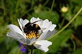
- Nomination Osteospermum flower with a fly. Ram-Man 21:49, 31 August 2008 (UTC)
- Promotion Subject in focus, nice coulours --Stephanemartin 17:15, 5 September 2008 (UTC)
-
- Nomination The Rings, by Buren, in Nantes, France --Stephanemartin 10:01, 31 August 2008 (UTC)
- Withdrawn Comment In France they have some strange copyright laws which affects such photographs. There might be some serious legal problems with this image. --LC-de 10:45, 31 August 2008 (UTC):The picture is under the same copyright laws as the Eiffel Tower. I doubt there are any problems with such state works. Just to be sure I asked the city services of Nantes about the derived rights and I'm waiting for the answer. --Stephanemartin 12:44, 31 August 2008 (UTC) Sigh, non response from the city services :-/ Stephanemartin 17:02, 5 September 2008 (UTC)
-

-

-

-

-

-
-

-
- Nomination Diuris corymbosa -- Common Donkey Orchid Gnangarra 05:38, 3 September 2008 (UTC)
- Withdrawn Comment Spider web and fly are distracting, sharpness is a bit poor to me. --Eusebius 12:50, 3 September 2008 (UTC)
withdrawn nominated image of same species different plant Gnangarra 12:19, 4 September 2008 (UTC)
-
- Nomination Blossom of Haemanthus albiflos --Berthold Werner 19:16, 2 September 2008 (UTC)
- Promotion possibly FP oe Gnangarra 12:28, 4 September 2008 (UTC)
-
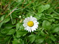
- Nomination Bellis perennis, the common daisy. Arria Belli 18:55, 1 September 2008 (UTC)
- Decline all but composition which is very central, too much wasted background Gnangarra 12:31, 4 September 2008 (UTC)
-

- Nomination Danaus plexippus caterpillar on its host plant. Ram-Man 21:49, 31 August 2008 (UTC)
- Promotion Shows both clearly. TimVickers 23:33, 4 September 2008 (UTC)
-
-

- Nomination: Litte area near the Spodek in Katowice. --Lestath 19:19, 29 August 2008 (UTC)
- Review needed
-
- Nomination: Cemantary in Chorzów. --Lestath 19:19, 29 August 2008 (UTC)
- Review needed
-

- Nomination Willow Emerald Damslfly (Chalcolestes viridis) --LC-de 07:10, 28 August 2008 (UTC)
- Promotion Superb, could only be improved by an increased DOF, but that would put it into FPC territory. TimVickers 21:53, 4 September 2008 (UTC)
-

-

-

- Nomination Police forces at the end of a demonstration in Paris --Romanceor 12:34, 3 September 2008 (UTC)
- Promotion Great framing, the picture tells the story. TimVickers 16:38, 3 September 2008 (UTC)
-
-

- Nomination: Singer Bobby Ellsworth of the band Overkill --Cecil 02:12, 29 August 2008 (UTC)
- Review needed
-
- Nomination: Bassist D.D. Verni and guitarrist Dave Linsk of the band Overkill --Cecil 02:12, 29 August 2008 (UTC)
- Review needed
-

- Nomination: Tram ČKD Alstrom T3RP in Olomouc (Olmütz), Moravia, Czech Republic --Pudelek 22:01, 28 August 2008 (UTC)
- Review needed
-

- Nomination: City center of Šternberk (Sternberg), Moravia, Czech Republic --Pudelek 22:01, 28 August 2008 (UTC)
- Review needed
-

- Nomination Male Common Hawker (Aeshna juncea) --LC-de 19:31, 28 August 2008 (UTC)
- Promotion Superb shot, an astounding level of detail on the head of the insect. TimVickers 16:29, 3 September 2008 (UTC)
-

- Nomination: pagoda in Jodoji --Jn1 13:45, 28 August 2008 (UTC)
- Review needed
-

- Nomination: pagoda in Honpoji --Jn1 13:45, 28 August 2008 (UTC)
- Review needed
-

-

-

- Nomination Sonnenblume --Böhringer 19:59, 1 September 2008 (UTC)
- Promotion Excellent. TimVickers 16:26, 2 September 2008 (UTC)
-
- Nomination Skiing area Hochjoch Schruns -- Böhringer 10:39, 1 September 2008 (UTC)
- Promotion Seems OK. --Nevit 12:54, 2 September 2008 (UTC)
-

- Nomination Papilio glaucus on a Milkweed. Ram-Man 21:49, 31 August 2008 (UTC)
- Promotion Question Nice colors but the background is a bit grainy. Why is the butterfly not categorised? And are there two types of flower on the photograph? Estrilda 05:12, 1 September 2008 (UTC)
It is categorized, and the flower is a hybrid. I don't understand these questions. Ram-Man 23:53, 1 September 2008 (UTC)
Looks fine to me. Lycaon 13:31, 2 September 2008 (UTC)
-

-

-

- Nomination Larus michahellis (Yellow-legged Gull) in Cíes Islands, Pontevedra, Galicia, Spain --Drow male 22:22, 1 September 2008 (UTC)
- Decline Tail feather cropped. --Eusebius 07:06, 2 September 2008 (UTC)
-

- Nomination Timber framing in Werne, germany --Mbdortmund 22:01, 1 September 2008 (UTC)
- Decline This one seems to be too noisy --Berthold Werner 06:44, 2 September 2008 (UTC)
-
- Nomination Timber framing in Werne, germany --Mbdortmund 22:01, 1 September 2008 (UTC)
- Promotion Technically ok but missing geocoding --Berthold Werner 06:44, 2 September 2008 (UTC)
-

- Nomination The train station of Gent-Sint-Pieters, Ghent, Belgium -- MJJR 21:05, 1 September 2008 (UTC)
- Promotion Good. --Berthold Werner 06:44, 2 September 2008 (UTC)
-

-

- Nomination Tender returns from shore. --Phil13 14:32, 31 August 2008 (UTC)
- Promotion Nice composition, OK technically. TimVickers 16:06, 1 September 2008 (UTC)
-

- Nomination Heliotrope very short description --IvanTortuga 21:51, 30 August 2008 (UTC)
- Decline If it were a undergrowth plant I could accept darkness, but as a sunfriend species I can't. --B.navez 16:54, 1 September 2008 (UTC)
-

-

-

- Nomination Osteospermum flower. Ram-Man 21:49, 31 August 2008 (UTC)
- Promotion good --Mbdortmund 22:31, 31 August 2008 (UTC)
-

- Nomination Danaus plexippus caterpillar beginning pupation. Ram-Man 21:49, 31 August 2008 (UTC)
- Promotion VERY GOOD --Böhringer 10:26, 1 September 2008 (UTC)
-

- Nomination Epargyreus clarus on a Zinnia. Ram-Man 21:49, 31 August 2008 (UTC)
- Promotion DOF on the limit, still QI. Very nice colours. Lycaon 09:33, 1 September 2008 (UTC)
-

- Nomination Damaged wings of Speyeria cybele. Ram-Man 21:49, 31 August 2008 (UTC)
- Promotion really good --Mbdortmund 06:52, 1 September 2008 (UTC)
-

- Nomination Proboscis of Danaus plexippus. Ram-Man 21:49, 31 August 2008 (UTC)
- Promotion good --Mbdortmund 22:35, 31 August 2008 (UTC)
-

-

- Nomination Fallen leaves from the Sea grape. (unassessed) -- Lycaon 18:49, 31 August 2008 (UTC)
- Promotion Good quality, composition so-so. What camera is this Hans?... -- Alvesgaspar 20:06, 31 August 2008 (UTC)
-

-

- Nomination The Bay bolete (Xerocomus badius). --Wisnia6522 11:09, 31 August 2008 (UTC)
- Decline Details of the background of low quality. Was the mushroom growing really like that in the moss ? --B.navez 16:47, 31 August 2008 (UTC):Yes, really :) --Wisnia6522 18:58, 31 August 2008 (UTC)
-

- Nomination Germany, Bernkastel-Kues, Burgstr. 21 --Berthold Werner 09:00, 31 August 2008 (UTC)
- Promotion good details, Beschnitt etwas knapp --Mbdortmund 12:15, 31 August 2008 (UTC)
-

- Nomination Bernardinų gatve, Vilnius, Lithuania --Sfu 08:53, 31 August 2008 (UTC)
- Decline perspective should be corrected --Mbdortmund 12:16, 31 August 2008 (UTC) -- And the picture is too dark. Why use this particular exposure solution when a large DOF is needed in this kind of picture? -- Alvesgaspar 13:16, 31 August 2008 (UTC)
-

- Nomination Bikers during Harley-Davidson's 105th anniversary parade in Milwaukee. Dori 05:07, 31 August 2008 (UTC)
- Promotion good --Mbdortmund 12:16, 31 August 2008 (UTC)
-
- Nomination Sialis lutaria by MdE (de) --Mbdortmund 23:42, 30 August 2008 (UTC)
- Decline Very pleasant composition and colors, but details are not so fine and background is noisy. As a good picture of Sialis lutaria, try for a Valued image. --B.navez 12:25, 31 August 2008 (UTC)
-

- Nomination A female Flesh-fly (Sarcophaga sp.) -- Alvesgaspar 18:36, 30 August 2008 (UTC)
- Promotion Good separation, good picture. Ram-Man 21:45, 31 August 2008 (UTC)
-

- Nomination Germany, Bernkastel-Kues, Burgstraße --Berthold Werner 13:26, 30 August 2008 (UTC)
- Promotion Pleasant street picture. --B.navez 17:51, 31 August 2008 (UTC)
-

- Nomination Call of the Wild --Specious 05:31, 30 August 2008 (UTC)
- Decline Poor lighting and too much distorted due to close distance. Background is distracting -- Alvesgaspar 20:09, 31 August 2008 (UTC)
-

- Nomination Olympus Superzoom 110 --Berthold Werner 10:37, 29 August 2008 (UTC)
- Promotion Good enough. The stripe could be put behind the camera -- Alvesgaspar 20:11, 31 August 2008 (UTC)
-

-

-

-
-

-
-

-

-

- Nomination Details of a palm of Latania lontaroides --B.navez 19:51, 21 August 2008 (UTC) Comment Thought the picture was for the cockroach ? ;-)). Lycaon 20:23, 21 August 2008 (UTC)
- Promotion Very nice ;-). Lycaon 09:21, 23 August 2008 (UTC)
Editor should not be the promotor. -- carol 08:56, 24 August 2008 (UTC)
Good colors and composition. Estrilda 05:04, 1 September 2008 (UTC)
- Nomination Details of a palm of Latania lontaroides --B.navez 19:51, 21 August 2008 (UTC)
-

- Nomination View to the Torres del Paine by User:Nanosmile --Mbdortmund 23:42, 30 August 2008 (UTC)
- Decline Very nice pic with some noise in the sky. That wouldn't be an obstacle but there is a significant loss of detail in the texture of the foreground due to noise reduction. --LC-de 09:45, 31 August 2008 (UTC)
-
- Nomination Sunset at Porto Covo, west coast of Portugal (new, improved version) -- Alvesgaspar 22:27, 30 August 2008 (UTC)
- Promotion maybe a painting of an old master? --Mbdortmund 23:22, 30 August 2008 (UTC)
-

-
- Nomination old door in Mergozzo, italy --Mbdortmund 12:43, 30 August 2008 (UTC)
- Promotion Very nice. TimVickers 13:54, 30 August 2008 (UTC)
-

-

- Nomination Yellow-blotched palm-pitviper (Bothriechis aurifer) --TimVickers 02:47, 29 August 2008 (UTC)
- Decline I don't like the shallow DOF, but it is personal opinion (only a comment). --Eusebius 11:23, 29 August 2008 (UTC)
Unnatural colours (cyan cast). Lycaon 22:45, 30 August 2008 (UTC)
-
-

- Nomination Emerald tree monitor (Varanus prasinus) --TimVickers 16:33, 28 August 2008 (UTC)
- Decline Unnatural colours (needs balancing) an noisy and specular highlights. Lycaon 22:47, 30 August 2008 (UTC)
-

-

- Nomination Knokke bridge at Houthulst (West Flanders, Belgium). -- MJJR 15:06, 28 August 2008 (UTC)
- Promotion not perfect, but good composition, natural colours --Mbdortmund 16:24, 30 August 2008 (UTC)
-

- Nomination Viola arborescens Catalonia, Spain -- Lycaon 17:08, 27 August 2008 (UTC) Comment I like this one. -- carol 14:08, 13 April 2008 (UTC)
This pic was declined after consensual review earlier this year. You did not uploaded a new version. What do you expect from the second nomination? --LC-de 06:39, 28 August 2008 (UTC) - Decline Unsharp. --Kosiarz-PL 18:55, 28 August 2008 (UTC)
The main flower is. Lycaon 11:11, 31 August 2008 (UTC)
- Nomination Viola arborescens Catalonia, Spain -- Lycaon 17:08, 27 August 2008 (UTC)
-

-
- Nomination Aguiño Ribeira Galiza by Lmbuga Mbdortmund Comment Who is the sculptor ? What dates? What are his rights? --B.navez 20:33, 22 August 2008 (UTC)
- Promotion Good work. (There are no legal problems because the sculpture is permanently located in public place. In spain it is legal to make such photos and publish them without infringing copyrights. Of course it would be nice to quote the sculptor.) --LC-de 10:33, 31 August 2008 (UTC)
- Nomination Aguiño Ribeira Galiza by Lmbuga Mbdortmund
-

- Nomination Sculpture in Ogród Saski, Warsaw, Poland. --Sfu 09:12, 22 August 2008 (UTC)
- Promotion Comment Please name of the sculptor, dates, rights ? --B.navez 20:39, 22 August 2008 (UTC) Info No rights — 18th century --Sfu 07:34, 24 August 2008 (UTC)
Subject is well illuminated and sharp. --LC-de 10:19, 31 August 2008 (UTC)
-

- Nomination Illustration of an airborne wind generator by JamesProvost nom by Gnangarra 12:00, 21 August 2008 (UTC)
- Promotion Looks good, but could you indicate some size/scale? Lycaon 12:13, 21 August 2008 (UTC) Comment I love it too, will support when scale is added. Bastique 23:47, 22 August 2008 (UTC) Comment creator has added size in image description page its 17m x 9m Gnangarra 09:16, 30 August 2008 (UTC)
problems seem to be solved --Mbdortmund 10:56, 31 August 2008 (UTC)
-
- Nomination The Bärensteine in Saxon Switzerland --LC-de 14:40, 29 August 2008 (UTC)
- Promotion nice composition, partially a bit overexposured --Mbdortmund 15:50, 29 August 2008 (UTC)
-

-

- Nomination Sears Tower as seen from below. --Dschwen 01:21, 29 August 2008 (UTC)
- Promotion Technically fine. Perspective gives a great sense of scale. TimVickers 19:56, 29 August 2008 (UTC)
-

- Nomination Saint-Benoît-du-Lac Abbey and a farm. --Phil13 00:35, 29 August 2008 (UTC)
- Decline Great resolution, but an unfortunate choice of viewpoint, as very little of the Abbey or the farm can be seen. TimVickers 20:03, 29 August 2008 (UTC)
-
- Nomination Klausen Pass --Böhringer 14:37, 28 August 2008 (UTC)
- Promotion Nice composition, good depth of field. Meets requirements. TimVickers 19:58, 29 August 2008 (UTC)
-
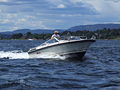
- Nomination Motorboat in Oslofjord --Pudelek 11:41, 26 August 2008 (UTC)
- Promotion Good sharpness and exposure, might improved if the boat was to the right of center, but I think it passes the requirements. TimVickers 17:20, 29 August 2008 (UTC)
-

- Nomination Caiman Lizard (Dracaena guianensis) at St Louis zoo --TimVickers 18:15, 25 August 2008 (UTC)
- Promotion A quality, valuable, useful image.
-

- Nomination Obserwation tower in Tønsberg, Norway --Pudelek 23:28, 24 August 2008 (UTC)
- Promotion Would be better without the people on the left, but it meets the requirements. TimVickers 04:21, 30 August 2008 (UTC)
-
- Nomination Eidsvåg in Bergen, Norway --Aqwis 19:27, 24 August 2008 (UTC)
- Promotion Decent image. Why the downsampling? --Dschwen 14:28, 27 August 2008 (UTC) In addition to what I wrote on the image page, I couldn't use the full height of the pictures due to me not using a tripod, which lead to some of the pictures being "too high up" and some being too "low". So I had to crop the resulting panorama, which lead to the bottom and top being cut off (not that there was a lot of interest there). --Aqwis 12:51, 29 August 2008 (UTC)


.JPG)
_19.08.08_p.jpg)


.jpg)


_20.08.08_p.jpg)


.jpg)


.jpg)
.jpg)


.jpg)


.jpg)


.jpg)


.JPG)


.jpg)


.jpg)


.jpg)

.jpg)
.jpg)
_ed.jpg)
.jpg)
.jpg)
_20.08.08_p.jpg)
Consensual review[edit]
MittagjochHochjochSchwarzsee1[edit]

- Nomination fresh snow of Hochjoch Schruns.--Böhringer 13:36, 27 August 2008 (UTC)
- Promotion
- Support Express promotion, beautiful colors.--B.navez 15:09, 27 August 2008 (UTC)
- Oppose a bit too soft --Ianare 21:16, 27 August 2008 (UTC)
- Support Good composition, focus looks fine to me. TimVickers 21:20, 27 August 2008 (UTC)
- Neutral Noise in a sky, a bit soft. What do you think of that version ? (denoised a little, sharpened) Stephanemartin 22:05, 28 August 2008 (UTC)
- The sharpened version has a bit of a halo along the dark parts of the skyline. TimVickers 22:39, 28 August 2008 (UTC)
- Ooops ! I can't see the halo though. Could tell me how to look for it so I can remove it ? Stephanemartin 09:44, 29 August 2008 (UTC)
- There are two, one the dark rock outline on the left, close to the camera, and a second halo on the far peaks, just above and to the right of the center of the picture. Maybe you could try masking off the sky and resharpening? TimVickers 16:46, 29 August 2008 (UTC)
- done. Stephanemartin 09:37, 31 August 2008 (UTC)
- There are two, one the dark rock outline on the left, close to the camera, and a second halo on the far peaks, just above and to the right of the center of the picture. Maybe you could try masking off the sky and resharpening? TimVickers 16:46, 29 August 2008 (UTC)
- Ooops ! I can't see the halo though. Could tell me how to look for it so I can remove it ? Stephanemartin 09:44, 29 August 2008 (UTC)
- The sharpened version has a bit of a halo along the dark parts of the skyline. TimVickers 22:39, 28 August 2008 (UTC)
- Support Rather soft indeed, but nice light, composition and atmosphere. -- MJJR 21:08, 29 August 2008 (UTC)
- Oppose Really too soft. Lycaon 18:25, 30 August 2008 (UTC)
File:Asaro Mud Man Kabiufa PNG.jpg[edit]

- Nomination A mudman from Asaro with his unique clay mask. by JialiangGao --Mbdortmund 19:27, 24 August 2008 (UTC)
- Decline
- Oppose Excellent, striking composition. IMHO picture would have potential for FP, if face of the man was in focus. As it is out of focus I tend to decline. --Sfu 13:28, 26 August 2008 (UTC)
- Support I agree with Sfu that it is an excellent composition. However, I just see the man's nose in the front out of focus. The rest of his face appears to be sharp for me. Hence, I plead to accept this image as a QI. --AFBorchert 07:19, 27 August 2008 (UTC)
- Comment Not only nose but forehead, moustache, part of cheeks and I think eyes are out of DOF. What's more there are compresion artifacts. --Sfu 10:56, 27 August 2008 (UTC)
- Oppose Agree with Sfu. Lycaon 13:01, 27 August 2008 (UTC)
- Oppose Sorry, I agree with Sfu. This is an absolutely amazing eye-catcher! But the strong compression made too many artifacts. Upload it again with a better quality and I will nominate it for FP. - Man's face out of focus doesn't matter in this composition. --Ukuthenga (talk) 19:39, 27 August 2008 (UTC)
![]() Neutral great composition, but noisy/artefacts and slightly OOF. With some de-noising would support for FP. Ianare 20:31, 27 August 2008 (UTC)
Neutral great composition, but noisy/artefacts and slightly OOF. With some de-noising would support for FP. Ianare 20:31, 27 August 2008 (UTC)
- Support It is good enough. Barabas 22:20, 28 August 2008 (UTC)
File:Parnassia palustris (plant).jpg[edit]
.jpg)
- Nomination Parnassia palustris at the Simplon Pass, Wallis, Switzerland. — Lycaon 22:46, 21 August 2008 (UTC)
- Decline
- Support good detail, nice composition --Foroa 17:13, 22 August 2008 (UTC)<
- Oppose Over-exposed. -- carol 08:54, 24 August 2008 (UTC)
- Comment The brightest parts are two (2) pixels with an RGB(254,255,255) in a picture of 12,166,656 pixels!! And that on sunlit bright white flower. Those two pixels, BTW are on the shiny, nectariferous staminodia. Then where is the over-exposure? Lycaon 12:45, 25 August 2008 (UTC)
- Question Would the suggestion that it might be time to hand that new camera over to your wife (the assumption being better eyesight) be crossing the line? -- carol (talk) 16:22, 25 August 2008 (UTC)
- Might I suggest you use your husband's new flatscreen then ;-)? Lycaon 18:22, 25 August 2008 (UTC)
- Had I stated here that I needed to ask my spouse permission to purchase anything new, I feel it would be a completely legitimate suggestion. Since this flatscreen I have is one of the few new things I have owned (the new Pentax SLR body and 55mm lens in 1986 was stolen) I have two thoughts -- 1)this image is over exposed and 2)I do not want your old camera via a secondhand purchase. If that was your canon AE-1 I got, it was great -- thanks. -- carol (talk) 05:15, 26 August 2008 (UTC)
- CommentYou have a very strange perception of how a photograph should be exposed. It's definitely not overexposed if there were only some blowned out parts. It's the harsh lighting I'm not happy with. --LC-de 07:44, 28 August 2008 (UTC)
- Oppose I understand conditions were not ideal for this type of flower, but tips of left-side petals are overexposed. Perhaps try again on a cloudy day, or with sun at zenith ? Ianare 20:50, 27 August 2008 (UTC)
- Sure it is only just under a 1,000 km, and they flower just a couple of weeks each year. Maybe in 2031 again? Kidding apart, I can't redo them, with any weather and they are not overexposed. How can a bright pure white flower be overexposed/blown when all structure is preserved and the RGB values are < 255,255,255. ??? Lycaon 18:23, 30 August 2008 (UTC)
File:NuagesNuages.JPG[edit]

- Nomination Just clouds --B.navez 19:39, 26 August 2008 (UTC)
- Decline
- OpposeLooks under-exposed to me, parts of these clouds should be white. Looking at the histogram, all the tones are clustered in the centre. TimVickers 04:28, 29 August 2008 (UTC)
- Can't let say so. As you can see on this other picture of the same series the picture was taken not from a plane but from a mountain in afternoon on the eastern slopes, opposite of the sun position. That means mass of the island makes some shadow and surface of the clouds is not overexposed, giving these visible nuances. For a monotone and mainly white picture, clustered tones is logical and valuable. Exploded histogram is not a QI requirement. --B.navez 16:05, 29 August 2008 (UTC)
File:MilkMaid.JPG[edit]

- Nomination Girl milking cow by hand. Jonathunder 14:58, 20 August 2008 (UTC)
- Decline
- OpposeFraming should be larger, I mean for the cow. --B.navez 15:48, 26 August 2008 (UTC)
- Support The composition is fine. Crapload 03:21, 29 August 2008 (UTC)
- Oppose poor light. Lycaon 18:30, 30 August 2008 (UTC)
- Oppose don't like the composition --Mbdortmund 06:58, 1 September 2008 (UTC)
File:Dortmund-City- 1661.JPG[edit]

- Nomination Dortmund, germany, opera, auditorium --Mbdortmund 15:13, 19 August 2008 (UTC)
- Decline
- Question There are blue tarpaulin and some stuff on the bottom left, these are on your purpose? _ Fukutaro 16:41, 25 August 2008 (UTC)
- there seem to be problems around the basis of the roof ( support(ing) strut? anchor?) and I think I should show that; excuse my terrible English --Mbdortmund 23:31, 25 August 2008 (UTC)
- Oppose Parts of the picture (building in the right and trees) completely dark and some CA. --B.navez 03:46, 28 August 2008 (UTC)
- Support I think it is fine. Crapload 03:19, 29 August 2008 (UTC)
- Oppose Unfortunate lighting. Lycaon 11:21, 31 August 2008 (UTC)
File:Escancer 01-07-cropped.jpg[edit]

- Nomination Anguis fragilis, O Grove, Provincia de Pontevedra, Galiza --Lmbuga 18:08, 26 August 2008 (UTC)
- Decline
- Oppose harrassment of wildlife. Ianare 21:02, 27 August 2008 (UTC)
- No! delicate attention to remove an animal from dangerous areas when gardening or making works. --B.navez 09:02, 28 August 2008 (UTC)
- Oppose Although it is impossible to know from the image why the slow-worm is being moved, most of the picture is still of a hand. I suppose I could support this if it were titled "Correct way to pick up a slow-worm", but the animal itself is not the focus of the picture. TimVickers 16:41, 28 August 2008 (UTC)
- Support Fine with me. Barabas (talk) 22:19, 28 August 2008 (UTC)
- Oppose Mostly hand, and I'm not sure this is the 'correct' way as the tail is already broken of!!. Lycaon 11:25, 31 August 2008 (UTC)
File:2008-08-24 Carpet array.jpg[edit]

- Nomination Carpets --Specious 02:51, 26 August 2008 (UTC)
- Decline
- QuestionWhat is the value for Wiki Projects of this picture? --Berthold Werner 15:29, 26 August 2008 (UTC)
- What does that question have to do with QI requirements? -- carol 15:17, 27 August 2008 (UTC)
Take a look at the the guidelines under "Value". --Berthold Werner 15:22, 27 August 2008 (UTC)
- meta:Help:Table#Square_monitors -- carol 19:07, 27 August 2008 (UTC)
- -)) --Berthold Werner 08:03, 28 August 2008 (UTC)
- What does that question have to do with QI requirements? -- carol 15:17, 27 August 2008 (UTC)
- Oppose The two farest carpets are slightly out of DOF. --Sfu 18:19, 28 August 2008 (UTC)
Impulse Turbine[edit]

- Nomination Impulse Turbine --Wuzur 11:48, 23 August 2008 (UTC)
- Decline
- Oppose Nice light and better than the official image, but I'm missing the view from the side to understand the maschine . Kolossos 16:17, 25 August 2008 (UTC)
- Support cropping could be a little less tight, but meets all QI requirements.
- Support this is nominated as a Quality Image, not as a Valued Imaged Set. (but should addionally be nominated as Valued Image) --Berthold Werner 15:54, 28 August 2008 (UTC)
- Oppose I don't like the light and the cropping. Lycaon 09:47, 30 August 2008 (UTC)
- Oppose doesn't show anything about the mechanism and sad background --B.navez 10:19, 31 August 2008 (UTC)
- Support detail --Beyond silence 15:42, 2 September 2008 (UTC)
- Oppose As Lycaon. --Kosiarz-PL 16:08, 2 September 2008 (UTC)
File:Revueflex ac 1 BW 1.JPG[edit]

- Nomination Chinon CE-3 memotron labeled as Revueflex AC 1 --Berthold Werner 14:15, 25 August 2008 (UTC)
- Promotion
- Support Informative, excellent resolution, sharp, and the composition gives good view of camera. --TimVickers 19:49, 25 August 2008 (UTC)
- Oppose It is technically, compositionally, etc very fine, but please clean the dust of the poor camera before shooting it for the world to see ;-). Lycaon 21:36, 25 August 2008 (UTC)
- That are the tracks of a long and busy life ;-) --Berthold Werner 10:37, 26 August 2008 (UTC)
- Scratches and bumps are acceptable (necessary) as proof of age/use, but dust/dirt? On a studio pic? Lycaon 12:33, 26 August 2008 (UTC)
- I passed this since it meets these criteria for a Quality image, which are based on technical standards and composition. I haven't done many of these reviews, so I don't know if it normal to oppose on the basis of what is the subject the image, even if this is a faithful representation of the object itself? TimVickers 16:26, 26 August 2008 (UTC)
- Scratches and bumps are acceptable (necessary) as proof of age/use, but dust/dirt? On a studio pic? Lycaon 12:33, 26 August 2008 (UTC)
- That are the tracks of a long and busy life ;-) --Berthold Werner 10:37, 26 August 2008 (UTC)
- Support Meets all QI requirements. Barabas 00:02, 27 August 2008 (UTC)
- Support no doubt a QI, dust notwithstanding. Ianare 20:35, 27 August 2008 (UTC)
- Support lost the fight against dust, too --Mbdortmund 16:26, 30 August 2008 (UTC)
- Support -- Phil13 16:43, 31 August 2008 (UTC)
- Oppose per Lycaon. Technique and old fashioned are fine but dust is just dirty for me :( _Fukutaro 15:04, 1 September 2008 (UTC)
File:Tower in Tønsberg1.JPG[edit]

- Nomination Obserwation tower in Tønsberg, Norway --Pudelek 23:28, 24 August 2008 (UTC)
- Promotion Nice, but slightly underexposed. Barabas 23:34, 25 August 2008 (UTC) Info I corrected lighting --Pudelek 08:20, 26 August 2008 (UTC)
- Support the edit. Barabas 23:57, 26 August 2008 (UTC)
- Support could be a little sharper but meets requirements Ianare 20:37, 27 August 2008 (UTC)
File:Pano_Schutterwald1_TK.jpg[edit]

![]()
- Nomination Panoramic view on the village Schutterwald, behind the mountains of Schwarzwald --Ukuthenga 20:01, 23 August 2008 (UTC)
- Promotion
- Support good stitching, good details --Mbdortmund 01:13, 24 August 2008 (UTC)
- Oppose Dust spot. -- carol 09:11, 24 August 2008 (UTC)
- Comment Can you tell me where you see this spot? Is it enough reason not to nominate this picture as a quality image? -- Ukuthenga 20:52, 24 August 2008 (UTC)
- While looking for the dust spot, I saw a seam which was not that smooth (I could see a soft line while moving the panorama horizonally) and I saw a seam error which really should be repaired. Dust spot in the green box, soft seam line in yellow box, seam error in the red box. The seam error should be repaired, the dust spot should be also, in my opinion (I am not the only person who can see those, btw) and the blend error is not that big of a deal to me but consideration could be given to repairing it. That is the answer to your first question from what my eyes can see in this image; there are often others who participate here who can find more blending problems and stitching errors. Your second question, it can be voted in to the QI collection without my support. I cannot guarrantee that there are no images in that collection with dust spots. You (or someone else) took a lot of time to make a beautiful seamed image and a little more time with it will take it that much more closely to perfection. So, the answer to your second question is that it is up to you. -- carol (talk) 09:04, 25 August 2008 (UTC)
- Support good stitching, good details, good colours. Lycaon 22:48, 24 August 2008 (UTC)
- Support as the panorama composition is well done, and many interesting details are to be seen. I fail to see any dust spots even at full resolution. --AFBorchert 14:48, 26 August 2008 (UTC)
- Support very impressive, though I don't see really on what kind of page it could be used. --B.navez 18:59, 26 August 2008 (UTC)
- Thanks for those support votes - so my work is not for the birds (für die Katz in my language). Thanks to Carol for the hint to go through the images with a fine-tooth comb. - I used this image for the Wikipedia site of Schutterwald and it's in the category 'Ortenau' to illustrate this countryside I'm living in. - Ukuthenga 19:06, 27 August 2008 (UTC)
- ok, Großes Bild template makes it easy. --B.navez 02:47, 28 August 2008 (UTC)
File:Jotunheimen - view from Galdhøpiggen1.JPG[edit]

- Nomination Jotunheimen mountains - view from Galdhøpiggen --Pudelek 09:37, 22 August 2008 (UTC)
- Promotion
- Oppose I think the mountains are a bit out of focus, and there are some chromatic aberrations on the rocks in the foreground (though I'm not sure how this can be avoided). --Eusebius 11:03, 24 August 2008 (UTC)
- Support I think the mountains appear softer because of haze, not because of focus. CA are not too bad. Crapload 04:56, 25 August 2008 (UTC)
- Support, to me it looks like the haze in front of mountains is a part of the view, not a technical flaw. TimVickers 21:43, 26 August 2008 (UTC)
- Sorry, no anonymous votes. Lycaon 21:48, 26 August 2008 (UTC) Comment TimVickers is anonymous?? --Pudelek 23:45, 26 August 2008 (UTC)
- Please search the edit history for 21:43. It is a forged signature unless the anon who added it is TimVickers. Walter Siegmund (talk) 00:43, 27 August 2008 (UTC)
- Yes, now I see --Pudelek 15:28, 27 August 2008 (UTC)
- Actually, it was me struggling with my computer logging me out randomly when I swapped between projects. Sorry for any confusion. TimVickers 16:58, 27 August 2008 (UTC)
- Yes, now I see --Pudelek 15:28, 27 August 2008 (UTC)
- Please search the edit history for 21:43. It is a forged signature unless the anon who added it is TimVickers. Walter Siegmund (talk) 00:43, 27 August 2008 (UTC)
File:Ponte_estaiada_Octavio_Frias_-_Sao_Paulo.jpg[edit]

- Nomination Long exposure shot of the new landmark of São Paulo - Brazil --Marcosleal 14:39, 21 August 2008 (UTC)
- Promotion
- Support good quality & composition --Ianare 01:02, 22 August 2008 (UTC)
- Oppose Lines in the light part of the sky. -- carol 09:00, 24 August 2008 (UTC) Conditional opposition -- carol (talk) 11:31, 25 August 2008 (UTC)
- Support Crapload 04:57, 25 August 2008 (UTC)
- Support Nice composition, visually striking and technically excellent. TimVickers 18:22, 27 August 2008 (UTC)
- Oppose Blurry. Lycaon 23:29, 1 September 2008 (UTC)
File:Panorama von Roeti 1.jpg[edit]


- Nomination The Jura taken from the Röti (near Weissenstein) --IqRS 22:12, 20 August 2008 (UTC)
- Promotion Support maybe too much sky, but very nice -Pudelek 08:04, 22 August 2008 (UTC)
- Oppose Too much sky and intermittent dust spots in that too much sky. -- carol 09:03, 24 August 2008 (UTC)
- Support as I do not agree that there is too much sky. And I was able to locale one very minor dust spot only. Otherwise it is a fine panorama shot. --AFBorchert 14:04, 24 August 2008 (UTC)
- Comment I outlined where the dust spots are and a green box around a really weird few white spots in the sky which I do not think are atmospheric phenomena. I would crop it right above the spots, btw. The recommendation of thirds is a good one. Additionally, this image had the sweet smell of gimp-1.2 touch to it, an odor which might have been artificially applied, but even when artifically recreated it is still a beautiful smell.... -- carol (talk) 09:26, 25 August 2008 (UTC)
File:Deadtree-mj.jpg[edit]

- Nomination: Dead tree by Misterjack --Mbdortmund 23:07, 19 August 2008 (UTC)
- Review Shot with a good photographic eye. Noise level is on the limit. --Ikiwaner 10:43, 23 August 2008 (UTC)
- Oppose For me noise (especially on the upper part of the image) is over the limit. Also some haloes and not too fortunate crop. Lycaon 18:18, 23 August 2008 (UTC)
- Support It is fine. Crapload 16:17, 25 August 2008 (UTC)
File:Dresden-Venus-Amor.jpg[edit]

- Nomination: Amor and Venus. --Kolossos 19:21, 11 August 2008 (UTC)
- Review
- Support Good composition and sharp, ok or QI. Btw. quite funny bookeh. Did you use catadioptric lenses? --LC-de 21:41, 19 August 2008 (UTC)
- Oppose Chromatic aberration, especially around the shoulders and head. Adamantios 08:44, 22 August 2008 (UTC)
- Support IMHO a CA of approximately one pixel width can be accepted at this resolution. --Berthold Werner 10:57, 25 August 2008 (UTC)
- Oppose CA makes really a noticeable blue line. I've tried this edit
 if you prefer. --B.navez 19:12, 25 August 2008 (UTC)
- it seems on my screen the green line over the shoulders turned to a red one and the picture lost sharpness --Berthold Werner 07:44, 27 August 2008 (UTC)
- Support I do not consider that thin line to be a big problem. Barabas 22:47, 25 August 2008 (UTC)
- Support - enough for QI --Pudelek 08:51, 28 August 2008 (UTC)
- Oppose Too much CA. Lycaon 09:42, 30 August 2008 (UTC)
- Oppose sorry, good composition and atmosphere, but small and different problems with the colours --Mbdortmund 16:29, 30 August 2008 (UTC)
- Oppose I'm sorry I can't overlook C/A problem. _Fukutaro 15:04, 1 September 2008 (UTC)
- Support --Beyond silence 15:30, 2 September 2008 (UTC)
File:Grandilla BW 3.JPG[edit]

- Nomination Tenerife, Grandilla de Abona --Berthold Werner 14:34, 3 September 2008 (UTC)
- Decline }
- Opposeroad in too much shade, Gnangarra 12:22, 4 September 2008 (UTC)}
- Support Does it really make the picture bad? Expositions is good. I like the colors. --Sfu 18:09, 4 September 2008 (UTC)
- Oppose I also think there is too much shade. --Eusebius 13:03, 5 September 2008 (UTC)
- Oppose Lens distortion on the edges if I don't err Stephanemartin 17:05, 5 September 2008 (UTC)
File:Livingston County Courthouse.jpg[edit]

- Nomination The Livingston County, New York courthouse in Geneseo. --Bdesham 03:40, 4 September 2008 (UTC)
- Promotion
- Comment Slightly tilted (can be corrected, of course). --Eusebius 11:21, 4 September 2008 (UTC)
- Comment titled or sloping ground, verticals look fine to me Gnangarra 12:17, 4 September 2008 (UTC)
- I agree, I have exagerated. There might be a tilt, but almost unnoticeable, and I'm not even sure about it. --Eusebius 12:39, 4 September 2008 (UTC)
- Yes, the building is on a slight hill. The original was tilted, but I think I've corrected it… let me know if you still think it's off. --Bdesham 17:49, 4 September 2008 (UTC)
- Support Looks ok to me. --Eusebius 12:39, 4 September 2008 (UTC)
File:Beetle on soda.jpg[edit]

- Nomination Beetle on a soda can. Nominated by Ram-Man 01:30, 1 September 2008 (UTC)
- Decline
- Comment A little bit weird, but good image quality. Please try to identify the beetle! -- MJJR 21:13, 1 September 2008 (UTC)
- Oppose Sorry, you know the drill: no id → no qi. Lycaon 22:19, 1 September 2008 (UTC)
File:Butterfly August 2008-4.jpg[edit]

- Nomination A Painted Lady butterfly collecting nectar from a Lantana camara flower - Alvesgaspar 23:31, 26 August 2008 (UTC)
- Decline
- Oppose Very shallow DoF. Not much of the butterfly is in focus, even the key parts. Ram-Man 23:58, 1 September 2008 (UTC)
- comment unsigned. --Mbdortmund 06:56, 1 September 2008 (UTC)
File:Negoroji03s3200.jpg[edit]

- Nomination pagoda in Negoroji --Jn1 13:45, 28 August 2008 (UTC)
- Promotion
- Support Good lighting, nice composition. Could be cropped a bit at top and bottom, but passes requirements. TimVickers 19:18, 28 August 2008 (UTC)
- Oppose Obvious noise reduction artefacts in the (too much) grass in front. Lycaon 22:49, 30 August 2008 (UTC)
- Support There is no flaw here other than the time of day. Ram-Man 22:00, 31 August 2008 (UTC)
File:Lestes sponsa LC0172.jpg[edit]

- Nomination Emerald Damselfly (Lestes sponsa) --LC-de 21:34, 28 August 2008 (UTC)
- Promotion
- SupportJust QI? Are you sure? Looks like a FPC to me. TimVickers 21:41, 28 August 2008 (UTC)
- Oh, thank you. Just nominate it as FPC if you think so. You have my vote ;-) --LC-de 21:52, 28 August 2008 (UTC)
- Oppose. DOF. Crapload 03:45, 29 August 2008 (UTC)
- Support Very good. --Kosiarz-PL 09:59, 30 August 2008 (UTC)
- Support --Mbdortmund 12:06, 30 August 2008 (UTC)
- Support --Aqwis 22:53, 31 August 2008 (UTC)
File:Native American PowWow 9488.jpg[edit]

- Nomination Native American during Indian Summer PowWow. Dori 16:21, 7 September 2008 (UTC)
- Withdrawn good --Mbdortmund 21:13, 7 September 2008 (UTC)
* Oppose Unfortunate crop and light. Should be crisper too. Lycaon 06:13, 8 September 2008 (UTC) - Oppose Tight crop and a little overexposed. --Kosiarz-PL 18:21, 8 September 2008 (UTC)
- I withdraw my nomination I disagree on the crop, but I think the light isn't all that great. Dori 23:28, 9 September 2008 (UTC)
Lausanne Panorama[edit]

- Nomination University and cathedral of Lausanne, Switzerland --Chmehl 11:11, 7 September 2008 (UTC)
- Promotion
- Oppose Bad QualityMrmariokartguy 14:33, 7 September 2008 (UTC)
- I don't know what you mean. Could you be more specific? Chmehl 14:59, 7 September 2008 (UTC)
- Support There's nothing wrong with the quality. --Massimo Catarinella 15:12, 7 September 2008 (UTC)
- Support, great quality. --Aqwis 18:52, 7 September 2008 (UTC)
- Support detail --Beyond silence 19:44, 7 September 2008 (UTC)
- Support good details --Mbdortmund 21:22, 7 September 2008 (UTC)
- Support Good quality in every aspect: excellent detail and sharpness, perfect lighting, and good composition. Thegreenj 22:58, 7 September 2008 (UTC)
- SupportNicely done indeed. No noticeable stitching errors (not easy given the large parallax) and good detail. Lycaon 23:35, 7 September 2008 (UTC)
- Support --Lestath 22:27, 9 September 2008 (UTC)
File:Préparation de grenouille.jpg[edit]

- Nomination Frog preparation --Romanceor 13:10, 3 September 2008 (UTC)
- Decline
- Oppose Even with the description "frog preparation" I can't work out what the subject of the image actually is. TimVickers 18:09, 4 September 2008 (UTC)
- Lucky you ;-(. Lycaon 06:13, 6 September 2008 (UTC)
- Ha! Probably very true. I'll hold on to the idea that it is some kind of root vegetable! :) TimVickers 15:01, 6 September 2008 (UTC)
- Lucky you ;-(. Lycaon 06:13, 6 September 2008 (UTC)
- Support I actually like it. Wouldn't try eating this though! Adamantios 18:39, 4 September 2008 (UTC)
- Support I like it. --Kosiarz-PL 05:53, 6 September 2008 (UTC)
- Oppose Too noisy. Lycaon 06:13, 6 September 2008 (UTC)
- Oppose It is not clear to me what to look at exactly in the picture. Besides, I like them fried, but I don't want to know about the whole process! :-P --Eusebius 09:11, 6 September 2008 (UTC)
File:Feeding frenzy catfish.JPG[edit]

- Nomination Domesticated fish feeding. Nominated by Ram-Man 01:30, 1 September 2008 (UTC)
- Decline
- Support good shot --Mbdortmund 06:51, 1 September 2008 (UTC)
- Oppose Good, but should have some sort of id. Lycaon 09:29, 1 September 2008 (UTC)
- Question Isn't the picture a bit too noisy? Phil13 (talk) 14:51, 1 September 2008 (UTC)
- By the experience of my previous rejections, I'd say yes, but it is rather localized here... --Eusebius 14:58, 1 September 2008 (UTC)
- Oppose too noisy. --Ianare 04:57, 4 September 2008 (UTC)
- Oppose Quality is lacking (sharpness, noise), but this shot should be replicated. Great composition. Dori 17:35, 7 September 2008 (UTC)
File:Livorno, Panorama dalla Fortezza Vecchia.jpg[edit]
![]()
- Nomination Panorama view of Livorno, Italy. --Lucarelli 18:21, 19 August 2008 (UTC)
- Promotion
- Support A well done panorama composition, good lighting (apparently due to the evening sun). Please add a {{Location}} template and please tell more about the picture, i.e. date/time and the number of shots this panorama is based upon. --AFBorchert 17:06, 26 August 2008 (UTC) I have added information and camera location.--Lucarelli 22:14, 26 August 2008 (UTC) Thanks :) --AFBorchert 22:39, 26 August 2008 (UTC)
- Oppose. Washed out highlights. Crapload 03:19, 29 August 2008 (UTC)
- Support Some smaller parts are a tad overexposed indeed, but IMO the overall quality is acceptable for QI. As AFBorchert already pointed out, it's a nice panorama. -- MJJR 20:47, 29 August 2008 (UTC)
- weak Oppose There is a small CCW tilt on the horizon. Lycaon 11:19, 31 August 2008 (UTC)
- Oppose too narrow, can't see. Mrmariokartguy 04:23, 6 September 2008 (UTC)
- Support Very nice panorama. Despite a couple minor cons as noted, I think it meets the requirements. Huwmanbeing ☀★ 22:37, 6 September 2008 (UTC)
- Support Can't see the tilt. Was it corrected ? Stephanemartin 23:42, 7 September 2008 (UTC)
File:Telephone pole silhouette.jpeg[edit]

- Nomination Telephone pole silhouetted against the sky. Collard 02:47, 25 August 2008 (UTC)
- Decline
- OpposeI like the composition, but I think it's too noisy. --Sfu 06:50, 26 August 2008 (UTC)
- Support not perfect but IMHO good atmo --Mbdortmund 07:02, 1 September 2008 (UTC)
- Oppose Underexposed, I understand it's a silhouette, but I don't see the value of that in this image. Sorry. Dori 17:28, 7 September 2008 (UTC)
File:2008-07-11 Air conditioners at UNC-CH.jpg[edit]

- Nomination Air conditioners --Specious 02:15, 24 August 2008 (UTC)
- Decline
- Support Quality is alright, composition isn't bad either. --Dschwen 14:25, 27 August 2008 (UTC)
- Oppose I think it lacks a bit of DOF, no? --Eusebius 09:28, 28 August 2008 (UTC)
- Support Crapload 03:06, 29 August 2008 (UTC)
- Oppose It doesn't look completely straight to me. Estrilda 05:15, 1 September 2008 (UTC)
- Question How does it need to be corrected? --Specious 13:54, 1 September 2008 (UTC)
- OpposeDoesn't look so great after all. Mrmariokartguy 14:31, 7 September 2008 (UTC)
- Oppose The light is lacking, for this kind of subject I don't see mitigating circumstances. Dori 17:27, 7 September 2008 (UTC)
Freezing rain[edit]

- Nomination Freezing rain on vine (Chocolate Vine, Akebia quinata) leaves.--TimVickers 22:38, 7 September 2008 (UTC)
- Promotion
- Oppose Some leaves blurred Mrmariokartguy 23:37, 7 September 2008 (UTC)
- Yes, macro shots have a shallow DOF. This is what you expect. TimVickers 04:00, 8 September 2008 (UTC)
- weak Support
Some chromatic noise.And needs to be slightly sharpened. But a very interesting picture -- Stephanemartin 23:45, 7 September 2008 (UTC)
- As a note, I did apply a conservative unsharp mask, but didn't push it since I could see some artifacts appearing. TimVickers 22:42, 10 September 2008 (UTC)
- Support interesting --Mbdortmund 11:48, 8 September 2008 (UTC)
- Good point. Thank you. TimVickers 16:27, 8 September 2008 (UTC)
- Neutral Slight CA prevents me from supporting, but major opposition reason has been resolved. Lycaon 20:11, 8 September 2008 (UTC)
- Support Good shot Huwmanbeing 15:42, 10 September 2008 (UTC)
File:Church near Monastiraki.jpg[edit]

- Nomination: Church near Monastiraki station in Athens. --Eusebius 08:34, 25 August 2008 (UTC)
- Review
- QuestionDo you like this version better (denoised a little bit, beware your browser cache)? --Eusebius 11:28, 28 August 2008 (UTC)
- What happend around the window? Much of detail is lost due to downsampling. --Sfu 13:48, 28 August 2008 (UTC)
- Oh gosh, I didn't see that. Something went wrong, clearly. I'll upload another version in a few hours (I'm not on my usual computer with my usual software). Regarding downsampling, I did it to limit the visual effect of noise while staying above the 2MP limit. Maybe I'm just playing with a bias of the QI evaluation criteria and would be happy to discuss that point somewhere else... The honest question would be: is it possible to make a version this picture meet the QI standards, and if not, what is the best way to improve it anyway? --Eusebius 15:05, 28 August 2008 (UTC)
- Uploaded new version (still denoised and downsampled but without the window glitches). --Eusebius 17:21, 28 August 2008 (UTC)
- Support I think it's good enough now. Although I don't like downsampling. --Sfu 18:18, 28 August 2008 (UTC)
- I understand. I could upload the denoised but not downsampled version, but then imperfection would be visible and there would be (justified) oppositions. This is why I said there could be a bias in the evaluation process. --Eusebius 19:01, 28 August 2008 (UTC)
- Comment As it is now, it's a nice picture. But you have some big artifacts in the sky (next to the dome at the right) and a small white triangle in the upper left corner. The triangle can easily be removed with Photoshop. The artifacts perhaps also. -- MJJR 21:01, 29 August 2008 (UTC)
- Thanks. Should be better now. --Eusebius 21:39, 29 August 2008 (UTC)
- I understand. I could upload the denoised but not downsampled version, but then imperfection would be visible and there would be (justified) oppositions. This is why I said there could be a bias in the evaluation process. --Eusebius 19:01, 28 August 2008 (UTC)
- Uploaded new version (still denoised and downsampled but without the window glitches). --Eusebius 17:21, 28 August 2008 (UTC)
- Oh gosh, I didn't see that. Something went wrong, clearly. I'll upload another version in a few hours (I'm not on my usual computer with my usual software). Regarding downsampling, I did it to limit the visual effect of noise while staying above the 2MP limit. Maybe I'm just playing with a bias of the QI evaluation criteria and would be happy to discuss that point somewhere else... The honest question would be: is it possible to make a version this picture meet the QI standards, and if not, what is the best way to improve it anyway? --Eusebius 15:05, 28 August 2008 (UTC)
- What happend around the window? Much of detail is lost due to downsampling. --Sfu 13:48, 28 August 2008 (UTC)
- Oppose Noise reduction has blurred fine details( e.g. grass). Lycaon 11:29, 31 August 2008 (UTC)
- Support I don't think the grass is important here. Dori 17:30, 7 September 2008 (UTC)
- Grass is not, but it is an indication of the quality of the image as a whole. Lycaon 23:18, 7 September 2008 (UTC)
- Oppose No details --Massimo Catarinella 16:29, 8 September 2008 (UTC)
File:ETalk2008-Diddy1.jpg[edit]

- Nomination Rapper Diddy performing in Toronto. --Zanimum 17:31, 9 September 2008 (UTC)
- Decline
As this is an artist's performing, he could have rights on any part of the artistic production, including the picture of it.--B.navez 01:45, 10 September 2008 (UTC)
- I doubt this would be the case, B.navez. This photo was taken at a Toronto International Film Festival party held by CTVglobemedia. I requested to send a photographer on behalf of Wikinews, and they managed to squeeze us into the crowded photographer's pit. Thus they explicitly wanted us there, and explicitly wanted to take photos. They would have mentioned, had there been any restrictions on photography. Note that this performance was on a red carpet, surrounded by fans on all sides, so it's unlikely that the exact choreography was the same as he would perform in actual concerts. -- Zanimum 14:53, 11 September 2008 (UTC)
- I just said it could. Your explainations seem clear about the free use of the picture. Unhappily the size (much less under 2M px) of it doesn't meet the QI requirements. Sorry cause I wanted to support it and I had not looked at this size's issue first. --B.navez 15:41, 11 September 2008 (UTC)
- Oppose --Lestath 22:51, 11 September 2008 (UTC)
File:Albuquerque_pano.jpg[edit]

- Nomination Albuquerque pano. --Dschwen 19:27, 9 September 2008 (UTC)
- Promotion
- Support WOW --Lestath 22:36, 9 September 2008 (UTC)
- Comment The picture appears too be a little blurry and the details are washed out. --Massimo Catarinella 17:14, 10 September 2008 (UTC)
- Given that the picture has 18.8 Megapixels the blur is negigable! You are welcome to downsample to 2MP for review, else the opposition is just unfair. --Dschwen 17:17, 10 September 2008 (UTC)
- First of all, I'm not opposing your picture. Second, your panorama of the Chicago skyline is of a similar size, but still more detailed. I just wanted to discuss this difference. --Massimo Catarinella 17:43, 10 September 2008 (UTC)
- hm, ok, the chicago pano is actually
12six times bigger and I used a different lens. I have a couple of ABQ panos still waiting to get stitched. Nonetheless, a change from promote to discuss always implies and oppose! --Dschwen 19:18, 10 September 2008 (UTC)
- hm, ok, the chicago pano is actually
- First of all, I'm not opposing your picture. Second, your panorama of the Chicago skyline is of a similar size, but still more detailed. I just wanted to discuss this difference. --Massimo Catarinella 17:43, 10 September 2008 (UTC)
- Given that the picture has 18.8 Megapixels the blur is negigable! You are welcome to downsample to 2MP for review, else the opposition is just unfair. --Dschwen 17:17, 10 September 2008 (UTC)
- Support good enough to QI. Dschwen, Perhaps my imagination, your sky is overcasted step by step, don't you? _Fukutaro 15:54, 11 September 2008 (UTC)
File:Orthrosanthus laxus 01 gnangarra.JPG[edit]

- Nomination Orthrosanthus laxus Morning Iris Gnangarra 12:14, 4 September 2008 (UTC)
- Decline
- Oppose Out of focus --Massimo Catarinella 16:25, 8 September 2008 (UTC)
- the flower isnt out of focus Gnangarra 03:24, 9 September 2008 (UTC)
- Oppose Blurkeh on stamen. -- carol (talk) 01:35, 10 September 2008 (UTC)
- Oppose Surrounding objects are distracting. Mrmariokartguy 02:23, 10 September 2008 (UTC)
File:Panorama_tour_montparnasse.jpg[edit]

- Nomination The Montparnasse Tower in Paris, taken from the Eiffel Tower. -- Stephanemartin 17:43, 6 September 2008 (UTC)
- Promotion
- Support Looks ok to me. Maybe you could identify in the description the noticeable buildings that can be seen on the picture. --Eusebius 17:56, 6 September 2008 (UTC).
- Done -- Stephanemartin 18:17, 6 September 2008 (UTC)
- Oppose It does look good? Mrmariokartguy 16:40, 7 September 2008 (UTC)
- Comment What do you mean ? Please provide some details. -- Stephanemartin 23:39, 7 September 2008 (UTC)
- vote excluded in QICcount, please clarify your comment Gnangarra 12:56, 8 September 2008 (UTC)
- Support good picture --Mbdortmund 11:52, 8 September 2008 (UTC)
File:Sissach Schloss Ebenrain.jpg[edit]


- Nomination Official country house of Basel-Landschaft --Ikiwaner 08:12, 6 September 2008 (UTC)
- Promotion
- OpposeSlightly distorted (see the bottom line of the roof), but I think it is not a big problem. A more noticeable point is the time of the day and the strange shadow pattern: the facade is quite dark but the rightmost house is overexposed. --Eusebius 08:26, 6 September 2008 (UTC)
- So you prefer this version? Personnally I think the shadow pattern in the first version makes it much more interesting. --Ikiwaner 13:54, 6 September 2008 (UTC)
- No, I don't prefer the second one over the first, the colours are less interesting and the overexposure, although less distracting, is simply on the other side of the picture (the main reason for my opposition is the overexposure, not the shadow pattern). --Eusebius 15:14, 6 September 2008 (UTC)
- Regarding distortion: You're wrong on that. The eaves are tilted to make the water flow to the downspouts. See the horizontal lines just below the eaves that are perfectly straight. --Ikiwaner 17:05, 7 September 2008 (UTC)
- So you prefer this version? Personnally I think the shadow pattern in the first version makes it much more interesting. --Ikiwaner 13:54, 6 September 2008 (UTC)
- Support first is better.--Beyond silence 19:56, 7 September 2008 (UTC)
- Neutralbecause I don't have a reason to support or oppose. Mrmariokartguy 00:38, 8 September 2008 (UTC)
- Support no reason ... --Mbdortmund 11:57, 8 September 2008 (UTC)
File:Varanus komodoensis (1) ed.jpg[edit]
_ed.jpg)
- Nomination Komodo dragon (Varanus komodoensis) --TimVickers 02:47, 29 August 2008 (UTC)
- Decline
- Comment Too much (chroma) noise. Lycaon 06:30, 6 September 2008 (UTC)
- Comment Is this noise-reduced version better? TimVickers 15:49, 6 September 2008 (UTC)
- Oppose Chroma has improved a lot, but image is not sharp enough. Lycaon 23:24, 7 September 2008 (UTC)
- For what reason????? :) TimVickers 03:57, 8 September 2008 (UTC)
- struck unexplained reason for oppose Gnangarra 12:49, 8 September 2008 (UTC)
- For what reason????? :) TimVickers 03:57, 8 September 2008 (UTC)
File:GullBrehat.jpg[edit]

- Nomination A seagull (larus argentatus) neer to Bréhat island -- Sanchezn 18:36, 3 September 2008 (UTC)
- Decline
- Support Looks good.Mrmariokartguy 03:43, 6 September 2008 (UTC)
- Comment Has been declined as a QI a few days ago, picture not updated since then (a previous version had been declined three weeks before). --Eusebius 18:48, 3 September 2008 (UTC)
- Oops, I didn't know about the last declination... While the first declination was about identifiction, I tried a "second" time... Sorry -- Sanchezn 19:01, 3 September 2008 (UTC)
- Oops, I didn't know about the last declination... While the first declination was about identifiction, I tried a "second" time... Sorry -- Sanchezn 19:01, 3 September 2008 (UTC)
- Issue of first decline was resolved, however, Oppose cause the picture shows disturbing CA lines and is rather noisy. Lycaon 06:22, 6 September 2008 (UTC)
- Comment I only see CA above the head (yellow). What I don't get is why he used a sharpening tool. The picture is full of sharpening artifacts. Why didn't you used a high pass filter instead? --Massimo Catarinella 13:46, 6 September 2008 (UTC)
- Oppose per above --Massimo Catarinella 15:11, 7 September 2008 (UTC)
- Support Looks good. It s not fpc. --Beyond silence 19:53, 7 September 2008 (UTC)
- weak Oppose Noise (BG), chromatic aberrations (head, top of wings). Nice colours. Stephanemartin 22:57, 10 September 2008 (UTC)
File:OldJewishCemeteryPrague.jpg[edit]

- Nomination A couple of gravestones in Old Jewish Cemetery, Prague --Massimo Catarinella 22:55, 1 September 2008 (UTC)
- Decline
- Comment I don't "understand" the composition, most of the picture is very dark and the only gravestone in focus (not really centered, not really on a "power point") is shown from an odd angle. But it is personal opinion here. --Eusebius 07:01, 2 September 2008 (UTC)
- Comment And it's your right to have that opinion. It's a cemetery, so the shadows gives it a surtain mood. The fact that you look to the gravestone which is in focus through two other gravestones makes it a power point and it claims all attention. The only thing that is in focus in this picture is that one gravestone and I like it like this --Massimo Catarinella 14:12, 2 September 2008 (UTC)
- Oppose I agree with Eusebius here. This is much more suited to a vertical format, with the subject placed more carefully in the frame. Right now, the composition is rather unbalanced and uncomfortable. Thegreenj 00:51, 3 September 2008 (UTC)
- Comment I like the current mood but I also think a crop placing the lit stone near the right image edge would improve the composition. Gnangarra 08:26, 3 September 2008 (UTC)
- I agree, but the way the third, foremost stone juts into the frame cut-off is still very awkward. Thegreenj 20:32, 3 September 2008 (UTC)
- Oppose crop. --Lestath 13:08, 4 September 2008 (UTC)
- Support detail --Beyond silence 19:43, 7 September 2008 (UTC)
- Oppose lighting, crop --Mbdortmund 22:39, 8 September 2008 (UTC)
File:Isopogon dubius gnangarra 03.JPG[edit]

- Nomination Isopogon dubius Gnangarra 12:12, 4 September 2008 (UTC)
- Decline
- Oppose Too soft --Massimo Catarinella 16:25, 8 September 2008 (UTC)
- whats too soft mean? Gnangarra 03:24, 9 September 2008 (UTC)
- It means that the picture doesn't show enough detail. --Massimo Catarinella 17:07, 10 September 2008 (UTC)
- whats too soft mean? Gnangarra 03:24, 9 September 2008 (UTC)
- The one flower that is in the area that is focused is maybe sharp enough to get more supporting votes -- I think that the crop shares the frame with the out of the field flower and brings attention to them both and that different or tighter crop (on what should be the main flower) might improve the image. But I don't know if the image will be large enough then. -- all these ifs and no observable opinion by carol (talk) 01:33, 10 September 2008 (UTC)
- Oppose Surrounding objects are distracting. Mrmariokartguy 02:21, 10 September 2008 (UTC)
- Support detail enough --Beyond silence 19:53, 13 September 2008 (UTC)
}}
File:Diuris corymbosa 83 gnangarra.JPG[edit]

- Nomination Diuris corymbosa -- Donkey orchid with both profiles and face on flowers in the same image Gnangarra 12:07, 4 September 2008 (UTC)
- Decline
- Oppose Too soft --Massimo Catarinella 16:25, 8 September 2008 (UTC)
- whats too soft, the flower when looking at the photo on screen is 2 to 3 times its actual size? Gnangarra 03:24, 9 September 2008 (UTC)
- Oppose The insect images we get here, even those sugar cubes I nominated recently are at least that much larger in the image than they are and they are often/usually extremely sharp and not supported here if they aren't. That is the first time for that argument though, I'll give you that, heh. -- carol (talk) 01:26, 10 September 2008 (UTC)
- Oppose not much sharpness. Color and composition are good, but the focus should be as sharp as possible for QI. _Fukutaro 11:29, 13 September 2008 (UTC)
}}
File:Uluguru Mountain Ranges Panorama.jpg[edit]
![]()
- Nomination Uluguru Mountain Ranges Panorama. --Muhammad Mahdi Karim 15:33, 7 September 2008 (UTC)
- Decline
Too narrow to see.Mrmariokartguy 16:32, 7 September 2008 (UTC)- Comment Open the image at full size then. Muhammad Mahdi Karim 09:12, 8 September 2008 (UTC)
- struck comment as an inappropriate review, please read QI guidelines Gnangarra 13:02, 8 September 2008 (UTC)
- Comment Problem fixed, higher resolution version uploaded Muhammad Mahdi Karim 15:11, 10 September 2008 (UTC)
- Comment 780px -> 820px ? LOL -- Stephanemartin 19:58, 10 September 2008 (UTC)
- There were some technical limitations ;) Muhammad Mahdi Karim 20:28, 10 September 2008 (UTC)
- Support --Beyond silence 19:52, 13 September 2008 (UTC)
- Oppose Unfortunate composition (foreground). Lycaon 21:36, 13 September 2008 (UTC)
- Oppose Doesn't seem to be the focus and trees in the way. Mrmariokartguy 23:42, 13 September 2008 (UTC)
Osteospermum ecklonis flower (Réunion).jpg[edit]
.jpg)
- Nomination Osteospermum ecklonis flower --B.navez 12:49, 13 September 2008 (UTC)
- Promotion
- Oppose Underexposed --Massimo Catarinella 16:28, 13 September 2008 (UTC)
- Support not light but appropriate exposure for detail of petal. _Fukutaro 17:17, 13 September 2008 (UTC)
- Support really nice, I like that Jwitos 18:09, 13 September 2008 (UTC)
File:Luftschloss Mont-Saint-Michel.jpg[edit]

- Nomination a castle in the air: another view of the abbey Mont-Saint-Michel --Tobi 87 10:04, 11 September 2008 (UTC)
- Decline
- Support good comosition --Mbdortmund 16:55, 11 September 2008 (UTC)
- Oppose - Nice composition but poor image quality, with visible noise and little detail on the building -- Alvesgaspar 20:00, 11 September 2008 (UTC)
- Oppose per Alvesgaspear. _Fukutaro 11:29, 13 September 2008 (UTC)
- Oppose Too less detail to castle. Mrmariokartguy 23:46, 13 September 2008 (UTC)
File:Trier Dreikönigenhaus BW 1.JPG[edit]

- Nomination Germany, Trier, Dreikönigenhaus --Berthold Werner 09:09, 8 September 2008 (UTC)
- Promotion Comment A little dark. Could you lighten it a bit ? Stephanemartin 11:18, 10 September 2008 (UTC)
Better? --Berthold Werner 08:55, 11 September 2008 (UTC) - Support detail enough --Beyond silence 19:54, 13 September 2008 (UTC)
Charles Bridge in Praha[edit]

- Nomination The bridge tower at the end of the Charles Bridge on the side of Malá Strana in Prague--Massimo Catarinella 11:18, 13 September 2008 (UTC)
- Decline
- CommentI love the light and colours, it is a pity the rightmost tower is cropped. --Eusebius 13:19, 13 September 2008 (UTC)
- Info That's the only part of the picture that isn't cropped. I could not get the whole tower on it, because I could not take a step more backwards due to the fact that the bridge is undergoing a restoration. Normally I would also see it as a problem, but not in this case. I still like the picture very much. Probably because only the spike is cut of and not the tower itself. --Massimo Catarinella 13:28, 13 September 2008 (UTC)
- Comment I used "cropped" in the sense "not present on the picture", that's it. Let us wait for other opinions. --Eusebius 13:53, 13 September 2008 (UTC)
- Oppose Unfortunate crop. One additional photo and hugin could've easily solved this without stepping backwards. Lycaon 07:12, 14 September 2008 (UTC)
Lychnis coronaria[edit]

- Nomination Lychnis coronaria, Poland. --Kosiarz-PL 20:03, 9 September 2008 (UTC)
- Decline
- Info I reduced a noise. --Kosiarz-PL 16:09, 11 September 2008 (UTC) ** Comment yep, but you denoised the flower too, which seems now too soft. Could you mask and only denoise the BG ? -- Stephanemartin 08:52, 12 September 2008 (UTC)
- Info Done. --Kosiarz-PL 17:07, 12 September 2008 (UTC)
- Oppose very noisy BG. Lycaon 21:22, 13 September 2008 (UTC)
- Oppose What Lycaon said. Mrmariokartguy 17:39, 14 September 2008 (UTC)
Phalaenopsis bellina (flower)[edit]

- Nomination Phalaenopsis bellina --Jwitos 13:10, 12 September 2008 (UTC)
- Decline
- Oppose
Too soft.Insufficient DOF. --Lestath 15:42, 12 September 2008 (UTC) - Comment No, this image isn't too soft. Look at this in full resolution. Jwitos 18:07, 13 September 2008 (UTC)
- Oppose Not too soft, but insufficient DOF. Lycaon 21:29, 13 September 2008 (UTC)
- Comment Yes, You are right - that is insufficient DOF. --Lestath 23:15, 13 September 2008 (UTC)
- Comment That was idea of this photo - insufficient dof, but this is a GREAT macro, all details are shown. There is good sharpness of flower, not of the background. I wanted to make a flower macro, not a flower&bg macro. --Jwitos 07:23, 14 September 2008 (UTC)
- Comment We don't say about background. Petals of that flower are out of DOF. --Lestath 12:39, 14 September 2008 (UTC)
File:Naddniestrze.png[edit]

- Nomination Map of Transnistria --Aotearoa 14:47, 2 September 2008 (UTC)
- Promotion
- Support Excellent example of a QI map. --Kosiarz-PL 17:01, 5 September 2008 (UTC)
- Oppose Should be SVG, if only for translation purposes. Lycaon 06:28, 6 September 2008 (UTC)
- Support Would be better as an SVG, but the image in png format still meets the QI criteria. TimVickers 01:38, 7 September 2008 (UTC)
- CommentWhat can't you see? Did you open this map ([1]) or maybe you looked only for thumbnail? Aotearoa 19:07, 7 September 2008 (UTC)
- I change it to Support then. Looked at the preview last time. Mrmariokartguy 23:02, 14 September 2008 (UTC)
- I change it to
![[1]](https://upload.wikimedia.org/wikipedia/commons/8/8a/Naddniestrze.png)
- Oppose, I agree that this should be an SVG. --Aqwis 19:01, 7 September 2008 (UTC)
- Support Looks good.--Beyond silence 19:53, 7 September 2008 (UTC)
File:Katowice - Kościół Św. Piotra i Pawła - Witraż 01.jpg[edit]


- Nomination Stained glass window in church in Katowice. --Lestath 10:55, 12 September 2008 (UTC)
- Promotion
- Oppose Too big contrast. --Jwitos 20:30, 12 September 2008 (UTC)
- Comment Contrast is godd for this kind of photo. This one is very detailed and have good sharpness. Please for another opinion. --Lestath 19:13, 12 September 2008 (UTC)
- weak Oppose I like the contrast, but the highlights on the upper part are too bright, and the picture may be sharpened a bit. Oh, love the 'ł' also, it's the first one I see. Stephanemartin 21:05, 12 September 2008 (UTC)
- Support Symmetrical, nice contrast, no blown highlights and sharp enough --Massimo Catarinella 00:33, 13 September 2008 (UTC)
- Support
Contrast is ok, but crop might be more tight. --Kosiarz-PL 05:03, 13 September 2008 (UTC)Edited version is OK. --Kosiarz-PL 17:12, 14 September 2008 (UTC) - Support Good contrast and sharpness for such a large window. Vassil 09:31, 13 September 2008 (UTC)
- Comment I added second version. --Lestat (talk) 13:40, 14 September 2008 (UTC)
- Support The corrected version is very nice --Lucarelli 22:39, 15 September 2008 (UTC)
File:Pisa Duomo.jpg[edit]

- Nomination Cathedral of Pisa, Italy --Lucarelli 22:25, 9 September 2008 (UTC)
- Promotion
- Tilted! Muahaha! --Dschwen 23:28, 9 September 2008 (UTC)
- Obviously the perspective needs repair.... -- carol 01:08, 10 September 2008 (UTC)
- Anyone got hugin installed and want to try straightening that tower out? -- carol (talk) 00:06, 11 September 2008 (UTC)
- Oppose Always the same problem with such large buildings : perspective correction makes an improbable vision for it's impossible having a vanishing point for horizontals and none for verticals. Height of the Cathedral seems to be about half of the length, so reduction should be also in the same proportions at the ends, otherwise it's an artificial vision. To make it natural, focal length must be approximatively like human eye's. --B.navez 18:10, 11 September 2008 (UTC)
- I agree with you that perspective correction often gives a strange, unnatural impression of a building, I have also uploaded here some over-corrected images, which I would not do any more now. But in this case I think that the correction is ok and rather weak, for comparison I have uploaded this un-corrected image: File:Pisa Duomo 2.jpg (the difference is that the nominated picture was stitched with Hugin using 2x3 images, downsized at 50 %, for higher sharpness, but the time and position is the same). Do you think that this image gives you a better impression of the building? Greetings, --Lucarelli (talk) 21:24, 11 September 2008 (UTC)
- Support detail --Beyond silence 19:53, 13 September 2008 (UTC)
- Support sharp including the smallest details, good documentation --Mbdortmund 11:52, 15 September 2008 (UTC)
Toothbrush and toothpaste[edit]

- Nomination Toothbrush and toothpaste. Thegreenj 20:32, 6 September 2008 (UTC)
- Promotion
- Oppose The blurred circles in the middle of the pictures are distracting Mrmariokartguy 23:54, 7 September 2008 (UTC)
- I guess you don't like my tap, but I think it provides balance to the composition without cutting in too much. (BTW, the "blurred circles" are more properly referred to as "out-of-focus highlights".)Thegreenj 00:35, 8 September 2008 (UTC)
- Support I like the composition, DOF is good at 800px and at full size the water doesnt distract. Gnangarra 13:01, 8 September 2008 (UTC)
- Support I too like the composition and the idea. --Moralist 10:48, 12 September 2008 (UTC)
- Support Per Moralist Jwitos 18:10, 13 September 2008 (UTC)
- Oppose Tough call, but DOF is too shallow (better with brush handle in focus) and part of toothpaste is overexposed. But congrats on originality! Blur on the tube is possibly apropos, and I don't mind the bokeh. --Specious 14:45, 15 September 2008 (UTC)
Voting period over. Mrmariokartguy 03:46, 16 September 2008 (UTC)Period is 48 h after the last vote so was not over. --B.navez 08:29, 16 September 2008 (UTC) - Support. Quality is ok, focus is well put, DOF is sufficient (toothpaste tube is recognizable, emphasis lies on the brush). --Dschwen 22:10, 16 September 2008 (UTC)
File:Zeche-Zollern 2059Kopie.jpg[edit]

- Nomination
- Infocoal mine in Dortmund, machine shop --Mbdortmund 16:54, 14 September 2008 (UTC)
- Promotion
- ok. --Berthold Werner 17:34, 15 September 2008 (UTC)
- "OK" is not a proper review is not a proper oppose reason. --Dschwen 21:48, 16 September 2008 (UTC)
- Generally, a positive review needs no major clarification, as it implies that all the criteria are met. A negative review, however, needs a rational to explain what of the criteria is not met. Your oppose does not do that, so I've struck it as invalid. Thegreenj 02:39, 17 September 2008 (UTC)
- Support OK means: sharpness is ok, exposure is ok, dof ist ok, perspektive is ok, colours are ok, noise is ok --Berthold Werner 06:06, 16 September 2008 (UTC)
- Support --Lestath 08:24, 16 September 2008 (UTC)
- Support Sharpness is high at edges and too low at area but the quality is high --Ukuthenga 19:41, 16 September 2008 (UTC)
- Support no significant flaws, good resolution. --Dschwen 21:48, 16 September 2008 (UTC)
File:SaintVitusCathedralPrague.jpg[edit]

- Nomination
- Info Interior St. Vitus Cathedral, Prague --Massimo Catarinella 14:11, 12 September 2008 (UTC)
- Promotion
- OpposeBright one side, other side dark. Mrmariokartguy 22:51, 14 September 2008 (UTC)
- That's called sunlight! --Massimo Catarinella 09:53, 15 September 2008 (UTC)
- So it reduces quality. I don't care if it's called sunlight, I care for quality!!! Mrmariokartguy 03:18, 16 September 2008 (UTC)
- Oppose Have to agree on the uneven lighting. Dori 03:31, 16 September 2008 (UTC)
- Since we only have one sun, this was out of my league to solve ;). --Massimo Catarinella 15:15, 16 September 2008 (UTC)
- Well, it could be taken when it's at a different position, or maybe when it's overcast. Dori 22:13, 16 September 2008 (UTC)
- Since we only have one sun, this was out of my league to solve ;). --Massimo Catarinella 15:15, 16 September 2008 (UTC)
- Support resol. --Beyond silence 14:04, 16 September 2008 (UTC)
- Support Details above the stone arches on the left are slightly washed, but IMO not enough to disqualify it from QI. Nice shot Huwmanbeing 16:18, 16 September 2008 (UTC)
- Support. Lighting is fine, no over- or underexposure problems. --Dschwen 19:31, 16 September 2008 (UTC)
Larches in Tyrol[edit]

- Nomination Some European Larches (Larix decidua) at dusk on the Siusi alp, South Tyrol, Italy near the Sassolungo range --Llorenzi 07:59, 10 September 2008 (UTC)
- Decline
- Support Great ambiance, good composition -- Stephanemartin 19:38, 11 September 2008 (UTC)
- Info It is already featured, why do you need to nominate it for QI? --Kjetil r 13:42, 12 September 2008 (UTC)
- Oppose Vignetting. Lycaon 21:18, 13 September 2008 (UTC)
- Isn't that just an effect of the contre-jour lighting? Thegreenj 20:29, 14 September 2008 (UTC)
- Oppose I think this is one of those rare ones where it's OK for FP but not for QI (due to lighting, and black and white conversion). Dori 03:35, 16 September 2008 (UTC)
- Oppose Too much light on back. Mrmariokartguy 14:18, 16 September 2008 (UTC)
File:Chorzów - Cmentarz przy ul. Katowickiej 02.JPG[edit]

- Nomination Cemantary in Chorzów. --Lestath 12:33, 7 September 2008 (UTC)
- Decline
- Oppose Is that main subject is grave? Color and composition is very good but subject is out of focus. _Fukutaro 11:29, 13 September 2008 (UTC)
- Comment Yes, grave is main subect, but it is sharp! --Lestath 16:38, 13 September 2008 (UTC)
- Hmmm.. I seem to be focused on a little the front of grave. _Fukutaro 17:17, 13 September 2008 (UTC)
- Support detail enough --Beyond silence 19:55, 13 September 2008 (UTC)
- Oppose composition not so good, should show the main obejct a little closer --Mbdortmund 18:42, 16 September 2008 (UTC)
Shells[edit]

- Nomination Shells in Brittany, France --Tobi 87 10:21, 11 September 2008 (UTC)
- Promotion
- Support Good and surprising picture. What a slaughter ! Did you eat them all? --B.navez 09:11, 12 September 2008 (UTC)
- Info Of course not, they have already escaped somewhere, but not in my stomach;) --Tobi 87 09:24, 12 September 2008 (UTC))
- Oppose There are only about five species, so some id is required. Lycaon 21:17, 13 September 2008 (UTC)
- Info 3 main : done, 2 secondary : Patella vulgata ? Tellina tenuis? Would you ask for species identification of Enteromorpha too ? --B.navez 08:13, 14 September 2008 (UTC)
- Comment That is a nice effort, you only missed the Nassarius reticulatus, the Ostrea edulis bits and three other—hard to identify—gastropods (Ocenebra(?), Gibbula(?)). The three on the image page are by far the main ones. The only thing standing still in the way of my support is the ugly CA in the left bottom corner. Lycaon 18:23, 14 September 2008 (UTC)
- Question I am really thankful for your support;) Could you please tell me, what does the abbreviation CA stand for? -- Tobi 87 12:34, 15 September 2008 (UTC)
- CA are Chromatic Aberrations. Personnaly I find the pink (or some green) fringes on cockle shells in the left bottom corner acceptable considering the mix of colors and considering slippersnails are naturally pink too. --B.navez 14:06, 15 September 2008 (UTC)
- Support I see a little bit CA, but I think this is a good quality image. --Lucarelli 22:24, 15 September 2008 (UTC)
- Neutral I don't think you need ID in this case. The composition is about shells in general, not about the specific species. I don't know how I feel about the light though. Dori 03:39, 16 September 2008 (UTC)
- QuestionWhat shall I do with this ugly CA? Does it suffer to cut the corner away? --Tobi 87 10:40, 18 September 2008 (UTC)
- Support Ianare 20:20, 18 September 2008 (UTC)
File:Roggwil Schloss.jpg[edit]

- Nomination Old castle in Roggwil --Ikiwaner 16:33, 31 August 2008 (UTC)
- Promotion CommentWhy BW ? --B.navez 16:44, 31 August 2008 (UTC)
- Support Good quality -- Massimo Catarinella 15:01, 7 September 2008 (UTC)
- Question Is the above remark of Massimo Catarinella a mere comment, or a support vote? -- MJJR (talk) 21:28, 9 September 2008 (UTC)
- Oppose Missing colour. Lycaon 22:49, 7 September 2008 (UTC)
- Since when is B&W not allowed? --Massimo Catarinella 11:40, 8 September 2008 (UTC)
- Nothing against original B&W (like in B&W film) but reducing/removing information from a colour image does not gain my approval. Sorry. Lycaon 12:34, 8 September 2008 (UTC)
- Since when is B&W not allowed? --Massimo Catarinella 11:40, 8 September 2008 (UTC)
- can you pls clarify is this an oppose or just a comment?
- Support Picture has sufficient qualities as a B&W image. Apart from that, this can be an interesting discussion about B&W images and how to get good digital ones, as there are no really B&W digital cameras... -- MJJR 21:17, 9 September 2008 (UTC)
- Oppose For this picture I can't understand B&W choice. This is not a contre-jour or a mono-tone picture with just light effects. Colors are missing and I suspect they could be very interesting for that scene. --B.navez 18:18, 11 September 2008 (UTC)
- Oppose B&W makes it even worse than color, I would like color so you can add some quality into it. Mrmariokartguy 23:08, 14 September 2008 (UTC)
- Can you clarify what you mean by so you can add some quality into it? --Dschwen 22:06, 16 September 2008 (UTC)
- Support black and white works well here, especially since the subject is white and well lit. --Dschwen 22:05, 16 September 2008 (UTC)
- Support Quality is ok --Simonizer 15:33, 19 September 2008 (UTC)
Litte area near the Spodek[edit]

- Nomination Litte area near the Spodek in Katowice. --Lestath 12:33, 7 September 2008 (UTC)
- Promotion
- Oppose Bad Quality Mrmariokartguy 14:32, 7 September 2008 (UTC)
- not counted as unexplained comment Gnangarra 12:53, 8 September 2008 (UTC)
- Comment Quality is good. Image is very detailed. Can You be more precise when You voting? --Lestath 14:53, 7 September 2008 (UTC)
- Support sharp! --Beyond silence 19:57, 7 September 2008 (UTC)
- Support Illustrative and highly detailed. Thegreenj 23:00, 7 September 2008 (UTC)
- Oppose Image quality tends to deteriorate towards the extremes (CA, sharpness). It is good in the middle of the picture. Camera issue? Lycaon 23:29, 7 September 2008 (UTC)
- Comment I feel that; its stone wall of the right bottom on the image is leaned, it's tilted? or perspective? _Fukutaro 11:29, 13 September 2008 (UTC)
- Oppose composition (left side distracts), contrast too harsh (both sides), text not enough readable though seems important to understand this place. --B.navez 11:43, 14 September 2008 (UTC)
- Comment Primo, text isn't important, because it don't correspond with main subject. Secundo, something space on the left is necessary. --Lestath 12:21, 14 September 2008 (UTC)
- Oppose Text not readable and staircase confuses me and messes up the picture. Mrmariokartguy 23:04, 14 September 2008 (UTC)
- Comment Text is perfectly readable and staircase is element of composition. --Lestath 20:40, 15 September 2008 (UTC)
- Comment Agree with Lestath. Mrmariokartguy: When you say text isn't readable, do you mean that it's not in English? If so, this is not grounds to oppose. Huwmanbeing 16:25, 16 September 2008 (UTC)
- Support Nice composition Huwmanbeing 16:27, 16 September 2008 (UTC)
- Support --Pudelek 09:06, 19 September 2008 (UTC)
File:2008-08-17 CAT 345B with hammer attachment.jpg[edit]
.jpg)

- Nomination Impact hammer vehicle in a rock quarry -- Specious 06:51, 3 September 2008 (UTC)
- Decline
- Comment I think it is better if you adjust the levels a bit (link) TimVickers 16:37, 3 September 2008 (UTC)
- Comment I agree that the excavator looks better, but the background is then in large part burnt out, and it doesn't look the way it did when I was there. I took this picture in the early morning. See my other pictures from this quarry for reference. If this picture fails because I took it at the wrong time of day, so be it, but I don't think I'll have an opportunity to retake it. --Specious 18:05, 3 September 2008 (UTC)
- True, that was a bit extreme. The picture is nicely composed, but I'm worried it might indeed fail because of the lighting. What about a less radical adjustment? (saved over other edit). TimVickers 18:13, 3 September 2008 (UTC)
- Hey, that doesn't look bad ;) Should I overwrite the original, or should we now vote on the edit instead? Is there a standard procedure? --Specious 21:17, 3 September 2008 (UTC)
- True, that was a bit extreme. The picture is nicely composed, but I'm worried it might indeed fail because of the lighting. What about a less radical adjustment? (saved over other edit). TimVickers 18:13, 3 September 2008 (UTC)
![]() Support I'm not sure, but I'll support the edit. :) TimVickers 21:50, 3 September 2008 (UTC)
Support I'm not sure, but I'll support the edit. :) TimVickers 21:50, 3 September 2008 (UTC)
- Support Edit Looks much better. Thegreenj 00:36, 4 September 2008 (UTC)
- Oppose too much color noise, sorry. Ianare 04:54, 4 September 2008 (UTC)
- Oppose Heavy chroma noise. Lycaon 05:27, 4 September 2008 (UTC)
- I've applied a slight blur to the lightness channel in lab color mode. Does that help deal with the noise? TimVickers 18:29, 4 September 2008 (UTC)
- No, chroma noise is color. Try applying a median filter with the hue channel (or as a color layer). Thegreenj 21:32, 4 September 2008 (UTC)
- I've made an edit with chroma noise reduction and selective luminescence noise reduction. Do you mind if I upload over your edits, instead of making a third version? Thegreenj 21:43, 4 September 2008 (UTC)
- Please, be my guest, but it's not my photo! TimVickers 21:50, 4 September 2008 (UTC)
- I've applied a slight blur to the lightness channel in lab color mode. Does that help deal with the noise? TimVickers 18:29, 4 September 2008 (UTC)
- Comment Edit redone with noise reduction. Thegreenj 00:23, 5 September 2008 (UTC)
- Comment I really appreciate all your efforts to save my photo! This is definitely beyond the editing that I've ever done on my photos, and I'm learning something new. Thanks so much! --Specious 04:10, 5 September 2008 (UTC)
- Oppose Not convinced by color balance --B.navez 02:47, 20 September 2008 (UTC)
- Comment I did another edit of the edit :-) and reduced CA and noise. IMO it could pass as QI now. The choice of perspective is excellent it makes the image very illustrative. --Ikiwaner 09:26, 21 September 2008 (UTC)
- The chroma problems get worse with every edit. I think it is beyond salvation. (And all these over-writings don't make the QIC procedure easier.) -- Lycaon 23:17, 21 September 2008 (UTC)
File:Zeche-Zollern 2053.JPG[edit]

- Nomination coal mine in Dortmund, winding tower --Mbdortmund 16:54, 14 September 2008 (UTC)
- Promotion
- Support Good enough for QI --Massimo Catarinella 11:47, 18 September 2008 (UTC)
- Oppose No, sharpness is not good so unsharpmask over-worked. _Fukutaro 15:16, 18 September 2008 (UTC)
- Support - Image quality is good IMO -- Alvesgaspar 22:25, 19 September 2008 (UTC)
File:Szczałb kościół.jpg[edit]

- Nomination Church in Szczałb, Poland.--Sfu 15:06, 6 September 2008 (UTC)
- Promotion
- Oppose Shadows on bottom are disturbing, maybe taking the picture at a different time of day. Mrmariokartguy 17:37, 14 September 2008 (UTC)
- Support I disagree, there are no over- or underexposure problems. This is not FPC, the quality of the picture is sufficient. --Dschwen 22:02, 16 September 2008 (UTC)
- Neutral This is not some rare or difficult to take shot. The way that I see it QI should be just as good if not better than FP with regard to quality. FP just has the added 'wow' factor. Dori 22:21, 16 September 2008 (UTC)<
- we can discuss these principles, but this seems to be the wrong place. Some of us have this technical view, that Dori describes, but I believe that "should be just as good if not better than FP with regard to quality" is absolutely the wrong direction. --Mbdortmund 12:10, 17 September 2008 (UTC)
- Support Good enough for QI, no flaws here. --Massimo Catarinella 23:11, 17 September 2008 (UTC)
- Comment I'm not sure with perspective. --Lestath 21:48, 19 September 2008 (UTC)
View from Galdhøpiggen to east[edit]
![]()
- Nomination
- View from Galdhøpiggen (Norway) to east. On the right is mountain hut Knut Voles hytte --Pudelek 21:35, 31 August 2008 (UTC)
- Promotion
- Comment Did you apply noise reduction to this? If so I think you might have overdone it as it looks too smooth. Same on the other image. Dori 17:18, 7 September 2008 (UTC)
- Support For me it's OK, very good photo Pudelek! Try to nominate it to FPC. --Lestath 22:50, 11 September 2008 (UTC)
- Oppose Faded details caused by post-processing. Lycaon 21:27, 13 September 2008 (UTC)
- Oppose confusing due to the sharp drop in the middle of picture. Mr. Mario 22:55, 14 September 2008 (UTC)
- Support--Beyond silence 14:04, 16 September 2008 (UTC)
Voting period over. Mrmariokartguy 14:24, 16 September 2008 (UTC)- So what makes your vote fall inside the period? This is just ridiculous. --Dschwen 21:51, 16 September 2008 (UTC)
- Support Fine. Crapload 03:12, 19 September 2008 (UTC)
Rheinfelden Saldome.jpg[edit]

- Nomination Salt depot in Rheinfelden --Ikiwaner 10:36, 13 September 2008 (UTC)
- Decline
- Oppose Too much noise (see transition lighter too darker areas) --Massimo Catarinella 16:29, 13 September 2008 (UTC)
- Comment It is certain that sky is noisy, but very nice image. I'd like to some opinion. _Fukutaro 17:17, 13 September 2008 (UTC)
- Support detail enough --Beyond silence 19:55, 13 September 2008 (UTC)
- Oppose Really too noisy (and why monochrome?). Lycaon 21:30, 13 September 2008 (UTC)
- Comment It's the noise level of a Canon 40D at ISO 100... Why monochrome? Because in colour it would look like this image. --Ikiwaner 08:31, 14 September 2008 (UTC)
- You can tell a lot more detail in that image than in yours. It's of better quality in my opinion. Unless you associate quality with artistic value. Dori 23:14, 17 September 2008 (UTC)
- Question Is that location coordinates a correct? I can't fond this dome on google maps.. _Fukutaro 09:55, 14 September 2008 (UTC)
- Yes it is, I have a GPS logger for a while now. Google maps data is often quite old. In this case older than April 2004. --Ikiwaner 18:47, 19 September 2008 (UTC)
- Support good composition, interesting structure. --Mbdortmund 11:48, 15 September 2008 (UTC)
- Support nice "classical" b&w low-key image, I like it. --Lucarelli 23:06, 15 September 2008 (UTC)
- Oppose Ack Lycaon. Dori 03:54, 16 September 2008 (UTC)
- Oppose Because it is B&W and I see no good reason for that. I do not think I can be convinced otherwise in this particular case. Crapload 03:16, 19 September 2008 (UTC)
File:Hibiscus boryanus orange flower.JPG[edit]

- Nomination Orange Hibiscus boryanus flower --B.navez 09:38, 23 September 2008 (UTC)
- Withdrawn
- Support High coloured, good detailed image Twdragon 17:25, 23 September 2008 (UTC)
- Oppose Not sharp enough -- Alvesgaspar 10:28, 24 September 2008 (UTC)
- I withdraw my nomination--B.navez 02:03, 25 September 2008 (UTC)
Portrait of Christiane Nüsslein[edit]

- Nomination: Christiane Nüsslein-Volhard -- Rama 23:28, 16 September 2008 (UTC)
- Review
- Comment: It is uncategorized, see image page req #2. --Pudelek 08:56, 22 September 2008 (UTC)
- Info I made a category. But it always had a gallery. Rama 13:09, 23 September 2008 (UTC)
- Info I made an edit. --Ikiwaner 21:52, 23 September 2008 (UTC)
- Comment It was shure no QI before: The face was too dark (no sufficient flash amount) and the faces colour temperature was too high. Big sensor dust spot on the bottom right. The edit tries to correct this but I leave it up to you to judge. It's shure a valuable image with a good composition. --Ikiwaner 21:52, 23 September 2008 (UTC)
File:BR458016.JPG[edit]
- Nomination: Front (or rear, take your pick) of a British Rail Class 458 at Reading railway station. Mattbuck 19:22, 16 September 2008 (UTC)
- Review Comment In this case it's the rear, as the red lights are lit... -- MJJR 21:08, 16 September 2008 (UTC) Comment Well this was the end that was coming towards me... Mattbuck 12:00, 19 September 2008 (UTC)
It's to closely for me --Pudelek 08:56, 22 September 2008 (UTC)
(Send it through again? I like the thumbnail of this.... -- carol (talk) 01:33, 25 September 2008 (UTC))
File:Afzal al-din badil khaghani statue-tabriz.jpg[edit]
File:Afzal al-din badil khaghani statue-tabriz.jpg
- Nomination Statue of the poet Khaghani, Tabriz, Iran --Fabienkhan 17:52, 19 September 2008 (UTC)
- Decline
- Supportvery good encyclopedic image. --Snek01 17:55, 20 September 2008 (UTC)
- Oppose Bad edges (sorry, I lack the precise vocabulary). --Eusebius 11:21, 21 September 2008 (UTC)
- Oppose Poor masking indeed. Lycaon 23:05, 21 September 2008 (UTC)
File:Opava - Slezské Divadlo 01.jpg[edit]

- Nomination Slezské Divadlo in Opava. --Lestath 13:17, 14 September 2008 (UTC)
- Decline
- Support Good composition, technically OK --Mbdortmund 22:32, 16 September 2008 (UTC)
- Oppose Very noisy. _Fukutaro 15:16, 18 September 2008 (UTC)
- Oppose Have to agree with Fukutaro. Lycaon 23:07, 21 September 2008 (UTC)
- Comment This is ISO-80!!! Lower ISO isn't aviable. --Lestath 08:30, 22 September 2008 (UTC)
- Oppose You should have changed ISO before taking a shot Juliux 10:32, 22 September 2008 (UTC)
- Comment You have to look at ISO 100, it might be less noisy than 80 believe it or not. I'd be curious actually to see a comparison. Dori 00:09, 23 September 2008 (UTC)
Barn in Meuchlein colour version[edit]

- Nomination Barn in Meuchlein --Simonizer 18:22, 17 September 2008 (UTC)
- Decline
- Oppose It is a pity the barn is so cropped, or otherwise the details of the boards are not closer. --B.navez 14:00, 18 September 2008 (UTC)
- Comment I would like other opinions. Showing the whole barn does not bring any additional information and will destroy the composition IMO --Simonizer 15:09, 18 September 2008 (UTC)
- Neutral nothing really against but the b/w version below is better. --Ikiwaner 20:04, 20 September 2008 (UTC)
Barn in Meuchlein[edit]

- Nomination Barn in Meuchlein --Simonizer 18:22, 17 September 2008 (UTC)
- Decline
- Support Pleasent. --Thermos 13:52, 18 September 2008 (UTC)
- Oppose Changing the picture into Black and white doesn't bring anything and spoils the lighting --B.navez 14:00, 18 September 2008 (UTC)
- Oppose Color seems better. Mrmariokartguy 23:14, 18 September 2008 (UTC)
- Oppose ac B.navez --Lestath 21:48, 19 September 2008 (UTC)
- Support a thight crop like this one is appropriate. Why is the b/w version better than the colour version? Because the lack of colour lets us focus on the geometry. The barn is standing out in the b/w version while in colour it's somewhat hidden. --Ikiwaner 19:54, 20 September 2008 (UTC)
- Oppose Removing colour is removing information. Lycaon 23:08, 21 September 2008 (UTC)
- Hmmm... recently, there's been a rash of images opposed for b/w. While I agree that for most of them, a color version would have been prefered, making so broad a statement as "removing colour is removing information" is unjustified, IMHO. B/W, if used in the right situations, often adds to the way a photograph works. It's not right to just oppose b/w in general by saying that it removes information; the use of b/w should detract from the photograph to warrant an oppose. Thegreenj 01:09, 22 September 2008 (UTC)
File:Benoit Mandelbrot mg 1804b.jpg[edit]

- Nomination Benoit Mandelbrot -- Rama 23:28, 16 September 2008 (UTC)
- Decline
- Support Very nice --Lucarelli 22:59, 17 September 2008 (UTC) --
- Oppose -- Poor image quality (with lots of fractal noise)-- Alvesgaspar 06:52, 18 September 2008 (UTC)
- Question Given the subject, wouldn't fractals be appropriate ? -- Ianare 20:17, 18 September 2008 (UTC)
- Well, maybe only suggested?... -- Alvesgaspar 15:10, 19 September 2008 (UTC)
- Neutral Certainly a very valuable image. Noise is not a problem here. Composition is great. But what makes me unsure is the overexposed forehead and the reflecting glasses in front of the left eye. --Ikiwaner 19:58, 20 September 2008 (UTC)
- Oppose Where did the colours go? Lycaon 23:10, 21 September 2008 (UTC)
- Support Imho a good portrait, inspite of the reflections on the right glass, which is a little unlucky. --Mbdortmund 11:36, 22 September 2008 (UTC)
- Oppose Too much noise, overexposed forehead, reflections could have been avoided for a posed portrait. --Eusebius 11:53, 22 September 2008 (UTC)
- Info Maybe this version would fare better (in colour, and softer on the overexposure side). Rama 09:26, 23 September 2008 (UTC)
- Thanks for the other version. To me it's a good argument for the b/w version. Colour doesn't add anything to that image. --Ikiwaner 16:14, 23 September 2008 (UTC)
Düsseldorf, Neuer Zollhof (1)[edit]

- Nomination Düsseldorf, Neuer Zollhof, „Gehry-Bauten“ --Mbdortmund 21:25, 6 September 2008 (UTC)
- Promotion
- Comment Please English description. _Fukutaro 14:43, 10 September 2008 (UTC)
- Infodescription added --Mbdortmund 00:15, 11 September 2008 (UTC)
- Support Thanks for adding. This is one of a composition what is good following feature of the building by Gehry. _Fukutaro 13:27, 11 September 2008 (UTC)
Sorry: any votes after 13:27, 13 September 2008 (UTC) do not count and I seem to remember not having my vote counted as a "lesson" in voting on time here.... -- carol (talk) 01:23, 25 September 2008 (UTC)
- Oppose Shame. Good composition and light but too much CA and noisy sky. Lycaon 21:25, 13 September 2008 (UTC)
- Support Sky a little bit noisy (and there is a strange dot left over the building which should be corrected), but the CA is weak, Good light and interesting perspective. --Lucarelli 22:32, 15 September 2008 (UTC)
- Oppose Dust spot on top left (and noise). Dori 03:43, 16 September 2008 (UTC)
- Support--Beyond silence 14:07, 16 September 2008 (UTC)
- Support Noise is fine. Crapload 03:11, 19 September 2008 (UTC)
- Comment Noise is rarely fine. Lycaon 19:22, 20 September 2008 (UTC)
- Support Lucarelli said everything. --Ikiwaner 21:06, 20 September 2008 (UTC)
- So did I. This is about QI, not about it is a bit noisy and only a bit sharp, and only a bit CA, and oh yes, only one dust spot, but for the rest it is OK so lets promote it as an image with good technical qualities... ???? -- Lycaon 22:31, 21 September 2008 (UTC)
- A typographig hint: Several question marks are unneccessary. QI to me is good photography with a decent technical quality. If QI would just be about noise level and focusing sharpness we could write an algorithm and a bot to tag files. Note the difference between good photography and wow factor which is requested for FP. --Ikiwaner 19:29, 22 September 2008 (UTC)
- Support Noise is barely there, sharpness is ok given resolution, and all the other problems are trivial given the excelent composition. If you're going to call this too noisy (a modern DSLR at ISO 100), you're going to have a hard time finding any QIs at all. Thegreenj 01:58, 22 September 2008 (UTC)
- Wow! With the hard times I've been getting for some dust spots it quite frankly is anoying the living crap out of me that this picture gets a ton of support votes, and that the two opposes are mainly motivated by noise. Get real guys, this amount of noise on a 9.5MP image is fine. Anyhow, it took me less time to remove the dustspot than it takes me to write this rant! Which makes me even more annoyed... --Dschwen 14:13, 22 September 2008 (UTC)
- Dschwen You wrote the difference between a bot and a human being in how the review system here works. Anybody can paste reviews from elsewhere, but how many of these reviewers can close out CR (especially when they might not be able to see or read)? I wonder if something clever can be written into the review system here which can separate the wannabees from the really are(s)? -- carol (talk) 12:43, 24 September 2008 (UTC)
File:Wola Gułowska kościół (2).jpg[edit]
.jpg)

- Nomination Church in Wola Gułowska, Poland. --Sfu 06:28, 10 September 2008 (UTC)
- Promotion
- Oppose Perspective overcorrected. --Lestath 22:48, 11 September 2008 (UTC) Comment
- Comment It's not overcorrected. This look is due to geometry of the chuch towers. I can upload uncorrectected version as a proof if really needed. --Sfu 07:55, 13 September 2008 (UTC)
- Comment OK, do it! I try to correct it for You. --Lestath 08:30, 13 September 2008 (UTC)
- Comment It's here. Let's see ;). --Sfu 08:58, 13 September 2008 (UTC)
- Comment I uploaded my version. What do You think about this one. --Lestath 17:04, 13 September 2008 (UTC)
- Well, first impression is that there is no such a difference. You've left some perspective, what often makes pictures look more natural. But on the other side I don't like f.e. titlted windows in bottom left corner. I was wondering about perspective some time ago. During that time I was watching high buildings. Suprisingly I got to idea (observation rather), that although pictures of high buildings with corrected perspective looks somtimes strange, the walls are really straight and perpendicular to each other in my eyes. See this picture of mine as example, walls of the building really seems perpendicular. Maybe this bad impression is beacause of diffren field of view of cameras and eyes. One reason to use really straight perspective is that architects are using it. Every render of projected buildings is painted in tha way. On the other side when picture was taken from the bottom of the building, and corrected version looks really strange, one should use the type perspective correction You are proposing. In conclusion, I think we should have care for the buildings looking natural in our pictures. Falling walls are as strange, as overcorrected pictures. Here, in my impression both versions look natural. --Sfu (talk) 18:47, 13 September 2008 (UTC)
- Support detail enough --Beyond silence 19:54, 13 September 2008 (UTC)
- Oppose Too much items that are not the church. Mrmariokartguy 13:42, 19 September 2008 (UTC)
- Comment That is personal taste and has nothing to do with the quality of the image --Simonizer 15:36, 19 September 2008 (UTC)
- Support. Acceptable quality. --Dschwen 16:09, 19 September 2008 (UTC)
- Support Original and moving this review forum along.... -- carol (talk) 01:18, 25 September 2008 (UTC)
File:Gliwice - Panorama 01.jpg[edit]

- Nomination Panorama of Gliwice. --Lestath 17:25, 21 September 2008 (UTC)
- Promotion
- Oppose Foreground is blurred and Background is noisy. --Guérin Nicolas 15:52, 23 September 2008 (UTC)
- Comment I don't agree. Maybe weather wasn't good, but photo is in good quality. It have 16MP and for me is sharp, but if for You is blurred You can downsample it. Noise - minimal, hard to find in this photo... --Lestath 19:04, 23 September 2008 (UTC)
- Support - Not the best weather for detailed pictures but the slight unsharpness is mitigated by a good composition and colours -- Alvesgaspar 11:07, 24 September 2008 (UTC)
- Support Very nice. I've never seen a 16 Mpx image. Mrmariokartguy 02:54, 27 September 2008 (UTC)
File:The mantis which eats a Bee20080829.jpg[edit]

- Nomination The mantis which eats a Bee--池田正樹 17:33, 20 September 2008 (UTC)
- Promotion
- SupportGood enough for QI --Massimo Catarinella 15:20, 21 September 2008 (UTC)
- Oppose Right anterior leg cropped. Lycaon 23:00, 21 September 2008 (UTC)
- CommentIsn't it a featured picture? --Mbdortmund 11:23, 22 September 2008 (UTC)
- That wouldn't be a criterion for QI --LC-de 20:23, 23 September 2008 (UTC)
- Comment"This is a featured picture on Wikimedia Commons: it is considered one of our finest images." --Mbdortmund 21:22, 23 September 2008 (UTC)
- Support. Uhm, wouldn't that be left, or do the biologists have some odd convention? Anyhow, the crop is minimal and the sharpness and clarity in the focus area around the mantis' head are really good. --Dschwen 21:53, 23 September 2008 (UTC)
- Comment I so think. You appreciate in your support .As for small fault you think that it is not something which dynamic expression and value of this image little is lost.Thank you--池田正樹
- Support I like the colours an the subject is interesting --Mbdortmund 21:10, 24 September 2008 (UTC)
File:Olmütz - panorama.jpg[edit]

- Nomination Olomouc (Olmütz, Ołomuniec) - panorama from St Maurice church --Pudelek 14:36, 16 September 2008 (UTC)
- Decline
- OpposeLarge parts of the panorama are not sharp/do not show enough details. --Massimo Catarinella 23:07, 19 September 2008 (UTC)
- Comment In my opinion sharping is ok. --Pudelek 19:34, 21 September 2008 (UTC)
File:Raduň - Castle 01.JPG[edit]

- Nomination Raduň Chateau --Lestath 09:13, 14 September 2008 (UTC)
- Promotion
- Oppose Noisy and underexposed parts --Massimo Catarinella 23:04, 19 September 2008 (UTC)
- Comment Can I please for another opinion? --Lestath 18:30, 20 September 2008 (UTC)
- Support Many of us have exaggerated requirements for noise. How can an image of a newer digicam at ISO 80 with correct exposure be too noisy? You could do fullsize prints without remarkable noise. The contrast is very strong (dark parts) but it accents the main subject (castle). --Ikiwaner 20:14, 20 September 2008 (UTC)
- With noise I meant compression. As for the accent, I'm not a fan of it, but that's a personal oppinion. --Massimo Catarinella 11:26, 21 September 2008 (UTC)
- I would expect compression artifacts around the needle on the tower. I see a small halo from unsharp masking but no JPG compression artifacts. The size of the file tells me that it was saved with more than 90% quality which means in Photoshop "maximum quality" ... --Ikiwaner 22:18, 21 September 2008 (UTC)
- With noise I meant compression. As for the accent, I'm not a fan of it, but that's a personal oppinion. --Massimo Catarinella 11:26, 21 September 2008 (UTC)
- Neutral I like the composition, and I don't think the noise is too bad, but the compression seems to be too much. It is a P&S though...so all in all I can't make up my mind on this one :) --Dori - Talk 00:10, 21 September 2008 (UTC)
- Support - good composition, colors and sharping. QI for me --Pudelek 12:56, 25 September 2008 (UTC)
Düsseldorf, Neuer Zollhof (2)[edit]

- Nomination: Düsseldorf, Neuer Zollhof, „Gehry-Bauten“ --Mbdortmund 21:25, 6 September 2008 (UTC)
- Review
- Comment Please English description. _Fukutaro 14:43, 10 September 2008 (UTC)
- Info description added --Mbdortmund 00:15, 11 September 2008 (UTC)
- Support Thanks for adding. This is one of a composition what is good following feature of the building by Gehry. _Fukutaro 13:27, 11 September 2008 (UTC)
- Oppose Shame. Good composition and light but too much CA and not crisp enough for a static object. Lycaon 21:25, 13 September 2008 (UTC)
- Oppose Dust spot on this one too, sorry to be a stickler but they're so easy to remove that it should be done for QI. P.S. I think you should have gone to f/11 on this one. Dori 03:56, 16 September 2008 (UTC)
- Support--Beyond silence 14:06, 16 September 2008 (UTC)
Original:
- Comment Colour aberrations corrected --Ikiwaner 21:21, 20 September 2008 (UTC)
- I do not agree with the way you count. Because I correct trivial things like CA or a dust spot I loose my right to vote? That's bullshit and not written in our guidelines. I might as well strike your vote because it has nothing to do with the image. --Ikiwaner 10:26, 25 September 2008 (UTC)
- Support Sharpness ok given resolution, and I'm having trouble seeing the dust spot (though I see on the other pic...). Thegreenj 02:02, 22 September 2008 (UTC)
- Oppose Send the edit back through. -- carol (talk) 12:50, 24 September 2008 (UTC)
Edit:
Suggestion: I suggest that the edits to this image be reverted and if the editor is so inspired, the edit can be reuploaded and entered properly here. The original can be closed as a draw and this farce can be gotten rid of. I am kind of sorry about much of this lately because we ("we" being participants in the QI reviews) have had some really great images and thoughtful reviews here in the past. -- carol 01:44, 25 September 2008 (UTC)
- ...so draw will be the best solution... --LC-de 23:13, 27 September 2008 (UTC)
File:Praha, Palác Smiřických 03.jpg[edit]

- Nomination CZE, Prague, Palace of Smiřický --Daniel Baránek 12:25, 26 September 2008 (UTC)
- Decline
- Support good --Mbdortmund 20:25, 26 September 2008 (UTC) --
- Oppose - Image is out of focus and tilted -- Alvesgaspar 21:11, 26 September 2008 (UTC)
- Oppose - Per Alvesgaspar --Massimo Catarinella 15:20, 27 September 2008 (UTC)
File:Sanok skansen chałupa piec garncarski (rekonstrukcja) 20.08.08 p.jpg[edit]
_20.08.08_p.jpg)
- Nomination Potter's oven in open air museum in Sanok, Poland --Przykuta 05:44, 24 September 2008 (UTC)
- Decline
- Support Some blurry in details, but good composition and main subject is truly visible from pretty viewpoint --Twdragon 09:49, 24 September 2008 (UTC)
- Oppose I don't agree with promotions. Photo is noisy in the dark parts. --Lestath 13:37, 25 September 2008 (UTC)
- Oppose - terrible noise/artifacts -- Alvesgaspar 16:29, 26 September 2008 (UTC)
File:Bristol MMB D0 Galleries.jpg[edit]

- Nomination The Galleries shopping centre in Bristol. Mattbuck 00:24, 23 September 2008 (UTC)
- Promotion
- Support Interesting image with good lighting setup and active composition --Twdragon 09:44, 24 September 2008 (UTC)
- Oppose - Most of the image is unsharp -- Alvesgaspar 10:28, 24 September 2008 (UTC)
- Support composition, res --Beyond silence 19:05, 28 September 2008 (UTC)
File:Angels Landing.jpg[edit]

- Nomination Angel's Landing, Zion NP, Utah --Tobi 87 21:33, 22 September 2008 (UTC)
- Decline
- Oppose Very good, interesting composition, high coloured and crispy image, but very strong chromatic aberration, noise and misplaced details --Twdragon 21:30, 23 September 2008
- Support - Very nice composition and colours. CA is minimal and can be corrected by cloning -- Alvesgaspar 10:31, 24 September 2008 (UTC)
- great composition, but the rest of violet in the upper part of the tree should be removed --Mbdortmund 18:56, 26 September 2008 (UTC)
- Oppose Good composition, but wrong DOF (no details apart from the tree) and disturbing CA. Lycaon 00:16, 28 September 2008 (UTC)
File:Cathedral of st peter and paul 5.jpg[edit]

- Nomination A stone angel at the back of the St. Peter and Paul Cathedral in Kamianets-Podilskyi, Ukraine --Ogre 16:14, 16 September 2008 (UTC)
- Promotion
- Oppose - Not enough DOF. Guérin Nicolas 16:11, 23 September 2008 (UTC)
- Support - Seems to me that the low DOF is intentional as it stops the background being too distracting. Possibly there's a bit to much space on the right, but that's not enough reason for me to oppose this one. Mattbuck 16:31, 23 September 2008 (UTC)
- Support Agree with Mattbuck about the DOF. Composition is great, Quality is ok --Simonizer 16:41, 26 September 2008 (UTC)
Flower poster[edit]

- Nomination A poster with twelve flowers of different families -- Alvesgaspar 08:36, 24 September 2008 (UTC)
- Withdrawn
- Oppose Bored image with mosaic composition, low interested --Twdragon 09:59, 24 September 2008 (UTC)
- Might as well strike this. We don't have to keep comments which have nothing to do with the QI criteria. --Dschwen 21:43, 24 September 2008 (UTC)
- Comment - So, boredom has become a technical reason to oppose. What about reading the instructions first? -- Alvesgaspar 10:19, 24 September 2008 (UTC)
- Neutral great potential there (in no way boring or low interest), but I think the text would look better with a slightly bigger font and an outline / shadow outline to bring out the letters. Another option could be to use large numerals with the description on image's page. --Ianare 18:50, 24 September 2008 (UTC)
- Support Good one! Mrmariokartguy 13:30, 28 September 2008 (UTC)
- OpposeSorry, I don't like the mix of wild/garden and monocots/dicots. It all seems very arbitrary and random. I also have a bit of a problem with the (too) elaborate font. And the species names are not all in italics (that's a must!). Lycaon 15:43, 28 September 2008 (UTC)
- You are right about the names. I withdraw and fix the flaws later -- Alvesgaspar 20:47, 28 September 2008 (UTC)