Commons:Quality images candidates/Archives June 20 2017
Jump to navigation
Jump to search

-

- Nomination Walk across the Hulshorsterzand/ Hulshorsterheide.
--Agnes Monkelbaan 04:45, 18 June 2017 (UTC) - Promotion
 Support Good quality. -- Johann Jaritz 04:53, 18 June 2017 (UTC)
- Nomination Walk across the Hulshorsterzand/ Hulshorsterheide.
-

- Nomination House “Drost Paschen” in Winterswijk, Netherlands --XRay 04:29, 18 June 2017 (UTC)
- Promotion Good quality.--Famberhorst 04:43, 18 June 2017 (UTC)
-

-

- Nomination Interior of the Abbey, Monastery Endowment of the Holy Grave, Heiligengrabe, Brandenburg, Germany --XRay 04:29, 18 June 2017 (UTC)
- Promotion Support Good quality.--Agnes Monkelbaan 04:35, 18 June 2017 (UTC)
-

-

- Nomination Parish church Saint Gertrude in Mellweg, Hermagor, Carinthia, Austria --Johann Jaritz 02:21, 18 June 2017 (UTC)
- Promotion Good composition, good focus to church --Michielverbeek 03:46, 18 June 2017 (UTC)
-

- Nomination Southeastern view of the bridge across the Gail river in Nampolach, Hermagor, Carinthia, Austria --Johann Jaritz 02:21, 18 June 2017 (UTC)
- Promotion Support Good quality.--Agnes Monkelbaan 04:27, 18 June 2017 (UTC)
-

- Nomination Wayside cross and subsidiary church Saint Cunigunde of Luxembourg in Nampolach, Hermagor, Carinthia, Austria --Johann Jaritz 02:21, 18 June 2017 (UTC)
- Promotion Good quality.--Famberhorst 04:41, 18 June 2017 (UTC)
-

- Nomination Westsouthwestern view of the subsidiary church Saint Martin in Moederndorf, Hermagor, Carinthia, Austria --Johann Jaritz 02:21, 18 June 2017 (UTC)
- Promotion Good quality. --Vengolis 04:34, 18 June 2017 (UTC)
-

- Nomination Zeus Temple in libyaاً. By User:Sanadalahlafi --Ovva olfa 01:53, 18 June 2017 (UTC)
- Decline Too small --Michielverbeek 03:50, 18 June 2017 (UTC)
-

- Nomination Cyrene Aljabal Alakhdar. By User:Sanadalahlafi --Ovva olfa 01:53, 18 June 2017 (UTC)
- Decline nice photo, but under 2 MB --Michielverbeek 03:48, 18 June 2017 (UTC)
-
- Nomination Lathron area in libya. By User:Aymen244 --Ovva olfa 01:53, 18 June 2017 (UTC)
- Decline 700-467 (171kB) is irritating small, please look to guidelines before nominating --Michielverbeek 03:52, 18 June 2017 (UTC)
-

-

- Nomination Ceiling of the Room of the giants in Palazzo del Tè, Mantua --Livioandronico2013 18:16, 17 June 2017 (UTC)
- Promotion Normally I don't honour your images of paintings sufficiently (while I should! - simply a question of different interests), but this one looks really, really, good. --Basotxerri 18:29, 17 June 2017 (UTC)
-

- Nomination Infertile egg of a Buzzard (Buteo buteo).
--Famberhorst 17:29, 17 June 2017 (UTC) - Promotion
 Question How do you know that it is an egg of a buzzard? Good quality. --Basotxerri 17:35, 17 June 2017 (UTC)
Answer: We provided the boy with a ring. Between the boy lay this infertile egg.--Famberhorst 18:01, 17 June 2017 (UTC)
- Nomination Infertile egg of a Buzzard (Buteo buteo).
-

- Nomination Walk through The Strubben-Kniphorstbos. Hunebed, Dolmen.
--Famberhorst 17:29, 17 June 2017 (UTC) - Promotion Good quality. --Livioandronico2013 18:17, 17 June 2017 (UTC)
- Nomination Walk through The Strubben-Kniphorstbos. Hunebed, Dolmen.
-
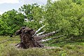
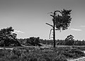
- Nomination Walk through The Strubben-Kniphorstbos. fallen birch (Betula).
--Famberhorst 17:29, 17 June 2017 (UTC) - Promotion Good quality. --Livioandronico2013 18:18, 17 June 2017 (UTC)
- Nomination Walk through The Strubben-Kniphorstbos. fallen birch (Betula).
-

- Nomination Sculpture near the summit of Peña Roja in the Entzia mountain range, surrounded by Narcissus sp.. Álava, Basque Country, Spain --Basotxerri 16:53, 17 June 2017 (UTC)
- Promotion Good quality. --Livioandronico2013 19:27, 17 June 2017 (UTC)
-

- Nomination Sculpture near the summit of Peña Roja in the Entzia mountain range. Álava, Basque Country, Spain --Basotxerri 16:53, 17 June 2017 (UTC)
- Promotion Support Good quality.--Famberhorst 17:24, 17 June 2017 (UTC)
-

- Nomination Sculpture near the summit of Peña Roja in the Entzia mountain range (detail). Álava, Basque Country, Spain --Basotxerri 16:53, 17 June 2017 (UTC)
- Promotion Support Good quality.--Famberhorst 17:22, 17 June 2017 (UTC)
-

- Nomination Road A-4112 from Salvatierra to Eguileor. Álava, Basque Country, Spain --Basotxerri 16:33, 17 June 2017 (UTC)
- Promotion Photo has been made under bad light conditions, so I can accept in this case that it is not a really sharp one--Michielverbeek 04:01, 18 June 2017 (UTC)
-

- Nomination Flowers of Lamium galeobdolon. --Bff 16:27, 17 June 2017 (UTC)
- Promotion Good quality. --Basotxerri 16:35, 17 June 2017 (UTC)
-

-

- Nomination Lion-tailed macaque close up --PJeganathan 15:47, 17 June 2017 (UTC)
- Promotion Good quality. --Basotxerri 16:34, 17 June 2017 (UTC)
-

- Nomination Logging in tropical rainforest, Sabah, Borneo: dipterocarp and other timber logs being taken by logging truck. By User:Shankar Raman --PJeganathan 15:47, 17 June 2017 (UTC)
- Decline The front of the truck isn't sharp, not a QI for me. --Basotxerri 17:14, 17 June 2017 (UTC)
-

- Nomination Golden jackal (Canis aureus) crossing the road in keoladeo national park_cropped version of JEG2629 --PJeganathan 15:47, 17 June 2017 (UTC)
- Decline Unsharp and noisy, not a QI for me. A pity, this could be very nice. --Basotxerri 16:37, 17 June 2017 (UTC)
-

- Nomination Celebes or Sulawesi crested macaque (Macaca nigra) in Tangkoko Nature Reserve, Sulawesi --Shankar Raman 15:44, 17 June 2017 (UTC)
- Decline
 Oppose Nice attempt, but shaken camera and unsharp image for QI --Deepugn 16:24, 17 June 2017 (UTC) Oppose Agree. Also crop is too close to the mouth. PumpkinSky 23:28, 17 June 2017 (UTC)
-

- Nomination Mégotier - cendrier au sol devant l'entrée de la gare de Marne-la-Vallée – Chessy. --Benoît Prieur 15:33, 17 June 2017 (UTC)
- Promotion Weak Support. Photo could have been sharper.--Famberhorst 15:49, 17 June 2017 (UTC)
-

-

- Nomination Long-tail boat. Ko Ngai. Mu Ko Lanta National Park. Ko Lanta District, Krabi Province, Thailand. --Halavar 14:52, 17 June 2017 (UTC)
- Promotion Good quality. --Basotxerri 17:33, 17 June 2017 (UTC)
-

- Nomination Auberge du Soleil hotel. Kampot, Cambodia. --Halavar 14:52, 17 June 2017 (UTC)
- Promotion Photo is messy, but the picture quality is good for me.--Famberhorst 15:44, 17 June 2017 (UTC)
-

- Nomination Sacsayhuamán, Cusco, Peru --Poco a poco 14:41, 17 June 2017 (UTC)
- Promotion Good quality --Halavar 14:52, 17 June 2017 (UTC)
-

- Nomination Storhofthi, Suðurland, Iceland --Poco a poco 14:41, 17 June 2017 (UTC)
- Promotion Good quality --Halavar 14:53, 17 June 2017 (UTC)
-

- Nomination Statue of saint Andrew, Bec abbey, Le Bec-Hellouin, Normandy, Eure, France. The w:Bec Abbey is the "mother" of the cathedral of Canterbury in England: Saint Anselm, and after him two other monks, were sent to England from this abbey, in the 11th-c, and became archbishop of Canterbury. Despite the english Reformation, strong links still exist between the two communities. For instance, nowadays, the Abbott of Bec is invited to the main ceremonies in Canterbury (among them the installation of the new archbishops). The archbishop of Canterbury often visits the abbey. --Jebulon 14:49, 17 June 2017 (UTC)
- Promotion Good quality but please keep the nomination text short. --Peulle 18:20, 17 June 2017 (UTC) Why ? Too Much culture ? Sorry --Jebulon 23:22, 17 June 2017 (UTC)
-

- Nomination Plaque commemorating the "Norman" from Normandy and England, 900th anniversary of the battle of Hastings, Bec abbey, Normandy, Eure, France.--Jebulon 14:36, 17 June 2017 (UTC)
- Promotion Support Good quality.--Famberhorst 15:41, 17 June 2017 (UTC)
-

-
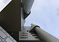
- Nomination Worm's-eye view of HVB Tower, an administrative building of the HypoVereinsbank in Munich. --Martin Falbisoner 13:45, 17 June 2017 (UTC)
- Promotion Good quality. PumpkinSky 13:58, 17 June 2017 (UTC)
-

- Nomination Munich's HVB Tower and "Mae West", a sculpture on Effnerplatz, at dusk. --Martin Falbisoner 13:45, 17 June 2017 (UTC)
- Promotion Very good! Good quality. --Basotxerri 17:40, 17 June 2017 (UTC)
-

- Nomination Munich's HVB Tower and "Mae West", a sculpture on Effnerplatz, at dusk. --Martin Falbisoner 13:45, 17 June 2017 (UTC)
- Promotion Special.--Famberhorst 17:26, 17 June 2017 (UTC)
-

- Nomination Detail of Wasserglockenbrunnen, also known as Wasserpilzbrunnen on Frauenplatz, Munich, at night. It was designed by Bernhard Winkler in 1972. --Martin Falbisoner 13:45, 17 June 2017 (UTC)
- Promotion Good quality. --Aeou 15:24, 17 June 2017 (UTC)
-

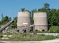
- Nomination Archive of Westdeutscher Rundfunk Köln (WDR, West German Broadcasting Cologne). --Code 10:51, 17 June 2017 (UTC)
- Promotion Good quality. -- Johann Jaritz 11:30, 17 June 2017 (UTC)
-

- Nomination Back of the Saint Faith Church in Montrozier, Aveyron, France. --Tournasol7 12:33, 17 June 2017 (UTC)
- Promotion Good quality. --Martin Falbisoner 13:46, 17 June 2017 (UTC)
-

- Nomination Keystone at the house of the chancellor of Niedermünster Abbey, Regensburg --Carschten 07:22, 17 June 2017 (UTC)
- Promotion Good quality. --Jacek Halicki 08:20, 17 June 2017 (UTC)
-
- Nomination Foundation buildings of Niedermünster Abbey in Regensburg --Carschten 07:22, 17 June 2017 (UTC)
- Promotion Good quality. -- Johann Jaritz 10:25, 17 June 2017 (UTC)
-

- Nomination Carmelites' Church of Saint Joseph in Regensburg --Carschten 07:22, 17 June 2017 (UTC)
- Promotion Good quality. -- Johann Jaritz 10:25, 17 June 2017 (UTC)
-

- Nomination Old bridge upon Aveyron River in Montrozier, Aveyron, France. --Tournasol7 12:33, 17 June 2017 (UTC)
- Promotion Good quality. --Martin Falbisoner 13:46, 17 June 2017 (UTC)
-

-

- Nomination Sandstone house in Neubrunn in the district Haßberge --Ermell 09:52, 17 June 2017 (UTC)
- Promotion Good quality. -- Johann Jaritz 10:31, 17 June 2017 (UTC)
-

- Nomination Building in the Lower Saline in Bad Kissingenhausen --Ermell 09:52, 17 June 2017 (UTC)
- Promotion Good quality. -- Johann Jaritz 10:31, 17 June 2017 (UTC)
-

- Nomination Arbor in the Lower Saline in Bad Kissingenhausen --Ermell 09:52, 17 June 2017 (UTC)
- Promotion Good quality. -- Johann Jaritz 10:31, 17 June 2017 (UTC)
-

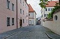
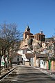
- Nomination 5 Matejki Street in Kłodzko 1 --Jacek Halicki 08:00, 17 June 2017 (UTC)
- Promotion Good quality. -- Johann Jaritz 10:22, 17 June 2017 (UTC)
-

- Nomination 5 Matejki Street in Kłodzko 2 --Jacek Halicki 08:00, 17 June 2017 (UTC)
- Promotion Good quality. --Ermell 09:55, 17 June 2017 (UTC)
-

- Nomination 5 Matejki Street in Kłodzko 3 --Jacek Halicki 08:00, 17 June 2017 (UTC)
- Promotion Good quality. --Ermell 09:53, 17 June 2017 (UTC)
-

- Nomination 7 Matejki Street in Kłodzko --Jacek Halicki 08:00, 17 June 2017 (UTC)
- Promotion Good quality. -- Johann Jaritz 10:22, 17 June 2017 (UTC)
-

- Nomination Evangelical Lutheran. Parish church in Kairlindach (Weisendorf) --Ermell 09:52, 17 June 2017 (UTC)
- Promotion Good quality. -- Johann Jaritz 10:31, 17 June 2017 (UTC)
-

- Nomination Abbey, Monastery Endowment of the Holy Grave, Heiligengrabe, Brandenburg, Germany --XRay 04:43, 17 June 2017 (UTC)
- Promotion Good quality. -- Johann Jaritz 10:34, 17 June 2017 (UTC)
-

- Nomination Olios milleti --Vengolis 03:50, 17 June 2017 (UTC)
- Promotion Good quality. -- Johann Jaritz 10:34, 17 June 2017 (UTC)
-

- Nomination Genista benehoavensis together Red Bugloss (Echium wildpretii ssp. trichosiphon) on La Palma, Canary Islands, Spain --LC-de 10:11, 17 June 2017 (UTC)
- Promotion Great composition. Very good quality. -- Johann Jaritz 10:33, 17 June 2017 (UTC)
-

- Nomination Grass Valley Public Library --Frank Schulenburg 05:06, 17 June 2017 (UTC)
- Promotion Good quality. --XRay 05:28, 17 June 2017 (UTC)
-

-

- Nomination Two European Herring Gulls fighting for a fish too large to swallow, Ahrenshoop(Germany) / Baltic Sea --PtrQs 00:22, 17 June 2017 (UTC)
- Promotion Good. Are they fighting or sharing? -- Ikan Kekek 01:00, 17 June 2017 (UTC)
 Comment They're fighting, but when the fish's spine snaps, they have a win-win situation - see 'other versions' of this image.--PtrQs 11:51, 17 June 2017 (UTC)
-

- Nomination Hamlet Börnste, Kirchspiel, Dülmen, North Rhine-Westphalia, Germany --XRay 04:43, 17 June 2017 (UTC)
- Promotion Good quality. --Martin Falbisoner 13:48, 17 June 2017 (UTC)
-

- Nomination South facade of Castle of the Montrozier, Aveyron, France. --Tournasol7 12:33, 17 June 2017 (UTC)
- Promotion Good quality. --Martin Falbisoner 13:48, 17 June 2017 (UTC)
-

- Nomination South facade of Castle of the Montrozier, Aveyron, France. --Tournasol7 12:33, 17 June 2017 (UTC)
- Promotion Good quality. --Martin Falbisoner 13:48, 17 June 2017 (UTC)
-

- Nomination Battlements and tower of the Castle of Montrozier, Aveyron, France. --Tournasol7 12:33, 17 June 2017 (UTC)
- Promotion Good quality. --Martin Falbisoner 13:48, 17 June 2017 (UTC)
-

- Nomination Serbian Orthodox church - candle room --PetarM 05:10, 17 June 2017 (UTC)
- Promotion Good quality. --Martin Falbisoner 13:48, 17 June 2017 (UTC)
-

-
- Nomination Dolmin limestone plant in Żelazno --Jacek Halicki 08:22, 17 June 2017 (UTC)
- Promotion Good quality. -- Johann Jaritz 09:47, 17 June 2017 (UTC)
-

-

-

-
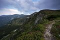
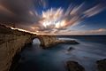
- Nomination східна Європа,Україна,Карпати,Чорногірський масив, east Europe, Ukraine,Carpathian mountains,Chornogora ridge.
--User:User:Хіраш Володимир 21:48, 16 June 2017 (UTC) - Decline Oppose Sorry, nothing sharp here. --Code 10:50, 17 June 2017 (UTC)
- Nomination східна Європа,Україна,Карпати,Чорногірський масив, east Europe, Ukraine,Carpathian mountains,Chornogora ridge.
-

- Nomination східна Європа,Україна,Карпати,Мармароський масив, east Europe, Ukraine,Carpathian mountains,Marmarosy ridge.
--User:User:Хіраш Володимир 21:13, 16 June 2017 (UTC) - Promotion Beautiful sunset nearly without noise --Michielverbeek 06:40, 17 June 2017 (UTC)
- Nomination східна Європа,Україна,Карпати,Мармароський масив, east Europe, Ukraine,Carpathian mountains,Marmarosy ridge.
-

- Nomination View on Castle of Severac in Severac-le-Chateau, Aveyron, France. --Tournasol7 12:46, 16 June 2017 (UTC)
- Promotion Good quality. --Jacek Halicki 09:05, 17 June 2017 (UTC)
-
- Nomination Walk across the Hulshorsterzand/ Hulshorsterheide.
--Agnes Monkelbaan 04:33, 16 June 2017 (UTC) - Promotion The image is OK but IMO you can improve B&W quality by better use of contrast, slight gradual filters in the sky and some other improvements. --Basotxerri 14:20, 16 June 2017 (UTC)
 Done. Small corrections. Thanks for your reviews. Better now?--Agnes Monkelbaan 15:58, 16 June 2017 (UTC)
Hi Agnes Monkelbaan, I thought more about something like the version that I've uploaded just now. However, please revert it if you don't like it. And of course it would be better that you prepare it by yourself using the original RAW file, the result should be better. --Basotxerri 17:12, 17 June 2017 (UTC)
- Nomination Walk across the Hulshorsterzand/ Hulshorsterheide.
-

- Nomination Cricket larva, Loire. --MirandaAdramin 20:33, 15 June 2017 (UTC)
- Decline Blurry. DOF too shallow. PumpkinSky 12:00, 17 June 2017 (UTC)
-

- Nomination Calmness of Phewa Lake, Pokhara. (By Q-lieb-in) --Biplab Anand 16:51, 15 June 2017 (UTC)
- Promotion Good quality. PumpkinSky 12:01, 17 June 2017 (UTC)
-
- Nomination View of Bijuesca, Spain --Poco a poco 17:05, 13 June 2017 (UTC)
- Decline Sorry but nearly the half of the image is unsharp (lens dirty?). Not a QI for me. --Basotxerri 17:46, 17 June 2017 (UTC)
-

- Nomination Vicuñas (Vicugna vicugna) in Reserva Nacional Salinas, Arequipa, Peru --Poco a poco 17:05, 13 June 2017 (UTC)
- Promotion ¡Con las orejas teñidas! Good quality. --Basotxerri 17:50, 17 June 2017 (UTC)
-

- Nomination Brown shrike (Lanius cristatus)from anaimalai hills closeup --PJeganathan 05:13, 12 June 2017 (UTC)
- Decline Oppose IMO too noisy. Looking at the EXIF data, I think lowering the ISO would have been possible. --Basotxerri 18:15, 17 June 2017 (UTC)
-

- Nomination Dried fish for sale in Poompuhar_ --PJeganathan 05:13, 12 June 2017 (UTC)
- Promotion Support OK for me. --Basotxerri 18:17, 17 June 2017 (UTC)
-

- Nomination View of Ziros, Crete. --C messier 15:59, 11 June 2017 (UTC)
- Promotion Not the sharpest but OK for me.
Could you crop a bit of the foreground, though?Optionally I would consider crop off a bit of the foreground --Basotxerri 18:03, 17 June 2017 (UTC)
-

- Nomination Lithines, Crete. --C messier 15:59, 11 June 2017 (UTC)
- Promotion Question The amphores on the right are they decoration or being used for something? Good quality. --Basotxerri 17:59, 17 June 2017 (UTC)
-

- Nomination: Church St. Peter und Paul (Busbach, Germany) --J. Lunau 14:08, 11 June 2017 (UTC)
- Review It need perspective correction. Tournasol7 15:40, 11 June 2017 (UTC) Comment
Thank you for your review, Tournaso17. I already made a slight perspective correction with ShiftN, more correction gives a totally unnaturally look for the use at Wikipedia --J. Lunau 16:52, 11 June 2017 (UTC)
-

-

- Nomination: Strobilanthus sp. from Dehing Patkai Wildlife Sanctuary, Assam. By User:Rohitjahnavi --PJeganathan 06:17, 11 June 2017 (UTC)
- Review needed
-

- Nomination Bonnet macaque 'yawning', south India. By User:Shankar Raman --PJeganathan 08:34, 6 June 2017 (UTC)
- Promotion Comment Nice moment! But where exactly in south India? Also inorder to get a very blurry background, dof has been kept very shallow and the back portion of the monkey is verily out of focus. --Shishir, 13:50, 6 June (UTC) Added location; the focus was specifically on face and mouth to reveal detail. Thanks--Shankar Raman 14:10, 12 June 2017 (UTC)
Support [Good quality. --PJeganathan 17:36, 17 June 2017 (UTC)


_01.jpg)


_crossing_the_road_in_keoladeo_national_park_JEG2629_a.jpg)


.jpg)
.jpg)


_en_Reserva_Nacional_Salinas,_Arequipa,_Per%C3%BA,_2015-08-02,_DD_60.JPG)
from_anaimalai_hills_closeup_DSC_2088_a.jpg)


Consensual review
[edit]File:Campanule_Rochebaron.jpg
[edit]
- Nomination Campanule, Haute-Loire. --MirandaAdramin 20:35, 11 June 2017 (UTC)
- Decline
- Support Good quality.--Manfred Kuzel 11:07, 14 June 2017 (UTC)
- Oppose Sorry, but I don't agree - 2 petals are out of focus. Tournasol7 21:43, 16 June 2017 (UTC)
- Oppose Per Tournasol7.--Peulle 13:57, 17 June 2017 (UTC)
File:Puycelsi Church Bell Tower.jpg
[edit]
- Nomination Puycelsi. XVIIth century porch-tower of the church --LeZibou 21:09, 9 June 2017 (UTC)
- Decline
- Support GQ Ezarate 22:13, 14 June 2017 (UTC)
- Oppose Sorry, but this image need a perspective correction... Tournasol7 22:57, 14 June 2017 (UTC) @Tournasol7: Done, I guess, I tried to find the best compromise between perspective correction and proportions (not to have the top of the belltower looking bigger than the bottom). --LeZibou 18:17, 15 June 2017 (UTC)
- Oppose Without more space on top this won't be fixable, I fear. --Basotxerri 16:03, 17 June 2017 (UTC) @Basotxerri: absolutely, unfortunately I took "too much ground" on the picture, and not enough sky... ; it's hard to get the bell tower in one single shot, as space lacks. --LeZibou 18:13, 17 June 2017 (UTC)
File:Vallas_del_campo_de_concentración_de_Dachau,_Alemania,_2016-03-05,_DD_24.jpg
[edit]
- Nomination: Fence of the concentration camp of Dachau, Germany --Poco a poco 08:26, 11 June 2017 (UTC)
- Review
- Comment Dramatic but seems that most of it is out of focus --Moroder 08:43, 11 June 2017 (UTC)
- Support Enough of it is sharp to satisfy me. There's no need for the entirety of a fence that's receding into the distance to be sharp, in my opinion. The barbed wire closest to the viewer that's unsharp is unfortunate, but I find the overall effect fine. Moroder, please vote to oppose if you'd like to move this to CR, or otherwise, we can promote it. -- Ikan Kekek 08:54, 11 June 2017 (UTC)
- Comment Blurred part prevails --Moroder 09:08, 11 June 2017 (UTC)
 Neutral to remain consistent but I like the image very much --Moroder 14:58, 13 June 2017 (UTC)
- Comment No it doesn't. I said you could either pass this photo or move it to CR. It's perhaps a little rude that you tried to decline it. Hoping I wouldn't notice? -- Ikan Kekek 13:02, 11 June 2017 (UTC)
- Comment Please @Ikan Kekek: , don't treat me like that... I tried to follow your suggestion and, working with the bottons, first you have to decline a nomination before you put it on CR --Moroder 09:08, 12 June 2017 (UTC)
- Support To my eyes this is a very good one. The photo tells an interesting story. Well implemented and of course good quality. -- Johann Jaritz 13:10, 11 June 2017 (UTC)
- Support The focus is on the subject and the subject is sufficiently well photographed. --Christian Ferrer 18:53, 11 June 2017 (UTC)
- Support Fine 4 me. --Palauenc05 21:18, 12 June 2017 (UTC)
- Comment - No, Moroder, the way to move anything to CR is to change the status to "Discuss" NOT "Decline". You didn't know that? Now you do. -- Ikan Kekek 22:24, 12 June 2017 (UTC)
- Oppose Double contours bottom left. Camera shake? Malfunctioning image stabilizer? Multiple Exposure/Bracketing? --Smial 09:37, 14 June 2017 (UTC)
- No, no bracketing, just one frame. Stabilizer is fine, otherwise the right side of the image would be sharp. How would you manage to have half a picture sharp and shake on the other side, that would just be possible through rotating the camera (then the center could be sharp and the rest unsharp), but it isn't the case here. Poco a poco 19:24, 14 June 2017 (UTC)
- Comment I don't know how this is possible, but the doubled contours exist. I would like to learn about this effect. Two more reasons could be possible: Partly oversharpening, or ugly bokeh. There are lenses that produce different bokeh at near distance and at far distance. Once a defective stabilizer in my k-x produced similar effects, and it was not distributed equally on the image. --Smial 08:50, 16 June 2017 (UTC)
- Oppose Sorry, for me too large blurred areas, strong blur, even though most of the fence is OK. --A.Savin 12:12, 14 June 2017 (UTC)
- Oppose I can not see the quality. Only the first two or three fence posts are sharp, most of this Image is very blurry. Also the close portrait is disturbing. If I use the usual rules for QI, I have to decline.--Zoppo59 14:06, 15 June 2017 (UTC)
- Comment I don't understand these criticisms, the subject is the fence and it is mostly sharp, why expect other areas to be sharp? Poco a poco 21:19, 15 June 2017 (UTC)
- Question Sorry, but are the barbed wire and gravel on the ground not part of the fence? It lookes like double exposure. --Zoppo59 14:28, 16 June 2017 (UTC)
- Oppose Sorry Diego but for Savin --Livioandronico2013 18:23, 17 June 2017 (UTC)
- Oppose Per others. --Peulle 07:52, 18 June 2017 (UTC)
- Support --Yann 09:05, 19 June 2017 (UTC)
- Support Per others. --Manfred Kuzel 04:38, 20 June 2017 (UTC)
Total: 5 support (excluding the nominator), 5 oppose →  Inconclusive result after 8 consensual review days (inconclusive after thorough voting process) --Peulle 19:40, 19 June 2017 (UTC)