Commons:Quality images candidates/Archives August 2007
-

- Nomination Nerium oleander flowers, buds and leaves. I know that some petals are overexposed but the picture illustrates so well the plant, and the colours and composition are so nice that I'll give it a try... - Alvesgaspar 19:24, 26 August 2007 (UTC)
- Promotion Some parts of the flowers are burnt white indeed. I know by experience that this is sometimes difficult to avoid in flower pictures. For me it's a QI though: good composition and DoF, nice colors, great sharpness. -- MJJR 20:36, 26 August 2007 (UTC)
-
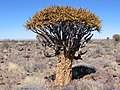
- Nomination Quiver tree (Aloe dichotoma) is a species of aloe, picture taken in the quiver tree forest, Namibia --Hsuepfle 13:34, 26 August 2007 (UTC)
- Promotion Good light, acceptable technical condition. Please write en description next time! Thanks --Beyond silence 14:20, 26 August 2007 (UTC)
-
-
- Nomination Miscolored Opisthograptis luteolata other version --MichaD | Michael Apel 10:03, 26 August 2007 (UTC)
- Promotion Good details. Lycaon 15:55, 26 August 2007 (UTC)
-

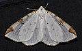
- Nomination Miscolored Opisthograptis luteolata --MichaD | Michael Apel 09:09, 26 August 2007 (UTC)
- Decline Really tight crop (do you have more breathing space?), but good quality. Lycaon 09:12, 26 August 2007 (UTC) Is there a way to withdraw a nomination? Going through my shots again I found a better crop with better focus as well --MichaD | Michael Apel 10:03, 26 August 2007 (UTC)
 MichaD | Michael Apel 14:25, 26 August 2007 (UTC).
-

-

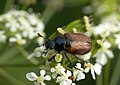
- Nomination The longhorn beetles or long-horned beetles (Cerambycidae) are a cosmopolitan family of beetles. As shown a female --Richard Bartz 18:42, 25 August 2007 (UTC)
- Promotion Good sharpness. --Beyond silence 14:15, 26 August 2007 (UTC)
-

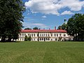
- Nomination Smolyniy Institute in Leningrad #!George Shuklin 11:04, 25 August 2007 (UTC)
- Promotion Good colors, lighting and sharpness. The centered composition doesn't bother me, as it is perfectly adapted to the subject. Slightly distorted verticals (could this be fixed yet?). Please give an English name to your picture, as not everybody has cyrillic characters on his computer. -- MJJR 21:06, 26 August 2007 (UTC)
-

- Nomination Vespula germanica, Topview. --Richard Bartz 21:00, 24 August 2007 (UTC)
- Promotion Acceptable sharpness. --Beyond silence 14:08, 26 August 2007 (UTC)
-

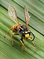
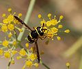
- Nomination French paper wasp (Polistes gallicus). Notice the damaged tips of the wings - Alvesgaspar 15:59, 24 August 2007 (UTC)
- Promotion Acceptable sharpness. --Beyond silence 14:08, 26 August 2007 (UTC)
-

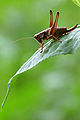
- Nomination Roesel's bush-cricket Metrioptera roeseli is a European bush-cricket, named after August Johann Rösel von Rosenhof, a German entomologist. Here we have a male --Richard Bartz 18:42, 25 August 2007 (UTC)
- Promotion Good DOF and detail --MichaD | Michael Apel 09:15, 26 August 2007 (UTC)
-

-

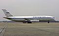
- Nomination Airbus A380 landing. - Keta 16:18, 25 August 2007 (UTC)
- Promotion Looks very sharp and clear to me. I can't see any noise and the body is nicely exposed. Inductiveload 19:43, 25 August 2007 (UTC)
-

- Nomination Time of shield bugs! This one is a Graphosoma italicum (same as Graphosoma lineatum) - Alvesgaspar 15:20, 25 August 2007 (UTC)
- Promotion I'd have been happy to catch that one. Maybe short DOF though, but to me OK for QI. Benh 17:20, 25 August 2007 (UTC)
-

- Nomination Cedar Waxwing --Ken Thomas 13:20, 25 August 2007 (UTC)
- Decline Sharp ! nice catch too, but too noisy, and a little overexposed. Benh 17:20, 25 August 2007 (UTC)
-

- Nomination Northern Cardinal (female) --Ken Thomas 13:20, 25 August 2007 (UTC)
- Decline What a shame, I was already antecipating the pleasure to see the feather details of this gorgeous bird :-(. Please try to remove the noise! Alvesgaspar 15:09, 25 August 2007 (UTC)
-

- Nomination Northern Mockingbird --Ken Thomas 13:20, 25 August 2007 (UTC)
- Decline The bird is over-sharpened and the leaves are very noisy. Sorry! Also the bird is detracted from bythe branches in front of it. Inductiveload 19:55, 25 August 2007 (UTC)
-

-
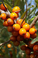
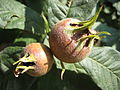
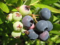
- Nomination Common Sea-buckthorn (Hippophae rhamnoides) berries -- Lycaon 20:45, 23 August 2007 (UTC)
- Promotion Not a very nice photo, but some berry in good focus, so can be acceptable. --Beyond silence 21:02, 25 August 2007 (UTC)
-

-

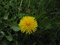
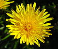
- Nomination I thought there was a distinct lack of flowers, especially dandelions on commons ;-) --Tony Wills 00:02, 25 August 2007 (UTC)
- Promotion Composition, detail! --Beyond silence 00:16, 25 August 2007 (UTC)
-

- Nomination Mecaflex SLR. --Adamantios 17:20, 24 August 2007 (UTC)
- Promotion Good DoF, sharp. Top of the metal casing perhaps a little overexposed, but in my opinion qualifies for QI anyway. - Till 20:36, 24 August 2007 (UTC)
I've made an edit here that brightens the bg a bit. Thegreenj 22:32, 24 August 2007 (UTC)
-

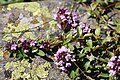
- Nomination Oxalis. --Simonizer 16:42, 24 August 2007 (UTC)
- Promotion
 Comment I don't think it is clover, but it is probably Oxalis acetosella. Lycaon 16:49, 24 August 2007 (UTC), I changed the description. Thanks for the hint --Simonizer 19:04, 24 August 2007 (UTC)
Good quality pic. Lycaon 19:15, 24 August 2007 (UTC)
-

-

- Nomination Black shag after drying out --Tony Wills 12:20, 24 August 2007 (UTC)
- Promotion Still needs to be a bit sharper and larger(!!), but colour, (lack of) noise and composition take it to QI. Lycaon 14:25, 24 August 2007 (UTC)
-

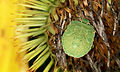
- Nomination The green shield bug Palomena prasina is a shield bug of the family Pentatomidae --Richard Bartz 23:21, 23 August 2007 (UTC)
- Promotion Not question, great detail! May you can nominate it to FP. --Beyond silence 02:16, 24 August 2007 (UTC)
* Comment You can do it if you like ;) --Richard Bartz 20:45, 24 August 2007 (UTC)
-

-

-

-

- Nomination Lighthouse of Peggys Cove, Nova Scotia --Aconcagua 06:06, 23 August 2007 (UTC)
- Promotion Nice composition and colours! --Beyond silence 07:45, 23 August 2007 (UTC)
-

- Nomination Cape Breton Island, Nova Scotia --Aconcagua 06:06, 23 August 2007 (UTC)
- Promotion Nice composition acceptable sharp foreground. Cheers --Beyond silence 07:49, 23 August 2007 (UTC)
-

- Nomination Black Poplar (Populus nigra) --Beyond silence 03:52, 23 August 2007 (UTC)
- Decline Everything sharp and clear - too bad the tree top is cropped. - Till 05:25, 23 August 2007 (UTC) Thanks for help. --Beyond silence 07:36, 23 August 2007 (UTC)
-

- Nomination A church portal in Brittany, close-up of the Gothic decoration.Vassil 23:24, 22 August 2007 (UTC)
- Promotion Nice subject. Good sharpness and light. --Beyond silence 03:54, 23 August 2007 (UTC)
-

-

-
- Nomination Phyllopertha horticola on Aegopodium podagraria. Lycaon 14:15, 22 August 2007 (UTC)
- Promotion Acceptable sharpness, nice lights and colours. --Beyond silence 21:30, 22 August 2007 (UTC)
-

- Nomination European beewolf (Philanthus triangulum) seen from above - Alvesgaspar 12:22, 22 August 2007 (UTC)
- Decline To small DOF, not sharp enough and
wrong id. sorry, didn't have a clue myself at the time of the decline; other issues stand however. Lycaon 18:44, 22 August 2007 (UTC) Lycaon 12:40, 22 August 2007 (UTC)
ID fixed Alvesgaspar 18:25, 22 August 2007 (UTC)
-

- Nomination A beautiful shield bug (Graphosoma lineatum) in a branch of a umbellifer. - Alvesgaspar 12:22, 22 August 2007 (UTC)
- Decline Too shallow DOF: the head at least should have been in focus. Lycaon 12:40, 22 August 2007 (UTC)
-

- Nomination A drinking horse in a meadow. Vassil 09:37, 22 August 2007 (UTC)
- Promotion Nice composition and subject, tech. acceptable. --Beyond silence 21:37, 22 August 2007 (UTC)
-

-

- Nomination Wilimowskiego Street in Katowice. --Lestat 21:05, 21 August 2007 (UTC)
- Promotion Good light, acceptable sharpness. Maybe it's a bit tilt, but I don't take high priority for that. --Beyond silence 03:57, 23 August 2007 (UTC)
-
- Nomination The green shield bug (Palomena prasina) is a shield bug of the family Pentatomidae --Richard Bartz 19:39, 21 August 2007 (UTC)
- Promotion Good composition, there is some low DOF but I think sharpness acceptable. --Beyond silence 03:41, 22 August 2007 (UTC) CommentThe description should mention that this is not an adult bug, but a nymph. Lycaon 12:46, 22 August 2007 (UTC)
Fixed --Richard Bartz 17:10, 22 August 2007 (UTC)
-

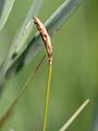
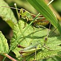
- Nomination Chorthippus parallelus, Belgium. Lycaon 12:55, 21 August 2007 (UTC)
- Promotion Acceptable detail, minor foreground object acceptable at QI. --Beyond silence 04:10, 23 August 2007 (UTC)
-

- Nomination Polar Bears in Tiergarten Schönbrunn --Aconcagua 08:15, 21 August 2007 (UTC)
- Promotion I like the theme (there isn't many similar shot on Commons), technicaly acceptable. --Beyond silence 04:01, 23 August 2007 (UTC)
-

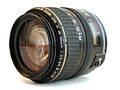
- Nomination Canon Rebel XT (350D) with EF 28-105mm Compact Macro f/3.5-4.5 Thegreenj 22:40, 20 August 2007 (UTC)
- Promotion I can't discern major faults. Nice DOF, QI for me. Lycaon 10:47, 22 August 2007 (UTC) CommentMinor changes: I seem to have lost a few hairs taking the picture :). I removed the hair and de-noised the background. Thegreenj 21:33, 22 August 2007 (UTC)
;-)) Acknowledged (Don't think I didn't notice!!) Lycaon 21:43, 22 August 2007 (UTC)
-
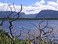
- Nomination Gros Morne National Park, Western Brook Pond. Aconcagua 09:54, 18 August 2007 (UTC)
- Promotion Very nice composition, technicaly acceptable. --Beyond silence 01:05, 19 August 2007 (UTC)
Interesting choice of focus, suggest description identify species in focussed foreground.--LeadSongDog 17:55, 22 August 2007 (UTC)
-
-

- Nomination The Small White (Pieris rapae) is a small to mid-sized butterfly species of the Yellows-and-Whites family Pieridae --Richard Bartz 23:21, 23 August 2007 (UTC)
- Decline Very pretty colours but insufficient DOF. Lycaon 06:16, 24 August 2007 (UTC)
-
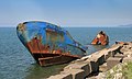
- Nomination The Shipwreck Ozlem at Black Sea coast at Batumi, Georgia --Richard Bartz 23:21, 23 August 2007 (UTC)
- Promotion Looks pretty and sharp, although it looks like it may be oversharpened in whatever software you use. -- Ram-Man 00:57, 24 August 2007 (UTC)
-
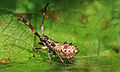
- Nomination Coreidae is a large family of insects of the order Hemiptera (the "true bugs"), including some of the largest members (> 4 cm) of the entire order. There are over 1800 species in some 250 genera --Richard Bartz 23:21, 23 August 2007 (UTC)
- Promotion A rather verbose description here and not very precise identification. Low DOF but good focus on important details like the head, well exposed - a QI :-) --Tony Wills 10:42, 24 August 2007 (UTC)
-

- Nomination Braconidae is a family of parasitoid wasps and one of the richest family of insects --Richard Bartz 23:21, 23 August 2007 (UTC)
- Promotion Yep, great! Perfect DOF. Lycaon 06:12, 24 August 2007 (UTC)
-

- Nomination Great Pond-sedge Carex riparia (inflorescence) -- Lycaon 20:29, 23 August 2007 (UTC)
- Promotion A bit low DOF, but acceptable sharpness & light. --Beyond silence 02:25, 24 August 2007 (UTC)
-

- Nomination Aebnistettenflue, Entlebuch --Simonizer 18:17, 23 August 2007 (UTC)
- Promotion Nice composition. Cheers Alberto Fernandez Fernandez 18:37, 23 August 2007 (UTC)
-

- Nomination Shield bugs mating (Graphosoma italicum) - Alvesgaspar 16:38, 23 August 2007 (UTC)
- Promotion OK for QI ! An amazing catch I would have nominated for FP with a little better technical qualities (and maybe a slight different angle) -- Benh 20:37, 23 August 2007 (UTC)
-

- Nomination Left upper corner of the Marble Hall of the Upper Belvedere Vienna - The trompe-l'oeuil gives the illusion of an extra balcony on an almost flat ceiling. Alberto Fernandez Fernandez 12:55, 23 August 2007 (UTC)
- Decline Hmm don't quite like the colours and composition... It's a bit noisy too and there are these overexposed windows. Benh 20:37, 23 August 2007 (UTC)
-
-

- Nomination Jeans fabric Thegreenj 00:37, 23 August 2007 (UTC)
- Promotion Sharp, good resolution. In my opinion the pic would be even better if rotated to the left by 1 or 2 degrees, to make the warp threads parallel to the image sides. - Till 05:36, 23 August 2007 (UTC)
Done. Thegreenj 20:59, 23 August 2007 (UTC)
-

-

- Nomination ♀ Decticus verrucivorus, Andorra. Lycaon 12:55, 21 August 2007 (UTC)
- Promotion Can you crop it? The much land don't looks good for me. --Beyond silence 03:59, 23 August 2007 (UTC) OK to me, cropped or not - Benh 20:23, 23 August 2007 (UTC)
-
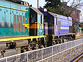
- Nomination Two diesel locomotives --Orlovic (talk) 14:22, 20 August 2007 (UTC)
- Decline Bad composition, distracting fence. --Beyond silence 01:04, 24 August 2007 (UTC)
-
-

- Nomination Daecheong Dam. --YooChung 08:06, 22 August 2007 (UTC)
- Promotion Acceptable technicaly detail for me. --Beyond silence 08:51, 22 August 2007 (UTC)
-

- Nomination Six bees --Aconcagua 06:52, 22 August 2007 (UTC)
- Promotion I like the theme and sharpness overall good. Thanks --Beyond silence 08:43, 22 August 2007 (UTC)
-
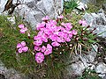
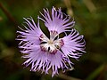
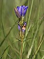
- Nomination Dianthus alpinus on mountain Schneeberg (Austria)
- Promotion Looks good for QI. Lycaon 10:52, 22 August 2007 (UTC)
-

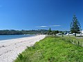
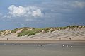
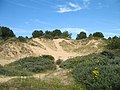
- Nomination Knokke (Belgium): North Sea, beach, embankment and dunes. -- MJJR 21:13, 21 August 2007 (UTC)
- Promotion Sharp enough, good composition (how did you shoot this? Did you rent a helicopter?) - Till 21:52, 21 August 2007 (UTC) Comment Yes, indeed: I had the lucky opportunity to fly with a helicopter - as a passenger, of course... -- MJJR 11:06, 22 August 2007 (UTC)
-

-

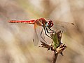
- Nomination A handsome male red-veined darter with the wings down to shade the thorax from the sun - Alvesgaspar 20:29, 21 August 2007 (UTC)
- Promotion Good composition, acceptable technical condition. --Beyond silence 03:48, 22 August 2007 (UTC)
-
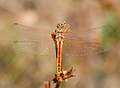
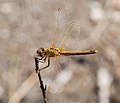
- Nomination A male red-veined darter whose red colouring is not yet fully develloped. Notice the beautiful golden grades in the wing veins and back of the head. Alvesgaspar 20:29, 21 August 2007 (UTC)
- Promotion Good composition, acceptable technical condition. --Beyond silence 03:48, 22 August 2007 (UTC)
-

- Nomination The longhorn beetles or long-horned beetles (Cerambycidae) are a cosmopolitan family of beetles --Richard Bartz 19:39, 21 August 2007 (UTC)
- Promotion Sharp and detailed enough, correct composition - Alvesgaspar 23:02, 21 August 2007 (UTC)
-

- Nomination Coreidae is a large family of insects of the order Hemiptera --Richard Bartz 19:39, 21 August 2007 (UTC)
- Decline There is a lot of edge noise around the bug (sharpening?). I know you don't like the idea but a downsample might help to improve the picture - Alvesgaspar 23:05, 21 August 2007 (UTC)
-

- Nomination Aeshna is the scientific name of a genus of dragonflies from the family Aeshnidae.--Richard Bartz 19:39, 21 August 2007 (UTC)
- Promotion Very good. QI no doubt. Lycaon 19:53, 21 August 2007 (UTC)
-
- Nomination Vespula is a small genus of social wasps, widely distributed in the Northern Hemisphere. --Richard Bartz 19:39, 21 August 2007 (UTC)
- Promotion Very nice. -- Ram-Man 02:03, 22 August 2007 (UTC)
-

- Nomination Vespula is a small genus of social wasps, widely distributed in the Northern Hemisphere. --Richard Bartz 19:39, 21 August 2007 (UTC)
- Promotion Excellent!! Lycaon 19:58, 21 August 2007 (UTC)
-
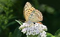
- Nomination The Silver-washed Fritillary (Argynnis paphia) --Richard Bartz 19:39, 21 August 2007 (UTC)
- Promotion Good composition, light. Acceptable technical condition. --Beyond silence 03:42, 22 August 2007 (UTC)
-

- Nomination Map of the andalusí city of Saraqusta (nowadays Saragossa, Aragon) --Willtron 16:23, 21 August 2007 (UTC)
- Promotion Good detail & colours. Please write an English description! --Beyond silence 21:04, 21 August 2007 (UTC)
-

- Nomination Glass Fishing Float. --Digon3 talk 15:52, 21 August 2007 (UTC)
- Promotion Good enough as an illustrative picture though I would prefer with a natural background - Alvesgaspar 23:14, 21 August 2007 (UTC)
-

- Nomination Merovingian buckle. Vassil 15:08, 21 August 2007 (UTC)
- Decline Really massive noisy - sorry. --Beyond silence 08:27, 22 August 2007 (UTC)
-

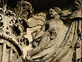
- Nomination Apotheosis of Charles VI- Fresco of Paul Troger (1739) - Imperial Stair Case - Göttweig Abbey, Austria. Alberto Fernandez Fernandez 13:41, 21 August 2007 (UTC)
- Promotion Nice detail., crop. Thanks --Beyond silence 21:00, 21 August 2007 (UTC)
-

- Nomination Alleyway and cat in Rogaro di Tremezzo --Aconcagua 08:15, 21 August 2007 (UTC)
- Promotion Nice composition, sharpness. Thanks --Beyond silence 20:55, 21 August 2007 (UTC)
-

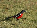
- Nomination Red Headed Finch ♀, Amadina erythrocephala at Sossusvlei, Namib desert, Namibia. -- Lycaon 07:32, 21 August 2007 (UTC)
- Promotion While a bit blurry at the edges, most of the body seems reasonably sharp, and the side profile shot is good. -YooChung 08:20, 22 August 2007 (UTC)
-

- Nomination Walls of Dubrovnik--Beyond silence 00:31, 21 August 2007 (UTC)
- Promotion Good composition, lighting and atmosphere. Nice contrasts between sharp foreground and hazy background. -- MJJR 19:10, 21 August 2007 (UTC)
-

- Nomination Tiled roof in Dubrovnik--Beyond silence 06:49, 21 August 2007 (UTC)
- Promotion I think the result is on the borderline though the exposure choice doesn't appear to be the best one for this subject. With a larger F number the picture should be sharper - Alvesgaspar 23:17, 21 August 2007 (UTC)
I think that f/4 is a good choice. It's a compact camera, 1/1.7" inch sensor, so pretty much any added lens performance will probably ofset by diffraction. Thegreenj 03:24, 22 August 2007 (UTC)
-

-

- Nomination Two black crowned cranes (another pic with the two heads in light).Vassil 10:00, 20 August 2007 (UTC)
- Promotion Good composition, acceptable technical condition.--Beyond silence 03:52, 22 August 2007 (UTC)
-

- Nomination Enamel on copper,Limoges, 17th century:Saint Gregorius.Vassil 09:46, 20 August 2007 (UTC)
- Decline Can you reduce the noise? --Beyond silence 00:34, 21 August 2007 (UTC)*
 InfoThis is a new version,I tried to fix it.Vassil 00:26, 22 August 2007 (UTC)
 Oppose lot's of CA. Lycaon 10:44, 22 August 2007 (UTC)
-

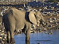
- Nomination A HUGEEE elphant. isnt he cute? -LadyofHats 11:19, 20 August 2007 (UTC)
- Decline Bad crop. Sorry. --Lestat 21:08, 21 August 2007 (UTC)
-

- Nomination A rather smaller elphant. isnt he cute too? -LadyofHats 11:31, 20 August 2007 (UTC)
- Decline Image has a cartoonish look, probably from aggressive noise reduction @ 200 ISO. Very little fine detail. Effective resolution is very low. -- Ram-Man 02:01, 22 August 2007 (UTC)
-

- Nomination Walls of Dubrovnik--Beyond silence 22:54, 19 August 2007 (UTC)
- Promotion i dont seem able to find a reason why not to accept this one LadyofHats 16:11, 21 August 2007 (UTC)
-

- Nomination Upper reaches of the Rhone river. --Dschwen 15:58, 19 August 2007 (UTC)
- Promotion CommentI think after some postprocessing it can be a QI, but now it has too much problem.--Beyond silence 20:28, 19 August 2007 (UTC). Can you be more specific about problems? -Tony Wills 01:38, 20 August 2007 (UTC) For me it's OK - QI. --Lestat 21:13, 21 August 2007 (UTC)
-
- Nomination Egg shaped puffball after expelling spores --Tony Wills 10:13, 19 August 2007 (UTC)
- Decline Are you sure it is Lycoperdon and not Bovistella? -- Lycaon 16:03, 19 August 2007 (UTC). Backed off to Lycoperdaceae until more certain id. --Tony Wills 01:36, 20 August 2007 (UTC)
Lighting and color balance are less than ideal. Unsharp from diffraction. -- Ram-Man 01:56, 22 August 2007 (UTC)
-

-
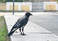
- Nomination Shabby crow #!George Shuklin 20:32, 17 August 2007 (UTC)
- WARNING: third template parameter added – please remove.
-
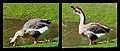
- Nomination A drinking goose. Vassil 18:38, 16 August 2007 (UTC)
- Decline Well, that is one way to get around the size guidelines, but the bottom edge and bottom left corners of both pictures looks ragged - can that be cleaned up? --Tony Wills 11:49, 18 August 2007 (UTC)
Ugly black frame, separate images too small. Lycaon 16:12, 19 August 2007 (UTC) Comment To be fair we are not evaluating photographs but image files, this is a single image in the same way a panorama is so you can't complain parts of it are too small! --Tony Wills 11:29, 20 August 2007 (UTC)
Yes, but a panorama's size is made up of "unique" (can't find the right word) but connected areas, somewhat equatable to a large photo, whereas this is 90% the same picture and not at all like a single picture. Thegreenj 22:07, 21 August 2007 (UTC)
-

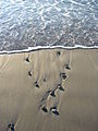
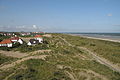
- Nomination What do those lines in the sand mean? --Tony Wills 12:38, 16 August 2007 (UTC)
- Promotion Comment: It's a message for the crop circle creating hedgehogs... --LC-de 14:30, 16 August 2007 (UTC). Sufficiently sharp, nice light and posture of the bird. Is it really that red or have you given it an extra turn on the saturation knob? -- Slaunger 03:13, 19 August 2007 (UTC)
No, I haven't processed the image apart from removing purple fringing from the edges of some white areas (eg feathers), under bright sunlight and subject quite close. Can show you original image if interested :-). --Tony Wills 08:42, 19 August 2007 (UTC)
The lines in the sand are a flood mark. Btw, full support. Lycaon 10:39, 22 August 2007 (UTC)
-

- Nomination M-Pio FL100 MP3 Player, HDR image --Willtron 22:56, 20 August 2007 (UTC)
- Decline Noise, DOF. Sorry, you may improve it & renominate. --Beyond silence 00:44, 21 August 2007 (UTC)
-
-
-

-

-

-

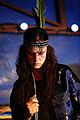
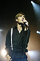
- Nomination Manu Moreau (The Viking) of Cré Tonnerre, a folk music band from Belgium.Vassil 16:52, 20 August 2007 (UTC)
- Decline Tough one... I like it, but it's very noisy. What do other people think ? Benh 20:24, 20 August 2007 (UTC)
Yeah, sorry but face unclear. Seems like the focus is on the microphone. --Orlovic (talk) 21:15, 20 August 2007 (UTC)
-
- Nomination This is a restitch of this QI image . -- Klaus with K 15:23, 20 August 2007 (UTC)
- Promotion Solid quality pano, res is not super-exciting, but I see no show stoppers for this one. --Dschwen 22:08, 20 August 2007 (UTC)
-
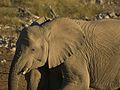
- Nomination Loxodonta africana a huge and a not so huge elephant ;-) -- Lycaon 14:14, 20 August 2007 (UTC)
- Promotion Good light and sharpness. --Beyond silence 00:26, 21 August 2007 (UTC)
-

- Nomination Stained glass in Historical museum in Lviv (Ukraine). --Lestat 13:59, 20 August 2007 (UTC)
- Promotion Good expose and sharpness. --Beyond silence 17:51, 20 August 2007 (UTC)
-

- Nomination Praying mantis, Sphodromantis viridis. --Adamantios 13:57, 20 August 2007 (UTC)
- Promotion Nicely done. Thegreenj 01:38, 21 August 2007 (UTC)
-

- Nomination Detail of the facade of the pharmacy "Zum weißen Engel" - Oskar Laske (1901-1902) - Vienna, Austria -- Alberto Fernandez Fernandez 13:21, 20 August 2007 (UTC)
- Promotion Nice composition, colours and sharpness. QI --Beyond silence 17:55, 20 August 2007 (UTC)
-

- Nomination Tübingen Neckarfront - after 3rd-person nomination just failed FP by one vote — what is the opinion regarding QI? -- Klaus with K 12:53, 20 August 2007 (UTC)
- Promotion QI looks favourable upon you. Technically this picture is very good. Lycaon 13:44, 20 August 2007 (UTC)
-

- Nomination Castanea sativa --Aconcagua 10:04, 20 August 2007 (UTC)
- Promotion Good focus, light, composition - acceptable.--Beyond silence 17:53, 20 August 2007 (UTC)
-

- Nomination Nymphaea alba --Aconcagua 10:04, 20 August 2007 (UTC)
- Decline Really overexposed - sorry. --Beyond silence 17:53, 20 August 2007 (UTC)
-
- Nomination Vaccinium myrtillus --Aconcagua 10:04, 20 August 2007 (UTC)
- Promotion Little bit of noise in the BG, but just passed my eagle eye ;-). Nice pic. Lycaon 18:02, 20 August 2007 (UTC)
-

- Nomination the skin is what makes them so special.. it looks like paper -LadyofHats 11:31, 20 August 2007 (UTC)
- Promotion Acceptable technical condition. --Beyond silence 03:26, 21 August 2007 (UTC)
-
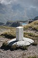
- Nomination Boundary stone, swiss side. --Dschwen 07:16, 20 August 2007 (UTC)
- Promotion Very good sharpness, nice background. --Beyond silence 00:40, 21 August 2007 (UTC)
-

- Nomination Walls of Dubrovnik--Beyond silence 22:54, 19 August 2007 (UTC)
- Promotion Pleasant composition, decent quality. --Dschwen 22:10, 20 August 2007 (UTC)
-

- Nomination Antique iron heater, from by grand-grand mother. #!George Shuklin 19:59, 19 August 2007 (UTC)
- Promotion Acceptable technical condition. --Beyond silence 03:11, 21 August 2007 (UTC)
-

- Nomination Rovinj, a beautiful town in Istria, Croatia --Orlovic (talk) 00:31, 19 August 2007 (UTC)
- Promotion Nice colours & lighting, not bad composition. --Beyond silence 03:13, 21 August 2007 (UTC)
-

- Nomination Rudbeckia, with white background. --moralist 15:48, 17 August 2007 (UTC)
- Decline it has a very closed focus so that must of the picture is afected -LadyofHats 08:47, 21 August 2007 (UTC)
-
- Nomination Juliette Lewis -- Rama 13:38, 14 August 2007 (UTC)
- Decline moved, bad composition, too dark -LadyofHats 16:20, 20 August 2007 (UTC)
-

- Nomination Juliette and the Licks -- Rama 13:38, 14 August 2007 (UTC)
- Decline very bad light all colors are lost, not a very interesting composition either -LadyofHats 16:19, 20 August 2007 (UTC)
-

- Nomination Juliette Lewis -- Rama 13:38, 14 August 2007 (UTC)
- Decline too dark, the black background takes out a lot of deepness-LadyofHats 16:19, 20 August 2007 (UTC)
-

- Nomination Juliette Lewis -- Rama 13:38, 14 August 2007 (UTC)
- Decline too much of the image goes into the dark, could be tecnically aceptable but the composition is poor, the next one has a much better composition-LadyofHats 16:19, 20 August 2007 (UTC)
-

- Nomination Juliette Lewis -- Rama 13:38, 14 August 2007 (UTC)
- Promotion much better than the other one, the empty space compensates her form, and since the light breaks the black thisone looses weight. i think this one can be a QI-LadyofHats 16:19, 20 August 2007 (UTC)
-

- Nomination Flower of the Acanthus mollis -- MJJR 20:08, 12 August 2007 (UTC)
 Question I can not see the picture, why? --Beyond silence 14:33, 17 August 2007 (UTC) Comment On my computer the picture is normally visible. Do others also have problems with this picture? Perhaps uploading again can resolve the problem? -- MJJR 20:39, 17 August 2007 (UTC)
 - Promotion * a tic overexposed and a very straight foward composition. also a snail left a very unadecuate hole in one of the flowers. still all in all i do like this one-LadyofHats 16:09, 20 August 2007 (UTC)
- Nomination Flower of the Acanthus mollis -- MJJR 20:08, 12 August 2007 (UTC)
-
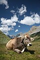
- Nomination Swiss Alps stereotype :-). --Dschwen 20:47, 19 August 2007 (UTC)
- Promotion Very nice composition, good sharp cow! --Beyond silence 22:44, 19 August 2007 (UTC)
-

- Nomination Podisma pedestris, grasshopper. --Dschwen 16:59, 19 August 2007 (UTC)
- Promotion Very good sharpness at full size too, gratulation. --Beyond silence 18:31, 19 August 2007 (UTC)
-

-
-

-
-

-

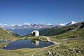
- Nomination Nunâ island east of Upernavik, Greenland. New stich and crop, not sharpened. -- Slaunger 01:26, 16 August 2007 (UTC)
- Promotion Support improved version. High res, good composition. Could benefit of a carefully applied sophisticaded sharpening plugin. --Ikiwaner 17:34, 16 August 2007 (UTC). Comment There were some stitching problems in this version too, and I have taken the liberty to change to an improved photo, where noise in the sky has also been adressed. -- Slaunger 16:57, 19 August 2007 (UTC)
-

- Nomination Quartz Crystal --Digon3 talk 17:54, 11 August 2007 (UTC)
- Decline Unsharp. Either focus is off, camera was shaking, or lens is unsharp. Try shooting at f/4 for more sharpness and DoF. -- Ram-Man 01:51, 17 August 2007 (UTC)*I cannot manually change the aperture in my camera. I am stuck at f/2.8 this close to the subject. --Digon3 talk 13:40, 17 August 2007 (UTC)
May I suggest shooting subjects which are wurther away from your camera instead? You probably made the most of the pic given your cameras limitations, but insufficient equipment (please excuse the exageration) should be no justification for QI status. --Dschwen 16:24, 19 August 2007 (UTC)
-

- Nomination View on Dubrovnik --Beyond silence 07:01, 19 August 2007 (UTC)
- Promotion QI quality. where is the Exif, btw? Lycaon 07:59, 19 August 2007 (UTC)
-
- Nomination sharp photo from above. Fabelfroh 07:38, 19 August 2007 (UTC)
- Promotion Good sharpness, beautiful colours! --Beyond silence 07:56, 19 August 2007 (UTC)
-

- Nomination big sharp photo. Fabelfroh 07:38, 19 August 2007 (UTC)
- Promotion Well focused, valuable composition. --Beyond silence 07:56, 19 August 2007 (UTC)
-

- Nomination big sharp photo. Fabelfroh 07:38, 19 August 2007 (UTC)
- Promotion Very good sharpness. --Beyond silence 07:56, 19 August 2007 (UTC)
-

-

- Nomination Ortspitze, Veste Niederhaus, Veste Oberhaus, confluence of Danube, Inn and Ilz in Passau. Aconcagua 09:54, 18 August 2007 (UTC)
- Decline Sharpness, overexpose. Sorry --Beyond silence 21:27, 18 August 2007 (UTC)
-
-
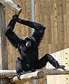
- Nomination A siamang in a zoo. Vassil 23:10, 17 August 2007 (UTC)
- Promotion Nice capture of subject. Technicaly near acceptable. --Beyond silence 07:06, 19 August 2007 (UTC)
-

- Nomination English Garden, Munich. --Lerdsuwa 17:15, 17 August 2007 (UTC)
- Decline Much shadow, composition, distortion - sorry --Beyond silence 04:15, 19 August 2007 (UTC)
-

-

- Nomination Pinus nigra bark closeup. -- Ram-Man 02:02, 17 August 2007 (UTC)
- Promotion Good sharpness. --Beyond silence 00:57, 19 August 2007 (UTC)
-

- Nomination Iris pseudacorus flower. -- Ram-Man 01:34, 17 August 2007 (UTC)
- Decline Unnatural background and low contrast. Lycaon 12:55, 18 August 2007 (UTC)
-

- Nomination Chamaecyparis pisifera bark. -- Ram-Man 01:34, 17 August 2007 (UTC)
- Promotion Acceptable sharpness and lighting. --Beyond silence 00:55, 19 August 2007 (UTC)
-
- Nomination Gentiana pneumonanthe photo from aside. Fabelfroh 09:09, 17 August 2007 (UTC)
- Promotion Technically sufficient for QI. Lycaon 12:55, 18 August 2007 (UTC)
-

- Nomination Diesel locomotive of HŽ --Orlovic (talk) 16:19, 16 August 2007 (UTC)
- Decline Noise, expose. Sorry --Beyond silence 00:53, 19 August 2007 (UTC)
-

- Nomination Unknown Bivalve, (Familia: Pectinidae) --Digon3 talk 14:18, 15 August 2007 (UTC)
- Decline Has bad lighting and less sharpness. Sorry --Beyond silence 18:08, 18 August 2007 (UTC)
-

- Nomination Tokyo Ska Paradise Orchestra -- Rama 16:38, 10 August 2007 (UTC)
- Decline Not a bad composition, but really noisy, and several tech. problem as overexp. parts & sharpness. Sorry --Beyond silence 17:49, 18 August 2007 (UTC)
-

- Nomination Fruits of Trollius europaeus, pretty sharp and great background. Fabelfroh 06:26, 23 August 2007 (UTC)
- Decline too small. Lycaon 07:27, 23 August 2007 (UTC)
-

- Nomination big image with stunning details. Fabelfroh 09:11, 18 August 2007 (UTC)
- Promotion Lives up to your promotional description :-) --Tony Wills 12:02, 18 August 2007 (UTC)
-

- Nomination big sharp image. Fabelfroh 09:11, 18 August 2007 (UTC)
- Promotion No doubt, a pity that the right wing is unfocused - Alvesgaspar 11:30, 18 August 2007 (UTC)
-

-

- Nomination Wild Lantana --Digon3 talk 19:05, 17 August 2007 (UTC)
- Decline I'm smiling because I'm starting in macro photography and took a lot of similar flowers too :) Given the subject and apparent conditions, I expect this to be sharper. Also, I think a narrower DOF could improve it. Benh 23:01, 17 August 2007 (UTC)
-

-

- Nomination Magnolia sprengeri 'Diva' leaves. -- Ram-Man 01:34, 17 August 2007 (UTC)
- Promotion Nice composition acceptable detail.--Beyond silence 02:32, 18 August 2007 (UTC)
-

- Nomination Magnolia sprengeri 'Diva' leaf. -- Ram-Man 01:34, 17 August 2007 (UTC)
- Promotion Nice composition and sharpness. --Beyond silence 02:32, 18 August 2007 (UTC)
-

- Nomination Magnolia sprengeri 'Diva' fruit. -- Ram-Man 01:34, 17 August 2007 (UTC)
- Promotion Well focused. --Beyond silence 14:30, 17 August 2007 (UTC)
-

- Nomination Styrax obassia leaf. -- Ram-Man 01:34, 17 August 2007 (UTC)
- Promotion Very good lighting and sharpness. --Beyond silence 14:30, 17 August 2007 (UTC)
-

- Nomination Chamaecyparis pisifera leaves. -- Ram-Man 01:34, 17 August 2007 (UTC)
- Promotion Nearly well focused, can be better but technicaly acceptable to a QI. --Beyond silence 14:28, 17 August 2007 (UTC)
-

- Nomination Old Town Passau with the Inn River and the Cathedral --Aconcagua 14:46, 17 August 2007 (UTC)
- Decline Sharpness, expose. sorry --Beyond silence 00:29, 18 August 2007 (UTC)
-

- Nomination Windmill of Moidrey, not so far from Mont Saint-Michel. I think it's nicely taken and hope you agree - Benh 22:33, 16 August 2007 (UTC)
- Promotion Please for description in en. --Lestat 13:00, 17 August 2007 (UTC) QuestionThe building seems to have a conical shape. Does that reflect reality, or is it due to geometric distortion? - Till 13:05, 17 August 2007 (UTC) Comment I added a description in English. Yes, the lower part isn't a straight cylinder, it is slightly conical. I think the point of view, from below, emphasizes that. Benh 22:48, 17 August 2007 (UTC)//PRO: technicaly acceptable, nice light. --Beyond silence 23:45, 17 August 2007 (UTC)
-
- Nomination Details of the Georges Pompidou centre, in Paris. I love it, but wonder if you agree. If it gets promoted here, I'll nominate for FP - Benh 22:10, 16 August 2007 (UTC)
- Promotion No doubt this is a high quality image. But I'm not so sure that is enough for FP... Alvesgaspar 23:19, 16 August 2007 (UTC) Thanks for the feedback. I think I'll still give it a try, after getting a HDR version of it (I'm currently working on that). Hopefully, this will improve the picture. Benh 22:55, 17 August 2007 (UTC)
-

- Nomination Pump those wings and run like hell --Tony Wills 12:38, 16 August 2007 (UTC)
- Promotion Great composition, IMHO. Motion blur yes, well, there's a lot of motion happening. Ben Aveling 09:05, 18 August 2007 (UTC)
-

-

-

- Nomination English Oak (Quercus robur 'Fastigiata') leaves. -- Ram-Man 00:21, 14 August 2007 (UTC)
- Promotion Good sharpness. --Beyond silence 14:34, 17 August 2007 (UTC)
-

- Nomination Pyrite --Digon3 talk 17:54, 11 August 2007 (UTC)
- Decline Unsharp. Either focus is off, camera was shaking, or lens is unsharp. Try shooting at f/4 for more sharpness and DoF. -- Ram-Man 01:51, 17 August 2007 (UTC)*I cannot manually change the aperture in my camera. I am stuck at f/2.8 this close to the subject. --Digon3 talk 13:40, 17 August 2007 (UTC)
-

- Nomination Limpet Shell --Digon3 talk 17:54, 11 August 2007 (UTC)
- Decline Unsharp. Either focus is off, camera was shaking, or lens is unsharp. Try shooting at f/4 for more sharpness and DoF. -- Ram-Man 01:51, 17 August 2007 (UTC)*I cannot manually change the aperture in my camera. I am stuck at f/2.8 this close to the subject. --Digon3 talk 13:40, 17 August 2007 (UTC)
-

- Nomination Sandstone --Digon3 talk 17:54, 11 August 2007 (UTC)
- Decline Too large of an aperture. Not sharp enough for a studio shot. -- Ram-Man 01:47, 17 August 2007 (UTC)*I cannot manually change the aperture in my camera. I am stuck at f/2.8 this close to the subject. --Digon3 talk 13:40, 17 August 2007 (UTC)
-
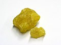
- Nomination Tourmaline Mineral Thanks Lycaon --Digon3 talk 16:52, 9 August 2007 (UTC)
- Decline
This has the same green tint as below (compare to the alternative linked on image description page).Reuploaded version is way better. Now only the ID is missing. --Dschwen 18:24, 9 August 2007 (UTC) Info I think it's a tourmaline. Vassil 00:14, 10 August 2007 (UTC)Filename changed and Identified. --Digon3 talk 13:02, 10 August 2007 (UTC). Oppose Not in focus not sharp no DOF, it's not going to move, how about higher f-stop, longer exposure? --Tony Wills 11:20, 18 August 2007 (UTC)
-

- Nomination Pinus nigra bark. -- Ram-Man 02:33, 17 August 2007 (UTC)
- Promotion - Benh 06:39, 17 August 2007 (UTC)
-

- Nomination Detail of Sorensen's Catchfly, Upernavik, Greenland -- Slaunger 01:47, 17 August 2007 (UTC)
- Decline I like the composition but the picture is just too noisy and with jpeg artifacts. The DOF should be much higher too. Alvesgaspar 10:04, 17 August 2007 (UTC)
-

- Nomination Fraxinus pennsylvanica bark. -- Ram-Man 01:34, 17 August 2007 (UTC)
- Promotion A bit bit dissapointing when seen at real size, but good enough - Benh 06:39, 17 August 2007 (UTC)
-

- Nomination Iris pseudacorus flower. -- Ram-Man 01:34, 17 August 2007 (UTC)
- Decline Unfortunate composition and crop, too shallow DOF. Alvesgaspar 09:59, 17 August 2007 (UTC)
-
![* Nomination Sulphur Tuft (Hypholoma fasciculare]]) --LC-de 16:52, 16 August 2007 (UTC) * Promotion Good image of the stipe and cap, but you should not have taken a bite out of them while filming :-) --Tony Wills 23:49, 16 August 2007 (UTC)](https://upload.wikimedia.org/wikipedia/commons/thumb/1/1c/Hypholoma_fasciculare_LC0091.jpg/120px-Hypholoma_fasciculare_LC0091.jpg)
- Nomination Sulphur Tuft (Hypholoma fasciculare]]) --LC-de 16:52, 16 August 2007 (UTC)
- Promotion Good image of the stipe and cap, but you should not have taken a bite out of them while filming :-) --Tony Wills 23:49, 16 August 2007 (UTC)
-

- Nomination Diesel locomotive of HŽ --Orlovic (talk) 15:44, 16 August 2007 (UTC)
- Decline Loco too dark. --Beyond silence 15:52, 16 August 2007 (UTC)
-

- Nomination Head of a hornet (Vespa crabo) - Alvesgaspar 15:29, 16 August 2007 (UTC)
- Promotion You've got a new camera, and it shows ! Maybe composition is a bit messy but otherwise, it's really nice. Benh 22:10, 16 August 2007 (UTC)
-

-

- Nomination Baden Railway station --Ikiwaner 21:46, 15 August 2007 (UTC)
- Decline The image is pixelated when seen in full size. Also, but this was not the reason for opposing, it seems a little overexposed or not contrasted enough (I might be wrong on this point) - Alvesgaspar 23:23, 16 August 2007 (UTC)
-
- Nomination Carex dioica, photo of a tiny, rare male plant. Fabelfroh 12:31, 15 August 2007 (UTC)
- Decline Rare or not, too low DoF and resolution. Try shooting at f/8 to f/11. -- Ram-Man 02:26, 17 August 2007 (UTC)
-

- Nomination Carex dioica, photo of a tiny, rare female plant. Fabelfroh 12:31, 15 August 2007 (UTC)
- Decline Rare or not, too low DoF and resolution. Try shooting at f/8 to f/11. -- Ram-Man 02:26, 17 August 2007 (UTC)
-

-

-

- Nomination Close-up of arctic chickweed (Cerastium arcticum) from Upernavik, Greenland. A small anonymous flower, which looks much more appealing when you get really close. -- Slaunger 01:12, 14 August 2007 (UTC)
- Decline Very noisy. Resolution is also moderately low. -- Ram-Man 02:18, 17 August 2007 (UTC)
-

-

-
-

-

-

-

-

- Nomination Eye on objetive by User:Rubashkyn --Tony Wills 05:53, 12 August 2007 (UTC)
- Decline Noisy and poor white balance. -- Ram-Man 01:54, 17 August 2007 (UTC)
-

- Nomination Fortifications at Ston (Croatia). --Beyond silence 00:45, 12 August 2007 (UTC)
- Promotion Good enough. -- Ram-Man 01:54, 17 August 2007 (UTC)
-
- Nomination Biokovo mountain at Baška Voda --Beyond silence 18:55, 6 August 2007 (UTC)
- Promotion I'm normally picky with my landscape evals, but I think this one is just good enough. -- Ram-Man 01:45, 17 August 2007 (UTC)
-

-
- Nomination Cityhall in Otmuchów. --Lestat 11:31, 11 August 2007 (UTC)
- Decline Unsharp from using too small an aperture (diffraction). This image is how it should have been taken. -- Ram-Man 01:44, 17 August 2007 (UTC)
-

-

-

-

-
-

-

-

-

-

-

- Nomination A lady bug --Richard Bartz 09:51, 7 August 2007 (UTC)
- Decline Comment Nice photo, but a more specific id of the coccinellidae would be nice if possible. There are 7 sub-families, about 360 genera and 5000 species in this family! (Could it be Coccinella septempunctata?) Also, I suggest to add the image to the Bupleurum falcatum species gallery. -- Slaunger 17:12, 13 August 2007 (UTC) Oppose Unsharp despite high resolution. -- Ram-Man 01:26, 17 August 2007 (UTC)
-

- Nomination Panel of glazed tiles representing Henry the Navigator at the Sagres Promontory. Lisboa, Portugal - Alvesgaspar 20:39, 15 August 2007 (UTC)
- Promotion Sharp, no geometrical distortion, perfect lighting. - Till 21:35, 15 August 2007 (UTC)
-

- Nomination Illustration of the photographic technique of contre-jour. Porto Covo, Portugal - Alvesgaspar 20:39, 15 August 2007 (UTC)
- Promotion Good composition, technicaly acceptable. --Beyond silence 23:52, 15 August 2007 (UTC)
-

- Nomination Colorium office building in Düsseldorf, Germany - Till 20:36, 15 August 2007 (UTC)
- Promotion Good angle, sharpness, light. --Beyond silence 01:22, 16 August 2007 (UTC)
-

- Nomination Pink Coral Fungus --Tony Wills 10:57, 15 August 2007 (UTC)
- Promotion Technicaly acceptable. --Beyond silence 23:57, 15 August 2007 (UTC)
-

- Nomination The island Nunâ east of Upernavik, Greenland. -- Slaunger 01:58, 15 August 2007 (UTC)
- Decline Please retouch this black thing sticking out of the left image border. Will be QI then. --Ikiwaner 20:34, 15 August 2007 (UTC)...and there is a really bad stitch close to it. I'm withdrawing my nomination and nominating a new file instead. -- Slaunger 23:38, 15 August 2007 (UTC)
-

- Nomination Aporia crataegi, sharp photo from aside. Fabelfroh 12:31, 15 August 2007 (UTC)
- Promotion Good composition, technicaly acceptable. --Beyond silence 23:52, 15 August 2007 (UTC)
-

- Nomination English Oak (Quercus robur 'Fastigiata') bark. -- Ram-Man 00:21, 14 August 2007 (UTC)
- Promotion Illustrative and sharp. Thegreenj 00:32, 16 August 2007 (UTC)
-

- Nomination Pillnitz, Germany --Kolossos 16:06, 13 August 2007 (UTC)--Kolossos 16:06, 13 August 2007 (UTC)
- Promotion Nice detail and a good picture in general. --Thermos 17:17, 13 August 2007 (UTC)
Info: I work a little bit on the image (resolution and verticals). I hope this is ok. --Kolossos 06:39, 16 August 2007 (UTC)
-

- Nomination Old World Swallowtail (Papilio machaon) --LC-de 23:51, 10 August 2007 (UTC)
- Promotion Beatiful picture and good photographic technique. The body of the insect is sharp and clear. Some motion blur in the wings is no problem. - Alvesgaspar 20:45, 15 August 2007 (UTC)
-
-

- Nomination Sick of it all guitarist --Rama 19:14, 9 August 2007 (UTC)
- Promotion Soft focus, but lots of pixels. --Dschwen 22:14, 9 August 2007 (UTC) Good composition, value, technicaly acceptable. --Beyond silence 01:25, 16 August 2007 (UTC)
-

- Nomination Phoenix singer --Rama 19:14, 9 August 2007 (UTC)
- Promotion Good composition, value, technicaly acceptable. --Beyond silence 01:25, 16 August 2007 (UTC)
-

- Nomination The Small White (Pieris rapae) is a small to mid-sized butterfly species of the Yellows-and-Whites family Pieridae. Here with a amazing close up. --Richard Bartz 09:51, 7 August 2007 (UTC)
- Decline I think this picture was heavily oversharpened. This would be correctable if you have kept the RAW-files or resize the image. And I want to hear a second opinion on this pic. --LC-de 11:38, 8 August 2007 (UTC)
I'll second that - the detail looks good, the halos don't. Thegreenj 15:25, 8 August 2007 (UTC)--yeah i do agree it has some strange sharpen efect-LadyofHats 10:31, 16 August 2007 (UTC)
-

- Nomination Zwitscher Heupferd, Tettigonia cantans in front of blue sky --Richard Bartz 09:51, 7 August 2007 (UTC)
- Decline Why is the sky around the head darker? The sky looks like painted: No structure and grain. Otherwise good composition. --Ikiwaner 21:52, 13 August 2007 (UTC)** the edges on top are so blury and those inside the image so fine that lets me think that the image was edited, the insect is clearly too exposed -LadyofHats 10:31, 16 August 2007 (UTC)
-

- Nomination Evening panorama of Upernavik, Greenland. -- Slaunger 22:57, 14 August 2007 (UTC)
- Promotion Nice panorama nd light, good composition. --Beyond silence 03:46, 15 August 2007 (UTC)
-

- Nomination Meadow Brown (Maniola jurtina) --LC-de 20:13, 14 August 2007 (UTC)
- Promotion Good sharp on subject. --Beyond silence 03:46, 15 August 2007 (UTC)
-

- Nomination Pores of Boletus erythropus --LC-de 18:23, 14 August 2007 (UTC)
- Promotion Good sharpness. --Beyond silence 03:54, 15 August 2007 (UTC)
-

- Nomination Boletus erythropus --LC-de 18:15, 14 August 2007 (UTC)
- Promotion Great sharpness! --Beyond silence 03:54, 15 August 2007 (UTC)
-

- Nomination Paul Simonon -- Rama 13:38, 14 August 2007 (UTC)
- Promotion Good moment and sharpnes on face! --Beyond silence 03:52, 15 August 2007 (UTC)
-

- Nomination Paul Simonon -- Rama 13:38, 14 August 2007 (UTC)
- Promotion Good composition and sharpnes on face! --Beyond silence 03:52, 15 August 2007 (UTC)
-

- Nomination Flame Azalea (Rhododendron calendulaceum 'Mandarin Red') flowers. -- Ram-Man 02:07, 14 August 2007 (UTC)
- Promotion Good technical condition. --Beyond silence 03:43, 15 August 2007 (UTC)
-

- Nomination Interchange from plane -- Rama 20:37, 13 August 2007 (UTC)
- Decline Unusual and beautiful shot but image is too noisy. Alvesgaspar 12:14, 14 August 2007 (UTC)
-

- Nomination Female Red-veined darter (Sympetrum fonscolombei) - Alvesgaspar 12:28, 13 August 2007 (UTC)
- Promotion Not as attractive a view as the others and head is out of focus. But a rear view is useful and informative, and the image is technically very good. So QI :-) --Tony Wills 11:07, 15 August 2007 (UTC)
-

- Nomination Chalcopyrite --Dschwen 20:02, 8 August 2007 (UTC)
- Promotion The gold of the fools! Good enough for illustration purposes - Alvesgaspar 15:37, 14 August 2007 (UTC)
-

- Nomination Colorful impression of a street fair in Little Italy, NYC. --Dschwen 13:30, 8 August 2007 (UTC)
- Promotion I like it despite the unorthodox tilt (but I hate capsicum!) - Alvesgaspar 15:34, 14 August 2007 (UTC)
-

- Nomination Keyhole for a skeleton key Thegreenj 04:29, 7 August 2007 (UTC)
- Promotion Can you straighten it? Lycaon 22:08, 9 August 2007 (UTC)
Done.Thegreenj 14:15, 12 August 2007 (UTC)
Issues resolved. Good quality. Lycaon 14:51, 12 August 2007 (UTC)
Because of naming issues, I have replaced the picture with an identical but renamed image. Thegreenj 20:16, 14 August 2007 (UTC)
-

- Nomination Monorail train and Hotel Cosmos. Moscow. --Alex Rave 20:35, 13 August 2007 (UTC)
- Decline Shadow, tilted, bad composition, low sharpness. Sorry, good luck at next time! --Beyond silence 23:26, 13 August 2007 (UTC)
-

- Nomination Small Balsam (Impatiens parviflora) --LC-de 19:53, 13 August 2007 (UTC)
- Promotion Good composition. Technicaly acceptable. --Beyond silence 23:55, 13 August 2007 (UTC)
-

- Nomination Heraldry,Meissen, Germany --Kolossos 16:06, 13 August 2007 (UTC)
- Promotion Good sharpnes and light, clean composition by crop. --Beyond silence 23:29, 13 August 2007 (UTC)
-

-

-
- Nomination Female Red-veined darter (Sympetrum fonscolombei) - Alvesgaspar 12:28, 13 August 2007 (UTC)
- Promotion Whole body in good focus, clear, crisp, good seperation from background, great image :-) --Tony Wills 12:52, 13 August 2007 (UTC)
-
- Nomination Male Red-veined darter (Sympetrum fonscolombei) - Alvesgaspar 12:28, 13 August 2007 (UTC)
- Promotion Good sharpness, nice composition. --Beyond silence 18:38, 13 August 2007 (UTC)
-
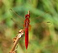
- Nomination Scarlet darter (Crocothermis erythrae) - Alvesgaspar 12:28, 13 August 2007 (UTC)
- Promotion Good sharpness, nice composition. --Beyond silence 18:38, 13 August 2007 (UTC)
-

- Nomination Self-nominating a favorite picture of autumn. --bdesham 06:05, 13 August 2007 (UTC)
- Promotion Good colours, technicaly acceptable. --Beyond silence 18:35, 13 August 2007 (UTC)
-

- Nomination Smolniy Cathedral, Saint Petersburg. #!George Shuklin 22:45, 12 August 2007 (UTC)
- Promotion Good light, composition. Technicaly acceptable.--Beyond silence 18:51, 13 August 2007 (UTC)
-

- Nomination Water tower in Saint Petersburg. #!George Shuklin 21:23, 12 August 2007 (UTC)
- Promotion good composition, nice colours, could be sharper --Ikiwaner 21:26, 13 August 2007 (UTC)
-

- Nomination The lighthouse of Villa Real de Santo António, Portugal -- MJJR 21:03, 12 August 2007 (UTC)
- Decline The image is sharp enough, it's just that I'd like to see more of the tower. You can't see the base, so it is not possible to get an impression of its height. Also, to place the tower in the center of the picture makes it uninteresting. So my reason for declining is composition. - Till 20:31, 13 August 2007 (UTC)
-

- Nomination A cloudy day and a little church in Brittany. Vassil 12:44, 12 August 2007 (UTC)
- Promotion Good sharpness at church. Light not the best, but acceptable. --Beyond silence 23:23, 13 August 2007 (UTC)
-

- Nomination Mossie (Passer melanurus) ay Sossusvlei, Namibia. -- Lycaon 20:57, 10 August 2007 (UTC)
- Promotion Technicaly acceptable. --Beyond silence 22:27, 13 August 2007 (UTC)
-

-

- Nomination Unknown white rock please help identify it. --Digon3 talk 16:52, 9 August 2007 (UTC)
- Promotion Technicaly acceptable, well focused. That's bad it's unknown. --Beyond silence 22:15, 13 August 2007 (UTC)
-

-

- Nomination Braconidae, a parasitic wasp --Richard Bartz 09:51, 7 August 2007 (UTC)
- Decline These little things are difficult to shoot: they are fast fliers and quick on the flowers. But the image is not good enough: unsharpness and obvious colour fringing - Alvesgaspar 14:17, 13 August 2007 (UTC)
-

- Nomination A red wasp --Richard Bartz 09:51, 7 August 2007 (UTC)
- Promotion Nice and sharp, though I don't like the un-orthodox composition... Alvesgaspar 14:14, 13 August 2007 (UTC)
-

- Nomination Light and shadow in the courtyard of the cloister--Szilas 18:41, 6 August 2007 (UTC)
- Decline Comment It's hardly oblique, need to correct I think.--Beyond silence 19:16, 6 August 2007 (UTC) Oppose interesting subject. I don't like the roof sticking out in the middle. The interesting part is too dark. --Ikiwaner 21:43, 13 August 2007 (UTC)
-

- Nomination Portrait of Benoit Mandelbrot. -- Rama 07:34, 13 August 2007 (UTC)
- Decline Sorry, lots of noise. Or should I say "fractal dimension too high" (but I have said this before)?... Alvesgaspar 09:38, 13 August 2007 (UTC)
-

- Nomination Inside the old castle of Castro Marim, Portugal -- MJJR 21:03, 12 August 2007 (UTC)
- Promotion Technicaly acceptable.--Beyond silence 23:45, 12 August 2007 (UTC)
-

-

-
-

-

- Nomination Parnassius apollo, very sharp photo from aside. Fabelfroh 08:54, 12 August 2007 (UTC)
- Promotion Sharp and illustrative --Ikiwaner 09:03, 12 August 2007 (UTC)
-

- Nomination Polyommatus damon, sharp photo from aside. Fabelfroh 08:54, 12 August 2007 (UTC)
- Promotion Well done composition sharp --Ikiwaner 09:03, 12 August 2007 (UTC)
-

- Nomination Pyrite --Digon3 talk 17:54, 11 August 2007 (UTC)
- Promotion Good light and sharpness. --Beyond silence 01:02, 12 August 2007 (UTC)
-

- Nomination House in St. Petersburg #!George Shuklin 17:43, 11 August 2007 (UTC)
- Promotion Good light, technicaly acceptable.--Beyond silence 00:53, 12 August 2007 (UTC)
-

-

- Nomination New and old buildings of Rijeka (2mgpixel not requirement by Tony Wills) --Beyond silence 12:25, 11 August 2007 (UTC)
- Decline Bad crop. ---Lestat 12:40, 11 August 2007 (UTC)
-
-

- Nomination Lesser spotted woodpecker in natural habitat (Dendrocopos Minor). What I would really like to know, is whether images of birds which naturally reside within dense forest can be accepted as QI with branches and such in front of the bird. After all, it may be more authentic way to see such birds. ----Thermos 10:03, 11 August 2007 (UTC)
- Decline Distracting foreground. --Beyond silence 12:28, 11 August 2007 (UTC)
-

- Nomination A candlelight symbolized a hope. Rico Shen 05:28, 11 August 2007 (UTC)
- Decline No, but please try again. This is very close. But it's neither a picture of a candle, nor a picture of a pair of hands holding (lighting?) a candle. Maybe if you had included a bit more of the hands? See File:Dolceacqua43 - Artista locale mentre dipinge un acquarello.jpg, for example. (You also have to be careful with noise, the back hand is not as good as it should be.) Regards, Ben Aveling 12:27, 11 August 2007 (UTC)
-

- Nomination Leptura rubra female --D-Kuru 22:59, 10 August 2007 (UTC)
- Promotion Sharp, a bit dark but enough good. --Beyond silence 00:48, 12 August 2007 (UTC)
-

- Nomination Stronghold in Kłodzko. --Lestat 11:31, 11 August 2007 (UTC)
- Decline Shadow, composition. --Beyond silence 12:12, 11 August 2007 (UTC)
-

-

-

-

- Nomination A hornet with the upper torso of a honeybee, which she gathers for her breed. Trenching the bee in a Bat-like posture lasts less then 20 hectic seconds. Adult Hornets just eat plants-juice. -- --Richard Bartz 17:07, 10 August 2007 (UTC)
- Promotion That's better! Lycaon 17:13, 10 August 2007 (UTC)
-

-

-

-
-

- Nomination Natural Copper Ore --Digon3 talk 15:16, 10 August 2007 (UTC)
- Promotion Obvious posterization in the shadow. --Dschwen 15:42, 10 August 2007 (UTC) Sharp. --Beyond silence 23:39, 10 August 2007 (UTC)
-

-

-

-
-

-

-

-
-

- Nomination Cathedral of Split (2megapixel not requirement by Tony Wills' attitude)--Beyond silence 05:03, 10 August 2007 (UTC)
- Decline Looks crooked, perspective correction would help. The rough corner of the other building is a compositional problem. And yes 2MP is not a size limit, just a guideline, this might be big enough if it was perfect in other respects. --Tony Wills 10:12, 11 August 2007 (UTC)
-

- Nomination Juvenile seagull in flight (Larus michaellis) - Alvesgaspar 17:04, 9 August 2007 (UTC)
- Decline Gull unsharp, noisy sky --Orlovic (talk) 14:34, 10 August 2007 (UTC)
-
- Nomination Galena --Dschwen 20:05, 8 August 2007 (UTC)
- Decline Sharpness, noise. --Beyond silence 23:29, 10 August 2007 (UTC)
-

-

-

-
- Nomination Crocus tommasinianus, new version --LC-de 18:17, 9 August 2007 (UTC)
- Promotion Good sharpness. --Beyond silence 23:09, 9 August 2007 (UTC)
-
- Nomination Common social wasp (Vespula vulgaris) - Alvesgaspar 17:02, 9 August 2007 (UTC)
- Promotion Rather limited DoF (abdomen of the wasp isn't sharp), but very sharp foreground, nice colors and composition. -- MJJR 21:02, 9 August 2007 (UTC)
-

-

-

- Nomination Marilyn Manson --Rama 14:23, 9 August 2007 (UTC)
- Decline Sorry, but no way to promote the picture with all this noise. Composition is not enough. Alvesgaspar 18:25, 9 August 2007 (UTC)
-

- Nomination Marilyn Manson --Rama 14:23, 9 August 2007 (UTC)
- Decline Sorry, but no way to promote the picture with all this noise. Composition is not enough. (Need for a sign!--Beyond silence 21:16, 9 August 2007 (UTC)
-

-

-

- Nomination Great image of delphi. ← Körnerbrötchen - @ 14:09, 9 August 2007 (UTC)
- Decline doesnt meet size rerquirements of at least 1600px Gnangarra 14:13, 9 August 2007 (UTC)
-
-

- Nomination Lavatera maritima--He Who Laughs Last 01:46, 9 August 2007 (UTC)
- Promotion Nice colours and good quality. But why this unfortunate crop? The poor flower needs to breathe! - Alvesgaspar 18:31, 9 August 2007 (UTC)
-

- Nomination ♀ Black-faced Impala (Aepyceros melampus petersi) in Etosha, Namibia. -- Lycaon 23:59, 8 August 2007 (UTC)
- Promotion Beautiful picture! Nice coat texture and the white backgroud is perfect. An obvious candidate to FP - Alvesgaspar 18:29, 9 August 2007 (UTC)
-
-

- Nomination Orsay Museum seen from the right bank of the Seine river, in Paris. Very neatly stitched panorama to my mind (and I don't say that because the author is my friend ;)) -- Benh 21:20, 8 August 2007 (UTC)
- Promotion Very good panorama. Lycaon 21:34, 8 August 2007 (UTC)
More like this please! --Ikiwaner 21:46, 8 August 2007 (UTC) -- Yes! MJJR 21:13, 9 August 2007 (UTC)
-

- Nomination Scoria --Digon3 talk 18:46, 8 August 2007 (UTC)
- Promotion It has a green tint (visible in the shadow) --Dschwen 18:22, 9 August 2007 (UTC) OK, its fixed now. --Digon3 talk 19:19, 9 August 2007 (UTC)
Yes. Your masking is a little off though, you made the out of focus edges sharper than they should be. --Dschwen 21:14, 9 August 2007 (UTC) Good sharpness. --Beyond silence 23:25, 9 August 2007 (UTC)
-

- Nomination unknown species of Salvia --LC-de 18:27, 8 August 2007 (UTC)
- Promotion Good sharpness. --Beyond silence 23:22, 9 August 2007 (UTC)
-

- Nomination Students working on a scanning electron microscope (SEM). --Dschwen 07:03, 8 August 2007 (UTC)
- Promotion Good sharpness on the microscope, valuable. --Beyond silence 23:22, 9 August 2007 (UTC)
-

- Nomination Inside Uina canyon. The trail is blasted into the vertical rock face. --Dschwen 12:40, 7 August 2007 (UTC)
- Promotion Good composition, technicaly acceptable. --Beyond silence 23:17, 9 August 2007 (UTC)
-

- Nomination Swiss mountain village of S'Charl with hikers boarding the last Postbus. --Dschwen 12:40, 7 August 2007 (UTC)
- Promotion Good angle take much valuable object to the view, technicaly acceptable. --Beyond silence 23:17, 9 August 2007 (UTC)
-

- Nomination Breaking wave. Porto Covo, Portugal. - Alvesgaspar 11:53, 7 August 2007 (UTC)
- Decline Tilt horizon! --Simonizer 12:33, 9 August 2007 (UTC)
-

- Nomination Small Skipper (Thymelicus sylvestris) --Simonizer 11:48, 7 August 2007 (UTC)
- Promotion Nice picture, technicaly acceptable. --Beyond silence 23:11, 9 August 2007 (UTC)
-
- Nomination 2 Grashoppers --Richard Bartz 09:51, 7 August 2007 (UTC)
- Decline So good picture, but really noisy. Sorry --Beyond silence 13:24, 9 August 2007 (UTC)
-

- Nomination Aymon Folk Festival: Harmony Glen. Vassil 14:56, 6 August 2007 (UTC)
- Decline Very is not shadows there is overexpose, sorry. --Beyond silence 21:45, 9 August 2007 (UTC)
-

- Nomination Solitary bee on flower (probably a Stelis punctulatissima) - Alvesgaspar 16:42, 8 August 2007 (UTC)
- Promotion Good quality, shrp. --Dschwen 18:10, 8 August 2007 (UTC)
-
- Nomination Wasp looking hoverfly on flower (Chrysotoxum sp.) - Thank you Lycaon - Alvesgaspar 16:16, 8 August 2007 (UTC)
- Decline Sorry, this one is unsharp and has camera shake. --Dschwen 18:10, 8 August 2007 (UTC)
-

- Nomination Diavolezza hut and aerial tram station. The Bernina range with Piz Bernina is visible in the background. --Dschwen 13:09, 8 August 2007 (UTC)
- Promotion Nice composed panorama, well focused.--Beyond silence 15:17, 8 August 2007 (UTC)
-
-

- Nomination Furniture installation tools. --romanm (talk) 12:21, 8 August 2007 (UTC)
- Decline Bad light, expose.--Beyond silence 15:18, 8 August 2007 (UTC)
-
-

- Nomination Agate from Esterel, France Vassil 00:47, 8 August 2007 (UTC)
- Promotion The background could use some cleanup to make it uniformly black. --Dschwen 06:56, 8 August 2007 (UTC)
Did a bit of cleaning.--Lycaon 07:41, 8 August 2007 (UTC)
Yep now I don't see any problems preventing a promotion. --Dschwen 13:41, 8 August 2007 (UTC)
-

-

- Nomination The Tawny Owl (Strix aluco) is a species of owl resident in much of Europe and southern Russia. --Richard Bartz 09:51, 7 August 2007 (UTC)
- Promotion Good sharpness at head. --Beyond silence 13:27, 8 August 2007 (UTC)
-

- Nomination Adult and juvenile seagulss (Larus michahellis) - Alvesgaspar 11:49, 7 August 2007 (UTC)
- Decline Burned out highlights, even the heads of the poor gulls are suffering. Lycaon 18:44, 8 August 2007 (UTC)
-

- Nomination Aymon folk festival: Harmony Glen. Vassil 14:58, 6 August 2007 (UTC)
- Decline Much shadow, hard to see what she does. Sorry --Beyond silence 00:29, 7 August 2007 (UTC)
If you ignore what she is doing it might be a decent portrait... --Dschwen 07:05, 8 August 2007 (UTC)
ack Beyond silence. Lycaon 18:54, 8 August 2007 (UTC)
-
-

- Nomination Settala, Italy - Saint Ambrogio parish church --Luigi Chiesa 21:59, 3 August 2007 (UTC)
- Promotion Borderline case, check if the tower is tilted in real life or should be adjusted 0.1° CCW. Lycaon 07:31, 9 August 2007 (UTC)
-

- Nomination Bird seed dispenser Thegreenj 18:11, 3 August 2007 (UTC)
- Decline CommentNeed to be categorized, I think.--Beyond silence 14:31, 6 August 2007 (UTC)
Sorry. There wasn't a category, so I created one. Thegreenj 04:17, 7 August 2007 (UTC)
Composition: unfortunate crop. Lycaon 07:31, 9 August 2007 (UTC)
-

-
-

-
- Nomination Slate. --Digon3 talk 16:42, 6 August 2007 (UTC)
- Promotion Good technical conditions, value.--Beyond silence 19:18, 6 August 2007 (UTC)
-

- Nomination Yellow Lantana Camara. --Digon3 talk 15:36, 6 August 2007 (UTC)
- Promotion Sharp and valuable on early flower.--Beyond silence 00:32, 7 August 2007 (UTC)
-
- Nomination Yellow Lantana Camara. --Digon3 talk 15:36, 6 August 2007 (UTC)
- Promotion Sharp and valuable on early flower.--Beyond silence 00:32, 7 August 2007 (UTC)
-

- Nomination Aymon folk festival: Harmony Glen. Vassil 14:59, 6 August 2007 (UTC)
- Decline Much shadow, hard to see what she does, bad compostion. Sorry --Beyond silence 00:29, 7 August 2007 (UTC)
-

-
- Nomination Water en wind eroded sandstone in Twyfelfontein, Namibia. -- Lycaon 13:32, 6 August 2007 (UTC)
- Promotion Good technical quality with nice value.--Beyond silence 14:36, 6 August 2007 (UTC)
-
-

- Nomination Angolan Giraffe (Giraffa camelopardalis angolensis) at Etosha, Namibia. -- Lycaon 13:37, 4 August 2007 (UTC)
- Promotion Good sharp and lighting. --Beyond silence 00:22, 7 August 2007 (UTC)
-

- Nomination Street in Split--Beyond silence 00:19, 3 August 2007 (UTC)
- Decline Noisy --Orlovic (talk) 14:02, 6 August 2007 (UTC)
-
- Nomination female Pholidoptera griseoaptera --Simonizer 16:49, 2 August 2007 (UTC)
- Promotion Sharp, interesting composition.--Beyond silence 12:43, 6 August 2007 (UTC)
-

- Nomination Heliograph of Lisca weather station. --romanm (talk) 07:55, 8 August 2007 (UTC)
- Decline Not the best angle for this beautiful instrument. The sensitive paper, where the glass sphere burns should be visible. Alvesgaspar 11:38, 8 August 2007 (UTC)
-

-
-

-

-
-

- Nomination Dree Castle.Christophe.Finot (nominated by Vassil)
- Promotion Looks ok to me, although sharpness is not perfect in the corners. --Dschwen 06:56, 8 August 2007 (UTC)
-

-
- Nomination Uina canyon, looking north towards Sur En. --Dschwen 16:58, 7 August 2007 (UTC)
- Promotion Majestic landscape, with great sharpnes and lighting.--Beyond silence 22:42, 7 August 2007 (UTC)!
-
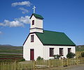
- Nomination Icelandic church by User:Steinninn. --Dschwen 12:26, 7 August 2007 (UTC)
- Promotion Simple and beautiful, though the noise on the sky could be removed, the tilt corrected and the hose cloned out. Saved by the composition... - Alvesgaspar 11:35, 8 August 2007 (UTC)
-

- Nomination Icelandic church by User:Steinninn. --Dschwen 12:26, 7 August 2007 (UTC)
- Decline Extreme distortion, harsh lighting - Alvesgaspar 11:35, 8 August 2007 (UTC)
-

- Nomination Wood Grouse or more specifically Western Capercaillie --Richard Bartz 09:51, 7 August 2007 (UTC)
- Promotion Greatly composed picture with good sharp!--Beyond silence 00:51, 8 August 2007 (UTC)
-

- Nomination Drone-fly (Eristalis tenax) on flower - Alvesgaspar 11:49, 7 August 2007 (UTC)
- Decline Wings are in sharp focus, but no flower petal, nor most of the insect are in focus, too shallow DOF --Tony Wills 13:29, 7 August 2007 (UTC)
-

- Nomination Portrait of a she-cat - Alvesgaspar 11:49, 7 August 2007 (UTC)
- Promotion Good photo (composition), with nice sharp on the face. --Beyond silence 12:44, 7 August 2007 (UTC)
-

- Nomination Hoverfly (Sphaerophoria scripta on flower - Alvesgaspar 11:49, 7 August 2007 (UTC)
- Promotion Good DOF, not much detail on insect, but then it's very small --Tony Wills 13:37, 7 August 2007 (UTC)
-

- Nomination The Small White (Pieris rapae) is a small to mid-sized butterfly species of the Yellows-and-Whites family Pieridae. Here with a amazing close up. --Richard Bartz 09:51, 7 August 2007 (UTC)
- Promotion sharp, light.--Beyond silence 13:00, 7 August 2007 (UTC)
-

- Nomination A Dragonfly (Sympetrum vulgatum) --Richard Bartz 09:51, 7 August 2007 (UTC)
- Decline Looks unsharp in full resolution due to tremor and diffraction. Why did you use such an high f-number? IMHO there was no need to do so. --LC-de 09:34, 8 August 2007 (UTC)
-

- Nomination Kaisermantel butterfly --Richard Bartz 09:51, 7 August 2007 (UTC)
- Promotion Good composition, sharp, resulotion. --Beyond silence 12:51, 7 August 2007 (UTC)
-

- Nomination Gargoyles, cathedral of Amiens. Vassil 00:51, 7 August 2007 (UTC)
- Promotion Good sharpness and light - with good value. --Beyond silence 22:26, 7 August 2007 (UTC)
-

- Nomination Jackson's Sawmill Covered Bridge. -- Ram-Man 13:53, 27 July 2007 (UTC)
- Decline Wow... this has been in need of a review for a long time. I think it's really on the border, but I think I have enough quibbles with it to decline. The crop really takes away from the picture. It feels far too tight on either side. There is some CA, not horrible, but there. The close-up wide angle combined with the non-centred perspective is somewhat dizzying. It's close, but for the crop. Thegreenj 15:35, 7 August 2007 (UTC)
-
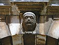
- Nomination Ornamental head on an arch in Rovinj, Croatia --Orlovic (talk) 14:32, 4 August 2007 (UTC)
- Promotion Sharp. --Beyond silence 02:49, 6 August 2007 (UTC)
-
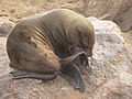
- Nomination Cape Fur Seal (Arctocephalus pusillus) at Cape Cross, Namibia. -- Lycaon 13:37, 4 August 2007 (UTC)
- Promotion Good value with good lighting.--Beyond silence 02:19, 6 August 2007 (UTC)
-

- Nomination rendered HDRI of the statue of Roma Triumphans in Rome, Italy. Alessio Damato 12:57, 4 August 2007 (UTC)
- Decline The tone mapping seems too exaggerated to me (the robe is actually much darker). I like the alternative version of this image much better. Till 19:12, 5 August 2007 (UTC)
-

-

- Nomination Circulation in macroeconomics --Beyond silence 00:20, 5 August 2007 (UTC)
- Decline Something like this should be SVG. Thegreenj 03:20, 5 August 2007 (UTC)
-

- Nomination Church in Winterthur --Ikiwaner 23:17, 4 August 2007 (UTC)
- Promotion Fulfills all QI requirements. Lycaon 23:27, 4 August 2007 (UTC)
-

-

- Nomination Facade of the church of Gesù in Rome, Italy; made of 4 pics stitched together. Alessio Damato 05:35, 4 August 2007 (UTC)
- Decline Comment Could you add a geo tag? Till 09:14, 4 August 2007 (UTC) Comment I have added the location template: was it what you meant?? Alessio Damato 12:57, 4 August 2007 (UTC)
Too much stitching errors!! Lycaon 13:23, 4 August 2007 (UTC)
-

- Nomination American Painted Lady (Vanessa virginiensis). -- Ram-Man 11:54, 3 August 2007 (UTC)
- Promotion DOF on the limit. Insufficient at 100% but ok at 2Mp. Lycaon 13:25, 4 August 2007 (UTC)
-

-

- Nomination Western ramp of the Flüela mountain pass in Switzerland. --Dschwen 20:51, 3 August 2007 (UTC)
- Promotion Good technical condition, sharpness and resulation.--Beyond silence 23:56, 3 August 2007 (UTC)
-
-
- Nomination Crimson-breasted Shrike (Laniarius atrococcineus) in Okaukuejo, Etosha, Namibia. -- Lycaon 20:04, 3 August 2007 (UTC)
- Promotion Acceptable technical condition and valueable.--Beyond silence 04:39, 4 August 2007 (UTC)
-

- Nomination High Brown Fritillary (Fabriciana adippe or Argynnis adippe) --Hsuepfle 19:04, 3 August 2007 (UTC)
- Promotion Good light and sharpness.--Beyond silence 19:37, 3 August 2007 (UTC)
-

- Nomination Caterpillar of the Spurge Hawk-moth (Hyles euphorbiae) --Dschwen 17:31, 2 August 2007 (UTC)
- Promotion Good sharpness.--Beyond silence 22:54, 2 August 2007 (UTC)
-

- Nomination Edelweiss (Leontopodium alpinum), a very rare strictly protected alpine flower. Seen near Scuol, Engadin, Switzerland. --Dschwen 16:11, 2 August 2007 (UTC)
- Promotion Good technical condition and resulation.--Beyond silence 22:51, 2 August 2007 (UTC)
-
- Nomination Wild thyme in the swiss alps. --Dschwen 12:50, 2 August 2007
- Decline There isn't in focus most of flowers.--Beyond silence 22:50, 2 August 2007 (UTC)
-

- Nomination Saint Cornély, protector of the cattle. (Carnac,Brittany,France) Vassil 12:45, 3 August 2007 (UTC)
- Promotion Acceptable technical condition, sharpness.--Beyond silence 15:39, 3 August 2007 (UTC)
-
- Nomination Genius on the Gallo-Roman triumphal arch, Reims, France. Vassil 22:58, 2 August 2007 (UTC)
- Promotion Nice picture with good sharp and lighting.--Beyond silence 00:29, 3 August 2007 (UTC)
-

- Nomination Saxifraga bryoides in the Swiss Alps. --Dschwen 21:47, 2 August 2007 (UTC)
- Promotion Good technical condition and resulation.--Beyond silence 00:29, 3 August 2007 (UTC)
-

- Nomination Haus Löwenstein is an ancient building in Aachen (Germany). -- Aleph 08:01, 1 August 2007 (UTC) (UTC)
- Promotion Acceptable technical condition.--Beyond silence 00:43, 3 August 2007 (UTC)
-

-
-

- Nomination Street lift in Lisbon in the evening with the moon --Szilas 06:09, 2 August 2007 (UTC)
- Decline Dark, unsharp, noise.--Beyond silence 09:57, 2 August 2007 (UTC)
-

- Nomination Mountain Laurel (Kalmia latifolia) flowers. -- Ram-Man 19:53, 1 August 2007 (UTC)
- Promotion Good composition. --Till 20:40, 1 August 2007 (UTC)
-
- Nomination Dandelion (Taraxacum sp.) photographed in Greenland. The exact species is unknown. -- Slaunger 12:12, 1 August 2007 (UTC)
- Promotion Good lighting and composition.--Beyond silence 14:33, 1 August 2007 (UTC)
-

- Nomination Soissons (France): Cathedral and War Monument before a thunder storm -- MJJR 11:53, 1 August 2007 (UTC)
- Promotion You could have used a smaller aperture value as the exposure time is really short. This might have resulted in a higher image sharpness. But altogether, it looks good to me. -- Aleph 11:28, 2 August 2007 (UTC)
-

- Nomination Pentaceratops the image is fixed now. -- LadyofHats 11:10, 1 August 2007 (UTC)
- Promotion Very good. Lycaon 12:32, 1 August 2007 (UTC)
-

- Nomination Endocytosis and its diferent forms. -- LadyofHats 10:34, 1 August 2007 (UTC)
- Promotion Nice work, need I say more? Lycaon 12:32, 1 August 2007 (UTC)
-
- Nomination Cape Fur Seal (Arctocephalus pusillus) at Cape Cross, Namibia. -- Lycaon 19:48, 31 July 2007 (UTC)
- Promotion Good technical condition and value--Beyond silence 14:44, 1 August 2007 (UTC).
-

- Nomination False Holly leaves. -- Ram-Man 14:54, 31 July 2007 (UTC)
- Promotion Good composition, acceptable technical condition.--Beyond silence 14:42, 1 August 2007 (UTC)
-

- Nomination False Holly leaf. -- Ram-Man 14:54, 31 July 2007 (UTC)
- Decline Big distracting light.--Beyond silence 14:42, 1 August 2007 (UTC)
-

-

- Nomination Swifts Creek region --Benjamint 12:11, 25 July 2007 (UTC)
- Decline Looks good, so far as I can tell. -- Ram-Man 11:57, 27 July 2007 (UTC)
Per discussions on FP. Lycaon 13:39, 30 July 2007 (UTC)
I concur. Changed vote. -- Ram-Man 17:05, 30 July 2007 (UTC)
Why?--Beyond silence 09:33, 1 August 2007 (UTC)
Click the link. Thegreenj 13:41, 1 August 2007 (UTC)
-
- Nomination Image of a Zebra lionfish. Dendrochirus zebra. --Jnpet 16:52, 25 July 2007 (UTC)
- Decline Difficult shot. To soft focus overall and some fringing. Well usable as species illustration though. Lycaon 21:55, 28 July 2007 (UTC)
Yes, and it is used in a number of language wiki articles already. I didn't actually consider this as QI initially, but then it showed up in French wikibooks on photography as a sample image and I thought maybe it was better than I realized. Afterall, if it's in a book on photography, surely it has to be a QI? I guess the French photo book could be describing what not to do. --Jnpet 05:48, 2 August 2007 (UTC)
-

-
-
- Nomination Ilyushin Il-86 of Aeroflot --Orlovic (talk) 21:58, 30 July 2007 (UTC)
- Decline Noisy and poorly lit. Thegreenj 23:57, 31 July 2007 (UTC)
-

- Nomination Unknown species of Consolida --LC-de 07:36, 30 July 2007 (UTC)
- Promotion Good shapness and lighting.--Beyond silence 12:18, 31 July 2007 (UTC)
-
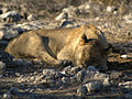
- Nomination Young male Lion, sleeping at Goas waterhole in Etosha, Namibia. Lycaon 05:42, 30 July 2007 (UTC)
- Promotion A bit shadowy, but good shapness and nice value.--Beyond silence 12:19, 31 July 2007 (UTC)
-
- Nomination Japanese Roof Iris Iris tectorum 'Woolong' Bud. -- Ram-Man 02:17, 29 July 2007 (UTC)
- Promotion Crisp and clean. Thegreenj 17:23, 31 July 2007 (UTC)
-

-

- Nomination Burr arch truss joint. -- Ram-Man 14:40, 25 July 2007 (UTC)
- Promotion the technical aspects are QI, Gnangarra 01:32, 1 August 2007 (UTC)
-

-

- Nomination Guînes (France): War Memorial -- MJJR 21:06, 30 July 2007 (UTC)
- Promotion Sharp.--Beyond silence 09:20, 31 July 2007 (UTC)
-
- Nomination Canon EF 28-105mm F3.5-4.5 II USM lens --Thegreenj 20:20, 30 July 2007 (UTC)
- Promotion Good. technical condition.--Beyond silence 03:28, 31 July 2007 (UTC)
-

- Nomination Stained glass windows in Elisabeth church --Beyond silence 15:10, 30 July 2007 (UTC)
- Decline Perspective distortion, much unused space, subject fairly lacking in detail. Thegreenj 22:11, 30 July 2007 (UTC)
-

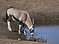
- Nomination Female Kudu at Chudop waterhole in Etosha, Namibia. Lycaon 05:42, 30 July 2007 (UTC)
- Promotion Acceptable technical condition.--Beyond silence 03:28, 31 July 2007 (UTC)
-

- Nomination Easter Tiger Swallowtail (Papilio glaucus). -- Ram-Man 03:53, 30 July 2007 (UTC)
- Promotion Acceptable technical condition.--Beyond silence 03:28, 31 July 2007 (UTC)
-
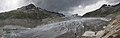
- Nomination Rhone Glacier panoramic --Ikiwaner 22:35, 29 July 2007 (UTC)
- Promotion Good shapness and high resulation.--Beyond silence 14:58, 30 July 2007 (UTC)
-

-
-

- Nomination The endemic Bradfield's Namib Day Gecko (Rhoptropus bradfieldi diporus) at Twyfelfontein, Namibia. -- Lycaon 09:18, 29 July 2007 (UTC)
- Promotion Sharp, clear subject. -- Ram-Man 17:03, 30 July 2007 (UTC)
-

- Nomination Monarch Butterfly (Danaus plexippus) on a purple coneflower.-- Ram-Man 05:10, 29 July 2007 (UTC)
- Promotion Sharp, light.--Beyond silence 14:56, 30 July 2007 (UTC)
-

- Nomination Ancient Egyptian sculpture in the Gulbenkian Museum--Szilas 19:41, 28 July 2007 (UTC)
- Promotion Acceptable technical condition.--Beyond silence 14:55, 30 July 2007 (UTC)
-

-

- Nomination Yard in Tauride Garden (St. Pitersburg) #!George Shuklin 18:14, 28 July 2007 (UTC)
- Decline Mostly unsharp throughout the image. Composition is not particularly strong either. -- Ram-Man 16:56, 30 July 2007 (UTC)
-

- Nomination Petal closeup of the Siberian Iris (Iris sibirica). -- Ram-Man 14:34, 27 July 2007 (UTC)
- Promotion Rather tight cropping below, but excellent quality. A square format should be better, perhaps. -- MJJR 21:19, 30 July 2007 (UTC)
-

- Nomination Japanese Larch (Larix kaempferi) needles. -- Ram-Man 13:55, 27 July 2007 (UTC)
- Promotion Technically excellent, compositionally I'ld choose another angle and so a different background. Lycaon 09:19, 31 July 2007 (UTC)
-

- Nomination Some chewing gum. ← Körnerbrötchen - @ 10:08, 27 July 2007 (UTC)
- Promotion Good technical condition.--Beyond silence 15:13, 30 July 2007 (UTC)
-

- Nomination A male Monarch Butterfly (Danaus plexippus). -- Ram-Man 05:25, 29 July 2007 (UTC)
- Promotion DoF is nearly perfect and good composition. --LC-de 09:04, 30 July 2007 (UTC)
-

- Nomination Monarch Butterfly (Danaus plexippus) laying an egg. -- Ram-Man 05:10, 29 July 2007 (UTC)
- Promotion Sharp enough, good composition and illumination. --LC-de 09:04, 30 July 2007 (UTC)
-

-

-
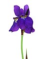
- Nomination Stalk of the Siberian Iris (Iris sibirica). -- Ram-Man 14:34, 27 July 2007 (UTC)
- Decline Nice image for illustration of the species, but for a QI, the cutting out looks a bit too artificial in places (not enough anti-aliasing?) . Lycaon 11:33, 30 July 2007 (UTC)
-

- Nomination Weaver's Mill Covered Bridge. -- Ram-Man 14:47, 25 July 2007 (UTC)
- Promotion Good but could be better: sharpening halo around the cable on the left, chromatic aberrations on the tree on the right. Both could be corrected. --Ikiwaner 22:18, 29 July 2007 (UTC)
-

- Nomination Yellow Coneflower (Echinacea paradoxa) closeup. -- Ram-Man 14:31, 25 July 2007 (UTC)
- Promotion Good technical condition.--Beyond silence 21:03, 29 July 2007 (UTC)
-
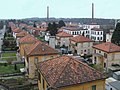
- Nomination View of Crespi d'Adda, a worker village in Italy --Luigi Chiesa 21:47, 23 July 2007 (UTC)
- Promotion Acceptable technical condition.--Beyond silence 21:02, 29 July 2007 (UTC)
-
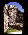
- Nomination Inside San Miguel Castle at Almuñécar, Andalusia, Spain -- MJJR 20:46, 23 July 2007 (UTC)
- Promotion Acceptable technical condition.--Beyond silence 21:02, 29 July 2007 (UTC)
-

- Nomination Six-spotted Fishing Spider (Dolomedes triton). -- Ram-Man 15:13, 23 July 2007 (UTC)
- Promotion Acceptable technical condition.--Beyond silence 21:02, 29 July 2007 (UTC)
-

-

- Nomination Stargazer Lilies (Lilium orientale 'Stargazer'). -- Ram-Man 05:10, 29 July 2007 (UTC)
- Promotion Good DOF, BG and POV. Lycaon 09:24, 29 July 2007 (UTC)
-

- Nomination Yellow Iris Iris pseudacorus Petal. -- Ram-Man 02:17, 29 July 2007 (UTC)
- Decline Flat light and crop do not entice me. Lycaon 09:24, 29 July 2007 (UTC)
-

-

-

-

-
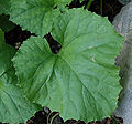
-

- Nomination Japanese Roof Iris (Iris tectorum 'Woolong') flower. -- Ram-Man 12:56, 27 July 2007 (UTC)
- Promotion Well executed. Lycaon 21:51, 28 July 2007 (UTC)
-
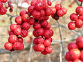
- Nomination American Winterberry (Ilex verticillata) berries. -- Ram-Man 12:21, 27 July 2007 (UTC)
- Promotion As good as the previous one. Lycaon 21:51, 28 July 2007 (UTC)
-
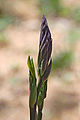
- Nomination White Wild Indigo (Baptisia alba) flowerhead. -- Ram-Man 14:45, 25 July 2007 (UTC)
- Promotion Good DOF and focus. Lycaon 21:56, 28 July 2007 (UTC)
-

-

-

- Nomination Kodak Brownie Starmite camera. -- Adamantios 18:07, 22 July 2007 (UTC)
- Decline Perhaps others disagree or I'm just too picky, but I don't like the front, non-diffuse lighting. It gives the camera a "hot" look. Move it to CR if anyone disagrees. -- Ram-Man 13:02, 27 July 2007 (UTC)
-

-

- Nomination Deerfield Beach, Florida. -- MJJR 19:54, 20 July 2007 (UTC) -- Info I changed the cropping at the right, for a more balanced image -- MJJR 15:40, 22 July 2007 (UTC)
- Promotion I don't care for the image content, but after a lot of thought, it has good technical quality. -- Ram-Man 13:05, 27 July 2007 (UTC)
- Nomination Deerfield Beach, Florida. -- MJJR 19:54, 20 July 2007 (UTC) --


.JPG)


.jpg)


.JPG)


_-_Imperial_Stair_Case_-_G%C3%B6ttweig_Abbey.jpg)


_-_trees_winter.jpg)


![* Nomination Sulphur Tuft (Hypholoma fasciculare]]) --LC-de 16:52, 16 August 2007 (UTC) * Promotion Good image of the stipe and cap, but you should not have taken a bite out of them while filming :-) --Tony Wills 23:49, 16 August 2007 (UTC)](/wiki/File:Hypholoma_fasciculare_LC0091.jpg)
.JPG)


_1.jpg)


.jpg)


.jpg)

.jpg)


.jpg)


.jpg)


.jpg)


.jpg)


.JPG)


Consensual review
[edit]Bee landing on flower
[edit]
- Nomination Bee landing on flower. --Adamantios 13:57, 20 August 2007 (UTC)
- Decline
- Oppose No identification (it is a type of Hybiscus, please check). Lycaon 14:15, 20 August 2007 (UTC)
- Question Does it make any difference in this case? It's not about the particular bee or flower, it's about the touchdown. Adamantios 14:33, 20 August 2007 (UTC) Comment I think it's a white flowered hybrid Hibiscus rosa-sinensis. Adamantios 18:01, 22 August 2007 (UTC)
- Oppose Expose. --Beyond silence 00:16, 25 August 2007 (UTC)
Result: 0 support (excluding the nominator), 2 oppose -> not promoted to QI -- Lycaon 09:55, 29 August 2007 (UTC)
Decticus verrucivorus
[edit]_m_01_(HS).jpg)
- Nomination Decticus verrucivorus male --Hsuepfle 20:15, 23 August 2007 (UTC)
- Decline
 Support A huge scary thing (I'm not so brave ;) ) nicely taken ! Benh 20:37, 23 August 2007 (UTC)
- Oppose Sorry, too small for QI and also because of the crop one antenna and one tarsus (leg) are cut! Lycaon 09:28, 24 August 2007 (UTC)
- Support Enough to QI. --Beyond silence 07:44, 24 August 2007 (UTC)
- Oppose If it is cropped, why not give us back the top of the antenna and the end of the middle leg/foot --Tony Wills 09:47, 24 August 2007 (UTC)
- Oppose see Lycaon and Tony --Hsuepfle 18:55, 25 August 2007 (UTC)
Result: 2 support (excluding the nominator), 3 oppose -> not promoted to QI -- Lycaon 09:54, 29 August 2007 (UTC)
Decticus verrucivorus Edit
[edit]_m_02_(HS).jpg)
- Nomination Decticus verrucivorus male, image less cropped. I think it was too late in the evening when I crooped it. Here you can see the rest of the antenna and tarsus. Also the size is now with 1600x1200px hopefully sufficient --Hsuepfle 18:55, 25 August 2007 (UTC)
- Promotion
- Support Focus a little soft perhaps, but shows good detail, good exposure - QI :-) --Tony Wills 20:50, 25 August 2007 (UTC)
- Support It is better, but only narrowly cuts it for me (size is really on the limit for this kind of picture with lots of details!!). Lycaon 08:44, 26 August 2007 (UTC)
Result: 2 support (excluding the nominator), 0 oppose -> Promoted to QI -- Lycaon 09:53, 29 August 2007 (UTC)
Dolls
[edit]
- Nomination Dolls. Vassil 00:52, 8 August 2007 (UTC)
- Decline
- Comment Can you write more descripition? --Beyond silence 23:19, 9 August 2007 (UTC)
- InfoSorry,I can't.I took the pic in a sale, and I don't know anything about dolls.Vassil 00:27, 10 August 2007 (UTC)
- weak oppose Dislike the composition, there are few aberrations in full view. still would like a second opinion on this one- LadyofHats 16:07, 20 August 2007 (UTC)
![]() Neutral --Beyond silence 02:01, 24 August 2007 (UTC)
Result: no support (excluding the nominator), 0.5 oppose -> not promoted to QI -- Lycaon 21:09, 28 August 2007 (UTC)
Neutral --Beyond silence 02:01, 24 August 2007 (UTC)
Result: no support (excluding the nominator), 0.5 oppose -> not promoted to QI -- Lycaon 21:09, 28 August 2007 (UTC)
Suricate
[edit]
- Nomination A young suricate (Suricata suricatta) in a zoo. Vassil 21:40, 16 August 2007 (UTC)
- Promotion
- Support Technicaly acceptable, good value. --Beyond silence 14:38, 17 August 2007 (UTC)
- Oppose Too tight crop, even the whiskers are cut. -- Lycaon 12:49, 18 August 2007 (UTC)
- Whiskers are cut? --Beyond silence 22:43, 19 August 2007 (UTC)
- At full resolution, above the eyes (perhaps they are eyebrows :-) --Tony Wills 12:32, 20 August 2007 (UTC)
- Whiskers are cut? --Beyond silence 22:43, 19 August 2007 (UTC)
- The eyebrows are cut, I missed this detail.I can't upload a larger crop because it's the original framing.Vassil 16:17, 20 August 2007 (UTC)
- Support --Lestat 19:51, 20 August 2007 (UTC)
- Oppose noise and blur --Orlovic (talk) 23:55, 20 August 2007 (UTC)
- Support what's a few cm of eyebrows between friends? Ben Aveling 07:38, 25 August 2007 (UTC)
Result: 3 support (excluding the nominator), 2 oppose -> promoted to QI --Tony Wills 09:09, 27 August 2007 (UTC)
St. Suitbertus, Kaiserswerth (2)
[edit]
- Nomination St Suitbertus church in Düsseldorf, Germany: Interior view- Till 15:07, 19 August 2007 (UTC)
- Promotion
- I can hardly see any CA. Or is it my eyes? A second opinion please... (btw: it's a HDR image - Till 16:23, 19 August 2007 (UTC))
- Support If you look hard you can notice chromatic aberration down the black wires and lamp shade of the nearest lights, that could be fixed easily. But really it's minimal CA. Is there something I'm missing? --Tony Wills 12:43, 20 August 2007 (UTC)
- Comment If this is easily fixed, then please do, I'll drop my opposition then straight away. Lycaon 13:02, 20 August 2007
- I see what you mean, but I found out it's not an issue of HDR creation - it seems to be an optical flaw of the lens due to the short focal length. So I guess I can't do anything about it in this case, because I neither have the time nor the patience to edit the two images pixel by pixel - and I don't want to crop the sides. Never mind about QI, then. - Till 20:38, 20 August 2007 (UTC)
- Info I've reduced CA (thanks for the hint, Lycaon) and replaced the image by a corrected version. Hopefully it pleases the community. - Till 22:10, 22 August 2007 (UTC)
- I ask for a bit conrast/brightness. Now:
 Neutral --Beyond silence 02:04, 24 August 2007 (UTC)
- Question Did you look at the image at full scale? I don't think it needs higher contrast or brightness. But viewed as a thumb, I agree that it seems a bit dull. - Till 05:32, 24 August 2007 (UTC)
- I ask for a bit conrast/brightness. Now:
Result: 1 support (excluding the nominator), 0 oppose -> promoted to QI --Tony Wills 07:01, 27 August 2007 (UTC)
View old on Dubrovnik
[edit]- Nomination View on Dubrovnik --Beyond silence 07:01, 19 August 2007 (UTC)
- Decline
- Oppose Needs perspective correction. Lycaon 07:59, 19 August 2007 (UTC)
- Really? --Beyond silence 16:14, 19 August 2007 (UTC)
- Oppose Really. It's not too bad though, should be easily fixable. Thegreenj 01:23, 20 August 2007 (UTC)
- How do you think perspective correction? --Beyond silence 01:58, 20 August 2007 (UTC)
- What software are you using? There might be some sort of auto correct with you imputting verticals - I don't know. On Photoshop 5.0, select the image and go to Edit -> Transform -> Skew and use guides to mark verticals. I've never really done perspective correction well. I'm just curious - what did you do to the edit? Thegreenj 20:06, 20 August 2007 (UTC)
- How do you think perspective correction? --Beyond silence 01:58, 20 August 2007 (UTC)
Withdrawn
![]() I withdraw my nomination
I withdraw my nomination
Edited
[edit]
- Nomination View on Dubrovnik --Beyond silence 07:01, 19 August 2007 (UTC)
- Promotion
![]() Done Corrected. Thanks for help! --Beyond silence 19:59, 20 August 2007 (UTC)
Done Corrected. Thanks for help! --Beyond silence 19:59, 20 August 2007 (UTC)
- Support The (slight) rotation has been corrected, and as it is obvious that one is looking downwards, I think that an architectural perspective/keystone correction with aligned verticals would not be appropriate. Image looking fine at full resolution. -- Klaus with K 21:02, 20 August 2007 (UTC)
- I don't think it's really bad. Do you oppose for it? --Beyond silence 13:25, 24 August 2007 (UTC)
- guess not ;-). Lycaon 16:05, 24 August 2007 (UTC)
- I don't think it's really bad. Do you oppose for it? --Beyond silence 13:25, 24 August 2007 (UTC)
Result: 1 support (excluding the nominator), 0 oppose -> promoted to QI --Tony Wills 06:59, 27 August 2007 (UTC)
View old city of Dubrovnik
[edit]
- Nomination View on Dubrovnik --Beyond silence 07:01, 19 August 2007 (UTC)
- Promotion
- I think tilt is enough weak. --Beyond silence 16:14, 19 August 2007 (UTC)
- The tilt is easily fixable. I'll Support now that it's done. --Dschwen 16:33, 19 August 2007 (UTC)
- Comment I fixed it before upload - but I didn't do it more because some building tilting to the other direction (as the cathedral at upper left corner). It can be because the city built to an hilly bay. --Beyond silence 18:27, 19 August 2007 (UTC)
- I'd take the horizon as a guideline. I don't want to sound like a smart-ass, but it is usually pretty horizontal over the sea ;-) --Dschwen 19:08, 19 August 2007 (UTC)
- (To Beyond Silence) Even houses built on hills are usually built straight up and down :-)
- I'd take the horizon as a guideline. I don't want to sound like a smart-ass, but it is usually pretty horizontal over the sea ;-) --Dschwen 19:08, 19 August 2007 (UTC)
![]() Done I fixed it, thanks for feedback. --Beyond silence 17:31, 20 August 2007 (UTC)
Done I fixed it, thanks for feedback. --Beyond silence 17:31, 20 August 2007 (UTC)
- Support Looks sufficient to me --Tony Wills 12:32, 22 August 2007 (UTC)
Result: 2 support (excluding the nominator), 0 oppose -> promoted to QI --Tony Wills 06:57, 27 August 2007 (UTC)
A calvaire in Brittany
[edit]
- Nomination A calvaire in Brittany, France.(Edit) Vassil 22:46, 11 August 2007 (UTC)
- Decline
- SupportGood light & sharpness. --Beyond silence 03:11, 12 August 2007 (UTC)
- Oppose Disagree on the lighting, that was not the best time of the day to shoot this subject because of the shadows. Alvesgaspar 15:46, 14 August 2007 (UTC)
- The best is FP... --Beyond silence 20:59, 14 August 2007 (UTC)
- In File:Gull Porto Covo July 2007-7.jpg isn't there shadow...? --Beyond silence 21:49, 14 August 2007 (UTC)
- --Beyond silence please do not take every comment so personal, we are all trying to give our best here and what you achieve with such comments is only making this process more stressfull. Remember that whatever it is said it is ment for the pictures not for you. and if someone thinks diferent than you doesnt mean that you are wrong. it only means he thinks diferent or gives more weight to certain things more than others. in all cases it is not ment as an attack. Try to cool down and base your opinions in the picture you are qualifying. -LadyofHats 15:51, 15 August 2007 (UTC)
oh yeah by the way *Weak Support the sky is well exposed and i dont mind the shadows, but it is quite a straight foward composition and actually a bit boring- LadyofHats 15:51, 15 August 2007 (UTC)
- weak oppose Looks slightly tilted but that may be because one end of the foundation is covered by dirt and the other not. Also seems to have a perspective distortion in that it gets narrower towards the top. Also composition: could not that background building be left out by moving to one side? --Tony Wills 10:26, 18 August 2007 (UTC)
- Oppose composition. I don't like the way it runs into the building, or the unbalanced space on each side of it. Ben Aveling 07:34, 25 August 2007 (UTC)
Result: 1.5 support (excluding the nominator), 2.5 oppose -> not promoted to QI --Tony Wills 09:03, 27 August 2007 (UTC)
Dullahan - Bartek Dębno-Artwiński
[edit]
- Nomination Bartek Dębno-Artwiński from celtic band Dullahan. --Lestat 19:55, 17 August 2007 (UTC)
- Decline
- Technicaly QI, but composition very poor and boring, sorry. If you don't agree take it consesual rw. --Beyond silence 07:10, 19 August 2007 (UTC)
- Please for another opinion. QI means Quality images and don't concern very subjective feelings like i.e. boring. --Lestat 10:13, 19 August 2007 (UTC)
- Comment Boring might be a composition question --Tony Wills 12:15, 20 August 2007 (UTC)
- Oppose unattractive composition. Lycaon 05:33, 25 August 2007 (UTC)
Result: 0 support (excluding the nominator), 1 oppose -> not promoted -- Lycaon 17:34, 22 August 2007 (UTC)
- Info Forgot about the clause in the rules which says to wait 15 days if no opinions other than first review. Need to wait another 10 days. --Tony Wills 02:19, 25 August 2007 (UTC)
Result: 0 support (excluding the nominator), 2 oppose -> Not promoted to QI -- Lycaon 06:30, 27 August 2007 (UTC)
Gyps fulvus
[edit]
- Nomination Gyps fulvus, The Griffon Vulture --Richard Bartz 09:51, 7 August 2007 (UTC)
- Decline What a shame the quality is not good enough! The posture of the animal is superb. I've not the courage for opposing it right away... Alvesgaspar 15:30, 14 August 2007 (UTC)
- Oppose it is a pity indeed, but i would opose it-LadyofHats 10:35, 16 August 2007 (UTC)
- Oppose insufficient quality. Lycaon 05:35, 25 August 2007 (UTC)
Result: 0 support (excluding the nominator), 1 oppose -> not promoted to QI --Tony Wills 10:45, 18 August 2007 (UTC)
- Question Why did you close the voting after one vote? --Beyond silence 17:59, 18 August 2007 (UTC)
- Well, two people have voted (one neutral), but as per rules it was closed after 48hours during which there were no further comments/votes. --Tony Wills 21:08, 18 August 2007 (UTC)
- Info Forgot about the clause in the rules which says to wait 15 days if no opinions other than first review. Need to wait 4 more days. --Tony Wills 02:19, 25 August 2007 (UTC)
- Support Sharp enough where it counts, given how good the composition is. Ben Aveling 07:31, 25 August 2007 (UTC)
Result: 1 support (excluding the nominator), 2 oppose -> (decline?) not promoted to QI --Tony Wills 09:01, 27 August 2007 (UTC)
Unknown Bivalve
[edit]
- Nomination Unknown Bivalve --Digon3 talk 00:15, 8 August 2007 (UTC)
- Decline
- Oppose A bit too dark and purple fringing. --Dschwen 06:52, 8 August 2007 (UTC)
- Info I have uploaded a new edit wich should get rid of those problems. --Digon3 talk 13:54, 9 August 2007 (UTC)
- Questionshouldnt be the species clarified first before proposing it here?-LadyofHats 10:37, 16 August 2007 (UTC)
- Oppose needs species id . Lycaon 05:38, 25 August 2007 (UTC)
Result: 0 support (excluding the nominator), 1 oppose -> not promoted to QI --Tony Wills 10:42, 18 August 2007 (UTC)
- Info Archived too soon. Need to wait 5 more days. --Tony Wills 02:19, 25 August 2007 (UTC)
Result: 0 support (excluding the nominator), 2 oppose -> Not promoted to QI -- Lycaon 06:30, 27 August 2007 (UTC)
Distel und bienen
[edit]
- Nomination Distel und Bienen--Richard Bartz 10:16, 24 August 2007 (UTC)
- Promotion
- Support Composition, sharp. --Beyond silence 11:06, 24 August 2007 (UTC)
conditionalI would love an id on the thistle. Lycaon 11:12, 24 August 2007 (UTC) Oppose- This is a Creeping Thistle (Cirsium arvense) I think. --LC-de 12:00, 24 August 2007 (UTC)
- Support Condition met. Thank you LC-de. Lycaon 14:29, 24 August 2007 (UTC)
Result: 2 support (excluding the nominator), 0 oppose -> Promoted to QI -- Lycaon 06:23, 27 August 2007 (UTC)
Simon Tong
[edit]
- Nomination Simon Tong -- Rama 13:38, 14 August 2007 (UTC)
- Decline
- Support Technically acceptable. --Beyond silence 14:36, 17 August 2007 (UTC)
- Oppose- i disagree with you, it is technically ok but it has a very poor composition-LadyofHats 16:19, 20 August 2007 (UTC)
- Oppose- ack LadyofHats. Lycaon 09:30, 24 August 2007 (UTC)
Result: 1 support (excluding the nominator), 2 oppose -> not promoted to QI --Tony Wills 12:45, 26 August 2007 (UTC)
Lake Como from Varenna
[edit]
- Nomination I don't think the image is too noisy. The shadow in the foreground adds to the effect of contrast, which shouldn't be a reason to decline. --Aconcagua 13:09, 23 August 2007 (UTC)
- Decline
- OpposeNice composition and lighting, but noisy is so much and the foreground in shadow. Sorry --Beyond silence 08:38, 22 August 2007 (UTC)
- Oppose agree with the noisiness. Lycaon 13:24, 23 August 2007 (UTC)
Result: 0 support (excluding the nominator), 2 oppose -> not promoted to QI --Tony Wills 12:44, 26 August 2007 (UTC)
Shield bug running
[edit]
- Nomination A beautiful shield bug (Graphosoma lineatum) running from the photographer. In a moment, it flew away. - Alvesgaspar 12:22, 22 August 2007 (UTC)
- Decline
- Oppose Too shallow DOF, not sharp enough. Lycaon 12:40, 22 August 2007 (UTC)
- I would like a second opinion on this one. No, it is not sharp, but that is mainly the result of motion blur (the bug is running) - Alvesgaspar 18:37, 22 August 2007 (UTC)
- Oppose Really not sharp, but head shadowy too. Difficult shot, but doesn't make more valuable his moving. --Beyond silence 21:14, 22 August 2007 (UTC)
Result: 0 support (excluding the nominator), 2 oppose -> not promoted to QI --Tony Wills 12:40, 26 August 2007 (UTC)
Baska Voda-beach
[edit]
- Nomination Beach in Baška Voda (renominate edited version after decline) --Beyond silence 01:03, 19 August 2007 (UTC)
- Decline
- Oppose Tilt, overexposed, composition... --Lestat 21:14, 21 August 2007 (UTC)
- I like it, other opinion?
- Oppose My post seems to have disappeared (again). For the record, I originally opposed this because of tilt and composition. A new version was uploaded, and my decline was deleted...
- In any case it is still tilted, poorly composed (mostly trees ands ky, little beach), and not very sharp, especially given the resolution. Thegreenj 20:18, 22 August 2007 (UTC)
Result: 0 support (excluding the nominator), 2 oppose -> not promoted to QI --Tony Wills 12:32, 26 August 2007 (UTC)
Dragonfly
[edit]
- Nomination Sympetrum is a genus of small to medium sized skimmer dragonflies --Richard Bartz 19:39, 21 August 2007 (UTC)
- Decline
- OpposeThe branch in the background ruins the composition. Also the image is noisy and not very sharp - Alvesgaspar 20:35, 21 August 2007 (UTC)
- Support Good technical condition, background isn't ruins the composition. --Beyond silence 21:09, 21 August 2007 (UTC)
- Neutral I can't support because of the low resolution, but it looks pretty nice otherwise. -- Ram-Man 01:51, 22 August 2007 (UTC)
- Oppose low res. Lycaon 04:43, 22 August 2007 (UTC)
- May "low" resolution not enough to oppose. --Beyond silence 08:55, 22 August 2007 (UTC)
- Why not? Resolution is one of the QI guidelines. Thegreenj 20:13, 22 August 2007 (UTC)
- What out to the QIC talk page! --Beyond silence 21:11, 22 August 2007 (UTC)
- I'm afraid I don't quite understand you. If you are referring to this discussion, I believe that there was no real consensus on how strongly resolution influences QI eligibility. Judging from the last few comments, I believe that the general conclusion was that 1600px could be set as an arbitrary limit as long as common sense and community consensus acted for exceptional pictures that did not meet the limit. Though this picture is 1600px, it is so cropped vertically that it is less than 1.6 MP; if one holds that 1600px should be applied to the standard 4:3 aspect ratio, this falls short. Thegreenj 02:13, 23 August 2007 (UTC)
- May "low" resolution not enough to oppose. --Beyond silence 08:55, 22 August 2007 (UTC)
Result: 1 support (excluding the nominator), 2 oppose -> not promoted to QI --Tony Wills 12:31, 26 August 2007 (UTC)
Boundary stone
[edit]
- Nomination Boundary stone, italian side. --Dschwen 07:16, 20 August 2007 (UTC)
- Promotion
Stone, the main subject too bright, sorry. If you want, you may fix it. --Beyond silence 00:40, 21 August 2007 (UTC) Neutral --Beyond silence 01:59, 24 August 2007 (UTC)- This is the same issue as the Rhone pic below. The stone is white marble and the sun shines on it. It is either blown out and thus unfixable becaus the detail is lost forever, or it is not blown out and thus there is nothing to fix. --Dschwen 10:36, 21 August 2007 (UTC)
- Comment Your photo is, as usual, perfectly exposed - there is no significant over-exposed or blown out pixels. Maybe 'too bright' means something different from over exposed ;-) --Tony Wills 12:51, 21 August 2007 (UTC)
- Support The main subject is perfectly rendered: a bright white marble stone, but absolutely no blown out parts, and sharply detailed. The surroundings are also nice: more or less blurred for a good depth impression, correct lighting and colors. So: what's the problem? For me, it's undoubtably a QI. -- MJJR 20:44, 23 August 2007 (UTC)
Result: 1 support (excluding the nominator), 0 oppose -> promoted to QI --Tony Wills 12:29, 26 August 2007 (UTC)
St. Suitbertus, Kaiserswerth (1)
[edit]
- Nomination St Suitbertus church in Düsseldorf, Germany: Interior view - Till 15:07, 19 August 2007 (UTC)
- Promotion
- Oppose Too much CA. Lycaon 16:09, 19 August 2007 (UTC) Support resolved Lycaon 22:30, 22 August 2007 (UTC)
- I can hardly see any CA. Or is it my eyes? A second opinion please... (btw: it's a HDR image - Till 16:23, 19 August 2007 (UTC))
- Comment CA slightly more noticeable (again down wires and lamp shade of nearest lights) also slight CA around arches, most noticeable on nearest partial arches. I would fix the lighjts and crop off those partial arches. But really considering this is a 6MP image, that's really quibbling. --Tony Wills 12:51, 20 August 2007 (UTC)
- Comment If this is easily fixed, then please do, I'll drop my opposition then. Lycaon 13:02, 20 August 2007
- I see what you mean, but I found out it's not an issue of HDR creation - it seems to be an optical flaw of the lens due to the short focal length. So I guess I can't do anything about it in this case, because I neither have the time nor the patience to edit the two images pixel by pixel - and I don't want to crop the sides. Never mind about QI, then. - Till 20:37, 20 August 2007 (UTC)
- You don't have to do it pixel by pixel. Try a colour replacement with adjacent colours as target. (never never mind) Lycaon 20:40, 20 August 2007 (UTC)
- Info I've reduced CA (thanks for the hint, Lycaon) and replaced the image by a corrected version. Hopefully it pleases the community. - Till 22:09, 22 August 2007 (UTC)
Result: 1 support (excluding the nominator), 0 oppose -> promoted to QI --Tony Wills 12:24, 26 August 2007 (UTC)
CH_Julier_Pass_column
[edit]
- Nomination
Ancient roman column fragment found on the julier pass, proving the early use of the pass.Julier pass in winter time, southern pass ramp in the background and an ancient roman column fragment in the foreground. --Dschwen 07:03, 8 August 2007 (UTC) - Promotion
- Oppose As landsape may can not bad, but if we talking about the column - it is in snow. --Beyond silence 13:20, 10 August 2007 (UTC)
- Neutral I withdraw my oppose. The picture may can be enough good, but I can't decide. --Beyond silence 23:35, 17 August 2007 (UTC) Support Good composition, sharp foreground. --Beyond silence 21:26, 22 August 2007 (UTC)
- Info If it gets declined for the blurb I wrote then whats to stop me from changing it... --Dschwen 13:33, 10 August 2007 (UTC)
- Neutral good only for excellent DoF. But the subject is unclear. --Orlovic (talk) 13:37, 18 August 2007 (UTC)
Result: 1 support (excluding the nominator), 0 oppose -> promoted to QI --Tony Wills 12:19, 26 August 2007 (UTC)
Rails in Puchberg am Schneeberg
[edit]
- Nomination Rails in Puchberg am Schneeberg with mountain Schneeberg --Beyond silence 04:11, 22 August 2007 (UTC)
- Decline
- Question So... where is the railway station? - Till 05:46, 22 August 2007 (UTC)
- Next to the train (yellow building is that) --Beyond silence 05:51, 22 August 2007 (UTC)
- Oppose a bit noisy a bit CA and a slight CW tilt. Lycaon 10:55, 22 August 2007 (UTC)
Result: 0 support (excluding the nominator), 1 oppose -> not promoted to QI --Tony Wills 12:33, 24 August 2007 (UTC)
Biokovo mountain
[edit]
- Nomination Biokovo at Baška Voda --Beyond silence 18:55, 6 August 2007 (UTC)
- Decline
- OpposeI thin close to the border, but IMO on the decline side. 1. the lighting makes it flat 2. the image structure in full resolution looks a bit overprocessed, maybe at the camera level (1. strong noise reduction washout out most detail 2. what remained emphasized with unsharp mask) 3. I think the mountain has a more specific name. --Wikimol 19:30, 8 August 2007 (UTC)
- Name found: Biokovo. Only minimal postprocession used, mainly cropped. Is there other opinion? --Beyond silence 20:02, 8 August 2007 (UTC)
Result: 0 support (excluding the nominator), 1 oppose -> not promoted to QI --Tony Wills 06:21, 11 August 2007 (UTC)
- Info Archived too soon. Need to wait 10 more days. --Tony Wills 02:19, 25 August 2007 (UTC)
Running total: 0 support (excluding the nominator), 1 oppose -> (decline?) --Tony Wills 02:19, 25 August 2007 (UTC)
![]() --Beyond silence 03:51, 25 August 2007 (UTC)
--Beyond silence 03:51, 25 August 2007 (UTC)
Feather of Indian Peafowl
[edit]
- Nomination Feather of Indian Peafowl(new photo with better background and sharpness). --Beyond silence 14:31, 1 August 2007 (UTC)
- Decline
It has acceptable sharpness and lighting, colors.--Frank47 14:47, 4 August 2007 (UTC) invalid vote Lycaon 18:51, 7 August 2007 (UTC)
- Oppose A flat object should be sharp all over. Weird CA problems too. Lycaon 18:57, 8 August 2007 (UTC)
- Is there other opinion?--Beyond silence 20:07, 8 August 2007 (UTC)
Result: 0 support (excluding the nominator), 1 oppose -> not promoted to QI --Tony Wills 06:23, 11 August 2007 (UTC)
- Info Archived too soon. Need to wait 4 more days. --Tony Wills 02:19, 25 August 2007 (UTC)
- Info After retrieving the original review from the page history, I see Lycaon's vote wasn't the review. So technically it was a valid closure.
Result: 0 support (excluding the nominator), 1 oppose -> not promoted to QI --Tony Wills 07:34, 25 August 2007 (UTC)
Tapir
[edit]
- Nomination Tapir.. a lazy one.-LadyofHats 16:06, 21 August 2007 (UTC)
- Decline
- Support Nice, technical acceptable. Thanks --Beyond silence 20:48, 21 August 2007 (UTC)
- Oppose Extreme crop - Alvesgaspar 23:10, 21 August 2007 (UTC)
- Oppose per Alvesgaspar. Thegreenj 00:56, 22 August 2007 (UTC)
Result: 1 support (excluding the nominator), 2 oppose -> not promoted -- Lycaon 05:56, 24 August 2007 (UTC)
NZ Red Admiral (Vanessa gonerilla)-3
[edit]-3.jpg)
- Nomination Vanessa gonerilla head detail --Tony Wills 12:22, 19 August 2007 (UTC)
- Decline
- Oppose Too small DOF, noisy and to few details. Lycaon 15:58, 19 August 2007 (UTC)
- Comment The depth of field and angle were deliberately chosen to hi-light the head only. The head, eye, retracted tongue, and antenna are all clearly illustrated. The noise is only in the out of focus background, and I don't have an expensive camera that processes such things into fashionably smooth colours - if that is a problem can someone help me edit it? --Tony Wills 21:51, 19 August 2007 (UTC)
- Oppose DOF - sorry. --Beyond silence 22:40, 19 August 2007 (UTC)
Result: 0 support (excluding the nominator), 2 oppose -> not promoted -- Lycaon 10:30, 22 August 2007 (UTC)
Grues couronnées
[edit]
- Nomination Two black crowned cranes in a zoo. Vassil 10:27, 17 August 2007 (UTC)
- Discussion
- Support Good composition, technicaly acceptable. --Beyond silence 00:55, 19 August 2007 (UTC)
- Oppose Too small and main action is in the shadow and hardly visible. Lycaon 08:06, 19 August 2007 (UTC)
- Info I uploaded today another picture of these two birds with a higher resolution and a better lighting.Vassil 16:02, 20 August 2007 (UTC)
![]() I withdraw my nomination unsigned comment by Vassil 09:00, 22 August 2007 (UTC) --Tony Wills 09:06, 24 August 2007 (UTC)
I withdraw my nomination unsigned comment by Vassil 09:00, 22 August 2007 (UTC) --Tony Wills 09:06, 24 August 2007 (UTC)
View old city of Dubrovnik
[edit]- Nomination View on Dubrovnik --Beyond silence 07:01, 19 August 2007 (UTC)
- Decline
- Oppose Tilted. Lycaon 07:59, 19 August 2007 (UTC)
- I think tilt is enough weak. --Beyond silence 16:14, 19 August 2007 (UTC)
- The tilt is easily fixable. I'll support when it's done. --Dschwen 16:33, 19 August 2007 (UTC)
![]() --Beyond silence 10:44, 22 August 2007 (UTC)
Running total: 0 support (excluding the nominator), 1 oppose -> not promoted to QI (withdraw) --Beyond silence 10:44, 22 August 2007 (UTC)
--Beyond silence 10:44, 22 August 2007 (UTC)
Running total: 0 support (excluding the nominator), 1 oppose -> not promoted to QI (withdraw) --Beyond silence 10:44, 22 August 2007 (UTC)
Fixed
[edit]
- Nomination View on Dubrovnik
 Done I fixed it, thanks for feedback. --Beyond silence 18:59, 19 August 2007 (UTC) --Beyond silence 07:01, 19 August 2007 (UTC)
 - Promotion
- Support I guess it's not going to get any straighter than this ;-). One personal note though, this 2MP image is not considerably sharper than the 12.7MP Rhone images which you commented on above. --Dschwen 17:23, 20 August 2007 (UTC)
- Reply at user talk. --Beyond silence 17:38, 20 August 2007 (UTC)
Result: 1 support (excluding the nominator), 0 oppose -> promoted to QI -- Lycaon 13:52, 23 August 2007 (UTC)
Dictionary indentations
[edit]
- Nomination Alphabetical indentations on a dictionary Thegreenj 01:41, 19 August 2007 (UTC)
- Decline
- Oppose Very low DOF, composition is weak too. --Beyond silence 04:14, 19 August 2007 (UTC)
- DOF is sufficient to illustrate the subject. Higher DOF would cause quality to degrade, and would cause distracting elements (eg text) to be in focus. Thegreenj 02:47, 19 August 2007 (UTC)
- I am understand you, but the composition in my opinion is weak too. It don't present well the indentations, so the low DOF not makes them stronger with sharpness, but everything else coverd by massive unsharpness. Sorry --Beyond silence 04:09, 19 August 2007 (UTC)
- Oppose Per Beyond silence. I think I might have a better version: File:Dictionary indents headon.jpg, I'm thinking about nominating this one myself - sorry, no offense intended. - Till 09:24, 19 August 2007 (UTC)
- Of course not. That's a nice picture, definitely meets all the guidelines. Thegreenj 14:00, 19 August 2007 (UTC)
Result: 1 support (excluding the nominator), 2 oppose -> not promoted -- Lycaon 10:21, 22 August 2007 (UTC)
Avenger
[edit]
- Nomination Avenger -- Rama 20:37, 13 August 2007 (UTC)
- Decline
- A bit dark & not too good composition, but at the engine looks good - technicaly acceptable. --Beyond silence 23:43, 17 August 2007 (UTC)
- Oppose Details are excellent, but the crop really kills this picture for me. The cut off wing and the red object sticking in are very distracting. Either the crop should be tighter to just include the engine/middle portion of the plane, or it should be farther out to include the entire plane. Thegreenj 17:05, 18 August 2007 (UTC)
- Oppose Bad crop. -- Slaunger 02:41, 19 August 2007 (UTC)
Result: 1 support (excluding the nominator), 2 oppose -> not promoted -- Lycaon 10:20, 22 August 2007 (UTC)
Unknown Butterfly on a Lantana
[edit]
- Nomination Gulf Fritillary Butterfly on a Lantana --Digon3 talk 19:05, 17 August 2007 (UTC)
- Decline
- Comment Very beautiful composition but I think you should try to identify the butterfly. In the meantime here are two suggestions: crop the pic around the flower and insect to emphasize them; try to darken the yellows in the flower, it seems overexposed to me. Alvesgaspar 20:57, 17 August 2007 (UTC)
- Neutral Yes, I like the composition too! But the overexpose distracting, if it can be fixed it may acceptable. Try using Photoshop!--Beyond silence 23:28, 17 August 2007 (UTC)
- Or The Gimp --Tony Wills 10:39, 18 August 2007 (UTC)
- Oppose --Lestat 10:27, 19 August 2007 (UTC)
- Question For any particular reason? --Tony Wills 12:11, 20 August 2007 (UTC)
Result: 0 support (excluding the nominator), 1 oppose -> not promoted -- Lycaon 17:32, 22 August 2007 (UTC)
Edited
[edit]
- Nomination Butterfly on a Lantana --Digon3
- Promotion
- Weak Support Has good composition and colour. May can be more sharp, but I think can be enough to QI. --Beyond silence 00:43, 19 August 2007 (UTC)
- Info My guess is
Agraulis vanillae maculosa (apparently common in Buenos Aires province if that helps), no probably just Gulf Fritillary (Agraulis vanillae), why don't people say where they took their photos :-) --Tony Wills 13:04, 21 August 2007 (UTC)
- It was taken in Florida. I was strongly leaning toward Gulf fritillaries, even before I read your comment. --Digon3 talk 15:57, 21 August 2007 (UTC)
Running total: 1.0 support (excluding the nominator), 0 oppose -> promoted to QI --Tony Wills 08:17, 24 August 2007 (UTC)
Railway track
[edit]
- Nomination Railroad in Gyula
(use simillar standars as File:CH_Gleis_Furka-Bergstrecke.jpg, thanks) --Beyond silence 18:34, 13 August 2007 (UTC) - Decline
- Support Acceptable quality, nice illustration of the 'railroad' subject; seems a little bit tilted at first sight, but is not. -- MJJR 20:24, 13 August 2007 (UTC)
- Oppose The image may also be illustrative but the sky is badly overexposed and there is posterization in the top right corner. This is not the case in the other image. It wouldn't have been impossible to take a better exposed picture in this scene. --Ikiwaner 22:14, 13 August 2007 (UTC)
- Comment The sky on File:CH_Gleis_Furka-Bergstrecke.jpg is overexposed too like on it! This is that case! If you oppose it please oppose on that too! A better cammera may capture it better, but with lesser expose the main subject been too dark. --Beyond silence 23:35, 13 August 2007 (UTC)
- This is wrong. You can see clouds on the Furka image which you can't here. There is no posterization on the other image. That's why I won't oppose there. --Ikiwaner 22:58, 14 August 2007 (UTC)
- Oppose per Ikiwaner. The composition more than makes up for the relatively isolated blown sky, whereas half of you picture is sky. Thegreenj 00:01, 14 August 2007 (UTC)
- Oppose the sky in this image ocupies almust half of the image, so that the overexposed area is bigger than your example. and also it "eats" the edges of many ofgects in the picture wich doesnt happen in the mountain foto.LadyofHats 15:41, 15 August 2007 (UTC)
Result: 1 support (excluding the nominator), 3 oppose -> not promoted to QI --Tony Wills 21:22, 17 August 2007 (UTC)
Edited
[edit]
- Nomination Hopefully dedicated for those, whoes don't like the cloudy autnum sky. --Beyond silence 23:32, 15 August 2007 (UTC)
- Decline
- Support sufficient for QI --Tony Wills 21:24, 17 August 2007 (UTC)
- Oppose - Am I the only one to see the artifacts in the sky? Around the wires, it looks like the image was edited with the clone tool - Alvesgaspar 11:39, 18 August 2007 (UTC)
- Are you only can see the sky? I tried reduct the overexpose sky, this makes some problem at here... I am sorry if it's a big fault. :( --Beyond silence 17:55, 18 August 2007 (UTC)
- Oppose ack Alvesgaspar, sharpness is not too good either. Lycaon 13:03, 21 August 2007 (UTC)
- Because of it I didn't nominate to FP, yeah it's the Quality images candidates. --Beyond silence 20:34, 21 August 2007 (UTC)
Result: 1 support (excluding the nominator), 2 oppose -> not promoted -- Lycaon 05:48, 24 August 2007 (UTC)
CH_Viamala_Gorge_descent
[edit]
- Nomination Descent into the Viamala gorge near Thusis, Switzerland. --Dschwen 13:33, 8 August 2007 (UTC)
- Promotion
- Oppose To me if only the white van wasnt laying on its side Gnangarra 14:19, 9 August 2007 (UTC)
- Info
This is confusing me.Ah! makes sense, not that you moved the comment to this picture :-). This is what you see if you bend over the guard rails, look down, and turn you head left and right. This orientation is still more natural than 90° turned. --Dschwen 06:20, 10 August 2007 (UTC) - Support May can be improve this picture (as with some contrast). But the composition realy impressive, and technicaly overall acceptable for me. --Beyond silence 23:32, 17 August 2007 (UTC)
- Support The white van on the right-hand side makes you stop and think about the perspective, and then suddenly you get the sense of depth. A well done panorama that's different from the regular ones. - Till 06:33, 18 August 2007 (UTC)
Result: 2 support (excluding the nominator), 1 oppose -> promoted to QI --Tony Wills 12:07, 20 August 2007 (UTC)
Eristalis
[edit]
- Nomination Drone-fly (Eristalis tenax) on flower. - Alvesgaspar 13:33, 7 August 2007 (UTC)
- Promotion
- QuestionIs the species of the plant known? -- Slaunger 00:58, 16 August 2007 (UTC)
- Info - I wish I knew. This is a cultivated plant, for sure of the Compositae family. Maybe a Bellis sp or a Aster sp ? I don't know. Alvesgaspar 11:50, 16 August 2007 (UTC)
- Neutral - Hmm. Maybe somebody can help with the plant ID. The flower and insect is sharp, but personally I find the petals in the top and left borders distracting, but I'll like a second opinion on that. -- Slaunger 19:40, 16 August 2007 (UTC)
- Support Enough good. --Beyond silence 07:26, 19 August 2007 (UTC)
- Support --Lestat 10:28, 19 August 2007 (UTC)
Running total: 2 support (excluding the nominator), 0 oppose -> promoted --Tony Wills 12:01, 22 August 2007 (UTC)
Marketplace Miessen, Germany
[edit]
- Nomination marketplace Meissen, Germany Kolossos 19:33, 16 August 2007 (UTC)
- Decline
- Comment Nice resolution, sharpness, composition and lightning, but there are stiching errors and some wobbling. Look at the window frames to the lower left on the yellow building for the worst ones. For wobbling, see, e.g., the roof of the yellow building, which has an unnatural bulge. -- Slaunger 17:49, 17 August 2007 (UTC)
- Comment For the stiching errors I can give you right, but the wobbling comes from the roof, it is realy so. --Kolossos 20:34, 17 August 2007 (UTC)
- Oppose The stiches needs to be fixed by having more spread out/better connection points. I realize the buildings are not straight, but are you sure there is no wobbling/warp in there? Look for instance at the tiles on the roof of the building with the large white facade. In isolated areas it is suddenly very non-straight. I suggest adding some horizontal connection points or guidelines if your stitching software offers this option to fix it. Other side issues is a stepwise blurred area on the same roof. Others would maybe grunt on the over-exposed sky and the unsharp top of the tower in the over-exposed area. In addition, I think the image page could benefit with some details concerning how you have generated the image (see here for an example). Also consider adding it to a relevant 'Panoramic' sub-category. If it is 'Created with Hugin' add that category also. If these issues are addressed in a reasonable manner I will change my vote. -- Slaunger 11:46, 18 August 2007 (UTC)
- Comment Yes it is created with hugin. Unfortunally, I don't take my tripod with me on this day, so I try a lot on the Computer to stiching the images. If you or somebody else want, you can try our luck with the source-images at DSC00337.JPG - DSC00347.JPG. So you can also see whats true whoobling and whats not. With hugin I see no more changes to optimize the image, but i'm no expert. The only way I see on the computer would be to reduce the resolution to reduce the mistakes. So, perhaps I'm able to make a travel to this town again and make a new shout. The point with the categories I will do. --Kolossos 14:40, 18 August 2007 (UTC)
- Comment Concerning wobbling, you are right. Its not geometrical distorion due to the stitching process. It is the way the buildings are in real life!. Concerning using a tripod or not, you may want to read this recent thread in Photography critiques. Although it is certainly a more controlled process to use a tripod, good results can actually be acheived without. This panorama, for instance, is based on 17 handheld zoomed photos taken while standing in a small boat that was even drifting during the shots. However, there I also had to put a considerable effort (2-3 hours) into editing auto-generated connection points in Hugin compared to this first attempt, which has stiching problems. I'm no expert either, but I found that, having a large overlap between images and spreading the connections points as much as possible especially close the borders gave good results sometimes supplemented by using the crop tab to cut bad quality areas away from individual photos. -- Slaunger 17:11, 18 August 2007 (UTC)
![]() Oppose Very distracting distortion. --Beyond silence 18:06, 18 August 2007 (UTC)
Running total: 0 support (excluding the nominator), 2 oppose -> not promoted to QI --Beyond silence 03:24, 21 August 2007 (UTC)
Oppose Very distracting distortion. --Beyond silence 18:06, 18 August 2007 (UTC)
Running total: 0 support (excluding the nominator), 2 oppose -> not promoted to QI --Beyond silence 03:24, 21 August 2007 (UTC)
Marilyn Manson
[edit]
- Nomination Marilyn Manson --Rama 14:23, 9 August 2007 (UTC)
- Decline
- Support very dramatic composition, good lighting, I know its just under the 1600px but only by a couple Gnangarra 14:33, 9 August 2007 (UTC)
- Oppose Sorry, this is absolutely no QI to me. Dramtic composition and famous subject, but QI is about technical standards, and this picture fails them (as do the other two manso pics) --Dschwen 14:46, 9 August 2007 (UTC)
- Oppose noisy. Note: unclear if Marilyn Manson, looks like Alice Cooper --Orlovic (talk) 13:40, 18 August 2007 (UTC)
- Oppose For noise and too much darkness. Sorry --Beyond silence 01:11, 19 August 2007 (UTC)
Running total: 1 support (excluding the nominator), 3 oppose -> not promoted to QI--Beyond silence 03:22, 21 August 2007 (UTC)
Darter's head
[edit]
- Nomination Head of a dragonfly with compound eyes. Captions of the various parts of the head are in the image file - Alvesgaspar 17:33, 13 August 2007 (UTC)
- Info To help the reviewer's dilemma a slightly larger file was uploaded - Alvesgaspar 08:51, 16 August 2007 (UTC)
- Decline
- Oppose I'm going to decline anyway. It's just not sharp enough despite mitigating circumstances. Other photographers, like Makro Freak, have taken great pictures at this magnification, so it is possible. Feel free to take it to CR for larger discussion if you care about precedent. -- Ram-Man 02:00, 17 August 2007 (UTC)
- Comment - I really think you are putting the bar too high for QIC and this kind of macro shots. Alvesgaspar 09:52, 17 August 2007 (UTC)
- Question Why do the left and right hand-sides of the compound eye look so differently? In one the individual elements are clearly visible, in the other not. What is this big blob on one of the compound eyes. Is that a real feature or caused by some lightning effect? In thumb size it looks like an additional object. -- Slaunger 10:10, 17 August 2007 (UTC)
- Info - I'm very ignorant on the subject but I think that the red and blue parts of the eye have different specialized functions and that the individual elements in one of them are much smaller (and not resolved by the sensor). The big blob, as well as the red spot, are the result of a direct reflection of the sun. I think that the fuzzier aspect of the left eye is a consequence of overexposure, also due to the direct lighting of the sun. This shot was really at the very limit of my equipment. It could be a little sharper if a higher f number was used but then motion blur would spoil everything. A higher ISO would result in visible noise. Note that this is a photo of a living and nervous creature, taken outside and with wind. In a studio, with controlled conditions, a much better depiction (like the one by Fir0002), would be possible - Alvesgaspar 10:53, 17 August 2007 (UTC)
- Neutral Thank you for the explanation. I realize it is a very difficult field shot, resulting in some technical problems. I think it is borderline. -- Slaunger 12:52, 17 August 2007 (UTC)
![]() Support Difficult shot, main problem is DOF. Slightly strange reflections from the eyes (but the dragon fly eyes all look a bit strange in other pictures - usually sort of fuzzy) and I think it is better in some ways than the Fir0002 shot you mentioned. --Tony Wills 21:42, 17 August 2007 (UTC)
Support Difficult shot, main problem is DOF. Slightly strange reflections from the eyes (but the dragon fly eyes all look a bit strange in other pictures - usually sort of fuzzy) and I think it is better in some ways than the Fir0002 shot you mentioned. --Tony Wills 21:42, 17 August 2007 (UTC)
- Oppose High DOF makes less sharp part. Sorry --Beyond silence 18:07, 18 August 2007 (UTC)
- Maybe you mean "low DOF" ... - Alvesgaspar 18:26, 18 August 2007 (UTC)
- Oppose I know this must have been a difficult shot. However, it has some problems. 1)So-so resolution - I wouldn't mind this too much because of the circumstances and the fact that its still in the borderline area, except for 2)Low detail - yes, I know - no NR from the RAW, but it really looks like a median filter has been run through this. There is almost no fine detail. 3)DOF I cannot really tell where this starts and ends due to the median-filterish look, but I don't think that the entire head is in focus. This is a fine result, and very close, but I think it just has a problem too many. Thegreenj 19:14, 18 August 2007 (UTC)
Running total: 1 support (excluding the nominator), 3 oppose -> not promoted to QI --Beyond silence 03:20, 21 August 2007 (UTC)
Aegypius monachus
[edit]
- Nomination Aegypius monachus --JuliusR 12:04, 13 August 2007 (UTC)
- Promotion
- Support Good composition, technicaly acceptable. --Beyond silence 18:44, 13 August 2007 (UTC)
- Oppose - Unfortunate crop, lighting problems (with an extense zone overexposed), image noisy. Alvesgaspar 00:18, 14 August 2007 (UTC)
- What problem with the crop do you have? --Beyond silence 02:47, 14 August 2007 (UTC)
- ...and where are the extense overexposed zones? --LC-de 06:58, 14 August 2007 (UTC)
- What problem with the crop do you have? --Beyond silence 02:47, 14 August 2007 (UTC)
- Support Nice portrait shot. Ok quality. --Simonizer 07:55, 14 August 2007 (UTC)
- Support - slightly overexposed head but reasonable enough for QI-LadyofHats 15:43, 15 August 2007 (UTC)
- Support -- Slaunger 23:48, 15 August 2007 (UTC)
- Support --Lestat 21:41, 16 August 2007 (UTC)
Result: 5 support (excluding the nominator), 1 oppose -> promoted to QI --Tony Wills 21:46, 18 August 2007 (UTC)
Palácio de Estoi
[edit]
- Nomination Gardens of the Palácio de Estoi in Estoi (Algarve, Portugal) with blooming Robinia pseudoacacia. -- MJJR 20:40, 15 August 2007 (UTC)
- Decline
- Support Beautiful composition and lighting! --Beyond silence 23:58, 15 August 2007 (UTC)
- Oppose The image looks a bit overexposed to me and there is purple fringing in the upper branches and gate. Also, the focus is on the soft side as a result of a wrong exposure choice. For this theme a higher F number was necessary. But the composition is nice. Alvesgaspar 08:42, 16 August 2007 (UTC)
- Oppose i agree with Alvesgaspar the compotition is nice yet the exposition it is not, specially the lost detail in the door anoys me -LadyofHats 10:24, 16 August 2007 (UTC)
Result: 1 support (excluding the nominator), 2 oppose -> not promoted to QI --Tony Wills 10:28, 18 August 2007 (UTC)
- Question Why did you close the voting after 3 or 2 days? --Beyond silence 17:59, 18 August 2007 (UTC)
- Info - Because it is written in the Rules: The decision is taken by majority of opinions, including the one of the first reviewer and excluding the nominator's. After a minimum period of 48 hours since the last entry, the decision - Promoted or Not promoted - will be registered at the end of the text and then executed, according to the Guidelines - Alvesgaspar 18:29, 18 August 2007 (UTC)
- I think it's a too short time. --Beyond silence 19:00, 18 August 2007 (UTC)
Olympus E410
[edit]
- Nomination Olympus E410 -- Rama 20:31, 13 August 2007 (UTC)
- Decline
![]() Oppose A pretty good image, a little noisy in places. But my main complaint is the background, much better if a plain desktop, or even if the blue background extended right across (even if chained down, could it be moved along the shelf, or a better angle to give a consistent background? --Tony Wills 11:20, 15 August 2007 (UTC)
Oppose A pretty good image, a little noisy in places. But my main complaint is the background, much better if a plain desktop, or even if the blue background extended right across (even if chained down, could it be moved along the shelf, or a better angle to give a consistent background? --Tony Wills 11:20, 15 August 2007 (UTC)![]() Info Sorry for modifying the image like this, I hope is doesn't appear too cavalier. This photograph was taken through the window of a shop with a Canon G7, so I wouldn't be too surprised if it was noisy and if disturbing effects arose; it just seemed to turn out rather lucky. Rama 12:47, 15 August 2007 (UTC)
Info Sorry for modifying the image like this, I hope is doesn't appear too cavalier. This photograph was taken through the window of a shop with a Canon G7, so I wouldn't be too surprised if it was noisy and if disturbing effects arose; it just seemed to turn out rather lucky. Rama 12:47, 15 August 2007 (UTC)
- Comment Well the money they spend washing their windows every day is well worth the effort, I certainly would not have guessed it was taken through a window :-) --Tony Wills 12:56, 15 August 2007 (UTC)
- Oppose The background removal edit was a vast improvement, but the blue reflection and halo on parts of the camera bother me, and the noise is still pretty high, considering the smudgy noise reduction. It really is close to borderline - if you can remove the halo/reflections, I think I'd be neutral on this. Thegreenj 22:15, 15 August 2007 (UTC)
Result: 0 support (excluding the nominator), 1 oppose -> not promoted to QI --Tony Wills 10:46, 18 August 2007 (UTC)
- Question Why did you close the voting after one vote? --Beyond silence 17:59, 18 August 2007 (UTC)
- Well two people have voted (mine was changed to neutral), but as per rules it was closed after 48hours during which there were no further comments/votes. --Tony Wills 20:39, 18 August 2007 (UTC)
Macroeconomics diagram
[edit]
- Nomination With help by LadyofHats it made in svg version!--Beyond silence 22:56, 6 August 2007 (UTC) The Investment arrow is missing the t. --Dschwen 06:58, 8 August 2007 (UTC) and Government is missing the n. Lycaon 07:36, 9 August 2007 (UTC) Done THX.--Beyond silence 13:29, 9 August 2007 (UTC)
- Decline
- Oppose - I believe that a QI should serve as a positive example for people to learn about shooting a photo or making a good illustration (that statement was once part of the guidelines if I recall well). But this illustration is carelessly done. It is cluttered and not appealing to the eye. Also the symbols should be explained in a legend or in the image file. Finally the colouring of legends and arrows seems randomly chosen (in some words, the first letter has a different colour, why?) - Alvesgaspar 14:09, 13 August 2007 (UTC)
- The legends are economic standards! These are used in study everywhere. I don't think that is a oppose reason if you don't interesting in the macroeconomics. --Beyond silence 15:07, 13 August 2007 (UTC)
- Alvesgaspar was talking about the colors. The abbreviations are standard, but are you sure those colors are standard for such a diagram as well? - I go with Alvesgaspar's opinion. - Till 18:53, 14 August 2007 (UTC)
- The legends are economic standards! These are used in study everywhere. I don't think that is a oppose reason if you don't interesting in the macroeconomics. --Beyond silence 15:07, 13 August 2007 (UTC)
- Question Being a macro-economics newbie I would like to ask whether there is some kind of logic in the format used for the shapes in the diagram. Some have an edge, others do not. Some have a gradient, others do not. One has a shadow, the rest do not. I have a feeling it could be more consistent? BTW, I like the colurs used. -- Slaunger 00:00, 16 August 2007 (UTC)
Result: 0 support (excluding the nominator), 1 oppose -> not promoted to QI --Tony Wills 10:11, 18 August 2007 (UTC)
- Question Why did you close the voting after one vote? --Beyond silence 17:59, 18 August 2007 (UTC)
- As per rules it was closed after 48hours during which there were no further comments/votes. --Tony Wills 20:42, 18 August 2007 (UTC)
Fortifications at Ston (Croatia)
[edit]
- Nomination Fortifications at Ston (Croatia). --Beyond silence 00:45, 12 August 2007 (UTC)
- Decline Blurry. Looks like a painting --Orlovic (talk) 13:22, 12 August 2007 (UTC)
- Big resulotion, anybody can support it? --Beyond silence 23:43, 12 August 2007 (UTC)
- Oppose See posterized sky. Extreme jpg compression? --Ikiwaner 21:38, 13 August 2007 (UTC)
- I don't know about any extreme jpg compression. I don't think the sky is on the main decision. --Beyond silence 23:38, 13 August 2007 (UTC)
- Judging from the fairly large file size, I don't think that jpeg compression is the problem, unless you've been doing editing and saving jpeg repeatedly. Thegreenj 00:25, 14 August 2007 (UTC)
- I don't know about any extreme jpg compression. I don't think the sky is on the main decision. --Beyond silence 23:38, 13 August 2007 (UTC)
- Oppose Over-exposed sky, harsh light. Morning/evening light would probably work better. -- Slaunger 00:35, 16 August 2007 (UTC)
- Comment The sky on File:CH_Gleis_Furka-Bergstrecke.jpg is overexposed too like on it! --Beyond silence 14:14, 16 August 2007 (UTC)
- Comment Yes, but in that image the lightning on the subject is better IMO, it's not an absolute science...and I did not promote that image. -- Slaunger 19:31, 16 August 2007 (UTC)
- Oppose --Lestat 21:39, 16 August 2007 (UTC)
Result: 0 support (excluding the nominator), 3 oppose -> not promoted to QI --Tony Wills 21:47, 18 August 2007 (UTC)
Pyrolusite Mineral with Dendrite
[edit]
- Nomination Pyrolusite Mineral with Dendrite --Digon3 talk 18:46, 8 August 2007 (UTC)
- Promotion
- Support For the plant so valuable, technicaly acceptable. --Beyond silence 23:25, 9 August 2007 (UTC)
- CommentCould you reshoot this one too, please? It also has the same tint as the alledged (:-)) tourmaline had until you uploaded a better version. --Dschwen 06:16, 10 August 2007 (UTC)
- Info Reuploaded. Should be gone now. --Digon3 talk 16:38, 10 August 2007 (UTC)
Result: 1 support (excluding the nominator), 0 oppose -> promoted to QI --Tony Wills 10:32, 18 August 2007 (UTC)
PortoCovo Gull
[edit]
- Nomination Seagull in flight (Larus michahellis) - Alvesgaspar 11:49, 7 August 2007 (UTC)
- Promotion
- SupportMaybe the first picture that i support because of highlights, but here they emphasize the outline of the gull. Beautiful! --Simonizer 12:42, 9 August 2007 (UTC)
- Oppose Shadow. --Beyond silence 02:52, 14 August 2007 (UTC)
- Support Even though the body of the gull is in shadow, the structure of the wings and tail is superbly shown. Could be a bit bigger (lots of empty sky), but then we make allowances for "photos in the field" :-) --Tony Wills 05:17, 14 August 2007 (UTC)
- Support clear and image the underboby areas are clearly visable these area is to be expected be in shadow. Gnangarra 06:02, 14 August 2007 (UTC)
- Comment Would be nice with a Date on the image page... -- Slaunger 23:43, 15 August 2007 (UTC)
Result: 3 support (excluding the nominator), 1 oppose -> promoted to QI --Tony Wills 10:13, 18 August 2007 (UTC)
Branzi panorama
[edit]
- Nomination View of Branzi (Italy) --Luigi Chiesa 23:23, 8 August 2007 (UTC)
- Promotion
- Oppose Support problem resolved Lycaon 22:06, 11 August 2007 (UTC) Quit nice (looks like a painting), but is tilted CW. Lycaon 05:01, 10 August 2007 (UTC)
- I have adjusted the perspective. Now is it ok?
 --Luigi Chiesa 21:01, 11 August 2007 (UTC)
 - Support Nice. -- Slaunger 00:43, 16 August 2007 (UTC)

Result: 2 support (excluding the nominator), 0 oppose -> promoted to QI --Tony Wills 10:06, 18 August 2007 (UTC)
Stairs
[edit]
- Nomination Stairs to Trsat district in city Rijeka (2mgpixel not requirement by Tony Wills) --Beyond silence 12:25, 11 August 2007 (UTC)
- Decline
- Oppose too small not a QI Gnangarra 02:11, 13 August 2007 (UTC)
- Is it enough to decline? --Beyond silence 02:36, 13 August 2007 (UTC)
- Oppose Composition is confusing, in the thumb I thought I was looking down the stairs, full size is looking up. -Fcb981 16:53, 13 August 2007 (UTC)
- The confusing is in your mind. --Beyond silence 18:05, 13 August 2007 (UTC)
- Oppose I had the same experience as mentioned by Fcb981, but I actually find this aspect of the photo intriguing. However, the resolution is on the low side and I find it slightly tilted. -- Slaunger 00:30, 16 August 2007 (UTC)
Result: 0 support (excluding the nominator), 3 oppose -> not promoted to QI --Tony Wills 10:09, 18 August 2007 (UTC)
Basilique St Remi
[edit]
- Nomination A stained glass window,12th century,Reims,France.Vassil 21:54, 10 August 2007 (UTC)
- Decline
- SupportTechnicaly acceptable.--Beyond silence 23:41, 10 August 2007 (UTC)
- Oppose To my eye this image has a number of problems - perspective distortion, gets narrower towards top, probably tilted (but maybe that's just the uneveness to the leading), and there is severe over and under exposure (look at a colour distribution histogram for it) --Tony Wills 03:44, 11 August 2007 (UTC)
- Then see File:Vitraux Cathédrale d'Auch 05.jpg, if that's promoted by Lycaon it must be too! --Beyond silence 12:09, 11 August 2007 (UTC)
- Comment I agree for the distortion (I think that I didn't straighten the perspective, but I deleted the original pic), but under- and overexposure on the histogram seem unavoidable for a stained glass window.This picture is sharper than Vitraux Cathédrale d'Auch 05, but it's a closer detail. Vassil 13:01, 11 August 2007 (UTC)
- Oppose Colours are fine IMO, but as mentioned, tilt and/or perspective problems distract. -- Slaunger 00:40, 16 August 2007 (UTC)
Result: 1 support (excluding the nominator), 2 oppose -> not promoted to QI --Tony Wills 10:07, 18 August 2007 (UTC)
Schrattenflue
[edit]
- Nomination View from Mittlist Gfaell to Schrattenflue --Simonizer 13:23, 11 August 2007 (UTC)
- Promotion
- Support Nice mood, warm colours --Ikiwaner 09:05, 12 August 2007 (UTC)
- Oppose Too dark. --Beyond silence 12:37, 12 August 2007 (UTC)
- Support nice lighting its reflective of the weather conditions, strong composition the sunrays are a focal feature that would be lost in a lightened image Gnangarra 13:24, 12 August 2007 (UTC)
- Support Ack Gnangarra. --Thermos 16:57, 13 August 2007 (UTC)
- Support - Totally agree with supporters, I'm not sure if this is a good candidate for FP - Alvesgaspar 15:24, 14 August 2007 (UTC)
Result: 4 support (excluding the nominator), 1 oppose -> promoted to QI --Tony Wills 21:11, 17 August 2007 (UTC)
plagiomnium_affine_laminazellen
[edit]
- Nomination Big lamina cells of the moss Plagiomnium affine where chloroplasts and cells walls are visible. Resolution is at maximum. The picture comes right out of the camera of the microscope. encyclopedic purposes: moss, cells, chloroplasts. Fabelfroh 11:30, 10 August 2007 (UTC)
- Promotion
- OpposeThis is great material, and you have more on your gallery. Unfortunately to qualify for QI they would have to be at least 2Mpx, lets say 1600x1250. Lycaon 15:00, 10 August 2007 (UTC)
- Comment Tony Wills said that 2Mpx is not requirement. --Beyond silence 16:22, 10 August 2007 (UTC)
- Yes as I continue to point out in FP and QI, 2MP is a guideline, not a cut-off limit. --Tony Wills 04:27, 11 August 2007 (UTC)
- Support If ever there are mitigating circumstances for size, I think microscopic pictures has to be a clear case. A quick survey of Category:Microscopic_images show most images around 800x600, a few large images 1200x900. A look at File:Whipworm egg.JPG which is 2592×1944 gives you some idea why - looking through a microscope you get a circular image, once you've cropped a rectangle out of that field of view you get an image of max dimensions about 1616x1212. Smaller images must be expected to be the norm. Also one needs to expect a small depth of field. Perhaps we need a seperate QI category for microscopic images too. --Tony Wills 04:25, 11 August 2007 (UTC)
- Comment I'm sorry but I don't agree on this one. 800x600 is really too small. I can make anything look good at that resolution. What you say about microscope pictures is not true. Resolution of older dedicated microscopy cameras tends to be at the lower size: 1300x1030 for a midrange camera (Zeiss AxioCam MR, the HR goes 4164x3120) two years ago (this example is 1200x900 after cropping). If you actually use a non-dedicated digital SLR on a c-mount, your resolution issues are completely gone.
What depth of field is concerned: As microscopic images are often static and circumstance controlled it is easy to use software to obtain extended depth of field images. Propriety software is often included with dedicated cameras, but open source software is also available (e.g. CombineZM). A last word on QI. I have tons of microscopy images (some are here and here) that are quite good, but I find them too small (1200x900) for QI (FP is another kettle of fish). It is not because an image doesn't qualify for QI that the image is no good, it just doesn't qualify for the standards of QI, that's all. My 2½€-cents. Lycaon 07:53, 11 August 2007 (UTC)
- Ok, I accept your superior knowledge about cameras on microscopes. But my point is that the 2MP figure is not magic, it just corresponds to what can reasonably be produced with current technology, giving a good display on current monitors and prints of some arbitrary size. 5 years ago it would be considered high resolution, 5 years from now, low resolution. I expect people will keep pushing up what is seen as a 'minimum' - it is a technology related figure rather than a magic 'quality' resolution. The current crop of microscope images appears to have greater resolution limitations, so 'quality' evaluation of them needs to take that into account. Should we propose a 1200x900 guideline for microscope images? --Tony Wills 09:00, 11 August 2007 (UTC)
- I agree that 2Mpx should not be the no-give cut-off rule. But we should set a minimum resolution limit, if not people are going to keep on arguing over puny pictures. It is something that has to be discussed with the community of regular contributors. Maybe 1200x900 is good enough, I'm not sure. Mitigation should get stronger fast with smaller size. But as the 'rules' are now, they don't work as they are not rules but guidelines. Guidelines are fine in most cases but minimal, acceptable and maybe optimal values for size should be set. And then no exceptions any more. Like min(1200x900) (with strong mitigation), acc(1600x1200), opt(3200x2400) (were the other rules can be slightly relaxed). Lycaon 14:17, 11 August 2007 (UTC)
- Let me comment as the author of that picture. It is true that some "high resolution" microscope-cameras exist but they also have their disadvantages. For example: low sharpness, high noise, low depth of field, physical related errors like purple fringing. Some of them can be compensated with special computer software but not everything. When people are buying a digital camera most of them think that megapixel is the no 1 criteria. But this is wrong. lens properties, low noise profile, etc. are more important than megapixels. The same counts for microscopes. There's a reason why e.g. Zeiss optics are considered superior than Olympus because they have better optical resolution. You can't make a bad optical performance of a cheap lens better with more megapixels. And finally, where I work there's no money for a better camera.
- Another thing: the photos of the galleries Lycaon has proposed are taken with a binocular and NOT a microscope. There's a big difference between a microscope and a binocular which is more like a very good and big magnifying glass.
- But put the technical issues aside. In my opinion the content, subject, composition of that photo is more important than image size. Maybe not particular in this case but I have other photos where you can search the internet or even books and cannot find such illustrations. Isn't a good microscope photo of a very rare plant more important than the 100th outstanding photo of a very common one? The reason why I think this photo qualifies as a quality image is also it's uniqueness among the internet. You can search the internet (linking does not work here) for similar microscope photos of that particular moss and can find only 1 or 2. And that photo has much of what it would qualify as a quality image: high depth of field (for a microscope), sharpness, visibility of details, an encyclopedic purpose. It's just my opinion. Fabelfroh 16:39, 11 August 2007 (UTC)
- I can understand that there is no money for a better camera. But that is no a reason to forcefully want to promote small pictures of rare items to QI. It's a discussion we've had before. It is not because this picture is rare (even the only one on the internet for this species) and even relatively hires (2400x1800), that is should be QI. No, the quality is not good enough. This is QI on Commons. On en:FP, for instance, 'value', content and applicability are far more important. Here technical quality (including size, focus, exposure, noise, correct identification and DOF issues) are most important. FP looks next to these more at composition and 'mood'. And about the difference between a stereoscopic microscope and a 'regular' microscope, there is none in this case. The camera uses one channel of the stereoscopic microscope and the same camera is used on my 'regular' microscopes (like this unprocessed image, also the only one of its kind on the internet), yielding similar resolution and quality as with the bino. Lycaon 18:02, 11 August 2007 (UTC)
- I don't forcefully want to promote my photo. It's just that I think that composition and quality in this case is more important than image size. That's why I put it in the candidates list. But lets focus more on general quality requirements for microscope photos. I have some more quite good microscope photos of the same resolution and consider them as QI candidates. If this photo won't get QI just because of it's image size all the other photos won't even have a chance. So maybe discussing general requirements of microscope photos for QI is important too. Fabelfroh 19:23, 11 August 2007 (UTC)
- I can understand that there is no money for a better camera. But that is no a reason to forcefully want to promote small pictures of rare items to QI. It's a discussion we've had before. It is not because this picture is rare (even the only one on the internet for this species) and even relatively hires (2400x1800), that is should be QI. No, the quality is not good enough. This is QI on Commons. On en:FP, for instance, 'value', content and applicability are far more important. Here technical quality (including size, focus, exposure, noise, correct identification and DOF issues) are most important. FP looks next to these more at composition and 'mood'. And about the difference between a stereoscopic microscope and a 'regular' microscope, there is none in this case. The camera uses one channel of the stereoscopic microscope and the same camera is used on my 'regular' microscopes (like this unprocessed image, also the only one of its kind on the internet), yielding similar resolution and quality as with the bino. Lycaon 18:02, 11 August 2007 (UTC)
- Support Special good picture. --Beyond silence 12:05, 11 August 2007 (UTC)
- Neutral I like the composition and colours. I can overlook the size, special circumstances and all that. I guess I'd just like the green blobs to be a bit more sharply focused, if that's possible? (And rarity is not an issue here, this is QI. It would count in your favour at FP.) Regards, Ben Aveling 03:32, 12 August 2007 (UTC)
- Support this kind of pictures must be an exception of the guidlines --Simonizer 08:03, 14 August 2007 (UTC)
Result: 3 support (excluding the nominator), 1 oppose -> promoted to QI --Tony Wills 21:07, 17 August 2007 (UTC)
Fluorite
[edit]
- Nomination Fluorite again --Digon3 talk 18:46, 8 August 2007 (UTC)
- Promotion
- Comment Sure, that this is Fluorite? In most cases they are green, blue, violett or colorless. --LC-de 19:20, 8 August 2007 (UTC)
- Fine with me now, make it support when you are sure it's sulfur. --Dschwen 06:23, 10 August 2007 (UTC)
- Comment I actually think it is sulfur now. As for the focus, is this better? --Digon3 talk 21:53, 8 August 2007 (UTC)
- Comment Yes, better, but you should reupload under a correct name (I can delete these later). --Dschwen 22:25, 8 August 2007 (UTC) So can I :) --Digon3 talk 23:08, 8 August 2007 (UTC)
- Comment It should be easy to verify if this is sulfur or not: Sulfur is flammable an melts before burning. On the other side fluorite shows fluorescence under ultraviolet light. --LC-de 06:58, 9 August 2007 (UTC)
- Comment I am not going to burn my only sample and I don't have a UV lamp. However, I have found my fluorite sample that I confused this with and am pretty sure its sulfur. --Digon3 talk 13:34, 9 August 2007 (UTC)
- Done Name changed and a slightly different angle was uploaded. --Digon3 talk 13:42, 9 August 2007 (UTC)
- Comment Sulphur (hardness 2) can be scratched with your finger nail (hardness 2½), fluorite (hardness 4) not. Lycaon 16:34, 9 August 2007 (UTC)
- Comment In that case it is Fluorite. I am going to wait a bit before change the filenames. --Digon3 talk 19:22, 9 August 2007 (UTC)
- I'd really suggest burning a tiny shard. You'll smell the answer (seriously). --Dschwen 22:33, 10 August 2007 (UTC)
- Support Enough sharp. --Beyond silence 21:42, 9 August 2007 (UTC)
Result: 1 support (excluding the nominator), 0 oppose -> promoted to QI --Tony Wills 20:59, 17 August 2007 (UTC)
Pieris rapae closer
[edit]
- Nomination The Small White (Pieris rapae) is a small to mid-sized butterfly species of the Yellows-and-Whites family Pieridae. Here with a amazing close up. --Richard Bartz 09:51, 7 August 2007 (UTC)
- Promotion
- Support Great zoom at hard subject, high resultion. --Beyond silence 00:33, 8 August 2007 (UTC)
- Oppose Noisy and nothing really sharp. Sorry Richard. Lycaon 18:48, 8 August 2007 (UTC)
- How large sharpness do you excepting at a small insect's head to be QI? --Beyond silence 20:12, 8 August 2007 (UTC)
- Comment Very nice, but what are those blobs in the image? Dust specks? Can they be removed? -- Slaunger 03:54, 9 August 2007 (UTC)
- Support- i do think it is good enough to be QI -LadyofHats 15:26, 15 August 2007 (UTC)
Result: 2 support (excluding the nominator), 1 oppose -> promoted to QI --Tony Wills 20:57, 17 August 2007 (UTC)
Dendrocopos Minor
[edit]
- Nomination Lesser spotted woodpecker in natural habitat (Dendrocopos Minor). What I would really like to know, is whether images of birds which naturally reside within dense forest can be accepted as QI with branches and such in front of the bird, while keeping the bird in focus by limiting the DOF to subject like in this image. After all, it may well be more authentic way to see such birds. Perhaps this could also be considered as an example how to judge pictures that utilise selective DOF. ----Thermos 10:03, 11 August 2007 (UTC)
- Decline
- Oppose Distracting foreground. --Beyond silence 18:07, 13 August 2007 (UTC)
- Oppose- agree the foreground is killing the image -LadyofHats 15:34, 15 August 2007 (UTC)
Result: 0 support (excluding the nominator), 2 oppose -> not promoted to QI --Tony Wills 21:17, 17 August 2007 (UTC)
Old man
[edit]
- Nomination Old man at Lokrum isle (2mgpixel not requirement by Tony Wills) --Beyond silence 12:25, 11 August 2007 (UTC)
- Decline
- Oppose Too small - no mitigation. -- Lycaon 14:20, 11 August 2007 (UTC)
- CommentThere isn't 2 megapixel size requiement. --Beyond silence 18:13, 11 August 2007 (UTC)
- Yes there is, the rules or guidelines have not changed. Any picture can be made 'to look good' at 1Mpx, but it is too small for us to judge any details. Lycaon 18:29, 11 August 2007 (UTC)
- There wasn't my idea that the guidelines isn't requiements. But it isn't a very small picture, may I can resize it or forget it. --Beyond silence 20:00, 11 August 2007 (UTC)
- My point about the 2MP guideline is that images shouldn't be failed just because they are smaller than that. It is not a cut-off limit. If an image is 'perfect' in all other respects and shows good detail of the image, size alone shouldn't fail it. I disagree that any picture can be made 'to look good' at 1Mpx - downsampling a larger picture can hide defects, but whether it 'looks good' is a different matter. --Tony Wills 20:31, 11 August 2007 (UTC)
- There wasn't my idea that the guidelines isn't requiements. But it isn't a very small picture, may I can resize it or forget it. --Beyond silence 20:00, 11 August 2007 (UTC)
- Oppose 1600px was created as an minimum size and that images below this size were to be decline the purpose was to encourage the uploading of the best possible image, exceptional circumstances within about 10% can be accepted. An image of just 1300 px isnt a Quality Image, ignoring size the composition isnt QI anyway. Gnangarra 12:53, 12 August 2007 (UTC)
Result: 0 support (excluding the nominator), 2 oppose -> not promoted to QI --Tony Wills 21:09, 17 August 2007 (UTC)
Renault 4
[edit]
- Nomination An Renault 4 --Beyond silence 00:18, 3 August 2007 (UTC)
- Decline
- Oppose Several flaws: What bothers me most are the background objects which distract from the main subject. Then the short focal length seems to distort the car front. And lastly I would like to see more of the car's side. Till 17:49, 10 August 2007 (UTC)
- Can you found mistake in everything? Oh my god, hard to take technicaly better photo for me. --Beyond silence 18:47, 10 August 2007 (UTC)
- Sharp and well exposed. Some artifacts (blame the camera). Take Tills comments as advice and try a reshoot. Step back and zoom in (maybe shoot slightly more from the side), if possible choose a wider apperture. --Dschwen 18:54, 10 August 2007 (UTC)
- I can't reshot, do you want vote? --Beyond silence 23:18, 10 August 2007 (UTC)
- Support I think that it is good enough for QI. A well worn Renault 4. Nice detail and the background doesn't bother me. After all, traffic is natural habitat for this car. --Thermos 10:12, 11 August 2007 (UTC)
- Oppose Nice perspective and lighting. Too bad the new car on the right spoils the composition. --Ikiwaner 09:00, 12 August 2007 (UTC)
- Can you resolved it? --Beyond silence 12:17, 12 August 2007 (UTC)
- The covered area is so big that I would have to copy street and bushes from another image here. That's too much a fake then. --Ikiwaner 21:33, 13 August 2007 (UTC)
- Can you resolved it? --Beyond silence 12:17, 12 August 2007 (UTC)
- Oppose composition either more side on view or directly front on, also background factors clashing with the new car both in age an appearance. Gnangarra 13:30, 12 August 2007 (UTC)
- Oppose Agree with Gnangarra. Lycaon 13:37, 12 August 2007 (UTC)
Result: 1 support (excluding the nominator), 4 oppose -> not promoted to QI --Tony Wills 21:01, 17 August 2007 (UTC)
Ranunculus circinatus
[edit]
- Nomination Ranunculus circinatus --LC-de 18:11, 8 August 2007 (UTC)
- Promotion
- Support very good quality --Orchi 21:13, 8 August 2007 (UTC) 18:11, 8 August 2007 (UTC)
- Sure it's a bag? It might be a wet half rotten leaf. --Dschwen 06:28, 10 August 2007 (UTC)
- Image analysis and photospectrography of the object tells us... hmmm ... nothing. Just kidding. No I can't be sure so the benefit of the doubt. Despite the bit cluttered composition, the flowers are quite sharp. Lycaon 16:50, 10 August 2007 (UTC)
- Sure it's a bag? It might be a wet half rotten leaf. --Dschwen 06:28, 10 August 2007 (UTC)
- Oppose Too much rain... sorry --Beyond silence 14:05, 9 August 2007 (UTC)
- Comment Rain? There was no rain. This is a semiaquatic plant and I shot this image standing in the river where the plants were floating. --LC-de 15:47, 9 August 2007 (UTC)
- Support Really?, then I support because of sharpness. --Beyond silence 21:40, 9 August 2007 (UTC)
Result: 2 support (excluding the nominator), 0 oppose -> promoted to QI --Tony Wills 09:55, 13 August 2007 (UTC)
Mushroom Coral (Fungia) Top Macro
[edit]_Top_Macro_91.JPG)
- Nomination Mushroom Coral, cleaned this time. --Digon3 talk 00:15, 8 August 2007 (UTC)
- Decline
- Support Nice work, maybe time to upgrade your camera... --Dschwen 06:52, 8 August 2007 (UTC)
- Oppose The background clean-up was not so successful this time, especially at the bottom. Try not to use a fill or an automatic selection tool. I personally painstakingly remove BGs bit by bit at 800% to 1200% magnification. It is a lot of work but the results are worth it. I also find the lighting a bit off (too much yellow). Try different WB settings for your camera, adjust afterwards or use a white cold light source (the last one is a bit tougher to implement). Lycaon 07:52, 8 August 2007 (UTC)
- Oppose The background moves in and out of coral. I find white backgrounds are easier (though probably no as effective with something like this) - I just photograph on a thick sheet of paper and use masks to selectively brighten the background. Thegreenj 15:23, 8 August 2007 (UTC)
- Info I have uploaded a new edit which should solve the problems. --Digon3 talk 16:00, 9 August 2007 (UTC)
Result: 1 support (excluding the nominator), 2 oppose -> not promoted to QI --Tony Wills 09:46, 13 August 2007 (UTC)
Denali National Park Wonder Lake
[edit]
- Nomination Wonder Lake in Denali National Park. -- Ram-Man 13:45, 27 July 2007 (UTC)
- Discussion
- Oppose Neutral Support can't let it sit in limbo Lycaon 17:40, 8 August 2007 (UTC) Mainly on composition: the combination of curved and oblique lines give a tilted impression, though I believe the horizon is actually straight. Also sharpness is not QI-standard with additionally thin halos around the tree tops. Lycaon 09:22, 31 July 2007 (UTC)
- I agree about the halos, but I think sharpness is acceptable and the the composition is fine, especially the symmetrical form of the cloud in the upper right and the bank in the lower left is great. I would support it after the halos are corrected --Simonizer 13:45, 31 July 2007 (UTC)
- Comment I've overwritten the older version with an new one without halos, but that shouldn't affect the vote count. Now, as for Lycaon's comments, the sharpness of this image is much better than many other QIs that come through here. The resolution and sharpness are high enough that you can actually see the individual stalks of grass. Unlike other brands of digital cameras, Nikon point-and-shoot cameras do not use high levels of detail reducing noise reduction. The image is 8MP and was taken on a tripod, although at this shutter speed it really wouldn't matter. Only a high quality DSLR could produce marginally better images. As for the composition, it would all be forgiven if the clouds were not shrouding Mount McKinley. -- Ram-Man 14:29, 31 July 2007 (UTC)
- Neutral I find it a little noisy, especially the sky. Sharpness is nice in the foreground more unsharp at the trees. Nice composition. With the tripos couldn't you have chosen a smaller aperture and a longer exposure time to increase overall sharpness? -- Slaunger 03:40, 1 August 2007 (UTC)
- With this particular sensor size, f/4.2 has the same depth-of-field as ~f/13 on my Nikon SLR and ~f/18 on a film/full-frame SLR. Using a USM on the tree line causes halos. The trees are farther away, so they would have less detail, but it is still better than many other cameras. At 100% the detail is quite good and it takes a trained eye to see the fine-grained noise, which is perfectly acceptable, even if the QI standard was 8MP. (I look at QI and FP candidates every day and can't see the noise in the sky at 100%) And viewing at 100% on the monitor is the same as viewing it at 33" x 22". I'd say it looks remarkably good at that large magnification, considering the 2MP standard. Compare the detail with this, this, and this, and you'll see that this image is clearly more detailed. -- Ram-Man 12:14, 1 August 2007 (UTC)
- Regarding the comparison of detail I agree that the second image is less detailed, and I would probably have opposed its nomination. Concerning the first image I am in doubt and with the third image the subject (the waterfall) is sharp and there I find it is no problem that other fetaures in the landscape are unsharp. The opinion on sharpness in general is a little subjective I think, and in my opinion it is borderline in this case when viewing in full scale. -- Slaunger 15:56, 1 August 2007 (UTC)
- With this particular sensor size, f/4.2 has the same depth-of-field as ~f/13 on my Nikon SLR and ~f/18 on a film/full-frame SLR. Using a USM on the tree line causes halos. The trees are farther away, so they would have less detail, but it is still better than many other cameras. At 100% the detail is quite good and it takes a trained eye to see the fine-grained noise, which is perfectly acceptable, even if the QI standard was 8MP. (I look at QI and FP candidates every day and can't see the noise in the sky at 100%) And viewing at 100% on the monitor is the same as viewing it at 33" x 22". I'd say it looks remarkably good at that large magnification, considering the 2MP standard. Compare the detail with this, this, and this, and you'll see that this image is clearly more detailed. -- Ram-Man 12:14, 1 August 2007 (UTC)
- Oppose I see as it's really straight... :(--Beyond silence 14:48, 1 August 2007 (UTC)
- Neutral As far as I know lenses show generally their highest center to corner sharpness at f/8 independently of DOF and crop factor. The image is good but I can't really identify a main subject. --Ikiwaner 20:12, 2 August 2007 (UTC)
- There are a couple of problems with that statement. First of all, even among SLRs, not all lenses are the same. Of the three lenses that I have, one is sharpest at f/5.6 (Macro lens), another at f/8 (generic zoom), and still another at f/11 (long zoom). The lens does matter, but only if the sensor is capable of resolving that much detail. Thus, center sharpness is a factor of both sensor resolution and the specific lens and aperture used. In point-and-shoots, f/8 is getting to the physical optical limitations and diffraction at that aperture will severely degrade image sharpness (similar to f/22-f/32 on an SLR). Lastly, landscapes do not appear sharp unless they have lots of depth of field, so shooting at the "sharpest" aperture may not be ideal if the whole image is not sharp enough. This image has the maximum DoF without degrading the image sharpness through diffraction. -- Ram-Man 20:32, 2 August 2007 (UTC)
- The fact that you can't see the main subject is the whole point of this image. The largest mountain in the Americas is hidden by clouds more days than it is visible. The lake itself is also a very popular location. Even Ansel Adams himself took a picture of the mountain and this lake on a clear day (in black and white, of course). -- Ram-Man 20:41, 2 August 2007 (UTC)
Running total: 1 support (excluding the nominator), 1 oppose -> (more votes needed) --Tony Wills 05:43, 11 August 2007 (UTC) This image is about to drop through into un-assessed images after being here for 15 days without decision
Schlingenpass
[edit]
- Nomination Schlingenpass, the border of Switzerland and Italy, seen from above. --Dschwen 12:40, 7 August 2007 (UTC)
- Discussion
- Support Majestic landscape! Good composition, a bit fogy but enough sharp and high resolution. --Beyond silence 22:40, 7 August 2007 (UTC)
- Oppose Dust on the sensor should not be tolerated. Colours look flat because of mist. Both could be corrected, see right version. --Ikiwaner 21:31, 8 August 2007 (UTC)
- I don't think that is dust. That is fog, and not a big problem. But can be vote to the other too. --Beyond silence 21:59, 8 August 2007 (UTC)
- He referred to the dark blotches in the sky. --Dschwen 22:15, 8 August 2007 (UTC)
- I don't think that is dust. That is fog, and not a big problem. But can be vote to the other too. --Beyond silence 21:59, 8 August 2007 (UTC)
Running total: 1 support (excluding the nominator), 1 oppose -> (more votes needed) --Tony Wills 06:25, 11 August 2007 (UTC)
Schlingenpass corrected
[edit]
- Nomination Schlingenpass, fog and sensor dust corrected by user:ikiwaner
- Promotion
- Support Majestic landscape! Good composition. --Beyond silence 21:59, 8 August 2007 (UTC)
- Comment Good job, I prefer this one too. Might as well upload over the old one. --Dschwen 22:16, 8 August 2007 (UTC)
- Support Good job indeed. Lycaon 05:51, 9 August 2007 (UTC)
Result: 2 support (excluding the nominator), 0 oppose -> promoted to QI --Tony Wills 06:27, 11 August 2007 (UTC)
Chrysotoxum intermedium (?)
[edit]
- Nomination A rare Hoverfly (Chrysotoxum intermedium) --Richard Bartz 09:51, 7 August 2007 (UTC)
- Promotion
- Support sharp, light.--Beyond silence 12:55, 7 August 2007 (UTC)
- Info Ok, done. I replaced it with a edited version, where i worked on the blur/noise issue and changed the filename, because Lycaon was right with his more exact identification. I cant tell when a Admin will do the replacement, the badname template is applied. Finaly I have to admit that i own really crappy literature. Thank you for doublecheck! :-) <3 --Richard Bartz 02:17, 9 August 2007 (UTC)
- Support Did a badname (with replacing) on the badname as the previously renamed was badly renamed (are you still following?) to caudum instead of cautum. Lycaon 05:45, 9 August 2007 (UTC)
Result: 2 support (excluding the nominator), 0 oppose -> promoted to QI --Tony Wills 06:16, 11 August 2007 (UTC)
Tockus leucomelas
[edit]
- Nomination Southern Yellow-billed Hornbill (Tockus leucomelas) at Sesfontein, Namibia. -- Lycaon 19:48, 31 July 2007 (UTC)
- Promotion
- Oppose Great picture - if it wasn't for the palm leaf that's right behind the head, which I find very distracting. --Till 11:08, 2 August 2007 (UTC)
- Comment This is a wild bird that you don't move about as you 'ld wish. It is not a building where you can choose your angle. Other opinions (or the same?)? Lycaon 23:32, 4 August 2007 (UTC)
- Support Promote, good photo of subject. -- Infrogmation 14:14, 5 August 2007 (UTC)
- Support Can be better technicaly, but acceptable. The value and the composition really good. --Beyond silence 02:47, 6 August 2007 (UTC)
- Support Nice composition, I do not find the leaf distracting. -- Slaunger 03:40, 6 August 2007 (UTC)
Result: 3 support (excluding the nominator), 1 oppose -> promoted to QI --Tony Wills 05:55, 11 August 2007 (UTC)
St Lambertus Church, Düsseldorf
[edit]
- Nomination Interior view of St. Lambertus church, Düsseldorf, Germany (HDR image). --Till 21:18, 31 July 2007 (UTC)
- Promotion
- Comment Needs a bit of perspective correction. At least the lamps have to hang straight. Lycaon 21:28, 31 July 2007 (UTC)
- Comment Lamps do hang straight — optical illusion. --Till 21:39, 31 July 2007 (UTC)
- Support PC good, quite well done DRI. Technically only colour aberrations are not perfect. However the monitor on the floor is very bad style for a church. --Ikiwaner 23:28, 4 August 2007 (UTC)
- Support Good composition, technicaly acceptable. --Beyond silence 02:45, 6 August 2007 (UTC)
- Support Well done. -- Slaunger 03:41, 6 August 2007 (UTC)
Result: 3 support (excluding the nominator), 0 oppose -> promoted to QI --Tony Wills 05:54, 11 August 2007 (UTC)
Smederevo Fortress map
[edit]
- Nomination Map of the en:Smederevo fortress --Nikola Smolenski 08:41, 28 July 2007 (UTC)
- Promotion
- Why is that a bad thing? Most diagrams at Commons:Featured pictures/Non-photographic media/Computer-generated have "no labels, only a confusing panoply of numbers". I will move the labels to the image description page. Nikola Smolenski 08:54, 1 August 2007 (UTC)
- Support Enough detalied.--Beyond silence 09:32, 1 August 2007 (UTC)
- Support Nice + I like the numbered contents of the description of the image. --Orlovic (talk) 14:34, 4 August 2007 (UTC)
- Support Looks good to me. -- Slaunger 03:47, 6 August 2007 (UTC)
Result: 3 support (excluding the nominator), 0 oppose -> promoted to QI --Tony Wills 05:49, 11 August 2007 (UTC)
African elephants rushing for the water
[edit].jpg)
- Nomination African elephants rushing for the water at sundown in Okaukuejo, Etosha. Lycaon 22:21, 28 July 2007 (UTC)
- Promotion
- Oppose Interesting light, but really bad on subject.--Beyond silence 14:53, 30 July 2007 (UTC)
- Comment Does everyone have the same opinion? Lycaon 17:13, 30 July 2007 (UTC)
- Support It refreshing to see a common subject matter presented differently Gnangarra 01:27, 1 August 2007 (UTC)
- Comment What kind of post-processing has been done on this image? It looks posterized to me. Besides that I find it QI-worthy. -- Slaunger 03:23, 1 August 2007 (UTC)
- Actually, only cropping & slightly rescaling. I'm normally not the 'artsy' type of photographer, I prefer to take clear pictures for e.g. species illustration and then I need sharpening, and sometimes WB-correction or retouching the background. I almost threw this one away ;-). I was getting late (by 18:35 it was pitch dark) and the light was 'just' right. -- Lycaon 05:31, 1 August 2007 (UTC)
- Oppose Oh, I see. Although it is very nice composition I think there are too many problems with noise and the sharpness of the elephants. -- Slaunger 03:54, 6 August 2007 (UTC)
- Actually, only cropping & slightly rescaling. I'm normally not the 'artsy' type of photographer, I prefer to take clear pictures for e.g. species illustration and then I need sharpening, and sometimes WB-correction or retouching the background. I almost threw this one away ;-). I was getting late (by 18:35 it was pitch dark) and the light was 'just' right. -- Lycaon 05:31, 1 August 2007 (UTC)
regretfulIt's got a lot of wow factor, but probably not quite enough for an FP, given the faults. And it has just a few too many technical problems for a QI. A great image in many ways, but just a bit too compromised in others. Bugger. Ben Aveling 11:54, 1 August 2007 (UTC) Changed my mind. Too much to like to be so picky. Oppose. Support Ben Aveling 07:48, 8 August 2007 (UTC)- Support - Terrific; exciting opportunity, very well exploited. The light on the flying dust makes it very artistic. —The preceding unsigned comment was added by Szilas (talk • contribs) at 07:16, 2 August 2007 (UTC)
- Support - Nice light. Special picture. Not perfect, but good. Christof01 02:16, 7 August 2007
- Support - Same as Chistof01 above. Compared to other images that make it to QI, this definitely should be one of them. Till 22:08, 7 August 2007 (UTC)
Result: 5 support (excluding the nominator), 2 oppose -> promoted to QI --Tony Wills 05:29, 11 August 2007 (UTC)
Bastille day flyover.4264
[edit]
- Nomination Lead jets in Bastille Day fly-over. Ben Aveling 17:59, 27 July 2007 (UTC)
- Promotion
- All aspects except composition are QI, is composition near enough to promote Gnangarra 00:18, 28 July 2007 (UTC)
- Question Composition can be subjective. Can you explain what it is that you dislike? Regards, Ben Aveling 07:31, 28 July 2007 (UTC)
- While the planes and the coloured smoke are the subject they aren't dominant and occupy about 25% of the image with the balance being the sky, additionally the first blue line only just enters the picture. Gnangarra 07:59, 28 July 2007 (UTC)
- You're right. Sometimes less is more.
 . Ben Aveling 11:35, 30 July 2007 (UTC)
- You're right. Sometimes less is more.

- Support I think the composition is fine in both examples. -- Ram-Man 16:59, 30 July 2007 (UTC)
- Support I clearly prefer the first version for compositional reasons. This composition leaves room to where the planes are flying. The diagonal lines give some dynamics. Sharpnes is far below excellent though. --Ikiwaner 20:30, 30 July 2007 (UTC)
- Comment I find that the cropped image is an improvement, but the resolution is marginal. In my opinion the composition could be improved further by rotating the original image a few degrees in the clockwise direction and then do the cropping such that the lines of planes are as close as possible to horizontal and vertical. -- Slaunger 02:42, 1 August 2007 (UTC)
- Comment I quite like the dramatic colours and texture of the sky which tends to be lost when cropping, but I might try this version:
 , drawing the eye to the leading plane. I think I'll vote in support of the original version :-) --Tony Wills 04:54, 2 August 2007 (UTC)
 - Support - Like the empty sky in the first picture. Christof01 02:16, 7 August 2007

Result: 3 support (excluding the nominator), 0 oppose -> promoted to QI --Tony Wills 05:10, 11 August 2007 (UTC)
Wasp looking hoverfly
[edit]
- Nomination Wasp looking hoverfly on flower (Chrysotoxum sp.) - Thank you Lycaon - Alvesgaspar 16:16, 8 August 2007 (UTC)
- Decline
- Oppose Super low DOF, no flower is in focus and only the center back of the wasp is sharp. --Dschwen 18:10, 8 August 2007 (UTC)
- Comment - Let's have a second opinion on this one. With a lesser aperture motion blur and diffraction would start be a problem, so this was kind of a limit situation. Remember this is not FPC - Alvesgaspar 19:06, 8 August 2007 (UTC)
- Whoops, I just noticed you used f/18 in this image. Odd, why is the DOF still so low? --Dschwen 19:58, 8 August 2007 (UTC)
- I think the unsharpness in the insect is mainly due to motion blur, that is a restles creature! - Alvesgaspar 20:10, 8 August 2007 (UTC)
- So I guess it just needs more light (or higher ISO). --Dschwen 21:53, 8 August 2007 (UTC)
Result: 0 support (excluding the nominator), 1 oppose -> not promoted to QI --Tony Wills 06:11, 11 August 2007 (UTC)
Sand dollar
[edit]
- Nomination Sand dollar. --Digon3 talk 16:42, 6 August 2007 (UTC)
- Decline
- OpposeLacking DOF (no surprise at f/2.8...) --Till 20:52, 6 August 2007 (UTC)
- Support I think it's really enough sharp to QI. --Beyond silence 00:11, 7 August 2007 (UTC)
- Oppose For studio + something this flat, it's not unreasonable to expect more. f/4 would have been more appropriate. Thegreenj 04:12, 7 August 2007 (UTC)
- Comment: If we talking about featured picture I agree with you, but at QI I don't think need more. A QI is not need to be absolut perfect, the reason of QI to "encourage the people that are the foundation of Commons, the individual users who provide the unique images that expand this collection. While featured pictures identifies the absolute best of all the images loaded into Commons, Quality images sets out to identify and encourage users efforts in providing quality images to Commons."--Beyond silence 12:40, 7 August 2007 (UTC)
- I never said anything about FP and I think that too shallow DOF, in this particular case, is a flaw significant enough, and yet so easily fixable (just stop down one step), that this should not be promoted to QI. Thegreenj 15:26, 7 August 2007 (UTC)
Result: 1 support (excluding the nominator), 2 oppose -> not promoted to QI --Tony Wills 06:01, 11 August 2007 (UTC)
Basilica of Tongeren
[edit]
- Nomination Part of the side facade - against the sun--Szilas 17:37, 5 August 2007 (UTC)
- Decline
- Comment I improved on picture (with accept of author). It been much better, but I think need others opinion to resolve the decision.--Beyond silence 14:26, 6 August 2007 (UTC)
- Comment I prefer the original version - the new one looks oversharpened with visible jpeg artifacts. I am reverting the image back to its original state. Please upload your edit as, say Basilica of Tongeren, detail edit.JPG so that we can discuss preferences. Thegreenj 15:58, 6 August 2007 (UTC)
- I don't think you are right, but please discuss with the author about he agree your edit! --Beyond silence 17:38, 6 August 2007 (UTC)
- I made no edit - I just reverted it back to the original version. Thegreenj 19:11, 6 August 2007 (UTC)
- I don't think you are right, but please discuss with the author about he agree your edit! --Beyond silence 17:38, 6 August 2007 (UTC)
- Comment I agree to have the two versions side by side, so the community could decide, which is the best. Thanks for your interest.--Szilas 17:50, 6 August 2007 (UTC)
- Comment Yes much better to upload modified versions as separate versions unless you are the author of the image --Tony Wills 13:19, 7 August 2007 (UTC)
- Oppose This image is not so well composed. I would prefer when the sun would be shining on the facade (like here). The door and the statue in front are cropped. The image is leaning to the left. There is no perspective correction. There is no geotag no proper description (side or main portal) and poor categorization. --Ikiwaner 23:44, 6 August 2007 (UTC)
- Comment To request a geotag for a town in Europe is bit strange for me, but it's your right. The portal is side portal, as I mentioned in the description (north east, if you wish). The image you like (here) is badly cropped. The sun shining from behind the structure is the meaning of the whole picture, that's why I made the photo. The door is cropped because there is building material in front of it. But all your comments are welcome, of course.--Szilas 08:53, 7 August 2007 (UTC)
- Geotags are not necessary but help identifying objects inside a city. I also see that there is a construction yard so you might not be able to shoot a good image in the next months. However the church is hundreds of years old so it might be worth to wait until it has gone. Maybe I don't like the composition too much because it's a somewhat unclear mixture of artsy and documentary image. --Ikiwaner 21:42, 8 August 2007 (UTC)
Result: 0 support (excluding the nominator), 1 oppose -> not promoted to QI --Tony Wills 06:00, 11 August 2007 (UTC)
Edited

- Nomination Edit by Beyond silence
- Decline
- Oppose as above --Ikiwaner 23:44, 6 August 2007 (UTC)
Result: 0 support (excluding the nominator), 1 oppose -> not promoted to QI --Tony Wills 06:00, 11 August 2007 (UTC)
50mm lens
[edit]
- Nomination Canon EF f/2.5 Compact Macro --Thegreenj 14:57, 30 July 2007 (UTC)
- Decline Underexposed front part of the lens and too shallow DOF. This would have needed a light form front. --Ikiwaner 21:10, 5 August 2007 (UTC)
- Underexposed? Maybe, but there's still plenty of detail in the shadow areas. Aperture was at f/13 - any noticably higher DOF (unlikely except at very small apertures) would be at the expense of heavy diffraction problems. Thegreenj 00:34, 6 August 2007 (UTC)
- Oppose Too much dark part. --Beyond silence 02:47, 6 August 2007 (UTC)
Result: 0 support (excluding the nominator), 2 oppose -> not promoted to QI --Tony Wills 05:57, 11 August 2007 (UTC)
Rock in Omiš
[edit]
- Nomination Rock in Omiš --Beyond silence 15:08, 30 July 2007 (UTC)
- Decline Lower black part is irritating, lacking detail. --Till 14:12, 1 August 2007 (UTC)
- I think it has a correct detail.--Beyond silence 14:38, 1 August 2007 (UTC)
Result: 0 support (excluding the nominator), 1 oppose -> not promoted to QI --Tony Wills 05:53, 11 August 2007 (UTC)
Eared Seals
[edit]
- Nomination Eared seals, Berlin zoo. --Adamantios 08:39, 29 July 2007 (UTC)
- Decline The only part that can be seen is the bottom of the jaw and the throat, not so interesting. --Nattfodd 10:17, 31 July 2007 (UTC)
- Sigh! Okay, anyone else? Adamantios 12:49, 1 August 2007 (UTC)
- Neutral It's a funny and interesting a shot! But tehnicaly is not too strong, and the seal there is a bit too far.--Beyond silence 13:35, 1 August 2007 (UTC)
- Question Is the species known? -- Slaunger 16:03, 1 August 2007 (UTC)
- The species is Arctocephalus pusillus. Adamantios 18:24, 1 August 2007 (UTC)
Result: 0 support (excluding the nominator), 1 oppose -> not promoted to QI --Tony Wills 05:51, 11 August 2007 (UTC)
Metrioptera Roeselii
[edit]
- Nomination Metrioptera Roeselii --JuliusR 07:53, 24 July 2007 (UTC)
- Decline
- OpposeCrop, distracting foreground, dust spot. -- Ram-Man 13:01, 27 July 2007 (UTC)
- Support Vers good sharpness!--Beyond silence 17:58, 31 July 2007 (UTC)
- Oppose Very good if it wasn't for the crop and distracting blob in the foreground, sorry. -- Slaunger 03:44, 1 August 2007 (UTC)
Result: 1 support (excluding the nominator), 2 oppose -> not promoted to QI --Tony Wills 05:47, 11 August 2007 (UTC)
Feather of a male Indian Peafowl
[edit]
- Nomination Feather of a male Indian Peafowl (Pavo cristatus) --Beyond silence 09:17, 31 July 2007 (UTC)
- Decline
Barely below the 2MP requirement andit doesn't seem to have much detail to make up for the lack of resolution. Thegreenj 17:21, 31 July 2007 (UTC)
- Done Replaced with the 2,2 megapixel version.--Beyond silence 17:52, 31 July 2007 (UTC)
- Oppose Barely meets size requirements, and is still low on detail. The bottom corners are particularly unsharp, and the distracting, low contrast background is a minor issue. Thegreenj 19:10, 31 July 2007 (UTC)
- Info There is no size requirement --Tony Wills 12:55, 7 August 2007 (UTC)
- Oppose I have a problem with the background, which I find distracts from the subject of the image. -- Slaunger 03:33, 1 August 2007 (UTC)
Result: 0 support (excluding the nominator), 2 oppose -> not promoted to QI --Tony Wills 05:45, 11 August 2007 (UTC)
Uloborus Walckenaerius weaving
[edit]
- Nomination A Uloborus walckenaerius spider weaving its web --Nattfodd 07:49, 29 July 2007 (UTC)
- Decline
- Oppose DOF is a bit to low, resulting too large out of focus areas. Lycaon 11:28, 30 July 2007 (UTC)
- Comment I know DoF is not perfect, but you have to consider that the spider is 2mm long and the magnification was about 1.4:1. I don't know if it is enough to reconsider QI status. --Nattfodd 10:13, 31 July 2007 (UTC)
- 2mm long? That's a bit more than 1.4:1 magnification, isn't it? Thegreenj 17:26, 31 July 2007 (UTC)
- Well, it was taken with 68mm of extension tube on a 50mm lens, which is 1.36:1 if focused at infinity, probably a bit more if focused closer. Of course, it's on a digital sensor, so there's a 1.5x factor, which makes a total of about 2.1:1. The point is, with that amount of light coming in, it's really hard to get a big DoF. --Nattfodd 18:00, 31 July 2007 (UTC)
- 2mm long? That's a bit more than 1.4:1 magnification, isn't it? Thegreenj 17:26, 31 July 2007 (UTC)
- Question Why was the aperture removed from the EXIF information? -- Ram-Man 16:09, 1 August 2007 (UTC)
- Info It was not removed, it never was there. The extension tubes I use don't have any cpu, so the camera doesn't even realize it has a lens attached, and everything goes to full manual (I have an aperture ring on the 50mm). I think the aperture was around f/5.6 (or perhaps f/4). --Nattfodd 17:16, 1 August 2007 (UTC)
Result: 0 support (excluding the nominator), 1 oppose -> not promoted to QI --Tony Wills 05:37, 11 August 2007 (UTC)
South view from the top of a dune
[edit]
- Nomination South view from the top of a dune over Sossusvlei, Namibia -- Lycaon 22:24, 31 July 2007 (UTC)
- Promotion Support Simply stunning. Thegreenj 01:35, 1 August 2007 (UTC)
Oppose Only for a technical detail, one can still see the vignetting from the original photos, four of them I presume. If you wish some advice on how to remove the vignetting when stitching again please leave a note on my talk page. -- Klaus with K 19:37, 1 August 2007 (UTC) - Support Very good picture!--Beyond silence 09:56, 2 August 2007 (UTC)
- Support Great picture. The vignetting is not enough to decline QI. --Till 16:33, 2 August 2007 (UTC)†
- Question Vignetting has been removed, but at the price of faint horizontal lines in the sky. Second opinions? -- Klaus with K 17:38, 3 August 2007 (UTC)
Result: 3 support (excluding the nominator), 1 oppose -> promoted to QI --Tony Wills 13:06, 7 August 2007 (UTC)
Piazza San Marco Venezia
[edit]
- Nomination Piazza San Marco and its pigeons, in Venice, Italy --Nattfodd 07:50, 29 July 2007 (UTC)
- Promotion
- Oppose Unacceptable editing (b&W).--Beyond silence 21:09, 29 July 2007 (UTC)
- Info Indeed, digital cameras don't leave the option of using directly B&W film, so there has to be editing afterwards if one wants to use B&W. Plus, I don't understand the whole "editing is evil" thing, but that's another debate. --Nattfodd 10:03, 30 July 2007 (UTC)
- B/W images should be as welcome as colour images! In this case I like B/W because the building is grey anyway. Still not a true quality image because of no perspective correction. --Ikiwaner 22:40, 29 July 2007 (UTC)
- Info Which distorsion are you complaining about? There is a very light barrel distorsion visible on the background monument, but I didn't consider it annoying enough to require correction. Otherwise, it's only the normal perspective at 11mm. --Nattfodd 10:03, 30 July 2007 (UTC)
- I'm not complaining about distortion at all. The wall on the right side is falling into the image. This is because there is no Perspective correction in this image. Perspective correction is required unless you use it as an element of style. --Ikiwaner 16:50, 30 July 2007 (UTC)
- Then yes, it definitely is used as an element of style, to drag the viewer in the picture, in the opposite direction from the pigeons. Wide-angle is very fun, and I much prefer exploiting the unusual perspective it provides rather than correcting it, which often only flattens the image and makes it lose its dynamics. But then, it's just my opinion. :-) --Nattfodd 19:02, 30 July 2007 (UTC)
- I'm not complaining about distortion at all. The wall on the right side is falling into the image. This is because there is no Perspective correction in this image. Perspective correction is required unless you use it as an element of style. --Ikiwaner 16:50, 30 July 2007 (UTC)
- Comment would love to see the original (colour) version Lycaon 22:48, 29 July 2007 (UTC)
- Info I'll try to upload it this evening, if you want. --Nattfodd 10:03, 30 July 2007 (UTC)
![[1]](http://aperturefirst.effraie.org/single/20070506-0001-venezia_colour.jpg)
- Support I think this picture is a good example of turning a relatively unimpressive color picture into an interesting one by using B&W --Inkwina 09:02, 31 July 2007 (UTC)
- Support ack Inkwina, it really is an improvement from the colour version, and it was not done to hide some blemishes in the original. Lycaon 09:08, 31 July 2007 (UTC)
- Comment Is the tilt intentional as well? -- Slaunger 02:59, 1 August 2007 (UTC)
- Support The original colour version is absolutely nice too, but the B&W one is more interesting indeed, as Lycaon says. I regret that there is no perspective correction (ShiftN is a good tool e.g., but unfortunately not working on Mac). It needs also a (very slight) tilt correction. But nevertheless, I'd like to support this image as QI, also because B&W is wrongly underestimated here on Commons! -- MJJR 21:07, 2 August 2007 (UTC)
Result: 3 support (excluding the nominator), 1 oppose -> promoted to QI --Tony Wills 12:44, 7 August 2007 (UTC)
Japanese Roof Iris Iris tectorum
[edit]
- Nomination Iris tectorum flower. -- Ram-Man 16:45, 26 July 2007 (UTC)
- Promotion
- Support good isolation, clear focus Gnangarra 02:36, 27 July 2007 (UTC)
- Oppose left leaf seems to be hanging there, not being connected to anything. Better remove it? Lycaon 09:42, 29 July 2007 (UTC)
- Support--Beyond silence 09:22, 31 July 2007 (UTC)
- Neutral Very nice, but I agree w Lycaon that the hanging leaf is distracting, and since the image already has had its background removed I am in favor of remong the leaf too. -- Slaunger 02:54, 1 August 2007 (UTC)
Result: 2 support (excluding the nominator), 1 oppose -> promoted to QI --Tony Wills 12:39, 7 August 2007 (UTC)
Reitoria da UFMT
[edit]
- Nomination Rectorate of the Federal University of Mato Grosso. Mateus Hidalgo 14:08, 22 July 2007 (UTC)
- Decline
- Oppose Needs perspective correction and a bit of a crop on the right. Lycaon 16:30, 26 July 2007 (UTC)
- QuestionWhy crop the right of the image? Can I update the corrected image with the same name, or to this is necessary a new name to it? Mateus Hidalgo 20:28, 26 July 2007 (UTC)
- Comment You can upload a new version over top of the old, or upload a new version as a new file and put if next to this one. --Tony Wills 02:02, 29 July 2007 (UTC)
- Support Enough good.--Beyond silence 12:03, 29 July 2007 (UTC)
- Oppose could be a QI with a little editing: Perspective correction and crop a few pixels on the right to remove the pole. Vignetting in the top right corner is easy to correct too. --Ikiwaner 17:00, 30 July 2007 (UTC)
![]() Comment I correct the image, but I can't put here :( -- Mateus Hidalgo 02:03, 31 July 2007 (UTC)
Comment I correct the image, but I can't put here :( -- Mateus Hidalgo 02:03, 31 July 2007 (UTC)
- Oppose Does not quite meet the 2M size requirement. Needs cropping. -- Slaunger 02:18, 1 August 2007 (UTC)
- Info There is not a minimum size 'requirement', there are guidelines, 1600x1200 is a quiet adequate size. --Tony Wills 03:53, 2 August 2007 (UTC)
- Comment The resoltion guideline says: 2 megapixels is normally the lower limit, but for 'easy to take' images, reviewers may demand more. I'd say this is an 'easy to take' image, so 2 megs is the absolute lower limit, and I do not agree 1600x1200 is an adequate size. -- Slaunger 18:59, 2 August 2007 (UTC)
- Oh please! The difference between 1600 × 1200 and 1600 × 1250 is 50 pixels in one direction! It, for all practical purposes, is non-existant. In fact, most of the time, I can't tell a difference in detail from 2 to 3 megapixels and to qibble about .08MP.... Upsample to 3 MP and do a little USM. It comes out looking almost as sharp as this pic! Thegreenj 22:11, 2 August 2007 (UTC)
Result: 1 support (excluding the nominator), 3 oppose -> not promoted to QI --Tony Wills 12:35, 7 August 2007 (UTC)
Edited version

- Nomination Rectorate of the Federal University of Mato Grosso. Mateus Hidalgo 14:08, 22 July 2007 (UTC)
- Promotion
- Support Enough good.--Beyond silence 12:03, 29 July 2007 (UTC)
- Oppose does not quite meet the size requirement. And I find it a little unsharp. -- Slaunger 02:18, 1 August 2007 (UTC)
- Info There is not a minimum size 'requirement', there are guidelines, 1600x1200 is a quiet adequate size. --Tony Wills 03:53, 2 August 2007 (UTC)
- Comment The resoltion guideline says: 2 megapixels is normally the lower limit, but for 'easy to take' images, reviewers may demand more. I'd say this is an 'easy to take' image, so 2 megs is the absolute lower limit, and I do not agree 1600x1200 is an adequate size. -- Slaunger 18:59, 2 August 2007 (UTC)
- Support Composition is good now. It's an illustrative image which will print nicely up to about 12x16 cm. I don't see a reason why I'd need a poster size print of this image. --Ikiwaner 20:17, 2 August 2007 (UTC)
- Support you just have to paint the building now ;-) Lycaon 22:26, 2 August 2007 (UTC)
Result: 3 support (excluding the nominator), 1 oppose -> promoted to QIO --Tony Wills 12:35, 7 August 2007 (UTC)
Galleria borghese facade
[edit]
- Nomination Facade of Galleria Borghese in Rome, Italy. It's made of 3 pics stitched together, with corrected prospective. Alessio Damato 19:01, 21 July 2007 (UTC)
- Promotion
- Comment Try to correct the colour tint and noise, will shure be QI then. --Ikiwaner 05:14, 23 July 2007 (UTC).
- Info I have fixed the white balance. Alessio Damato 10:34, 23 July 2007 (UTC)
- Support As per white balance fix. -- Ram-Man 15:10, 24 July 2007 (UTC)
- Comment Noise has not yet been reduced. Lycaon 10:24, 28 July 2007 (UTC)
- Info Da noise has gone! --Ikiwaner 22:47, 29 July 2007 (UTC)
- Support Lo and behold!! ;-) Lycaon 09:26, 30 July 2007 (UTC)
- Support -- MJJR 21:26, 30 July 2007 (UTC)
- Support Nicely done. Can't even guess where the stiches are. -- Slaunger 02:47, 1 August 2007 (UTC)
Result: 4 support (excluding the nominator), 0 oppose -> promoted -- Lycaon 23:22, 3 August 2007 (UTC)
Silurian Orthoceras Fossil Macro
[edit]
- Nomination Silurian Orthoceras Fossil --Digon3 talk 14:08, 26 July 2007 (UTC)
- Promotion
- Support good isolation, clear focus Gnangarra 02:36, 27 July 2007 (UTC)
- Support --Beyond silence 21:10, 29 July 2007 (UTC)
- Neutral DOF is somewhat shallow in my opinion. -- Slaunger 02:34, 1 August 2007 (UTC)
Result: 2 support (excluding the nominator), 0 oppose -> promoted -- Lycaon 23:21, 3 August 2007 (UTC)
Malachite Macro
[edit]
- Nomination Malachite (copper ore). --Digon3 talk 14:08, 26 July 2007 (UTC)
- Promotion
- Support good isolation, clear focus Gnangarra 02:36, 27 July 2007 (UTC)
- Support --Beyond silence 21:10, 29 July 2007 (UTC)
*resolved --Beyond silence 09:24, 31 July 2007 (UTC)
![]() Oppose "Quality images must be categorized, have meaningful title and description. This should include the Taxa naming for Plants, Animals etc". Sorry. Ben Aveling 10:52, 30 July 2007 (UTC)
Oppose "Quality images must be categorized, have meaningful title and description. This should include the Taxa naming for Plants, Animals etc". Sorry. Ben Aveling 10:52, 30 July 2007 (UTC)
- Done. Lycaon 11:07, 30 July 2007 (UTC)
![]() Support -- Slaunger 02:31, 1 August 2007 (UTC)
Result: 3 support (excluding the nominator), 0 oppose -> promoted -- Lycaon 23:20, 3 August 2007 (UTC)
Support -- Slaunger 02:31, 1 August 2007 (UTC)
Result: 3 support (excluding the nominator), 0 oppose -> promoted -- Lycaon 23:20, 3 August 2007 (UTC)
Amethyst Quartz Macro
[edit]
- Nomination Amethyst. --Digon3 talk 14:08, 26 July 2007 (UTC)
- Promotion
- Support good isolation, clear focus Gnangarra 02:36, 27 July 2007 (UTC)
![]() Support Looks good to me. -- Slaunger 02:27, 1 August 2007 (UTC)
Result: 2 support (excluding the nominator), 0 oppose -> promoted -- Lycaon 23:19, 3 August 2007 (UTC)
Support Looks good to me. -- Slaunger 02:27, 1 August 2007 (UTC)
Result: 2 support (excluding the nominator), 0 oppose -> promoted -- Lycaon 23:19, 3 August 2007 (UTC)
Mayapple Leaf
[edit]
- Nomination Mayapple (Podophyllum peltatum) leaf. -- Ram-Man 14:54, 23 July 2007 (UTC)
- Promotion
- Oppose This is a too static composition in my eyes --Ikiwaner 18:46, 24 July 2007 (UTC)
- This is supposed to be a static composition. Its purpose is for illustrative value in the Wikipedia article for this species. It meets the basic requirements for QI even though it is rather boring and would never have a dream of being a FP. -- Ram-Man 13:13, 25 July 2007 (UTC)
- Support Agree, technically ok (even composition is fine for a leaf). Lycaon 13:17, 25 July 2007 (UTC)
- Support Detailed, clear, informative. Good for QI! Thegreenj 21:41, 25 July 2007 (UTC)
- Support Agree. Being a real pedantic I would suggest correcting the typo in the image name, although it is a pain... (podophylum -> podophyllum). -- Slaunger 01:27, 29 July 2007 (UTC)
Result: 3 support (excluding the nominator), 1 oppose -> promoted to QI --Tony Wills 03:40, 2 August 2007 (UTC)
Arctica islandica valves
[edit]
- Nomination Studio photograph of Arctica islandica Lycaon 08:11, 23 July 2007 (UTC)
- Promotion
- Support I'm not sure if black is the best choice of background, but it's clearly a QI. -- Ram-Man 16:56, 24 July 2007 (UTC)
- Comment My review of this last month was "A neutral grey background may have been better. Harsh reflection on right shell. Difficult to make out the detail. Is this an old dried out shell?". I expect studio photos to be of very high quality, no excuse for bad lighting or background, has this image improved since last month (or am I wrong ;-) ? --Tony Wills 01:04, 25 July 2007 (UTC)
- Sorry, I forgot the previous review. I left on holiday for a whole month after submission and never even checked the outcome.
The shell was fresh (bought in a supermarket, the photo was a request from a Dutch wikipedian). Background was chosen in function of all my other species illustration images, to be consistent and neutral. In this case, with a dark shell, the contrast with the outside is admittedly not that high. Other images can be seen on my gallery.
If you think resubmitting is to soon, then please consider this image withdrawn. Lycaon 07:15, 25 July 2007 (UTC)- With dark images it depends a bit upon which monitor its viewed on, might look ok on LCD screens (tend to be brighter, better contrast). Perhaps treat this as a CR process for the original submission, perhaps a third opinion? --Tony Wills 12:57, 25 July 2007 (UTC)
- PS yes we noticed you've been away taking the odd snapshot ;-) --Tony Wills 12:59, 25 July 2007 (UTC)
- Support At first I frowned at the black background seen on the thumbnail, but in full size I think it is OK. Even though it is a studio shot, I do not think it has to be better than the general QI requirements, which I find it fulfills. -- Slaunger 01:17, 29 July 2007 (UTC)
- Oppose The dark background is very distracting and drowns the upper, dark side of the shell at any size but 100%. --Florian Prischl 13:33, 30 July 2007 (UTC)
- Support Enough good.--Beyond silence 14:47, 30 July 2007 (UTC)
Result: 3 support (excluding the nominator), 1 oppose -> promoted to QI --Tony Wills 03:39, 2 August 2007 (UTC)
Cuiaba
[edit]
- Nomination View of Cuiabá. Mateus Hidalgo 14:08, 22 July 2007 (UTC)
- Decline
- Oppose Cluttered composition and needs noise reduction, especially in the sky. Lycaon 07:19, 25 July 2007 (UTC)
- Info This is a well-known view of the city, what's the problem with the composition? Moreover, this and this images have noise too but was promoted. Mateus Hidalgo 20:28, 26 July 2007 (UTC)
- Oppose Unsharp. Weak composition.--Beyond silence 12:02, 29 July 2007 (UTC)
- Oppose As per Beyond silence. --Nattfodd 10:06, 31 July 2007 (UTC)
- Oppose Noisy sky, unsharp see e.g. features at chimney. -- Slaunger 02:22, 1 August 2007 (UTC)
- Oppose Needs correction of perspective distortion. --Till 14:49, 1 August 2007 (UTC)
Result: 0 support (excluding the nominator), 5 oppose -> not promoted -- Lycaon 23:18, 3 August 2007 (UTC)
Morro da Luz (Cuiaba)
[edit].jpg)
- Nomination Morro da Luz (Hill of the Light), in Cuiabá. Mateus Hidalgo 14:08, 22 July 2007 (UTC)
- Decline
- Oppose Composition and quality. If this is a picture of the hill, then the tree line has poor detail from noise reduction. Compositionally, there is too much sky, not enough content. The very dark foreground trees are distracting. -- Ram-Man 17:01, 24 July 2007 (UTC)
- InfoSorry if I don't understanding you very well, but the image wasn't edited. This is the original image. Mateus Hidalgo 20:28, 26 July 2007 (UTC)
- This picture was taken with a Kodak camera. From some other recent QI noms from others with Kodak cameras, it seems that these cameras use high noise reduction, even in bright sunlight. In landscape shots like this, that turns fine detail in trees into mush. The "editing" was done in-camera, and while not your fault is still a technical quality fault with this picture. -- Ram-Man 00:35, 27 July 2007 (UTC)
- Oppose as per Ram-Man --Ikiwaner 16:55, 30 July 2007 (UTC)
- Oppose To illustrate the city, it has too much sky, and the sky doesn't offer anything interesting. --Till 20:36, 1 August 2007 (UTC)
Result: 0 support (excluding the nominator), 3 oppose -> not promoted -- Lycaon 23:17, 3 August 2007 (UTC)
Bald Eagle Haliaeetus leucocephalus
[edit]
- Nomination Bald Eagle. -- Ram-Man 13:58, 19 July 2007 (UTC)
- Decline
- Comment image is washed out, what's between the lens and subject, depending clarification maybe move to CR. Gnangarra 13:24, 22 July 2007 (UTC)
- Shot through glass. -- Ram-Man 14:36, 23 July 2007 (UTC)
- Oppose Through glass shooting may have spoiled the picture. Lack of focus for such a close-up, fringing (very visible on the branch in front) and indeed washed out colours. Lycaon 07:43, 27 July 2007 (UTC)
- Oppose Not sharp enough in my opinion. -- Slaunger 01:33, 29 July 2007 (UTC)
Result: 0 support (excluding the nominator), 2 oppose -> not promoted to QI --Tony Wills 03:43, 2 August 2007 (UTC)
Katowice - Młyńska Street
[edit]
- Nomination Młyńska street in Katowice --Lestat 13:13, 21 July 2007 (UTC)
- Decline
- Oppose Not sure what value this has, but the quality is too low, likely due to excessive in-camera noise reduction. There is no detail fine detail in the brick, roof, etc. -- Ram-Man 15:07, 24 July 2007 (UTC)
- I don't agree, please for another opinion. --Lestat 22:37, 24 July 2007 (UTC)
- Comment The composition is a problem, we mainly see parts of two buildings a lot of sky, and can't really see much of the street. What is the focus of the photograph? And I agree with Ram-Man that there is surprisingly little detail on the stonework and building ornaments, sort of smudged (a bit like over exposed looks) - perhaps just too high a jpg compression level - was this stored at maximum quality settings in your camera? --Tony Wills 00:11, 25 July 2007 (UTC)
- I don't agree, please for another opinion. --Lestat 22:37, 24 July 2007 (UTC)
- Oppose Composition, lighting, sharpness. Sorry. Ben Aveling 15:15, 26 July 2007 (UTC)
- Oppose I find that the composition and sharpness is insufficient for QI. Also, fringing around the tower. -- Slaunger 00:22, 29 July 2007 (UTC)
- Oppose Lacks details (I second Ram-Mans suspicion that this is due to noise-reduction) and has way too much sky shown - the building should be in full view, I think. --Florian Prischl 13:28, 30 July 2007 (UTC)
Result: 0 support (excluding the nominator), 4 oppose -> not promoted to QI --Tony Wills 03:33, 2 August 2007 (UTC)
Pentaceratops dinosaur
[edit]Original version[2]
![[2]](https://upload.wikimedia.org/wikipedia/commons/archive/c/c2/20070801110111%21Pentaceratops_dinosaur.png)
- Nomination Pentaceratops-LadyofHats 18:54, 17 July 2007 (UTC)
- Decline
- So good.--Beyond silence 10:21, 18 July 2007 (UTC)
- Comment I have a little problem with the colouring of the two epijugal (suborbital) horns versus the two on the distal rim of the head shield. Shouldn't the former be pale and the latter dark? According to the generic name prominence should be given to the five on the head rather than to the ones on the shield. (I could be wrong of course) Lycaon 05:36, 20 July 2007 (UTC)
- Not an a-typical LOH work number of minor finishing touches appear to have been missed, rear leg across the back on the front animal. on the back and face of the rear one Gnangarra 13:38, 22 July 2007 (UTC)
- Oppose --Lestat 19:56, 23 July 2007 (UTC)
- Please state your reason for opposing. Lycaon 20:13, 23 July 2007 (UTC)
- Question Could we wait another week to close this one, as to give LoH an opportunity to comment? Lycaon 13:19, 25 July 2007 (UTC)
- Oppose It does not meet the 2MPixel requirement. In addition, I find that the illustration should have more depth by using darker tones for the dino in the back as has also been menstioned by Lycaon. --Slaunger 00:16, 29 July 2007 (UTC)
- Oppose As Slaunger noted, it is rather small. Also, the left rear leg of the dinosaur in front seems to be too small, even when accounting for the perspective. --Florian Prischl 13:17, 30 July 2007 (UTC)
- the image is changed, but i actually wanted to add it on the top rather than here. so you can close this dialog -LadyofHats 11:02, 1 August 2007 (UTC)
Result: 1 support (excluding the nominator), 3 oppose -> not promoted to QI --Tony Wills 03:30, 2 August 2007 (UTC)