Commons:Featured picture candidates/File:Santa Maria dell'Orto (Rome) - Interior.jpg
Jump to navigation
Jump to search

_-_Interior.jpg&action=edit§ion=1)
Voting period is over. Please don't add any new votes.Voting period ends on 19 May 2016 at 19:51:32 (UTC)
Visit the nomination page to add or modify image notes.
_-_Interior.jpg)
- Category: Commons:Featured pictures/Places/Interiors
 Info All by -- LivioAndronico (talk) 19:51, 10 May 2016 (UTC)
 Support -- LivioAndronico (talk) 19:51, 10 May 2016 (UTC)
- Support --Ralf Roleček 19:54, 10 May 2016 (UTC)
- Support - Slightly hazy in the front right, but I'm more than willing to make that tradeoff for the brilliant colors! I think the Rome Ufficio di Turismo should hire you as their official photographer of churches. -- Ikan Kekek (talk) 20:40, 10 May 2016 (UTC)
- Support Fine! 😄 ArionEstar 😜 (talk) 21:02, 10 May 2016 (UTC)
- Support --Hubertl 21:06, 10 May 2016 (UTC)
- Support INeverCry 22:50, 10 May 2016 (UTC)
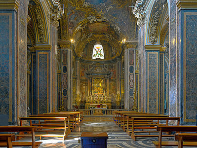
 Comment Looks oversaturated if compared to other images of the church. Grey marble is blue, gold is yellow. --DXR (talk) 05:04, 11 May 2016 (UTC)
_-_Interior.jpg#c-Livioandronico2013-2016-05-10T19:51:00.000Z-File:Santa_Maria_dell'Orto_(Rome)_-_Interior.jpg,_featured)
_-_Interior.jpg#c-Livioandronico2013-2016-05-10T19:51:00.000Z-Livioandronico2013-2016-05-10T19:51:00.000Z)
_-_Interior.jpg#c-Ralf_Roletschek-2016-05-10T19:54:00.000Z-Livioandronico2013-2016-05-10T19:51:00.000Z)
_-_Interior.jpg#c-Ikan_Kekek-2016-05-10T20:40:00.000Z-Livioandronico2013-2016-05-10T19:51:00.000Z)
_-_Interior.jpg#c-ArionEstar-2016-05-10T21:02:00.000Z-Livioandronico2013-2016-05-10T19:51:00.000Z)
_-_Interior.jpg#c-Hubertl-2016-05-10T21:06:00.000Z-Livioandronico2013-2016-05-10T19:51:00.000Z)
_-_Interior.jpg#c-INeverCry-2016-05-10T22:50:00.000Z-Livioandronico2013-2016-05-10T19:51:00.000Z)
_-_Interior.jpg#c-DXR-2016-05-11T05:04:00.000Z-Livioandronico2013-2016-05-10T19:51:00.000Z)
- Comment - Just guessing here, but I doubt any of the other images were taken with this long an exposure, so perhaps they, rather than this photo, are less accurate. But I'll be interested to read Livio's reply. -- Ikan Kekek (talk) 05:15, 11 May 2016 (UTC)
- They are not too saturated are real, that's the beauty of the churches of Rome. The colors are vivid and very bright, of course on a long exposure is more noticeable. However 90% of my photos are made immediately after the restoration that accentuate the colors (remember what they said of the restoration to the Sistine Chapel?),thanks --LivioAndronico (talk) 06:26, 11 May 2016 (UTC)
- A couple of points: First, I doubt that there is any connection between exposure time and colors (why should there be?). Second, I admit that there is a chance that I am wrong, but I doubt that the images are nearly as colorful when they come out of the camera as raw files (happy to be proven wrong, though, and I shall stop complaining forever). Just compare the colors to the images the church itself has shared Third, I believe that the post-processing you use is not ideal. For example, why are the benches at the left side switching between orange and green? It seems like overprocessing that has overemphasized the differences between two brown tones. Please don't misunderstand me, I appreciate very much that you upload good pictures. --DXR (talk) 11:20, 11 May 2016 (UTC)
_-_Interior.jpg#c-Ikan_Kekek-2016-05-11T05:15:00.000Z-DXR-2016-05-11T05:04:00.000Z)
_-_Interior.jpg#c-Livioandronico2013-2016-05-11T06:26:00.000Z-Ikan_Kekek-2016-05-11T05:15:00.000Z)
_-_Interior.jpg#c-DXR-2016-05-11T11:20:00.000Z-DXR-2016-05-11T05:04:00.000Z)
- Support --Martin Falbisoner (talk) 05:52, 11 May 2016 (UTC)
- Support --Johann Jaritz (talk) 03:17, 12 May 2016 (UTC)
- Support Can't really go wrong with a crepuscular ray, IMO. Daniel Case (talk) 05:19, 13 May 2016 (UTC)
- Support this photo makes the building look very impressive. --Pine✉ 02:19, 15 May 2016 (UTC)
_-_Interior.jpg#c-Martin_Falbisoner-2016-05-11T05:52:00.000Z-Livioandronico2013-2016-05-10T19:51:00.000Z)
_-_Interior.jpg#c-Johann_Jaritz-2016-05-12T03:17:00.000Z-Livioandronico2013-2016-05-10T19:51:00.000Z)
_-_Interior.jpg#c-Daniel_Case-2016-05-13T05:19:00.000Z-Livioandronico2013-2016-05-10T19:51:00.000Z)
_-_Interior.jpg#c-Pine-2016-05-15T02:19:00.000Z-Livioandronico2013-2016-05-10T19:51:00.000Z)
Confirmed results:
_-_Interior.jpg#c-Laitche-2016-05-16T06:50:00.000Z-File:Santa_Maria_dell'Orto_(Rome)_-_Interior.jpg,_featured)
This image will be added to the FP gallery: Places/Interiors
_-_Interior.jpg&oldid=196362775)