Commons:Featured picture candidates/File:Georges Rochegrosse's poster for Jules Massenet's Don Quichotte.jpg
Jump to navigation
Jump to search

Voting period is over. Please don't add any new votes.Voting period ends on 15 Jan 2016 at 09:49:02 (UTC)
Visit the nomination page to add or modify image notes.

- Category: Commons:Featured pictures/Non-photographic media
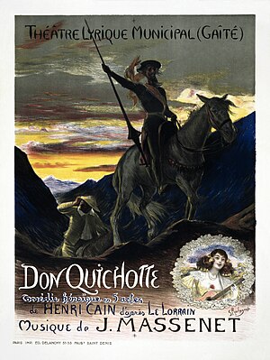
 Info created by Georges Rochegross - restored, uploaded, and nominated by Adam Cuerden -- Adam Cuerden (talk) 09:49, 6 January 2016 (UTC)
 Support -- Adam Cuerden (talk) 09:49, 6 January 2016 (UTC)
 Comment I like this poster, but it looks very dark to me. I suppose Archaeodontosaurus had the same impression. His version looks much better to me. There is(was?) a bug about PNG rendering which produces this result. Is this the case here? Regards, Yann (talk) 10:16, 6 January 2016 (UTC)
- Comment It's obvious. Part of the engraving work disappears under the black tones. One can see from the test had been done, but is also measurable by the weight of the picture. --Archaeodontosaurus (talk) 11:23, 6 January 2016 (UTC)
- Some things are meant to be dark. The poster is about contrasts. Things in shadow shouldn't look bright as day, or you ruin the artistic intent. The darker image is a wonderful metaphor for Don Quixote. The brighter one is just... meh. Adam Cuerden (talk) 13:36, 6 January 2016 (UTC)
 Oppose Archaeo's version is already quite dark, but your version is completely dark. The nice blue color is now black, and no details of both personages are visible. Regards, Yann (talk) 17:21, 7 January 2016 (UTC)
- @Yann: Are you sure your monitor is adjusted correctly? Adam Cuerden (talk) 01:21, 8 January 2016 (UTC)
- I looked at it on 2 different PCs/monitors, and I get the same darkness. Yann (talk) 21:52, 8 January 2016 (UTC)
- @Yann: Are you sure your monitor is adjusted correctly? Adam Cuerden (talk) 01:21, 8 January 2016 (UTC)
- Some things are meant to be dark. The poster is about contrasts. Things in shadow shouldn't look bright as day, or you ruin the artistic intent. The darker image is a wonderful metaphor for Don Quixote. The brighter one is just... meh. Adam Cuerden (talk) 13:36, 6 January 2016 (UTC)
- Support Daniel Case (talk) 18:15, 6 January 2016 (UTC)
- Support Per Adam. INeverCry 19:53, 6 January 2016 (UTC)
- Support --Medium69 You wanted talk to me? 15:02, 7 January 2016 (UTC)
- Support Johann Jaritz (talk) 04:20, 8 January 2016 (UTC)
- Oppose This image does not give a good idea of the original poster. --Archaeodontosaurus (talk) 17:31, 8 January 2016 (UTC)
Confirmed results: